Tiki Central / General Tiki
Which carpet is more Tiki? (Decision made)
Pages: 1 37 replies
|
L
LiddleLola
Posted
posted
on
Fri, Apr 16, 2010 8:51 AM
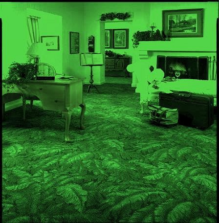
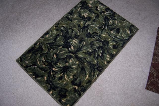
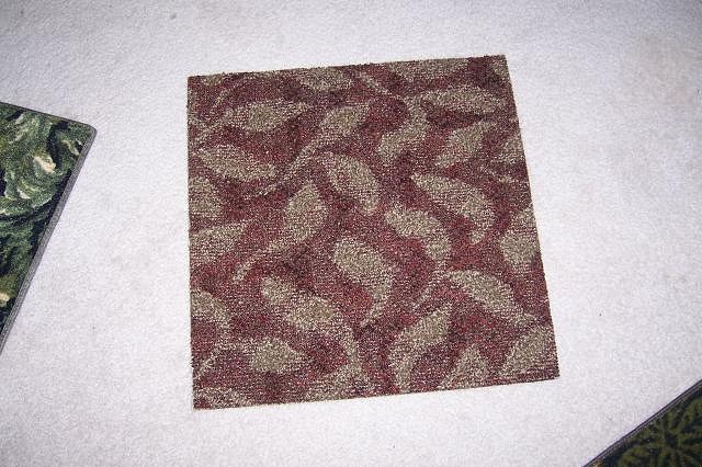
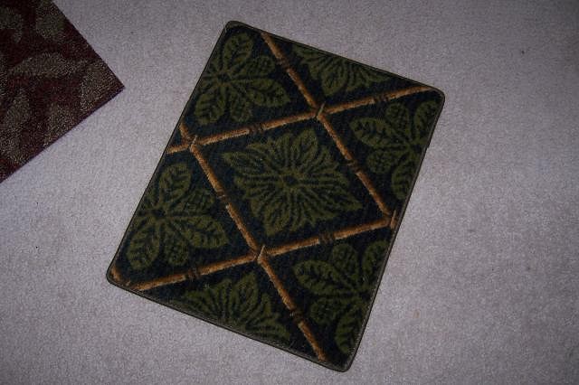
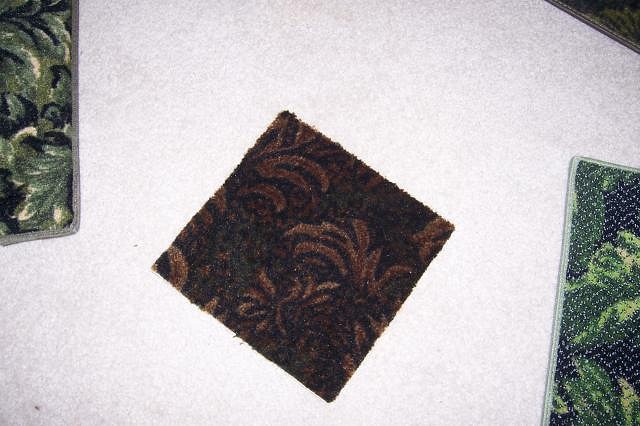
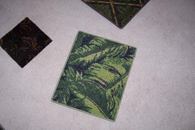
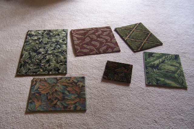
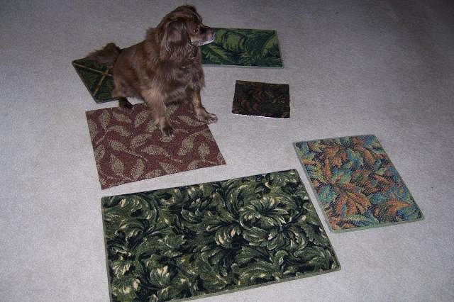
I ordered 6 carpet samples for my tiki room. Someone asked about the walls. They will be Luahala with bamboo framing. Sample A Sample B Sample C Sample D Sample E Sample F Here they are together for comparison Tiki Dog added to show scale. Which do you think is the most tiki and would work well in this room? Looking forward to opinions from the experts. Darilyn [ Edited by: LiddleLola 2010-04-16 09:05 ] [ Edited by: LiddleLola 2010-04-20 09:29 ] |
|
BTH
Brenda's Tiki Hut
Posted
posted
on
Fri, Apr 16, 2010 9:02 AM
I'd go with the first one. It's tropical and will hide all sorts of fruit juice sins. And the size of the room can take a dark carpet. It will cozy it up a bit. Have fun decorating! |
|
BB
Bora Boris
Posted
posted
on
Fri, Apr 16, 2010 9:25 AM
I also think A would work best. I prefer D but I'm afraid it would make the room appear smaller. F is cool it's very Mirage Las Vegas 1990. My final Answer is A. :) |
|
T
tikiyaki
Posted
posted
on
Fri, Apr 16, 2010 10:27 AM
WAIT ! Before you buy anything...check out FLOR carpet tiles. Rubber backed carpet tiles that you just stick to the floor. If you spill on it, just pull the tile up and wash it out in the sink. WAY less work, and much better looking than regular carpet. http://www.flor.com/service/flor/shop/item/House-Pet/60900609164.html |
|
M
Monkeyman
Posted
posted
on
Fri, Apr 16, 2010 10:40 AM
go with the big leaves... tighter patterns make it look like a hotel lobby ** E ** |
|
T
tikiyaki
Posted
posted
on
Fri, Apr 16, 2010 11:07 AM
Out of all of the sample choices...I agree...E. |
|
C

catmomma
Posted
posted
on
Fri, Apr 16, 2010 11:19 AM
I personally love "A" |
|
A
arriano
Posted
posted
on
Fri, Apr 16, 2010 1:34 PM
The answer is: The easiest one to clean :wink: Seriously, A or C would be my choice |
|
STCB

Sabu The Coconut Boy
Posted
posted
on
Fri, Apr 16, 2010 1:43 PM
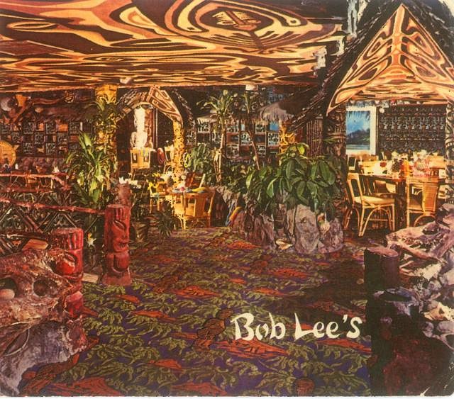
Sample A looks most like the classic carpets I see on my postcards of old Tiki Bars & Restaurants from the 60s. Sample E is nice too though. [ Edited by: Sabu The Coconut Boy 2010-04-16 13:44 ] |
|
T
tobunga
Posted
posted
on
Fri, Apr 16, 2010 1:45 PM
I like E. To me, it's the only one that actually seems tropical, which is good for tiki! |
|
M
Monkeyman
Posted
posted
on
Fri, Apr 16, 2010 2:13 PM
exactly |
|
B
Beachbumz
Posted
posted
on
Fri, Apr 16, 2010 2:18 PM
"E" ~ Reminds me of old Hawaiian barkcloth... very retro looking... and will look xlnt with lot's of bamboo... NO WHITE WALLS as ben would say... :wink: |
|
BB
Bora Boris
Posted
posted
on
Fri, Apr 16, 2010 2:30 PM
We really need Poll software on this site for this type of thing. Hey Hanford, we really need Poll software on this site for this type of thing. Thanks! |
|
E
exquisitecorpse
Posted
posted
on
Fri, Apr 16, 2010 2:32 PM
C |
|
L
leleliz
Posted
posted
on
Fri, Apr 16, 2010 2:51 PM
E !!! |
|
M
Monkeyman
Posted
posted
on
Fri, Apr 16, 2010 3:13 PM
|
|
T

twitch
Posted
posted
on
Fri, Apr 16, 2010 5:14 PM
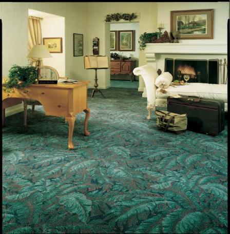
First choice was C but although a patch of it looks really frickin cool, I'm not sure how a whole room of it under your feet would look, or if it would compliment or repel the rest of the finished room. E looks all around good n safe tho. |
|
D
danlovestikis
Posted
posted
on
Fri, Apr 16, 2010 5:42 PM
F for Fireplace. It seems to compliment the colors of the fireplace while still looking tropical. A fireplace should be a focal point of a room while at the same time blending with surrounding colors. Wendy |
|
H
hiltiki
Posted
posted
on
Fri, Apr 16, 2010 7:00 PM
To answer the question, maybe D or E. However, a busy carpet will draw the attention to the floor and not the decors on the walls. It will eventually make you crazy. Would be interesting to know what color your walls are going to be, your ceiling is a brown color. Then you can put the samples next to some of the color combination around the room such as furniture pieces etc. and make sure the carpet stays neutral. The design on B is more subtle than the other samples, and it seems to be very close to your ceiling color maybe B?? |
|
BVT
Baron von Tiki
Posted
posted
on
Fri, Apr 16, 2010 7:39 PM
Sample A is very "William Morris" (i.e. Victorian) and not really appropriate for a Mid-Century or Revivalist Tiki room. Sample C has the most kitsch factor to it. Plus, it also has the most naturalistic color scheme which, I think, is important if your Tiki room is supposed to emulate the outdoors. My second choice would be Sample E. It's doesn't have the cool kitsch factor of Sample C but does lend itself to more naturalistic representation even if the color is more muted. |
|
S

swizzle
Posted
posted
on
Fri, Apr 16, 2010 7:48 PM
That's a tough one. I really like C, but I also like E and F. I completely agree with twitch and also what hiltiki said about the carpet being too busy it will distract from the walls. The photo Monkeyman posted makes me swing towards C, but without seeing the whole floor covered with E or F it's hard to say. I'll be interested to see what you finally decide on. |
|
BVT
Baron von Tiki
Posted
posted
on
Fri, Apr 16, 2010 7:57 PM
Something just occurred to me regarding Sample C: While it is a great choice in terms of color, it's bamboo pattern will create a graph-paper-like grid on the floor which may not be conducive to a relaxing atmosphere. So Sample E may be more of what you want. Whatever you do, don't use Sample F. It looks more like vomit than plants. |
|
V
VampiressRN
Posted
posted
on
Sat, Apr 17, 2010 12:12 AM
I like the DOG the best. :) I am voting for E. |
|
CJ
Coco Joe
Posted
posted
on
Sat, Apr 17, 2010 12:48 AM
C or E |
|
D
Dustycajun
Posted
posted
on
Sat, Apr 17, 2010 7:19 AM
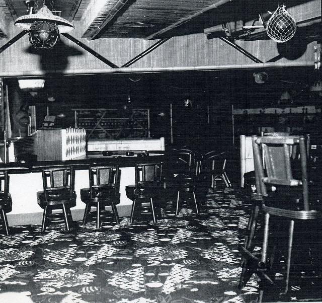
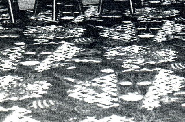
Not to sound like a conformist, but C and E are my top choices in that order, unless you can find some carpet like that used at Bob Lee's Islander!
DC |
|
BK
Big Kahuna
Posted
posted
on
Sat, Apr 17, 2010 8:55 AM
"E" |
|
T
tikiyaki
Posted
posted
on
Sat, Apr 17, 2010 9:19 AM
OR the one used at the Kapu Kai...
|
|
W
WaikikianMoeKele
Posted
posted
on
Sun, Apr 18, 2010 12:20 PM
E! |
|
BB
Bongo Bungalow
Posted
posted
on
Sun, Apr 18, 2010 8:05 PM
None of the above! Whatcha doin' carpet for? Or, really, what is your vision of this room? Family room with a tiki decor? Retro-style comercial tiki lounge? Bar? Tropical or maybe more nautical? Just look at the variety of styles in the tiki bars found here on TC. I'm a believer in a written description to which the elements fit. Ya know, something that helps you make decisions like this, rather than deciding, "which one looks best". My 2c. |
|
BVT
Baron von Tiki
Posted
posted
on
Mon, Apr 19, 2010 1:03 AM
Since we're working in a visual medium with a visual final outcome, it is better to sketch things out. Written description is too abstract. It's here one can decide on controlling elements ("Predominantly blue color scheme" or "organic shapes not geometric," or "light values dominant" or "rough visual textures"). But when it comes down to completed work, art and design are intuitive and existential. You actually have to see all the elements working in concert to know they work. All the elements could fit "The Plan" but just not work together. There's a reason why artists use color swatch books and interior designers have books and books of wallpaper and carpet samples. When it comes right down to it, "which one looks best" trumps everything else. -The Baron |
|
BB
Bongo Bungalow
Posted
posted
on
Mon, Apr 19, 2010 2:42 AM
The Baron, I get what you're sayin'. But before the sketches and color swatches, some of us benefit from devising a logic for what we've creating. I do this in my real life. So, if I was starting a themed space such as a tiki bar, I might spend a good deal of time writing and rewriting a statement such as: "(Name) is a mid-century bachelor pad located along a popular California beach. The owner likes to surf, sail, drink original rum creations, listen to his collection of Patsy Cline records, and entertain lady friends." A completely different direction might be: "(Name) is a darkly lit '60's South Seas themed lounge, frequented by a swinging and wealthy clientele, featuring live music on a small stage, drinks that are too strong for most, and a collection of art appreciated by fans of the female form." I merely contend that these descriptions would influence a different flooring choice, and that starting with the logic leads to better and easier decision making. I'd like to add that there's nothing wrong with creating a space wit the logic of, "A room where I display the tiki stuff I've been buying for the last six months." But the better spaces we see by TC members are something more than that. Those that are going so far as to re-floor a room are perhaps looking for something more.
[ Edited by: Bongo Bungalow 2010-04-19 03:21 ] |
|
L
LiddleLola
Posted
posted
on
Tue, Apr 20, 2010 9:31 AM
A decision has been made. See original post for the results. Darilyn |
|
BVT
Baron von Tiki
Posted
posted
on
Tue, Apr 20, 2010 10:59 PM
Ah, I see. Not a description of visual elements as such but really a mission statement detailing an aesthetic or artistic goal. Artists use those all the time (even if they're aren't written down and are just subconscious things.) -The Baron |
|
L
LiddleLola
Posted
posted
on
Wed, Apr 21, 2010 11:38 AM
"(Name) is a darkly lit '60's South Seas themed lounge, frequented by a swinging and wealthy clientele, featuring live music on a small stage, drinks that are too strong for most, and a collection of art appreciated by fans of the female form." Wow, thanks for writing my vision! All I have to do now is figure out a name and where the dance floor will be. And change "wealthy" to "struggling to make ends meet" clientele. Darilyn |
|
L
LiddleLola
Posted
posted
on
Wed, May 26, 2010 5:48 PM
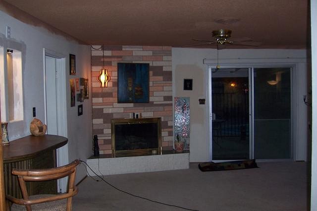
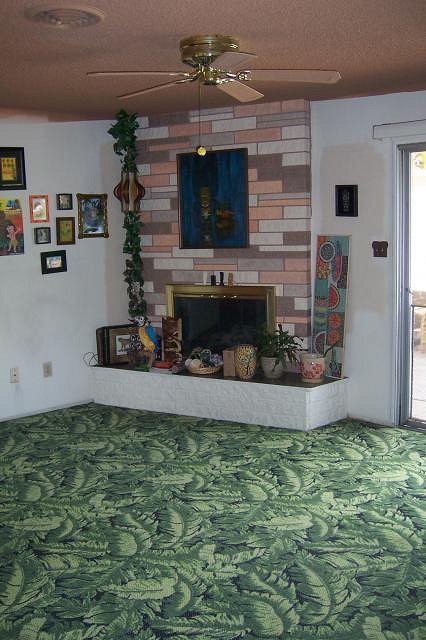
Carpet installed. Wish me luck pulling it all together now.
Thank you all for your input. Mahalo [ Edited by: LiddleLola 2010-05-26 17:49 ] |
|
D
Dustycajun
Posted
posted
on
Wed, May 26, 2010 5:54 PM
Congrats on the carpet! Looks great. As for the room, I would start with the famous Bamboo Ben refrain: No White Walls! DC |
|
L

littlegiles
Posted
posted
on
Wed, May 26, 2010 7:33 PM
I have to admit that i was a bit worried about the pattern looking too busy, but it looks great! You chose wisely. :) Can't wait to see what you do next. |
|
B
beadtiki
Posted
posted
on
Wed, May 26, 2010 8:06 PM
I miss having brand new carpeting (at least CLEAN carpeting!) It looks like you ARE doing somethng about those white walls too - do I see a tan color swatch by the door? Oooohh - and your fireplace is awesome! "Something, something, something, Dark Side, something, something." [ Edited by: beadtiki 2010-05-26 20:07 ] |
Pages: 1 37 replies

