Pages: 1 2 3 4 5 6 7 8 9 10 11 12 13 14 15 16 17 18 19 20 21 22 23 24 25 26 27 28 29 30 31 32 33 34 35 36 37 38 39 40 41 42 43 44 45 46 47 48 49 50 51 52 53 54 55 56 57 58 59 60 61 62 63 64 65 66 67 68 69 70 71 72 73 74 75 76 77 78 79 80 81 82 83 84 85 86 87 88 89 90 91 4,327 replies
|
TSA

Tiki Shark Art
Posted
posted
on
Thu, Apr 10, 2008 10:41 AM
Aloha~ |
|
LLT

little lost tiki
Posted
posted
on
Thu, Apr 10, 2008 11:35 AM
that mug is GREAT! |
|
M

MooneyTiki
Posted
posted
on
Thu, Apr 10, 2008 12:08 PM
Aloha Tiki Shark Art! WOW! More aweasome Paintings! Thanks for sharin, Aloha, Mooney |
|
TSA
Tiki Shark Art
Posted
posted
on
Fri, Apr 11, 2008 11:13 AM
Happy aloha Friday! LLT Mahalo, and have a great weekend! |
|
P

Paipo
Posted
posted
on
Fri, Apr 11, 2008 1:05 PM
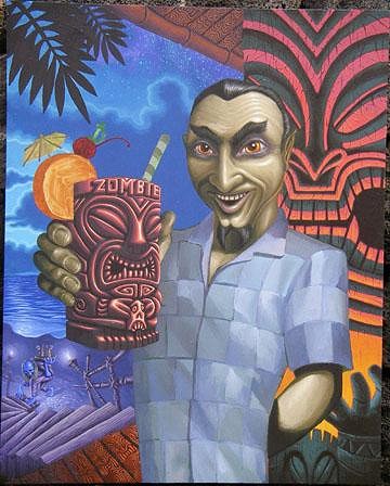
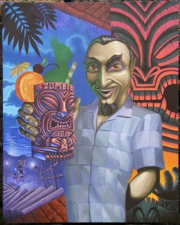
Man, that's really starting to pop now Brad. Those waxy looking fingers are creeping me out! Seems like for all the trouble this one's given you it's going to be one of, if not the best? We're all waiting to see that shirt...whatcha gonna do? |
|
TSA
Tiki Shark Art
Posted
posted
on
Sat, Apr 12, 2008 12:38 PM
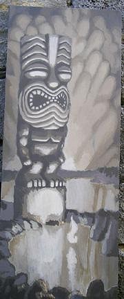
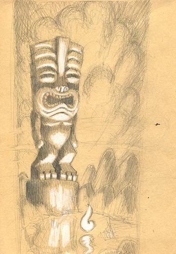
Aloha! The strongest time I ever had this feeling was years ago, in a artist's studio, in Venice California. He specialized in life sized portraits - done in an "old Master's" style - many many glazes of oil paint. In his studio was this huge canvas, nearly all black except for a standing, naked, girl. Some how the figure in the painting seemed more alive than the actual people in his studio. It was uncanny. Now, Bela's no where near that level of mastery in oils, however, you walk in my studio and right away you feel his eyes on you. Last night I did some work on #14. I keep telling myself I want parts of this painting to remain "rough". I want to see some brush strokes, and texture. (but I find myself having to stop my hand from seeking out to smooth out everything!) Mahalo! |
|
TSA
Tiki Shark Art
Posted
posted
on
Sun, Apr 13, 2008 11:19 AM
Aloha~ Mahalo~ |
|
LLT
little lost tiki
Posted
posted
on
Sun, Apr 13, 2008 12:46 PM
Dude! |
|
K

Kahu
Posted
posted
on
Sun, Apr 13, 2008 2:52 PM
TS! Like the addition of the "ink". How soon before this is available as a print? |
|
J

JenTiki
Posted
posted
on
Sun, Apr 13, 2008 10:52 PM
:lol: :lol: :lol: Yes, and No. I'm dying to see the whole thing finished, but I also love the slow tortuous progression! This has been so much fun to watch! |
|
FB

Flat Black
Posted
posted
on
Mon, Apr 14, 2008 11:59 AM
This painting just keeps getting better. Looks amazing man. |
|
TSA
Tiki Shark Art
Posted
posted
on
Tue, Apr 15, 2008 12:59 PM
Aloha~
Mahalo! |
|
J
JenTiki
Posted
posted
on
Tue, Apr 15, 2008 1:17 PM
Sounds very reasonable (and affordable) to me! That's a bargain price for such a cool print! |
|
I

ivanchan
Posted
posted
on
Wed, Apr 16, 2008 7:46 AM
Been out of the loop but missed your art and energy, Tikishark! It's a boost seeing the stuff you've been working on. Take care, I. |
|
FB
Flat Black
Posted
posted
on
Wed, Apr 16, 2008 8:03 AM
$50 seems VERY reasonable to me. I really like this piece and if you printed it, that would certainly be in my price range. Keep knockin' it out. |
|
K
Kahu
Posted
posted
on
Wed, Apr 16, 2008 8:08 AM
TShark~ I would say do a print, it just has a certain tiki lounge vibe that would be a big hit/classic in a home bar. And I do think it would be a hit at Tiki Oasis if you are vending there. But, hey this is all just my opinion. And $40 for a gilcee is not bad from my limited knowledge especially if he can capture the true colors of it all. |
|
TSA
Tiki Shark Art
Posted
posted
on
Wed, Apr 16, 2008 11:53 AM
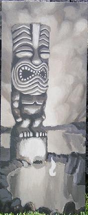
Aloha~ Mahalo ~ (cough cough) This morning the area of the Big Island known as Ka'u was evacuated due to high levels of Sulfur Dioxide! - "The VOG is coming! There's something in the VOG! Stay out of the VOG!" (how very John Carpenter, ya know!) Tiki Shark [ Edited by: Tiki Shark Art 2008-04-16 11:54 ] |
|
K
Kahu
Posted
posted
on
Wed, Apr 16, 2008 12:19 PM
No, I wish I could make it this year. If you can find a way to have your art there for people to see and buy I would go for it. [ Edited by: Kahu 2008-04-16 12:19 ] |
|
M
MooneyTiki
Posted
posted
on
Wed, Apr 16, 2008 4:26 PM
Aloha Tiki Shark! I love the Details and the Great color you've got going in your art,Excellent stuff, Aloha Mooney |
|
F

frostiki
Posted
posted
on
Thu, Apr 17, 2008 9:00 AM
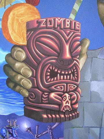
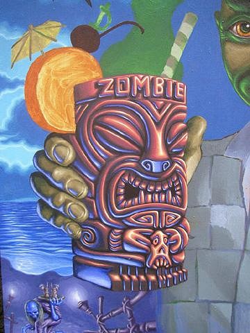
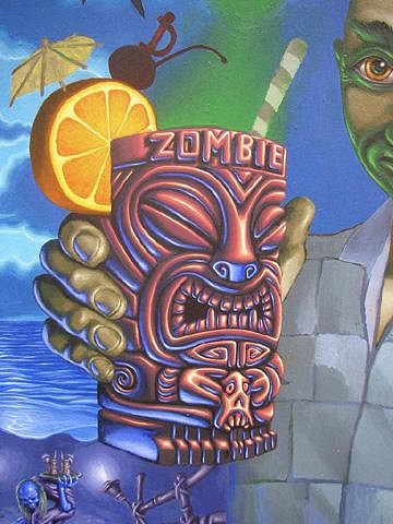
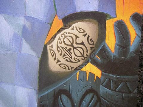
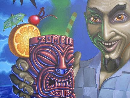
Brad, Bella is coming along nicely. Love the detail and lighting you have going on in the mug (well the whole thing really, but you are focusing on the mug right now) and his hand. Keep them coming. |
|
TSA
Tiki Shark Art
Posted
posted
on
Thu, Apr 17, 2008 10:35 AM
Aloha~ Mahalo~ |
|
T
teaKEY
Posted
posted
on
Thu, Apr 17, 2008 1:24 PM
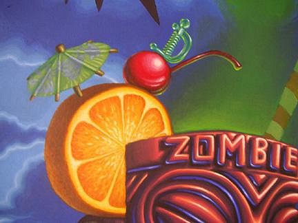
Not only would the mug make a good mug, the swizzle would make a good mug. |
|
F
frostiki
Posted
posted
on
Thu, Apr 17, 2008 2:54 PM
WOW, what size is that painting again? |
|
G

greentikipat
Posted
posted
on
Thu, Apr 17, 2008 3:35 PM
Brad- i love watching your stuff progress from underpainting to tone and highlight; too killer, dude. all the really fun stuff is starting to pop up. cheers, man!! |
|
SG

Sam Gambino
Posted
posted
on
Thu, Apr 17, 2008 9:36 PM
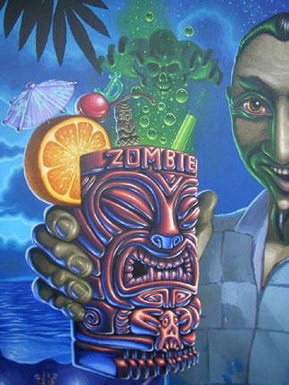
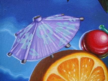
Man, Brad! Excellent detail and colors! Everything down to the swizzle and umbrella in the mug. Just beautiful technique and work. |
|
TSA
Tiki Shark Art
Posted
posted
on
Sun, Apr 20, 2008 10:44 PM
Aloha~ VOG report - Okay, we had a nice bright sunny day here. Thought I'd let you know that, after all the complaining about the VOG. Laters~ |
|
J
JenTiki
Posted
posted
on
Sun, Apr 20, 2008 11:03 PM
Wow! The dude in the green haze is totally unexpected, and totally RAD, Brad! :wink: Yep, I do believe this will be another addition to my growing Tiki Shark collection! Still looking forward to the shirt! |
|
K
Kahu
Posted
posted
on
Mon, Apr 21, 2008 7:44 AM
Jen is right, you have to do this as a print now man! This print is starting to remind me of one where you are able to stare at it for hours because of the details and nuances. You should just start a pre-sale list now. |
|
TSA
Tiki Shark Art
Posted
posted
on
Tue, Apr 22, 2008 12:37 PM
Aloha, I've been collecting the "SPECTRUM" books for years, so it was cool to get into it. |
|
K
Kahu
Posted
posted
on
Tue, Apr 22, 2008 1:14 PM
Congrats man on the inclusion! |
|
TSA
Tiki Shark Art
Posted
posted
on
Wed, Apr 23, 2008 12:17 AM
Thanks Kahu~ |
|
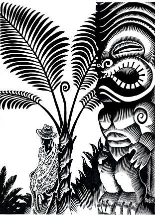
T

tikiracer
Posted
posted
on
Wed, Apr 23, 2008 12:38 AM
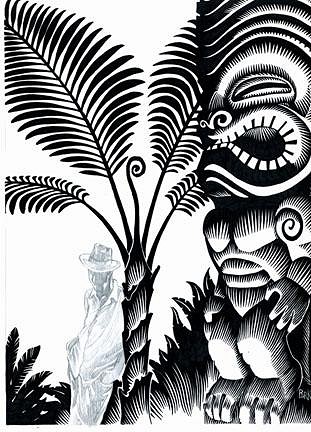
Hey Brad This wood cut is looking great, even without the background colour. How's #2 shaping up in production? |
|
TSA
Tiki Shark Art
Posted
posted
on
Wed, Apr 23, 2008 2:15 AM
Tikiracer~Thanks! I'm glad you like it. It's got a different vibe than the fist one, but still in that Honolulu noir feel. (Actually in my mind they are all illustrations for the same story.) Aloha! |
|
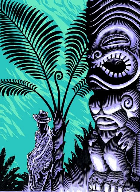
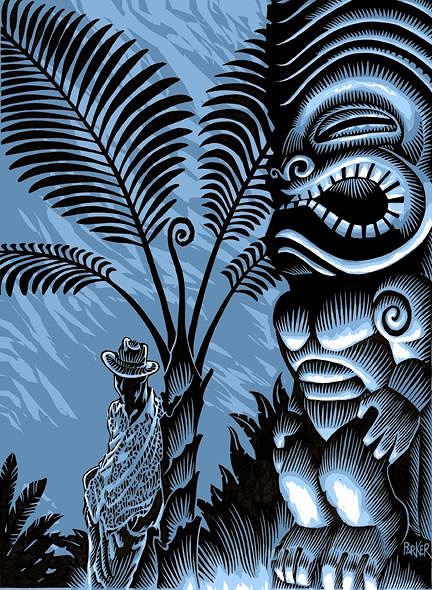
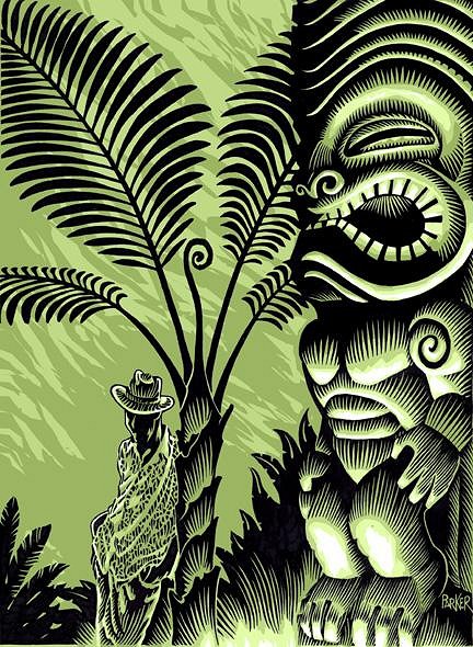
H

hewey
Posted
posted
on
Wed, Apr 23, 2008 5:12 AM
Looks sweet. What about making the background the same colours as the foreground, for a cool monochromatice effect? The painting is coming along sweetly too :D |
|
T
tikiracer
Posted
posted
on
Wed, Apr 23, 2008 8:08 AM
I agree with Hewey, maybe this would look great a bit more mono. Bit more noir. I really like the black and sand paper finish of the first one. Saying that, the use of the blue and purple feels more like a tikishark use of colour. Will all the colour work make the prints a lot more money?? Just I was hoping to get the complete set. |
|
K
Kahu
Posted
posted
on
Wed, Apr 23, 2008 8:16 AM
I tend to agree with TRacer, I love the look and the feel of the other pieces that you have done. Still a great piece regardless. |
|
T

TikiFool
Posted
posted
on
Wed, Apr 23, 2008 10:38 AM
I like the colors you've chosen. Two things. I wonder if the background green shapes would benefit from more specificity, that is, more jungle vine- and leaf-shaped silhouettes, not to any great detail, just shapes more reminiscent of a jungle forest. The green is sufficiently light enough to tolerate more complex imagery. Also, the way the color is, the man's face perhaps could use some more detail. Not a lot. Just a few touches to highlight cheekbones/forehead, well, you're the artist. You would best know what to highlight. The point is, the way the coloring is, it seems to me his face ought to be a bit more revealed. His shirt and his collar are completely lit, so the brim of the hat seems insufficient to cast the whole side of his face in shadow. [ Edited by: TikiFool 2008-04-23 10:44 ] |
|
RH

Robb Hamel
Posted
posted
on
Wed, Apr 23, 2008 12:21 PM
I agree with JenTiki, the image in the green mist is unexpected and very cool. Spectrum 15? Awesome Brad... wow, Spectrum. |
|
TSA
Tiki Shark Art
Posted
posted
on
Wed, Apr 23, 2008 12:55 PM
Hewey ~ Thanks for the feed back. Monochromatic, okay take a look. Mahalo for all the good comments folks! |
|
T
TikiFool
Posted
posted
on
Wed, Apr 23, 2008 2:24 PM
Color me crazy — but I really really like your original color scheme. The black light violet against the aqua green, for me, popped the foreground. Now it all looks sooooo flat and the background seems like an empty sound stage. Just one opinion... |
|
C

Clysdalle
Posted
posted
on
Wed, Apr 23, 2008 2:40 PM
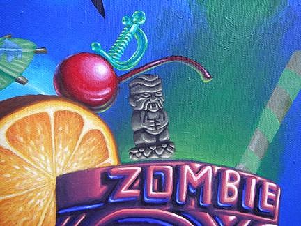
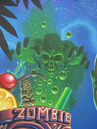
mono is the way to go....strong line work...bold shapes.....perfect!! how about a close up of that zombie skull mist!!!! Me digs'em! |
|
LLT
little lost tiki
Posted
posted
on
Wed, Apr 23, 2008 2:46 PM
JUST PRINT ONE-COLOR AND HAND-TINT SOME! |
|
P
Paipo
Posted
posted
on
Wed, Apr 23, 2008 2:54 PM
Keep it simple I reckon. It's gonna be a lot of extra work for your print guy to add in colour layers, and we're buying this for your great sense of design and the crisp linework more than anything else! I do like the look of some of those samples you posted, but if you are gonna go the colour route, I suggest maybe doing some bigger screenprinted (maybe too much work for woodcut?) pieces on heavier stock (and charging accordingly!) I got my prints yesterday and they look amazing as they are - the black ink and the natural looking paper work really well together. I had to make sure my hands were clean as I couldn't stop pulling them out of the envelope to look at them. Finally I have some Tikishark art! |
|
J
JenTiki
Posted
posted
on
Wed, Apr 23, 2008 4:19 PM
Here's another opinion - take it for what it's worth. I really like your original color scheme, but I do understand that it will be much more work. I also kinda like the monotone in green, but I would like it better if you did what someone else suggested and maybe put some shapes in the background to give it that "foliage" look. On the other hand, Kinny's idea of hand coloring each one Rocks! Then everyone would be it's own little piece of original art. Kinda like what Munktiki did with their "Rotting Skull" mugs, where each one had different colors, or different features to give each it's own "personality." p.s. - I second the vote for a close-up of the green mist ghoul! |
|
H
hewey
Posted
posted
on
Wed, Apr 23, 2008 5:42 PM
Yeh, Im much preferring the monochrome look. I love how they have very different vibes, just through the use of colour - eg. the blue evokes a feeling of a cool night with light breeze, the kind of night where the clouds move across the sky quickly, revealing patches of stars as they move. The green has a real tropical feel, like a sticky humid jungle in the middle of the day, where it's that enclosed you're just surrounded by green. The sepia one has a cool moody vintage feel. A red/orane print one would have a great volcano vibe. I think I like the look of the blue one the best. The night vibe works the best, seeing as the main light source is coming from the tikis feet, not from the sun. The small light accents on the guys hat suggest tiny bits of moonlight is also lighting the scene, and this also makes sense given the blue background too (like a landscape under moonlight).
Yeh, thats a top idea :D Would also address the issue of the background looking "flat" too.
Yeh, I 3rd that! :D :D and how about a size reference in the pic, so we can appreciate the detail? |
|
TSA
Tiki Shark Art
Posted
posted
on
Wed, Apr 23, 2008 8:36 PM
Wow, thanks everyone for the great feed back. It really helps me figure out where to take the wood prints next. While I like everyones suggestions, the monochrome idea made me step back and think why I was attracted to doing the wood cuts in the first place. It was because they are so beautifully retro. So non computer enhanced. So, less is more. Making a Wood cut into a full color print then pushes it into the modern realm, and heck, I'm already doing full color giclees with full color. I'd rather they remain something unique and unusual and ...er...wood cutty. Anyways, I'm still waiting to hear back from Earl on his thoughts - since he's going to to be doing the carving. We'll confer and see whats what. But again, thanks everyone! As requested, here's the close up of the zip fizz zombie raising outa the drink. Mahalo~ |
|
T

TiKiMaN77
Posted
posted
on
Wed, Apr 23, 2008 8:54 PM
Brad. Your work just continues to inspire me man. Not to mention I have to constantly pick my jaw up from the floor and wind my tongue back into my head. I would KILL to have a print of this Latest painting. Friends seem to be in disbelief when I show them my detailed work, but then I mention they should see yours. Actually, I was wondering if you might be able to help me figure out a layout for a piece of mine I've had to put off because I can't think of how I want to do it just yet. |
|
F
frostiki
Posted
posted
on
Thu, Apr 24, 2008 6:43 AM
Brad, Is there evil czech absinthe in that drink? Is that is what is making the green phantom zombie come out of the drink. I like the new umbrella, better detail in it and the color plays better that the green one did. |


Pages: 1 2 3 4 5 6 7 8 9 10 11 12 13 14 15 16 17 18 19 20 21 22 23 24 25 26 27 28 29 30 31 32 33 34 35 36 37 38 39 40 41 42 43 44 45 46 47 48 49 50 51 52 53 54 55 56 57 58 59 60 61 62 63 64 65 66 67 68 69 70 71 72 73 74 75 76 77 78 79 80 81 82 83 84 85 86 87 88 89 90 91 4327 replies