Tiki Central / Tiki Marketplace
Don the Beachcomber - Sahara
Pages: 1 12 replies
|
A
arriano
Posted
posted
on
Sat, Feb 9, 2008 9:09 AM
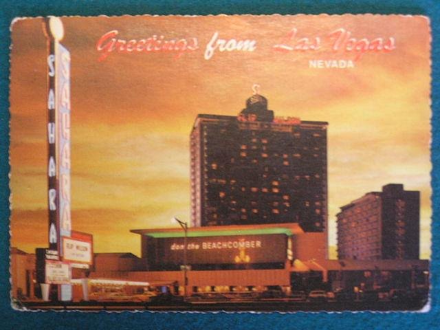
Check out this postcard now on ebay from Don the Beachcomber at the Sahara. http://i5.ebayimg.com/05/i/000/d7/3b/1b48_1.JPG Kind of wild, but I don't see anything that even remotely looks tiki. I'll never complain about the Trader Vic's in Vegas again. |
|
Z
Zeta
Posted
posted
on
Sat, Apr 4, 2009 1:51 AM
|
|
A
artsnyder
Posted
posted
on
Sat, Apr 4, 2009 6:43 PM
Aloha! |
|
Z
Zeta
Posted
posted
on
Tue, Apr 7, 2009 12:12 PM
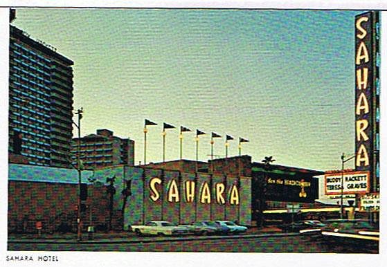
Another vintage postcard |
|
R
RevBambooBen
Posted
posted
on
Wed, Apr 8, 2009 4:40 AM
|
|
B
bigbrotiki
Posted
posted
on
Wed, Apr 8, 2009 1:03 PM
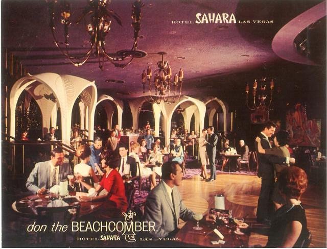
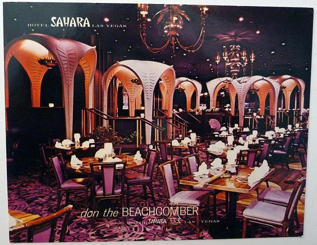
Zeta, here is the perplexing interior:
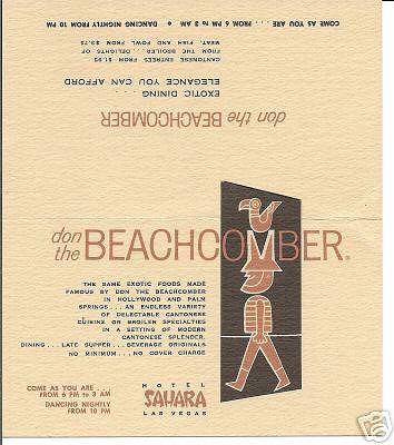
I have always wondered how the heck they (and who!?) came up with that design! A menu I have lists the opening date as 1962, but this place looks more like a late 60s/ early 70s "Hollywood Regency" Eleganza version of Art Nouveaux... The whole concept for this particular franchise seems like a conscious attempt to "update" the classic Beachcomber/Bamboo style: The typeface on the building is very modern, the Beachcomber figure himself also, and totally different than any icon used for him before (and after!):
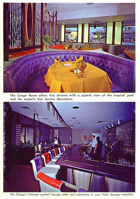
The card's text reads: "..in a setting of modern Cantonese splendor." I have a hard time detecting anything Cantonese OR Polynese! The whole style reminds me of the Tropics Motel's Congo Room: It's purple too, and just as far removed from the theme:
I used to own a giant size postcard of that Sahara Beachcomber interior that shows its weird style even better, can someone please post that? In the late 60s, when the Getty Corporation took over the chain and built the Marina Del Rey and Dallas UFOS, the interiors went back to the full-fledged Oceanic Arts style. [ Edited by: bigbrotiki 2009-04-08 15:06 ] |
|
TS
Tiki Shaker
Posted
posted
on
Wed, Apr 8, 2009 1:47 PM
this one?
|
|
B
bigbrotiki
Posted
posted
on
Wed, Apr 8, 2009 3:03 PM
I think the one I had did not have any type on it. But this one is great too, it shows the weird palm leaf gazebos, and the floor to ceiling purpleness of the place better. :) |
|
TS
Tom Slick
Posted
posted
on
Thu, Apr 9, 2009 8:59 AM
With all of that purple...Are you sure this wasn't "The Tiki bar formally known as Don The Beachcomber"? |
|
M
MamboKing
Posted
posted
on
Thu, May 14, 2009 11:21 AM
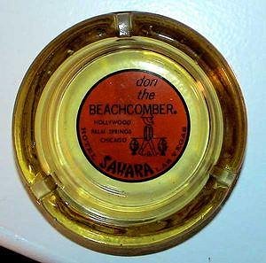
I have two of these; I think Bongo Fury also has a few.
|
|
E
ebtiki
Posted
posted
on
Thu, May 14, 2009 12:37 PM
For those of you into mid-century Googie, I highly recommend visiting the Neon Museum and touring the Boneyard on your next Vegas trip; the original Sahara signage is there, along with many other other cool signs: http://www.neonmuseum.org/tours.html |
|
P
pappythesailor
Posted
posted
on
Fri, May 15, 2009 6:47 AM
If they have neon signs that say "Tiki Bar", I'm in! |
|
K
kohalacharms
Posted
posted
on
Sun, Aug 11, 2019 10:11 AM
|
Pages: 1 12 replies

