Beyond Tiki, Bilge, and Test / Beyond Tiki
Mid-Century Modern in the South
Pages: 1 2 replies
|
WD
White Devil
Posted
posted
on
Thu, Mar 1, 2012 9:44 AM
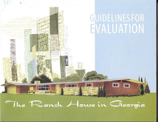
Our used & rare bookshop just got in a copy of a book that apparently isn't available to the public yet, but would have enormous interest to Mid-century Modern architecture aficionados, especially in the South. Here's the link... http://georgiashpo.org/historic/housing
|
|
LL

Limbo Lizard
Posted
posted
on
Thu, Jun 7, 2012 11:20 AM
Oklahoma isn't "The South", but all you MCM enthusiasts, take a look at the job they did on period restoration of their '50s Tulsa ranch house (article in the UK Daily Mail): |
|
A

AceExplorer
Posted
posted
on
Wed, Nov 4, 2015 8:27 AM
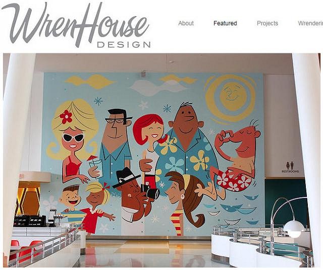
I spent some time at the new (June 2014) Cabana Bay Beach Resort in Orlando at the Universal Studios resort complex. Some of what I saw looked like copied art from several of the artists we're used to seeing in and around the tiki scene. For example, this giant wall mural - "The Tourists"
Wren House design did much of the work, together with Universal Creative, and Wren has some great photos of the resort on their web site: http://www.wrenhouse-design.com/#!featured/c1jrc Additionally, if you do a Google image search on "Cabana Bay Beach Resort," you will be rewarded with a rich selection of additional photos of this mid-century resort. Is it worth seeing? Definitely, there's a lot of good stuff there, including a "shrine" to Jack LaLanne, the fitness guru, on the walls in the gym. Ok, so, with all this fun retro joy in the resort, what's "wrong" with it? The hotel rooms are colorful, very retro, nicely appointed, and very pleasant to stay in. The seating area for non-restaurant diners is cavernous, and they show vintage TV commercials on four huge screens. There's a Starbucks. The lobby is cool looking. The pool area is interesting. There are many cool fonts and retro-style signs. In summary, the resort is a lot of fun to see, it really embraces and plays well with a lot of familiar mid-century stuff. I recommend looking at the pictures online with Google. And if you're in the Orlando area, you should definitely check it out if time permits. You may even find some very cool Florida-weight retro bowling shirts for sale in one of their well-stocked gift shops. [Edited to fix a typo - "four" instead of "for" huge screens...] [ Edited by: AceExplorer 2015-11-04 08:30 ] |
Pages: 1 2 replies


