Tiki Central / General Tiki / That's just wrong! The un-Tiki thread:
Post #247894 by Paipo on Wed, Aug 9, 2006 2:49 PM
|
P
Paipo
Posted
posted
on
Wed, Aug 9, 2006 2:49 PM
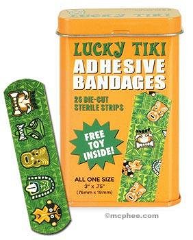
It's interesting that this one is the only example that isn't a restaurant logo or mascot, as it stood out against the others in your original post to me as an example of a design by someone who doesn't "get" tiki and probably hadn't done their homework. It's wrong on so many levels (baboon/moai hybrid, huge African style hoop earrings) that, to me at least, it's "un-tiki". As is this:
[ Edited by: Paipo 2006-08-09 15:08 ] |


