Tiki Central / Collecting Tiki / Ren Clarks Home Bar
Post #469636 by bigbrotiki on Fri, Jul 17, 2009 5:59 AM
|
B
bigbrotiki
Posted
posted
on
Fri, Jul 17, 2009 5:59 AM
Interesting evolution, made possible to trace by the now added pieces of the puzzle:
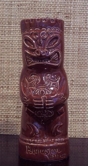
I had always wondered where the ceramics took all that x-tra body ornament from, since the logo Tiki on the plates and print items did not have it. I now believe the mug designer made it up (...and made the head a little to small for a Tiki).
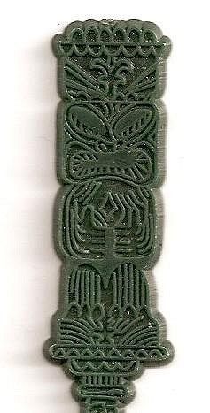
The swizzle was based on the rendering again, you can tell by the eyes. I earlier wondered who did the original rendering, because its execution is too professional to be done by Milan Guanko.
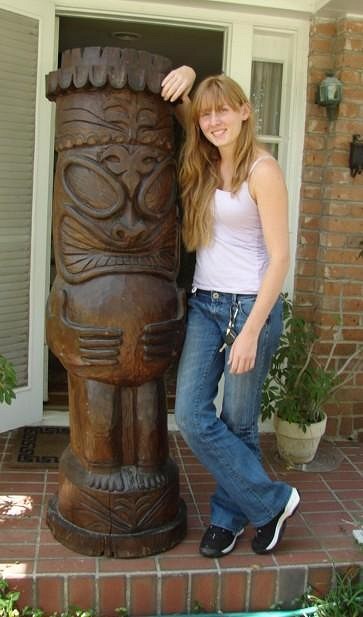
But the un-Polynesian ornamental touches are unlike any of Milan's work, who kept his carvings simple. So did the designer take his inspiration from another similar Guanko design, and added to it....OR did Milan see this Tiki first in the designer's rendering, and then added its features to his repertoire, carving the Kapu Kai post AFTER the Ren Clark logo Tiki? Aaah, Tiki archology is full of profound mysteries... :) [ Edited by: bigbrotiki 2009-07-17 06:05 ] |


