Tiki Central / Other Crafts / Tiki Tiger Studios: Big long Egyptian trip report!
Post #645787 by tigertail777 on Fri, Jul 27, 2012 6:17 AM
|
T

tigertail777
Posted
posted
on
Fri, Jul 27, 2012 6:17 AM
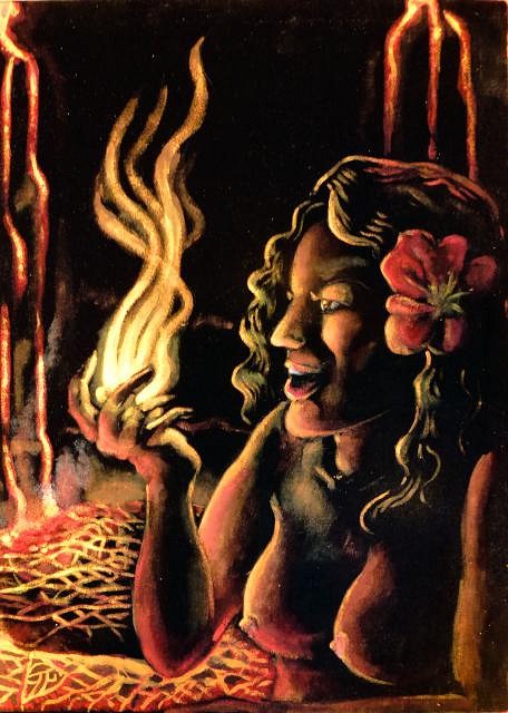
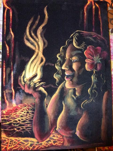
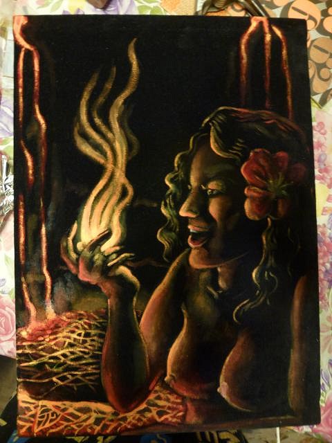
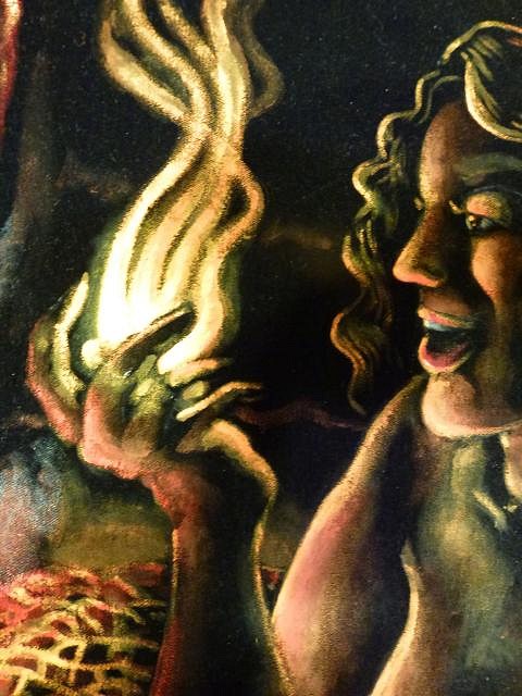
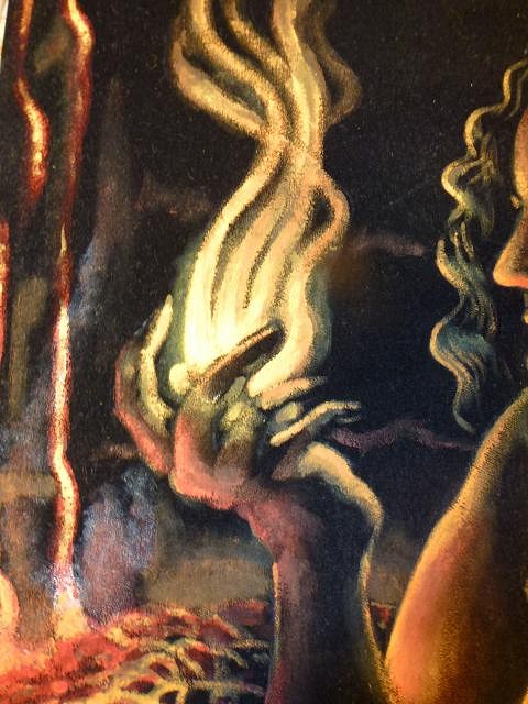
Well I finally finished Pele. Not entirely happy with all the anatomy, I see now the head is a bit too big for that body and something about the turn of the body and the breasts doesn't look right. However for my first black velvet painting, it's pretty good considering how unforgiving the medium is. I am very glad I got to to do a volcanic theme for my first one as I feel it really suits the black velvet well. I have learned a thing or two about making frames and stretching fabric over it so hopefully the next one should be a little less loose. Think I may have to invest in one of those canvas gripper tools if I keep doing these to make things easier. I have been thinking a lot about my next piece, and I keep coming back the idea that the old Mai Kai sign I wanted to paint all lit up would be perfect for velvet. I am halfway toying with the idea of doing the same thing in a regular painting as well so I can see them side by side, but I have never been one to want to repeat myself so I am not sure about that. I also could see painting some Poly pop matchcovers in velvet ( I collect matchbooks/matchcovers). Photographing or digitally documenting paintings is very hard to do, and black velvet makes it twice as hard. I have not yet figured out that magical way of capturing my paintings where they look at least pretty close to the original, even when I plop them on the scanner something just doesn't look right. So below you will see all my struggles with photographing this velvet Pele, granted I should have some kind of better lighting but ALL the lighting in our house has a horrible yellow tinge to it. One of these days I will figure something out to do this better, meanwhile on with the show... This first one I used photoshop to try and get the colors close as I could to the original, but I am not sure how well it worked out. Well kids, until next time under the pineapple sunshine it's time for the tiger to bid adieu. :wink: :tiki: |