|
TM
Tipsy McStagger
Posted
posted
on
Tue, Mar 20, 2007 3:12 PM
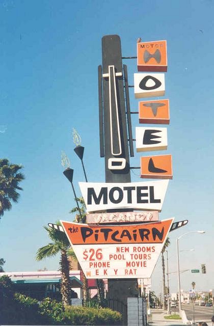
..One down, 2 to go!!!........as mentioned in my AKU AKU sign post, I'm trying to create 3 new pieces for the DVA Gallery annual tiki art show in June.......with the AKU sign finished (except for a couple small details), I'm moving on quite rapidly to the next project, The Pitcairn Hotel sign.....However, I'm going for a change of pace here...i'm going to turn this sign into an actual chair that you can sit in your tiki room on....I've been dabbling with making vintage signs into furniture and this particular vintage sign really lends itself to the task..... I first have to build a base so it can support the weight.....the pitcairn marqee will be the seat part you sit on and the rest of the sign will serve as the back rest......the nose of the tiki will be upholstered in black vinyl with padding and the white marquee itself will be tuck and rolled white vinyl with padding so that you have something soft to sit on, yet it will still look like a marqee.... I'm hoping to have this one light up as well, but probably only partially..the tiki torches will have flicker flame bulbs, the tiki will be outlined in the flex neon and the letters in the word "hotel" will light up.....it may be too much to ask to have the other parts light up as this poses the problem of having easy access to change the bulbs!!......stay tuned!! p.s - if anyone has any other pics of this sign please post them here.....between this one below and the book of tiki i have only 2 to work from....thanks!!
[ Edited by: Tipsy McStagger 2007-06-04 21:03 ] |
|
F
finkdaddy
Posted
posted
on
Tue, Mar 20, 2007 4:28 PM
Sounds ambitious! I can't wait to see how it turns out. :drink: |
|
T
teaKEY
Posted
posted
on
Tue, Mar 20, 2007 6:33 PM
I guess I didn't know those were the colors and I like it. Halloween is becoming my favorite holiday, after Christmas of course. |
|
TM
Tipsy McStagger
Posted
posted
on
Fri, Mar 30, 2007 5:15 PM
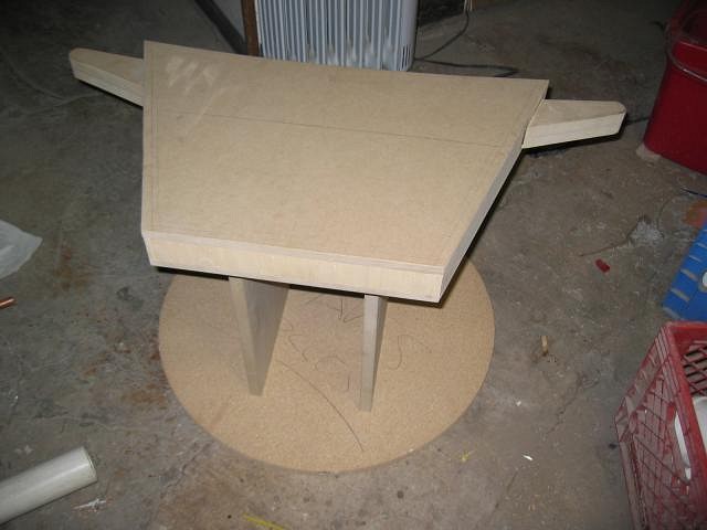
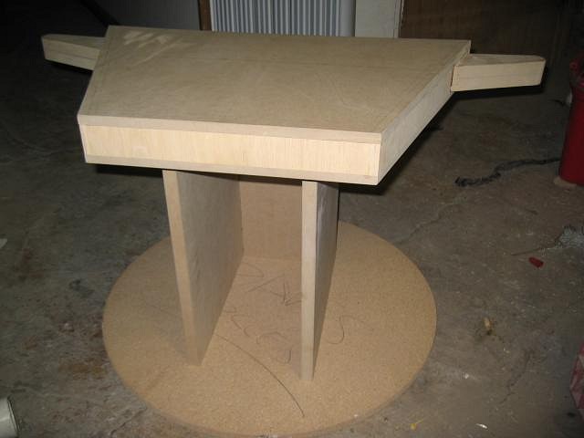
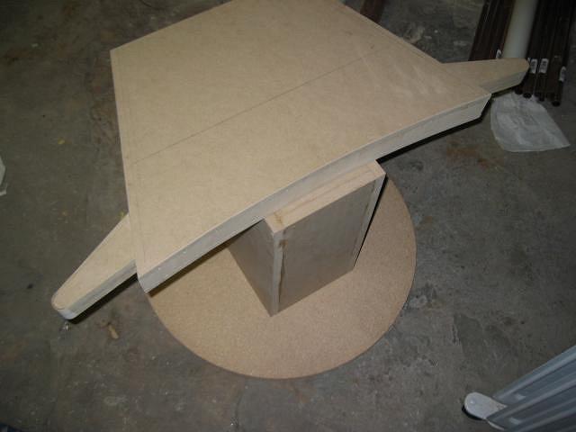
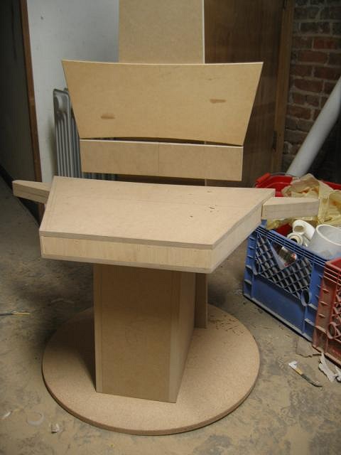
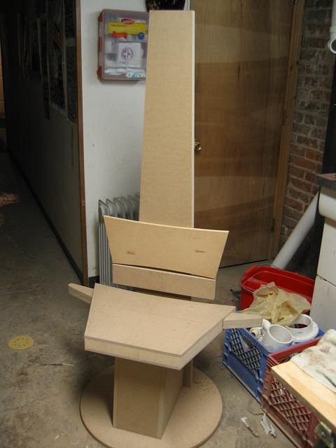
..not much to post today...been torn between a number of projects, but i managed to get it off the ground.......basically the photos show the marquee part of the sign as the seat......the circular base, though not yet attached is going to be covered in green astro turf to give the effect of the sign being set into the ground.....the base that holds up the seat is not finished, in fact the front will be enclosed and will taper down on an angle starting shallow at the top/underside of the seat and getting larger as it reaches the bottom....the chair will disassemble for easy shipping and transportation. that's about it for now...stay tuned!!
|
|
SG
Sam Gambino
Posted
posted
on
Fri, Mar 30, 2007 7:36 PM
Looking fine so far Dave. That's going to be a truly unique one of a kind piece of "tiki-dom". I'm anxious to see the finished piece! |
|
TM
Tipsy McStagger
Posted
posted
on
Fri, Mar 30, 2007 7:51 PM
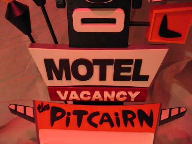
thanks sam!! ...It's gonna be fun seein this fall together. I hope to have the base finished and the moai started by mid week.....already got the "vacancy" and "motel" signs done...... |
|
C
Cammo
Posted
posted
on
Mon, Apr 2, 2007 7:22 PM
Will your chair have a "Weky Rat"? |
|
TM
Tipsy McStagger
Posted
posted
on
Mon, Apr 2, 2007 7:35 PM
..no....i'm fresh outta them!! |
|
H
hewey
Posted
posted
on
Mon, Apr 2, 2007 8:42 PM
This sounds out there, but your last sign was killer so Im keen to see how you go :D |
|
TM
Tipsy McStagger
Posted
posted
on
Tue, Apr 3, 2007 8:07 AM
thanks!! this ones gonna really knock you out....more pics posted later this weekend.... |
|
TM
Tipsy McStagger
Posted
posted
on
Tue, Apr 3, 2007 7:41 PM
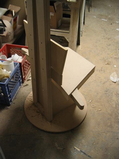
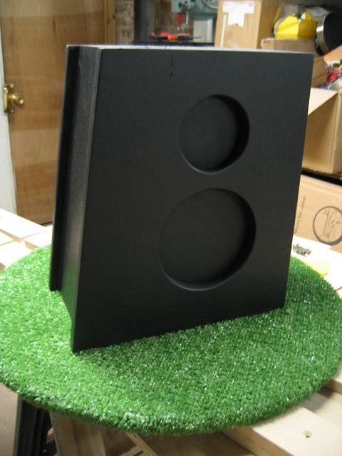
here's what i did tonight....i finished building out the base and started the backrest......i have another panel that goes on the back and covers all the screws and bolts. the chair will be able to disassemble into 4 pieces. ...next i have to mount it to the circular base and then focus on the hotel sign, the tiki face and the tiki torches......what i like about this chair is that when someone is sitting in the chair you won't be able to see the "vacancy" sign..but when they get up, you will clearly see the words "vacancy".....kind of a nice little bonus......enjoy!!
|
|
P

PockyTiki
Posted
posted
on
Tue, Apr 3, 2007 8:33 PM
a throne fit for a tiki god. nice work. :) |
|
M
mzoltarp
Posted
posted
on
Wed, Apr 4, 2007 7:35 AM
Make one for me too! I just know this will blow minds. The last one was a slice of amazing. |
|
HK
Haole Kat
Posted
posted
on
Thu, Apr 5, 2007 12:49 PM
Wow Tipsy, you've got some really creative ideas. I'll definitely be keeping an eye out for updates. If the previous sign is any indicator, this is gonna be one kick-ass chair! Josh |
|
T
tikitammy
Posted
posted
on
Mon, Apr 9, 2007 9:53 AM
I love the functional design of this piece...not just something beautiful to hang on the wall. I will be watching the progress on this. Thanks for sharing. |
|
S
Swanky
Posted
posted
on
Mon, Apr 9, 2007 10:11 AM
As I understand it, the only pictures of that sign around are bigbro's. He says he knows any time he sees it reproduced, they are ripping off his photo. It was destroyed not long after he took his pictures. |
|
J
JohnnyP
Posted
posted
on
Mon, Apr 9, 2007 10:54 AM
Now that is something else. Very clever idea! Looking forward to the updates. JP |
|
TM
Tipsy McStagger
Posted
posted
on
Mon, Apr 9, 2007 3:43 PM
..thanks for all the kind words....i'm really excited about this one....should have some pics up later tonight....after i finish these up for the dva show i'm going to continue on with more signs/furniture art.... at the urging of some of my fellow artists i am considering publishing a book of my works, including the entire series of signworks as well as some of my other work related to roadside america.....i figure, what the hell!..everyone and their brother is publishing books on their art these days, i may as well join the fray.... stay tuned! |
|
TM
Tipsy McStagger
Posted
posted
on
Mon, Apr 9, 2007 3:44 PM
..if that's the case, hey big bro, ya got any sideviews of this damn thing!! ....and it's a good thing i'm preserving yet another fine specimen of lost vintage signage through my work for others to enjoy that don't know sven!! [ Edited by: tipsy mcstagger 2007-04-09 15:49 ] |
|
TM
Tipsy McStagger
Posted
posted
on
Mon, Apr 9, 2007 5:31 PM
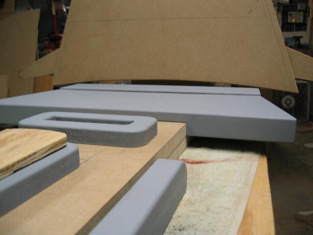
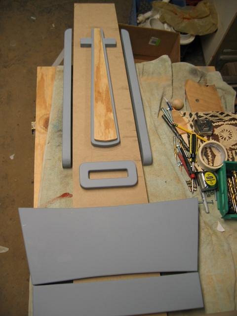
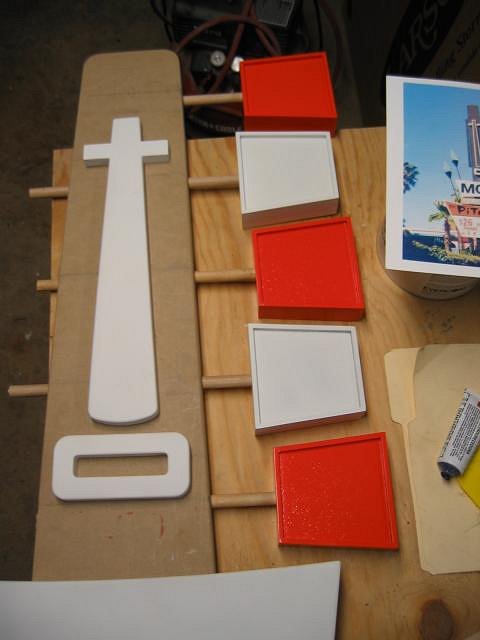
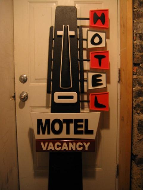
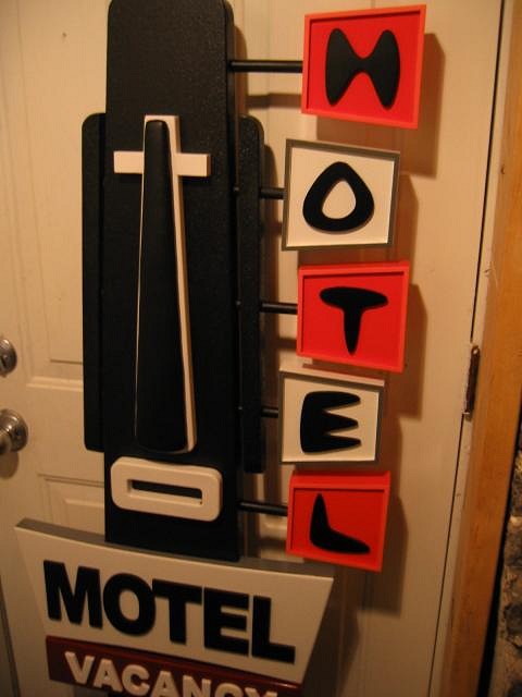
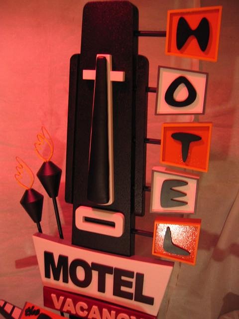
...okay, it's not too much, but it's something.....I thickened up the motel and vacancy signs as you can see from the first photo, how it differs from the last set of pics i posted....As for the face, i just have the component pieces resting on there for now...gettin ready to spot putty and paint the motel and vacancy signs, then paint the mouth and face. the plywood piece in the middle of the nose will be upholstered in black vinyl with foam padding then attached to the finished nose part which will be painted white......the ears and hotel signalong the head will be next. I'll have that sign finished tommorrow. The base is done..just gotta wrap it in astro turf and seal the bottom with laquer....This things gonna go together quite fast once all the pieces are cut, finished and in place.....so stay tuned!!
|
|
H
hala_kahiki
Posted
posted
on
Mon, Apr 9, 2007 5:50 PM
I want one! So awesome. amazing craftsmanship |
|
T
teaKEY
Posted
posted
on
Mon, Apr 9, 2007 7:47 PM
"He says he knows any time he sees it reproduced, they are ripping off his photo" After this project, anytime you see it reproduced you will know that is came from BigBro and/or Tipsy. If there ever is a BOT2 your picture is going to have to be the one featured. Sven took the pic, you brought it to life. |
|
Z

ZuluMagoo
Posted
posted
on
Mon, Apr 9, 2007 8:41 PM
I also shot this sign several years ago on a trip to Anaheim and documented it in this older extinct Anaheim thread. In fact, I think the picture on the first page of this thread is the one I shot (notice the bird on top of the lettering). Shutterfly cropped down the picture when I orginally posted it. I'll have to dig out the original picture in my pile'O'stuff downstairs (this was before I had a digital camara). |
|
TM
Tipsy McStagger
Posted
posted
on
Mon, Apr 9, 2007 9:26 PM
..same bird, different picture...compare them side by side......no clouds in the background on the pic in this thread...your pic has plenty of clouds, plus it was shot a different angle....nice colors in yours though...this one here is alittle washed out... |
|
Z

ZuluMagoo
Posted
posted
on
Mon, Apr 9, 2007 10:29 PM
You are right, different shots after closer examination. What's up with that bird same spot yeras apart?? |
|
S

sputnikmoss
Posted
posted
on
Tue, Apr 10, 2007 12:29 PM
It's one of those plastic owls. They scare off the pigeons so they won't poop on the customers! |
|
TM
Tipsy McStagger
Posted
posted
on
Tue, Apr 24, 2007 5:37 PM
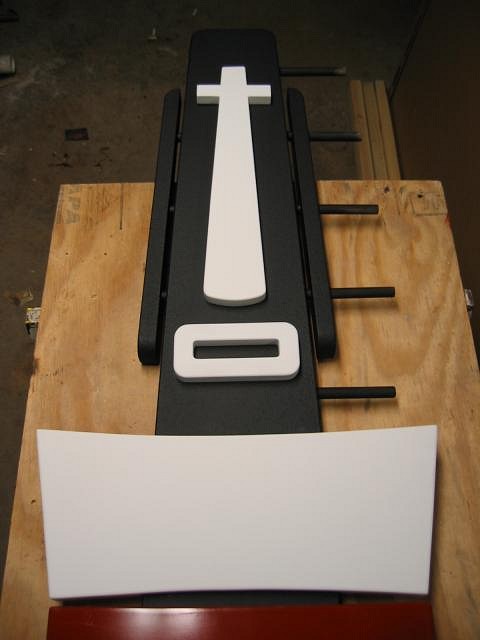
here's the latest... been super busy and the finish work on this takes the most time in order to get the paint on there nice....i got pariarts paul in on this one again...he's cuttin' me the letters as i write this...
here's the back of the chair thus far.....i loosely place the hotel sign boxes so you can get an idea of where they will end up...the wooden posts go through the entire head. they will go through the ears as well once i get the through-holes drilled like in the photo of the original sign.....I added some texture to jazz it up in the areas where the letters will go..
here's the base again.....i thought it was originally a little bland so i put a "googie" twist on it by adding the cirle details and runners on the front edge.....it will be mounted to the astro turf base, which has another thin circle painted green, with floor glides attached so as not to scratch up the floor or the piece..... ..sorry it's been slow going, but these things take time... more pics soon!! |
|
TM
Tipsy McStagger
Posted
posted
on
Mon, Apr 30, 2007 10:07 PM
here's a shot of the painted moai backrest......i textured it to look like lava. kinda like that look for this particular piece.....it's gettin closer to bein' finished everyday!!
|
|
SG
Sam Gambino
Posted
posted
on
Mon, Apr 30, 2007 10:35 PM
Hey Dave- This guy looks better everytime I see him. I wish I could see it in person. You're creating true kitsch there! |
|
TM
Tipsy McStagger
Posted
posted
on
Tue, May 1, 2007 5:14 AM
thanks sam!! you should try to make it up here for the DVA tiki show opening in june if possible.... |
|
F
Fugu
Posted
posted
on
Tue, May 1, 2007 7:16 AM
That looks fantastic! I can't wait to see the next round of progress pix. |
|
S
suburbanpagan
Posted
posted
on
Tue, May 1, 2007 1:12 PM
man! that is incredible! |
|
TM
Tipsy McStagger
Posted
posted
on
Tue, May 1, 2007 1:15 PM
cool- thanks! |
|
TM
Tipsy McStagger
Posted
posted
on
Thu, May 17, 2007 5:56 PM
whew!!!...been chippin away at this lately......here is the back of the chair finished!!! except for the 2 tiki torches which will be added last....it's gettin close!! The base is also finished...all i have left is the seat upholstery and the seat itself needs to be painted yet.....i should have this thing pretty much wrapped up by the end of next week!!
|
|
S
suburbanpagan
Posted
posted
on
Thu, May 17, 2007 6:47 PM
Holy mackeral! That's flippin' incredible! * I noticed that I already called it incredible earlier...that is a disservice to your piece not to add a different word! Flippin' Astounding! [ Edited by: suburbanpagan 2007-05-17 19:08 ] |
|
S
SwampCreature
Posted
posted
on
Thu, May 17, 2007 9:04 PM
I hate you. I love you, but I hate you. I want. Too cool. |
|
TM
Tipsy McStagger
Posted
posted
on
Mon, May 21, 2007 8:29 AM
thanks for all the kind words!! i hope to have this bastard wrapped up by friday...till then,.... |
|
N
NOTCH
Posted
posted
on
Mon, May 21, 2007 9:59 AM
Man TM, That sign-chair is kick ass!!! Just let us know how much it's gonna cost to sit on it... Killer job yer doing!!! |
|
QK
Queen Kamehameha
Posted
posted
on
Mon, May 21, 2007 11:12 AM
Tipsy, it looks great, I love the fact you did something out of the norm, Very different, very cool!!! great job Amy |
|
D
DaTiki
Posted
posted
on
Thu, May 24, 2007 11:16 AM
Lookin' good. Can't wait to get it in the gallery. I'll have to make a "Don Not Sit" sign for it for all the lazy drunks!! |
|
TM
Tipsy McStagger
Posted
posted
on
Thu, May 24, 2007 3:28 PM
|
|
I
insanetikiers
Posted
posted
on
Thu, May 24, 2007 4:39 PM
I want it!!!That's awesome! |
|
TM
Tipsy McStagger
Posted
posted
on
Fri, May 25, 2007 8:59 AM
...thanks!! ..i'll have the tiki torches finished this weekend...except for the flames..that's gonna take a little more time....upholstery is all done...just putting the finish coats of paint on all the parts...hope to assemble the seat by early next week. |
|
TM
Tipsy McStagger
Posted
posted
on
Mon, Jun 4, 2007 9:02 PM
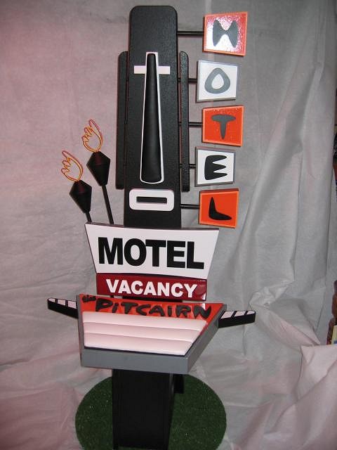
well.....it's finally done!! ..almost...just gotta attach the Letters "pitcairn" and attach the upholstered seat to the main seat base and it's done, but basically, this is what it looks like......it was quite the challenge and adventure putting it all together.....hope ya like it.!! I gotta give a big shout out to my friend pariarts paul and company for providing the means to get all the lettering done.....it really makes the piece!! thanks!! You can see it up close at the DVA Galleries Tiki Show this June. http://www.dvagallery.com Okay..next thing i have to finish this week is the islander sign....till then, enjoy!!
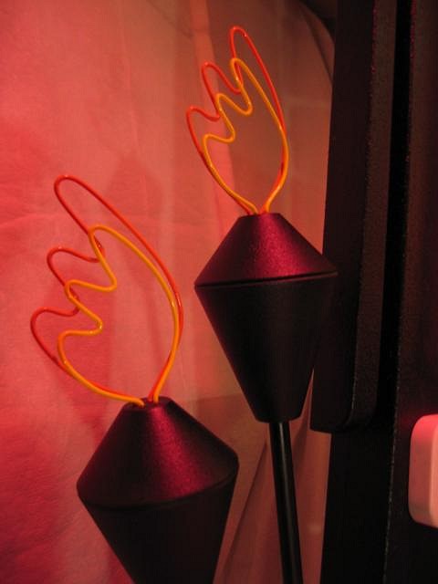
here's a close -up of the torches faux "neon".....the real sign had 2 sets of neon tubes..one yellow and one orange that would blink on and off to simulate flickering torches.... I mimicked it here using painted wire.
|
|
TL
T1K1 LEE
Posted
posted
on
Mon, Jun 4, 2007 9:42 PM
Dude that is something special. Whats next. I am waiting to here. Scale and proportion's are right on. A "TIKI 10" on this one. |
|
S
Sneakytiki
Posted
posted
on
Mon, Jun 4, 2007 10:57 PM
That is sooooo original and good! |
|
F
frostiki
Posted
posted
on
Tue, Jun 5, 2007 6:37 AM
Wow, I am impressed. This turned out beautifully. |
|
MB
Mr&Mrs BPHoptiki
Posted
posted
on
Tue, Jun 5, 2007 11:02 AM
That looks so cool. What a great piece, you should be proud. Mrs Hoptiki |

