Tiki Central / General Tiki
New Luau in Beverly Hills?
Pages: 1 2 3 4 5 6 287 replies
|
B
bigbrotiki
Posted
posted
on
Wed, Oct 29, 2008 6:57 AM
Jeff, are you seriously still assuming that the old Luau would have have looked like that when you stepped into it, color-wise!? Golly, Grog, do you think I don't understand that? Do you think I am NEW in this world? Does that make it a good Tiki Bar then? Dusty, you are just such an old-school guy! Look, friends, y'all can flock there and and admire the fact that it is not done in "circus colors", applaud that it follows the common consensus taste of the rich, and revel in the fact that it looks more like a 40s bamboo bar than a mid-century Tiki bar, this is YOUR future Tiki bar then, congratulations. Confronted with this combined level of confusion and diffusion, I throw the towel, you win. Its a middle of the road, muted, "classy" world that we want! :) [ Edited by: bigbrotiki 2008-10-29 07:01 ] |
|
R
RevBambooBen
Posted
posted
on
Wed, Oct 29, 2008 7:22 AM
" It's Polynesian Panache!" [ Edited by: RevBambooBen 2008-10-29 07:25 ] |
|
B
bigbrotiki
Posted
posted
on
Wed, Oct 29, 2008 7:28 AM
How about Poly-Asian pastiche? :D |
|
R
RevBambooBen
Posted
posted
on
Wed, Oct 29, 2008 7:34 AM
How big is your towell? :) :) :) |
|
B
bigtikidude
Posted
posted
on
Wed, Oct 29, 2008 8:19 AM
Sven, I think that the New Luau needs more tiki and less Buddha stuff for sure. catch my drift? Jeff(bigtikidude) |
|
MP
ms pleasant
Posted
posted
on
Wed, Oct 29, 2008 8:33 AM
Just wanted to chime in and say that the work that Bamboo Ben put into the place looks absolutely beautiful. I can't wait to see it up close someday. Congratulations Ben. |
|
B
bigbrotiki
Posted
posted
on
Wed, Oct 29, 2008 11:34 AM
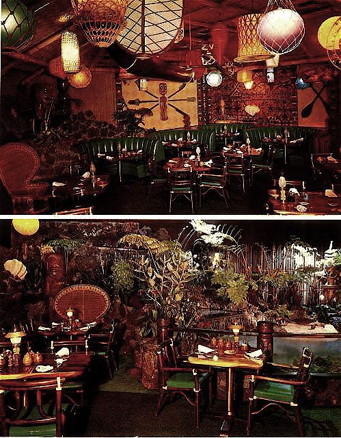
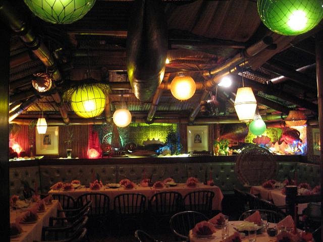
I know, which I have repeatedly pointed out here in this thread. His work, which represents the ground layer of a any good Tiki Bar, is stellar. But he is not the designer (though he defends it like he was). This is what the designer wanted: "In the September issue of Vanity Fair, designer Loree Rodkin said she and Hewitt wanted to create a "Zen-like retreat," which translates to Balinese-inspired decor (wood, stone, water elements, Buddha relics, Turkish lanterns)." What got added later might have been due to Ben, and Hewitt's assistant Doug Major's benevolent influence, who wanted more Tiki all along. Big Jeff, There ARE no photos of the Luau or ANY mid-century Tiki haven without flashlight lighting, that was the way it was done back then. If you can't imagine what the interior looked like without that, what do you like about Tiki then? ALL the interiors of vintage Tiki bars out there, and in my books, were shot that way. Well, here is my attempt to bring the Luau postcard down to the lighting level it really had:
Yet clearly, that still doesn't do it justice. But if you think that colored fishnet floats and basket lamps give a place circus colors, then you might feel that my house looks like a carnival tent:
and the Munich Trader Vic's is really a Ringling Brothers operation:
Notice what happened to the green Naugahyde covered benches here? |
|
TS
Tom Slick
Posted
posted
on
Wed, Oct 29, 2008 12:36 PM
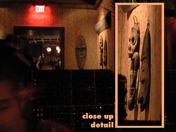
I find it interesting also that Cheryl Crane attended the pre-opening party. If they only used the name "The Luau" and nothing else, then the appearance of Ms. Crane makes a tie in an indirect way, as in asking for approval and acceptance. I just wanted to make the statement that it seems odd to me either way. Most of us know what happened to the Kustom Kulture iconery name Von Dutch, and that it was recently used for... what it initially and originally stood against. In my opinion, Most of the new restaurants looks/aethetics(or lack of) doesn't fare much different than current developers/society tastes in housing....Mediterranean styled homes in brown/beige/yellow earthtones throughout...They all look the same to me, and the style is not for me. But neither is party city easter looking tikis, and or brightly painted "clown" houses. There has to be a midway point that falls into a "tasteful yet unique" category. I however only base this on color schemes, or lack of. The actual craftsmanship that went into this place looks phenomenal, and it seems the BamBoo'ster did another kickass job! BB also usually jokes around with people and "white walls", and i feel the same, but about ANY "all the same colored" interiors, including all brown. Breige floorways leading to brown tikis sitting atop brown pedestals, which are placed against brown walls just doesn't doit for me, personally...Unless I'm going to a museum or similar. The only true noticeable color is the "red" exit sign....No offense, but it is too sepia-toned and muted for me. A few fishfloat/nautical lamps in color wouldn't hurt anything. 15w bulbs vs 100w bulbs makes all the difference in the world, moodly speaking of course. Let us see if Trader Vic's L.A. is also going to follow this sepia shaded path, As Upscale imagery nowadays seems to dictate ideas of a single color/same shade world. [ Edited by: Tom Slick 2008-10-30 10:50 ] |
|
C
Cammo
Posted
posted
on
Wed, Oct 29, 2008 1:29 PM
*"In the September issue of Vanity Fair, designer Loree Rodkin said she and Hewitt wanted to create a "Zen-like retreat," which translates to Balinese-inspired decor (wood, stone, water elements, Buddha relics, Turkish lanterns)." * If that's true, why's it even called the "Luau"????? Bam-Bam's work is superb as always, and I like Ray's dark & flat colored tiki, both give this place a nice aged look on the first day. I've read this whole thread and not once does anybody pin down exactly WHAT A TIKI BAR IS. This sounds a bit looney, but is a Tiki Bar designed to look like;
Cause they're all sort of mutually exclusive, while each describes at least one different classic Tiki Bar I can think of... |
|
C
congawa
Posted
posted
on
Wed, Oct 29, 2008 2:05 PM
Jeff, the bright colors in the old photos of the Luau that Sven posted also have a lot to do with the Kodachrome film of the 1950's/1960's, as well as a a little extra "pushing" of the colors and maybe even some tinting which was standard for postcards of that era. Kodachrome, like old Technicolor movies, produced a vibrant color scheme that did not reflect reality but turned colors into is own special palette that did not really exist but produced an extra-pleasing, optimistic look that artistically "improves" reality. Regarding the new Luau, they probably don't want to hew too close to the original--otherwise the vice squad may have to pay a visit! Brent |
|
B
bigbrotiki
Posted
posted
on
Wed, Oct 29, 2008 2:39 PM
I - am - .... so sorry, I really thought I made it pretty clear in this post where I describe THE BIRTH OF THE FIRST TIKI BAR!: http://www.tikicentral.com/viewtopic.php?topic=27025&forum=1&vpost=415933 Let me try to put it clear and concise, so not much thinking or arguing is involved: A Tiki Bar is a bar that uses all the decor and concepts invented by the founders of Polynesian pop, Don The Beachcomber and Trader Vic in the 30s and 40s, and embellishes them with lots of Oceanic art: Shields, masks, weapons and most of all many Tikis, as freestanding carvings, as support and railing posts, and carved into doors and panels. It also uses the Tiki as a logo for the business on its menus, mugs, lamps, ashtrays, matchbooks, swizzle sticks, coasters, and napkins. (Not all Tiki Bars did all of these things, but to do a good percentage of these set them apart from the generic tropical or Polynesian Bar. or, super-simplified, a Tiki Bar is a bar with lots of Tikis in it. |
|
B
bigbrotiki
Posted
posted
on
Wed, Oct 29, 2008 3:01 PM
Oh, here's a handy little chart I once came up with, from a book I wrote a while back:
Notice the line separating the PRE-Tiki period from the TIKI period? And WHERE do we find the Luau? |
|
C
Cammo
Posted
posted
on
Wed, Oct 29, 2008 5:35 PM
"a Tiki Bar is a bar with lots of Tikis in it." Thanks, Sven. |
|
B
bigtikidude
Posted
posted
on
Wed, Oct 29, 2008 6:28 PM
Sven, and Congawa, Jeff(bigtikidude) |
|
A
aquarj
Posted
posted
on
Wed, Oct 29, 2008 6:38 PM
The way I see it is that the original Luau had a certain magic. As suggested in Sven's timeline, it was the paradigm of tiki establishments, thanks to the totally unrestrained vision of Steven Crane. It's fair to say that the revived Luau doesn't have the same wild abandon and density as the original, from the perspective of one vision of what tiki and polynesian pop look like. It's worth pointing out that this one particular vision is not held exclusively by just one individual evangelistic teutonic documentarian, but is in fact shared by many who cherish that same esthetic. In a discussion where we offer opinions, we still have to acknowledge that there are objective facts when it comes to esthetics. The original Luau and places like it used color palettes and placement choices that had very little relationship to any so-called Circus Circus style. Combining any number of decorative themes together (tiki + buddha + turkish = ?) does not amount to extending or updating them, it amounts to split personality. HOWEVER, refusing to equivocate the decor of the revived Luau with that of the original should not be confused as disparagement of the creative work involved, especially by well respected locals here on TC. We've all seen the magic that Bamboo Ben in particular has created, and it looks to me that the Luau has benefited from that. Simply put - if it's specifically billed as an update to the Luau, then it's inescapable to compare it to the original Luau. I think the new one looks nice, but just with a different palette, style, density, and identity from the original Luau that many people still celebrate. This topic reminds me of Ocean's Eleven. I'm a big fan of the original - the cast, the music, the locations, the story, everything. When the remake came out, I saw an interview with Julia Roberts where she laughed about not wanting to sit through the original as any kind of prep for the remake. I was disgusted, but confess that eventually I saw the remake. It's kind of a fun movie, in the usual current Hollywood way. But it has VERY LITTLE in common with the original. I know they want to make money, I know audiences are different, I know the movie would have to be different. That's all perfectly fine with me. And I even enjoyed it - not in a way that I'd celebrate like the original - but it was pretty good. But I just don't understand what value they got from calling it Ocean's Eleven. -Randy |
|
R
RevBambooBen
Posted
posted
on
Wed, Oct 29, 2008 6:43 PM
|
|
CJ
Coco Joe
Posted
posted
on
Wed, Oct 29, 2008 6:47 PM
THANKS Ben! I doubt I'll eat there again anytime soon but I'm going to the bar for sure once they get more drinks on the menu. I'll also dress scummier and scummier as time goes by to represent us peoples. No offense to the non-scums on here. |
|
M
Murph
Posted
posted
on
Wed, Oct 29, 2008 9:56 PM
|
|
A
aquarj
Posted
posted
on
Thu, Oct 30, 2008 9:35 AM
Oops, I didn't know this topic already passed the cutoff for more comments. Happens to me a lot, so that's part of why I don't post as much anymore - can't keep up! -Randy |
|
B
bigbrotiki
Posted
posted
on
Thu, Oct 30, 2008 10:09 AM
Your intelligent and thoughtful posts are always appreciated here, Randy, and we wish to see more of them. |
|
R
RevBambooBen
Posted
posted
on
Thu, Oct 30, 2008 11:10 AM
Notice the sign..... http://www.youtube.com/watch?v=CFSlQ6ABtUg&feature=channel ...it just says, LUAU. |
|
M
Murph
Posted
posted
on
Thu, Oct 30, 2008 12:15 PM
At least it wasn't Jimmy Buffett. |
|
C
cheekytiki
Posted
posted
on
Thu, Oct 30, 2008 1:43 PM
Here Ben, maybe I can take some slack for you http://www.tikicentral.com/viewtopic.php?topic=30316&forum=2&1,I like the puffer fish, great minds think alike (only mine change colour :wink: ) |
|
TK
Tiki Kiniki
Posted
posted
on
Thu, Oct 30, 2008 1:44 PM
[ Edited by: Tiki Kiniki 2008-11-02 08:32 ] |
|
WM
Wildsville man
Posted
posted
on
Thu, Oct 30, 2008 2:04 PM
Great point!!!!! The guy who put up the Cash for the restaurant has the final word and he was smart enough to hire some great artist that will bring a bit of tiki to a higher end clientele. I love Tiki Bar's but putting something like the Tiki-Ti in Beverley Hills is like putting perfume on a pig!!!! Great Work Ray and Ben!!!! Keep it coming!!!! This is more of Phase II Tiki!!!!!Tiki with a twist!!!!! This is just another layer to the onion!!! But keep the focus on Great Tiki artist that are getting paying gig's doing what they do best!!!! So it is written so let it be done!!!!!!
|
|
TT

Trader Tom
Posted
posted
on
Thu, Oct 30, 2008 3:49 PM
Kiniki, Sometimes arguments can get a little overheated, but I think you're looking at this the wrong way. I think it's wonderful that artists and critics can talk about things in a public forum. It's free speech. And the fact that the Tiki community is so open that people feel free to discuss these things is really refreshing. I may not always agree with people's criticism, but it would be really sad if the discussion died out and Tiki Central just turned into a repository of still photographs because nobody felt they were entitled to discuss or critique things. We may not read in Tiki Bars (due to dim lighting and difficulty in juggling mai tais while flipping pages) but at home we all read quite a bit...and it's through thinking hard about our aesthetic choices that we come to a better understanding of what "Tiki" or "Pop Polynesian" style means to us. By all means, let's praise our artists and their art. But don't belittle the writers. Their voices are important also! |
|
F
freddiefreelance
Posted
posted
on
Thu, Oct 30, 2008 7:43 PM
Hey! Sven is also Editor & Art Director! |
|
TSW
The Sperm Whale
Posted
posted
on
Thu, Oct 30, 2008 8:03 PM
I can't wait to check this place out and make my own opinion. Bamboo Ben has never let me down. Who cares if Elton John eats here. He used to be cool in the 70's...after that not so much. "Saturday Nights alright for fighting" (that is the shit) I want to try the Beachbum Berry drinks. |
|
F
freddiefreelance
Posted
posted
on
Thu, Oct 30, 2008 8:17 PM
From the pictures I like the choice of (the admittedly very few) tikis, I like the visual quote of the pre-tiki Bamboo Bar look on the stairway, and I LOVE the constellation of puffer fish. Bravo Ben! An incredible job as always. |
|
B
bigbrotiki
Posted
posted
on
Thu, Oct 30, 2008 9:04 PM
Nooo, I "only write about or critique others people's work, and my ONLY talents lie in pen, ink, and written word"! And I have used these talents mercilessly to attack the works of Ray and Ben in this thread! Because what I really was aiming for is to transplant the Tiki Ti to Beverly Hills! Yep! You got it figured out goood, guys! And Freddie, thank you, but I don't think there is an easy label for my work and its effect. Or maybe it's very easy: I find images I like and I share them with people, so they can enjoy them too --which they do! :) Then I ad a little text to the images so it's not just mindless fun. Then, when people misunderstand my visuals, or misinterpret them, I try to explain what I liked about them in the first place. Some friends think I shouldn't even try, but I can't help it. Don't people SEE !!!? |
|
TD
Tiki Diablo
Posted
posted
on
Thu, Oct 30, 2008 9:13 PM
Now where did I put that lock?.................. P.s. n Nice talking to you last night Sven. |
|
TK
Tiki Kiniki
Posted
posted
on
Thu, Oct 30, 2008 9:31 PM
[ Edited by: Tiki Kiniki 2008-11-02 08:33 ] |
|
B
bigbrotiki
Posted
posted
on
Thu, Oct 30, 2008 9:43 PM
I got it! It's the Babylonian curse! I seemingly speak and write the same language, but it is not comprehended the same way. :D |
|
H

Hearn
Posted
posted
on
Fri, Oct 31, 2008 7:00 AM
Thought y'all would find this interesting http://www.buzzfoto.com/2008/10/elton-john/elton-finds-nostalgia/ "the original Luau was a kitschy tiki room" No respect. |
|
B
bigbrotiki
Posted
posted
on
Fri, Oct 31, 2008 8:13 AM
"Like its namesake, the new Luau is full of tiki gods, island themed drinks and décor. The new restaurant is more of a tribute to the old, with a chic new style and reminders of the old. (The original Luau restaurant was a kitschy tiki room.)" But the new one is full of Tiki gods...? Obviously, they know what they are talking about. :D But this is a good example. My stance on this issue is largely motivated by the prevailing cliche, perpetuated here and in the media, that mid-century Tiki bar decor was "kitschy" and "tacky", and therefore cannot be resurrected in a meaningful way in this day and age. I disagree. One, that it was kitschy and tacky, and Two, that it has to be watered down nowadays to be palatable. Here is a good example of a new, stylish well thought out Tiki Bar that uses the classic Tiki bar concepts (Tikis, a logo Tiki mask on the menu, as mug and around the interior/exterior, AND thunder storm effects for the signature drink): http://www.tikicentral.com/viewtopic.php?topic=30316&forum=2&10 In closing, I repeat IN CLOSING, a few points made in a simple, abbreviated form so ALL (or some more) understand: I have never, I repeat never, said the new Luau should have been a carbon copy of the old. I have never attacked the work of the artisans and craftsman that supplied parts of the decor, rather, I commended them on their work. If this place would have been a new translation of classic Polynesian dining style in general, I would have had much less of a problem with it. But it took the name of an influential Tiki power place and did not live up to THAT. I agree that, in general, one should visit a location before one can form an opinion. I, however, am in the unique position of having formulated and defined the stylistic language of Tiki style in my books, which had never been made conscious before. And I did so not by blabbering on on endless pages of theoretical text, but by showing hundreds and hundreds of VISUAL examples of it. These examples in turn inspired many new Tiki bars to be opened in the new millennium. I have applauded most of them. But I will exercise my critical faculties where I see it fit. The Tiki revival was not inspired by customers going to Tiki bars and saying "I like this, let's build one", but by the imagery that and I and others put out there in the recent 8 years. I wish the Luau much success, and I am sure I will enjoy an evening out in its halls sometime, and beg forgiveness for the fact that I am so sensitive and opinionated on my ideas of what was and IS great about Polynesian pop/panache/pastiche (whatever you wanna call it). [ Edited by: bigbrotiki 2008-10-31 08:18 ] |
|
TK
Tiki Kiniki
Posted
posted
on
Sat, Nov 1, 2008 1:31 PM
[ Edited by: Tiki Kiniki 2008-11-02 08:31 ] |
|
TD
Tiki Diablo
Posted
posted
on
Sat, Nov 1, 2008 5:36 PM
Tiki Kiniki. Jeez buddy let it go already. Apparently I see Sven differently than you do. Yes he is a friend first, but also a mentor. His book really helped me channel my creativity in a focused direction. His advice and help has opened doors for me as an artist in places I thought I'd never see. I consider myself a Johnny come lately compared to the likes a tiki forefathers like Sven, Bosko , Jeff Berry.... and on. Imagine researching, investigating , compiling info and obscure pictures and ephemera that is just bizarre to most. Oh yeah and all this pre internet ! |
|
TD
Tiki Diablo
Posted
posted
on
Sat, Nov 1, 2008 5:38 PM
Oh yeah, let me write your response to me while I am at it. |
|
R
RevBambooBen
Posted
posted
on
Sat, Nov 1, 2008 8:44 PM
Found this today at the Rastafarian Shop at Ports o Call in San Pedro. It's says, "The Hand Of Fate" Tiki and Reggae CAN be mixed after all!!!
|
|
BB
Bora Boris
Posted
posted
on
Sat, Nov 1, 2008 8:54 PM
Or maybe that's why Port's o'Call is DOOMED! :o |
|
R
RevBambooBen
Posted
posted
on
Sat, Nov 1, 2008 8:59 PM
Maybe they'll add some Polynesian Panache !!?? |
|
C
christiki295
Posted
posted
on
Mon, Nov 3, 2008 11:47 PM
Has anyone sampled the cuisine? |
|
P

PiPhiRho
Posted
posted
on
Wed, Nov 5, 2008 10:58 AM
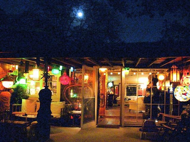
I met some friends at the Luau on Sunday night. I found parking around there to be a bit of a problem. Most of the nearby parking structures were closed and metered parking on the street was mostly full, although I did eventually find a parking space about a block away. Valet parking is available. The place looks great from the outside with a few outdoor tables on the patio. Bamboo and thatch give it that kind of generic southseas look. Inside the decor is very elegant and upscale. While the name "Luau" suggests Hawaii, the theme is much more indo-chinese than Hawaiian. The TiPsY factor is quite low. I saw only two tikis in the entire place, and one of those was a painting of a tiki. But what they lack in tikis, they make up for in puffer fish.
Mahalos to Bamboo Ben, Tiki Ray and Jeff Berry for their great contributions. The bar is integrated right into the lobby. There are no tables there. In fact, there is only ONE CHAIR in the bar, over by the window. Clearly, this is not a bar that is intended for hanging out and drinking in the bar and other than that it is standing room only. This clearly is intended to be a restaurant and not a bar. If you go there you need to get a table and have some pupus with your drinks. The drinks are excellent. I had a Pearl Diver and it tasted just like the one in Sippin Safari. Better in fact, because I used too many substitutions in the one I made from the book recipe and it didn't come out all that well. The Pearl Diver at Luau was well made, well balanced and tasted wonderful. The Mai Tais are Trader Vic's style, and since they don't have the Vic's Mix they are made from scratch. They are potent and tasty, but certainly not any cheaper than the one you would get down the street at Vic's. I also had a Bahia, which came in a pineapple.
Also excellent, but pricey. The food is also very good. We had the halibut and the chicken plus the pupu platter. It was very good, of a quality at least matching that of the Trader Vic's restaurant.
The food, like the drinks, are expensive. I dropped $100 there, but the portions are large and can be shared, so this is not a place to go to alone, nor is it a place to be going to often. I give it a big thumbs up. While it may not be the reincarnation of the old Steven Crane's Luau, it is still a great place for special occasions and a nice replacement for the loss of the BH Trader Vic's. Ben, Ray and Jeff did an excellent job here in giving this a warm, exotic atmosphere with excellent drinks and food. Just be prepared to leave there with your wallet a lot lighter than when you entered. [ Edited by: PiPhiRho 2008-11-05 11:31 ] |
|
B
bigtikidude
Posted
posted
on
Wed, Nov 5, 2008 5:50 PM
ouch my wallet hurts just reading that. Jeff(bigtikidude) |
|
R
RevBambooBen
Posted
posted
on
Wed, Nov 5, 2008 5:58 PM
Nicely critiqued, PiPhiRho. I'm happy you enjoyed the well researched cocktails and superbly mastered entrees and pupus. I have to be fair and say, from our little tiki group, it was solely Bamboo Ben who created that wonderful exterior and interior atmosphere working with the design visions of Loree Rodkin and, owner, Andy Hewitt. Four months of Bamboo Ben's heart and soul went into this project and the outcome displays Ben's passion for his craft. It's, simply, beautiful. Aloha, Mrs. Bamboo |
|
T
TIKI-RAY
Posted
posted
on
Wed, Nov 5, 2008 6:11 PM
Mrs. Boo is right . I was there a few times during construction and I must say Ive never seen Ben do cleaner work . And many aspects was from his intervention . He had to talk them into it and tell them what they wanted . I carved a tiki. But I dont deserve the acclaim that Ben should be getting . He really outdid himself with this project . I just hope he doesnt screw up that Vegas gig ....hahahaha |
|
K
KuKu
Posted
posted
on
Wed, Nov 5, 2008 7:09 PM
Really?!? Even if they don't have live surf music...? :lol: |
|
B
bigtikidude
Posted
posted
on
Wed, Nov 5, 2008 8:41 PM
Amazingly enough, |

