Tiki Central / Collecting Tiki
Another view of The Imperial Luau.
Pages: 1 8 replies
|
BK

Basement Kahuna
Posted
posted
on
Mon, Mar 24, 2003 4:37 PM
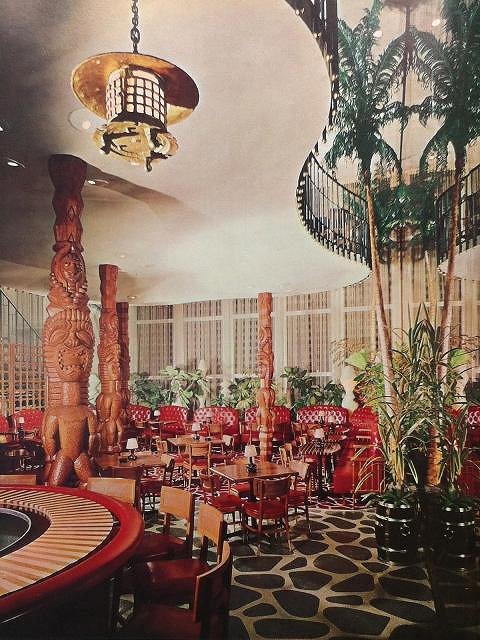
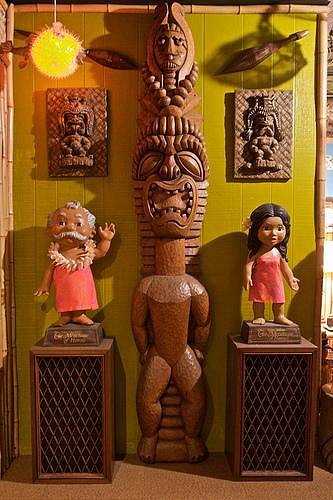
Here's another view of the Imperial Luau I just recieved in the mail. This is a different angle than the one on the B.O.T. Note the spires at the top and bottom that the tikis that shored them up to the cieling height(gone forever). The second view is two of the rescued tikis as they appear today |
|
STCB

Sabu The Coconut Boy
Posted
posted
on
Tue, Mar 25, 2003 10:40 AM
That's a beautiful postcard, Base. I've got to get me one of those for my collection. Sabu |
|
BK

Basement Kahuna
Posted
posted
on
Tue, Mar 25, 2003 11:16 AM
That sucker cost me 21.00 on E-bay. Why? I have no idea. |
|
STCB

Sabu The Coconut Boy
Posted
posted
on
Tue, Mar 25, 2003 11:41 AM
That seems to be the going price on good tiki postcards nowadays, unless you can find the truly hidden ones. I keep getting outbid on postcards of the Islander in L.A., because they have been consistently selling for over $40.00 on Ebay, as have postcards of the Tonga Lei in Malibu. I expect prices will come back down in a year or so. (I hope). Sabu |
|
M
MTKahuna
Posted
posted
on
Tue, Mar 2, 2004 5:48 PM
BK, Tell me more about the Imperial Luau??? MTK |
|
B

boutiki
Posted
posted
on
Wed, Nov 9, 2011 10:51 AM
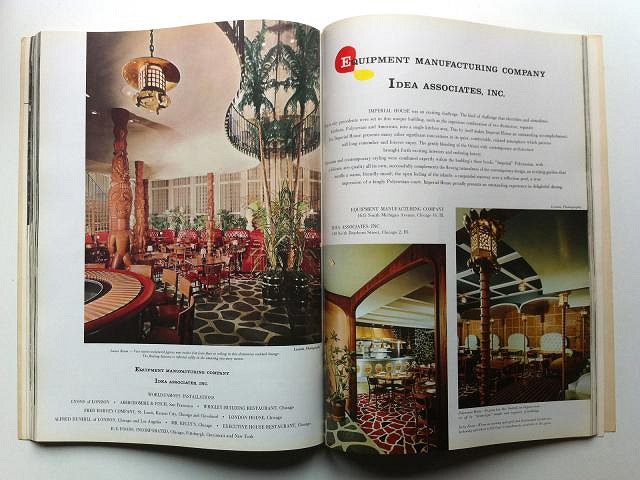
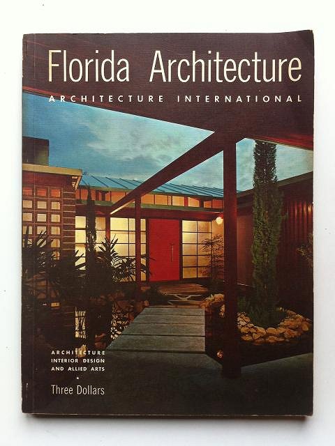
This thread is very old, but I thought I'd share this picture I just found. It's from an advertisement for Equipment Manufacturing Co. and Idea Assoc. Inc. in a 1960 issue of Florida Architecture. It's different views of the Imperial Luau in Pompono Beach, FL. I wish Basement Kahuna's image was not gone. Maybe he can re-post it, or if someone else has the postcard, please share. Sven used one of the postcard images on page 24 of the B.O.T. which gives a totally different impression of the space with the dark stone wall. This view shows that the room was actually more light and open with a floating balcony and a two-story high mirrored wall. A very different aesthetic than we are used to with vintage Tiki temples. Almost Tiki-Modern one could even say! In the ad, they even describe how they gently blended the Orient with contemporary architecture and how it gives "a warm, friendly mood" and "the open feeling of the islands... a true impression of a kingly Polynesian court." This images show that there were actually four of the two-sided Tiki support poles which means eight of the carved Tikis. I think we know where two or three of them are, I wonder what happened to the other five, not to mention the smaller figures behind the bar. So Bamboo Ben, does this mean we can consider using a white ceiling in our Tiki rooms now? -Duke
The cover: |
|
D
Dustycajun
Posted
posted
on
Wed, Nov 9, 2011 12:31 PM
Boutiki, Nice find on that magazine. Images of the two interior postcards, as well as several other postcards showing the exterior of the building and that image you just posted can all be found on this thread I started under Locating Tiki. http://www.tikicentral.com/viewtopic.php?topic=32625&forum=2&hilite=imperial pompano DC |
|
B

boutiki
Posted
posted
on
Wed, Nov 9, 2011 2:03 PM
Thanks Dustycajun, but damn! that really let the air out of my sail. I even did a search before posting. Oh well, at least now you know which magazine it is from and have more than just the one image. I had not seen your thread in Locating, so thanks. Being as we get to live with one of those guys, I like seeing anything about the place. Funny thing, we just found the magazine in Kansas City. We were looking though a pile of vintage architecture magazines when I came across that one. I was just flipping through when I saw the image and my jaw hit the floor. Vintage modernist design and Tiki... does it get any better? Here is a little better shot of our Imperial Luau tiki. Guess I should add my pictures to your Locating thread as well. -Duke
|
|
B
bigbrotiki
Posted
posted
on
Wed, Nov 9, 2011 2:27 PM
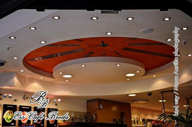
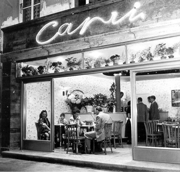
Naaaaice! Tres Tiki Moderne, love the floor patterns. In Europe they used that kind of second floor with undulating edges in modern cafes a lot in the 50s, like in Italian ice cream parlors. And mosaic tile work and planters. And lots of great shapes and concepts. Check out this ceiling/clock:
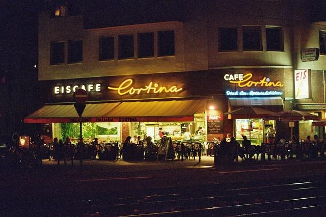
And cool neon:
I could do a whole book on 50s Italian ice cream parlor design in Germany. Cologne still has a bunch. My favorite place to eat pizza there: Ooooops! I apologize, got a little carried away there :D Back to the phantastic Imperial House!: What great contrast of primitive and modern. Reminds me of your house, Duke! The contrast of the 50s socialites with those gnarly Tikis is still the most dazzling, though. Few images sum it all up so well. |
Pages: 1 8 replies

