Tiki Central / Tiki Gallery
Are my Tikis the real thing?
|
GSM
Gene S Morgan
Posted
posted
on
Fri, Aug 5, 2011 7:38 PM
I have a couple of designs that I would really appreciate some opinions on. I have a Cafepress shop I have run for several years now. A while back I added a Tiki section to my shop, and I have been trying to develop Tiki oriented graphics for that shop with varying degrees of success. (well maybe yes, maybe no.. you be the judge) I have been studying everything I could find on the web and in magazines for quite some time. I only discovered this site recently and have studied the examples and opinions of all you all. I had hoped some of you would let me know if I am heading the right direction on these designs. Thanks in advance …...
|
|
GSM
Gene S Morgan
Posted
posted
on
Fri, Aug 5, 2011 7:41 PM
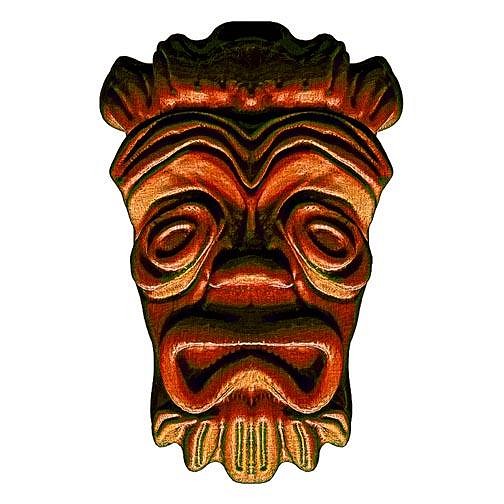
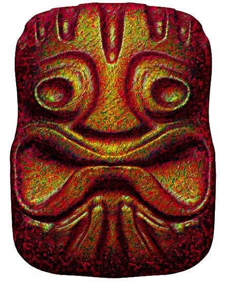
I create these designs in an unusual way. I sculpt them digitally. (I showed an example of this method elsewhere in the digital discussion in the craft thread) It is the same as working with clay and the second step is adding color and texture. I see the process to be pretty much the same as ceramic sculpture and mug making. I know many of you object to color added to carved wood, but try to think of this as ceramics which I take a picture of the final image and put it on t-shirts and other stuff. So, I ended up with this green guy.
|
|
GSM
Gene S Morgan
Posted
posted
on
Fri, Aug 5, 2011 7:45 PM
I really like the humor of many of the artist I find on this site. My images are very simple on purpose because of how they are used, and that makes it hard to tell a real story with an image, so I go for goofiness. I realize my graphics are somewhat stylized and I let my own imagination guide me in some of the elements of my Tikis, and I hope that does not make me too much of a bad guy in the eyes of you Tiki lovers out there. But whatever your opinions may be, I would love to hear them. Thanks again ….. Gene
|
|
B
bigbrotiki
Posted
posted
on
Fri, Aug 5, 2011 8:36 PM
Well, first of all, I find it very commendable that you are concerned about your Tikis being the real thing. That is the exception nowadays, where folks go only internet page 3 or 4 deep, and then think they know enough to design their first Tikis. In brief, from what I see, your facial features are definitely recognizable as Tiki, and that is a plus compared to other "monster" or "wood spirit"-looking attempts out there. So you are on the right track. But what gives you away as not having gone as far as studying authentic Polynesian art is the frills on top and on the bottom of the faces. Those patterns are all made up and have no roots in Oceanic art like Tapa, petroglyphs, or PNG paintings and shields. I am not saying you have to copy any such sources, but just know them and let them flow into what you are doing, then the mask will come across as believable. |
|
D
danlovestikis
Posted
posted
on
Sat, Aug 6, 2011 8:35 AM
Hi Gene, welcome to the tiki art world. There is so much joy creating tiki. Just in case you don't know bigbrotiki is Sven the author of The Book Of Tiki and Tiki Modern. He and Otto of Tiki News really started the craze that is tiki today. To have him post on your thread is an honor. He answered your question spot on but now remember that tiki artists in general bend all the rules to create tikis. There are tiki designs from other planets to robots and monsters. You just get to decide what you enjoy doing and what it looks like. My husband is a major collector and he doesn't collect every thing. He collects what he enjoys looking at over and over again. So if looking at your art gives you joy you are on the right track. You should join the digital thread on the Creating Tikis "other crafts" forum. There is a wonderful discussion of digital art versus traditional art and you should be a part of that. I WAS JUST TOLD YOU HAVE BEEN CONTRIBUTING TO THIS THREAD. TERRIFIC. Enjoy being part of a super wonderful community. Cheers, Wendy - danlovestikis [ Edited by: danlovestikis 2011-08-06 15:40 ] |
|
M
MadDogMike
Posted
posted
on
Sat, Aug 6, 2011 9:22 AM
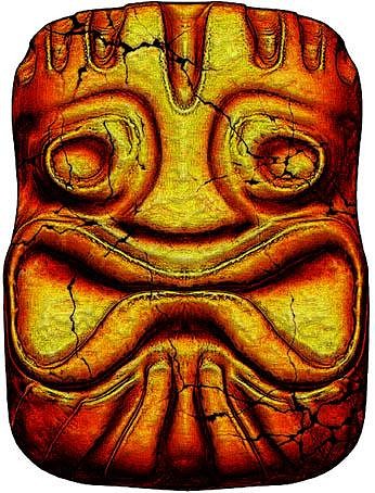
Gene, I like the fire-lit one (#1), very cool! |
|
B
bigbrotiki
Posted
posted
on
Sat, Aug 6, 2011 10:40 AM
Well thank you Wendy, I wouldn't go that far as to call it an honor, I am merely trying to keep things on track and connected to what people liked about Tiki initially. In doing that, I cannot cover all the posts and questions out there, so it's a bit of a lucky number game. The mentioning of robots and monsters brings up a good point. The Tiki Revival of the late 90s and 2000s has become its own genre (as compared to the key period of American Tiki style of the 50s and 60s). Today's artist have expanded the borders of Tiki art in many creative ways. There are some of us though that feel that in recent times it has gotten too far away from its origins (Original Polynesian, and mid-century modern and cartoon art) and "Tiki art" has become a free-for-all grab bag of every pop culture cliche out there being thrown together with Tiki. While this is "fun" and entertaining, it can lead away too far from the subject to the degree that it becomes generic and redundant. It seems that, as the Tiki Revival has gone on for over ten year now, the need for new ideas lets artists reach farther and farther to find something "fresh". There is however such a horn-of-plenty of untapped design concepts and ideas in the vast genre of original Oceanic art that it's really not necessary to bastardize the original subject at hand to the degree of loosing its original context. This attitude of mine gets regularly interpreted as being "purist" and "traditionalist", and I repeat again, do not misconstrue it as a call to slavishly copy what has been there before. After all, what inspired me to write two books about American Tiki culture is its carefree handling and creative interpretation of an authentic art form. I am merely cautioning to study and know the parameters of that art form, and its interpretations. |
|
GSM
Gene S Morgan
Posted
posted
on
Sat, Aug 6, 2011 10:19 PM
I must admit I'm a bit overwhelmed by the comments I have received so far. In spite of his humble remarks, I consider any comments by Sven to be like Bob Dylan commenting on my songwriting. (In case you, unlike me, are young folks, Dylan is an old guy who wrote a couple of good songs a long time ago) Sven, I am thankful for your honesty in your opinions of my work. I am a victim of my own imagination in my work and that is what I'm trying to improve on. But, I also want some originality in my work as well. I have collected primitive mask from many cultures since I was 13, and I'm sure some of those styles have crept into my work. I'll keep trying. Thanks so much for your input .... Wendy thanks for your heads-up on Sven. I'm an old guy who has lots of computer experience, but lacks the online hipness of you younger folk. This screen name stuff throws me off a bit and if I was more with it I would have noticed it was Sven's posting. I also appreciate your comments on creativity in Tiki creation. I have been really torn on what direction to go with my work. And, what you said about pleasing myself first, I think is really good advice. I think I will be stuck in the middle of pleasing myself and trying to be authentic for a while, but I will have some fun trying. Mr. Mad Dog, thanks much for your comment as well. I have noticed your many fine opinions as I have been scanning this site for quite awhile. A positive reply from you is nice boost for this would be artist ...... |
|
GSM
Gene S Morgan
Posted
posted
on
Thu, Aug 11, 2011 7:39 PM
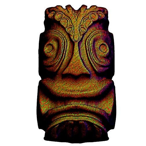
OK, I'm gonna try again. I have received some really good advice from some great folks out there and have been trying to figure this Tiki thing out. One problem I find is that there is just too much reference material out there, and I don't know for sure who is getting it right. I tried something different this time. Instead of starting my sculpture with a digital ball of clay, I built this image up from a flat plain. It is kinda like doing a relief tile. This limited my possibilities of getting too carried away with embellishments. Because I felt it was rather plain looking I gave it a rough wood like surface.
|
|
GSM
Gene S Morgan
Posted
posted
on
Thu, Aug 11, 2011 7:44 PM
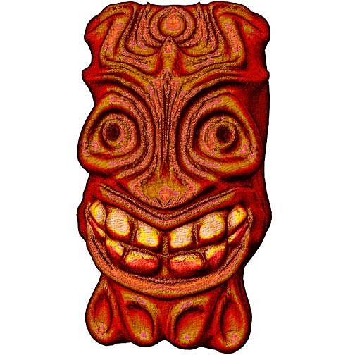
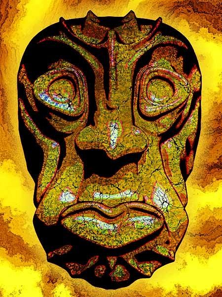
My next couple of tries were starting with a digital log. I have been studying log sculptures here by some of the carvers on site. I especially like Lake Surfer's work. So I put the limitation on myself to only carve the surface instead of adding clay as has been my habit. So, I carved and sanded with the smooth tool keeping things simple. Again it seemed too simple to me and I went crazy with the surface treatment. I used to do real clay. (I have been following Wendy's Bob's Tiki adventure and really envy the fun she is having glazing and firing her project. I miss that most about not doing real clay anymore, the pleasure of seeing how your finished glaze looked fresh out of a still warm kiln) Many of my designs have the look of glazed ceramics because I can't stop experimenting with color and texture.
|
|
GSM
Gene S Morgan
Posted
posted
on
Thu, Aug 11, 2011 7:48 PM
This is of course the same sculpture as the last, but with a completely different surface treatment. I wanted it to look like an old stone relic just dug up on some exotic tropical island.
|
|
GSM
Gene S Morgan
Posted
posted
on
Thu, Aug 11, 2011 7:51 PM
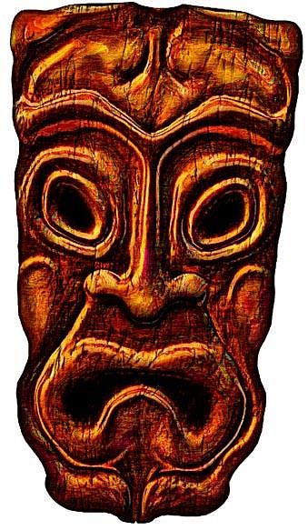
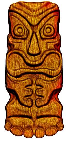
I started with a larger log this time in order to create a more complete form. Again I kept it simple with carving only. (I do admit that digital carving allows some tweaking by actually moving stuff around a bit after the carving is done. I always end up doing some of that to get the shapes I'm aiming for) The surface is somewhat more complex than it looks. I had to layer in a number of different colors and wood like textures to get the finished look to the image.
|
|
D
danlovestikis
Posted
posted
on
Thu, Aug 11, 2011 9:12 PM
I like these best of all, Wendy |
|
M
MadDogMike
Posted
posted
on
Thu, Aug 11, 2011 9:47 PM
I like them all! But them seem nekkid there by themselves. You need to paste them over a digital or photographed background scene, I think that will "sell" them as a finished art project. |
|
D
danlovestikis
Posted
posted
on
Fri, Aug 12, 2011 8:11 AM
That's a terrific idea MDM. I'd love to see that, Wendy |
|
T
TikiG
Posted
posted
on
Fri, Aug 12, 2011 8:25 AM
Gene - Its all good man! Let your own creative soul find a manifestation in your art...that could be something as simple as a flowing line, a squiggle, a series of crosshatches...whatever. I find sometimes the sporadic spontaneous act creates wonderful results...in other words don't sweat it - there's always the "next piece" if the current work-in-progress doesn't quite feel right! Keep on creating your art and your vision. Thanks for posting what you have so far and I look forward to peeping at new things as you go. Cheers! G |
|
B
bigbrotiki
Posted
posted
on
Fri, Aug 12, 2011 9:38 AM
Sure! - Just don't call it "Tiki" if it ain't. :D Here's some more advice from "Mr. Know-it-all": Of yesterday's stuff, 3 and 4 look darn good. No 1 looks too much like some medieval Devil's mask. Why? Original Oceanic Tiki carvings (and other "primitive" art) were the opposite of realistic, human-like portraiture. They stylized human facial features by not only exaggerating, but also simplifying them in bold, cubist ways. That is why the 20th Century avantgarde were inspired by them, they showed them ways to go beyond realism. So if you find your faces (and bodies!) becoming too humanoid, you are getting away from Tiki. Part of that too human-like style is the use of flowing, organic lines. The less organic, the more cubist you get, the more Tiki it should become. |
|
GSM
Gene S Morgan
Posted
posted
on
Fri, Aug 12, 2011 5:52 PM
Thanks so much for all of your kind remarks and encouragement. Mike and Wendy, I agree with your opinions about needing backgrounds. The reason mine are so plain is that most of my stuff at this time is used for my CafePress t-shirt shop. It is not very "in" to have square or framed t-shirt designs in the this modern world. That is why mine kind of float in air. I have started making some framed art designs lately and have several on my site. I will upload them to this site. I must warn all that they are not very tiki like. I really appreciate your comments G. I feel much the same way about art, but at the same time I want to at least try to create something authentic. I hope I can find a happy medium. Thanks for the encouragement. Sven, please do not visit my t-shirt site. I have been breaking your main rule for a long time now. As you said "Don't call it tiki if it's not" I have been committing that sin for quite some time. But, I do want to improve things and do a better job. Your comments are always so helpful to me. I understand your explanation of noses. I spent years trying to learn how to create faces and make them real. Now I have to try to make them unreal. Your comments comparing tiki art to cubism were really cool. I never thought of it that way before. Thanks for your help. |
|
B
bigbrotiki
Posted
posted
on
Fri, Aug 12, 2011 7:50 PM
Aha! I KNEW you were one of those.....Tiki Imposters! :lol: (just kidding) OK ok, I won't visit your T-shirt site, I promise....but ONLY if you promise to not only look at Tiki Revival Tikis for reference, but mid-century and ancient Tikis too (as for example Lake Surfer does) :) [ Edited by: bigbrotiki 2011-08-12 20:12 ] |
|
GSM
Gene S Morgan
Posted
posted
on
Fri, Aug 12, 2011 8:44 PM
Sven ..... I promise to follow your advise. I have been trying to study Lake Surfer's stuff ever since I discovered his thread. Thanks for pointing me that direction ..... |
|
GSM
Gene S Morgan
Posted
posted
on
Fri, Aug 12, 2011 8:51 PM
Here are several images that are on my CafePress site already that are 9 by 12 framed prints. They have backgrounds, so they don't look so naked. I must warn in advance that these images were created before I stumbled onto Tiki Central and started getting an idea what tikis should look like. I don't know what this first guy is but I still think he is kinda cool. Sven ... don't look.
|
|
GSM
Gene S Morgan
Posted
posted
on
Fri, Aug 12, 2011 8:54 PM
This guy is one of my early wood look carvings. I had to add some color and I thought blue was as good as any. The background was created by a guy with the screen name Sphinx on the Filter Forge site.
|
|
GSM
Gene S Morgan
Posted
posted
on
Fri, Aug 12, 2011 8:57 PM
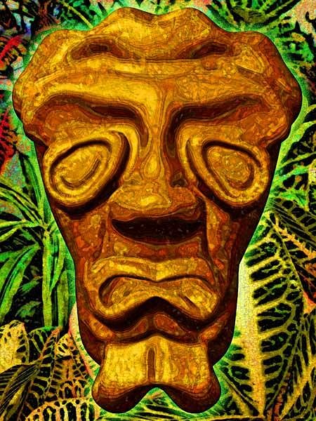
I don't know what this dude is all about. He could be an Elvis impersonator or an old beatnik. The background is some real tropical plants.
|
|
GSM
Gene S Morgan
Posted
posted
on
Fri, Aug 12, 2011 9:00 PM
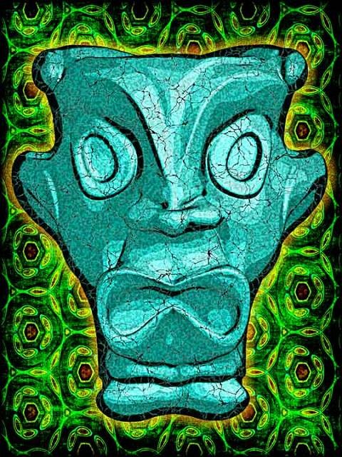
This blue guy is one of my favorites even though he is far from tiki. I think he is an alien. The background I call turtle shell and was created with a pattern maker filter. In the future I will try to do a better job of making my images more tiki like and do some more background work.
|
|
GSM
Gene S Morgan
Posted
posted
on
Tue, Aug 16, 2011 7:17 PM
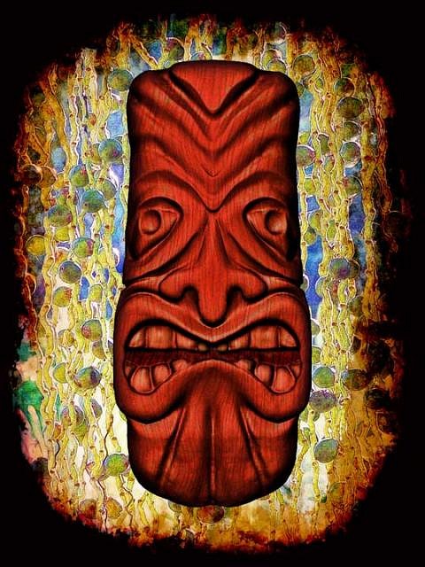
I have been trying to follows people's advice on improving my images. As Sven suggested I have been studying wood tiki carvers and think maybe I am heading the right direction. As Sven said, a good sculptor to study is Lake Surfer. He really seems to research his carvings. I have always found it hard to copy other folks work. ( that is the normal way artist get started. I find copying kinda boring and not very creatively stimulating. That is probably why I'm not much of an artist.) What I think I have discovered is that my digital clay carving produces a softer image than is desirable. In wood the chisels produce a sharp clean cut making for sharper lines and edges. This is harder to do with my method, but I have been taking extra time trying to refine these cuts. I'm still trying. here is my latest ........ The background is of a plant that looks line peas on a string or a beaded curtain. I have not a clue what it is, but the photo was taken in Waimea Valley on Oahu. I don't know why I made it so grungy. Just the mood I was in at the time .......
|
|
GSM
Gene S Morgan
Posted
posted
on
Sat, Aug 20, 2011 8:04 PM
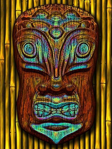
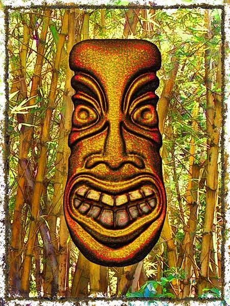
This is another try at making my Tiki images have a more Tiki like look. I tried to hold my carving to the wood carvers style. I used a rough glaze like surface. I thought a bamboo forest was where he belonged.
|
|
M
MadDogMike
Posted
posted
on
Sat, Aug 20, 2011 9:30 PM
I like that second one Gene, nice background and the colors seem to compliment the tiki. The first one seems a little too abstract for me (personal opinion), my little pea-brain doesn't grasp abstracts too well. |
|
GSM
Gene S Morgan
Posted
posted
on
Sat, Aug 20, 2011 10:00 PM
Thanks Mike ... I kinda agree with you about the first one. I grunged it up a bit too much. But, that plant wasn't abstracted. It really looks like that. It's just a wierd plant that grows on Oahu ......... |
|
GSM
Gene S Morgan
Posted
posted
on
Wed, Aug 24, 2011 8:30 PM
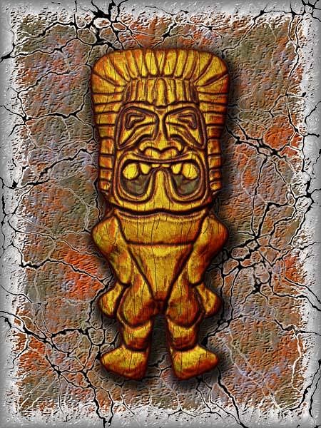
Everybody does this guy sooner or later. Mine is not perfect, but the roughness of the body was on purpose. i wanted the emphasis to be on the head. Maybe too stylized?
|
|
GSM
Gene S Morgan
Posted
posted
on
Sun, Aug 28, 2011 6:39 PM
Another attempt in my quest for the perfect Tiki.
|
|
D
danlovestikis
Posted
posted
on
Sun, Aug 28, 2011 7:02 PM
I really enjoy looking at the backgrounds. I wish I could glaze my ceramics with some of them. Fun art. I like aliens. Wendy |
|
GSM
Gene S Morgan
Posted
posted
on
Mon, Aug 29, 2011 6:29 PM
Thanks Wendy ... My backgrounds are made in layers kinda like dipping in several types of glaze and letting them mix it up .... Do my Tikis look like aliens? Man I'm still not getting it, huh. Wish I was still working in clay,...Gene |
|
M
MadDogMike
Posted
posted
on
Mon, Aug 29, 2011 6:56 PM
I like the Hawaiian guy (Ku? I never can get them straight) Great woodgraining texture and nice lava background |
|
GSM
Gene S Morgan
Posted
posted
on
Tue, Aug 30, 2011 7:47 PM
Thanks Mike ... I always appreciate your encouraging comments ..... Gene |
|
GSM
Gene S Morgan
Posted
posted
on
Wed, Aug 31, 2011 8:10 PM
Another attempt at good Tiki. A kinda ocean wave background ........
|
|
TT
Tucker's Tikis
Posted
posted
on
Thu, Sep 1, 2011 12:15 PM
I love what you've done with your color here, and an Alien Tiki is fine with me, I've done many Alien Tiki's myself. I agree that your backgrounds are one of your strengths because they compliment your Tiki's |
|
S
Sophista-tiki
Posted
posted
on
Thu, Sep 1, 2011 5:35 PM
lots of "tiki" on Cafe press from this to this anything else I could say would be percieved as offensive. |
|
GSM
Gene S Morgan
Posted
posted
on
Thu, Sep 1, 2011 8:51 PM
Thanks much Keith. It is really nice for me when a real artist likes some stuff about my graphics. Now if I could only sculpt some hula girls. I have been trying to check out your site, but I live out here in the country with no wireless. (yes I'm so twentieth century) I'll get to the library later this week and do a better job of seeing your art. I'm waiting for the next installment of "Weird Tiki-Comics", but I might have to do some traveling to find Tiki Magazine now that they are closing Borders. Sophista, I kinda knew I wasn't the only poser on Cafepress. I really liked the second site though, and yes it is a lot classier than mine. I'm an old guy and have made lots of art and craft stuff in my life, some a little good, mostly pretty bad. I'm not easily offended. I love the fact that some really good artist have commented on my work. That makes it worth while for me to take part in Tiki Central. |
|
S
Sophista-tiki
Posted
posted
on
Thu, Sep 1, 2011 9:09 PM
I think what I should have said earlier but couldn't find any polite words in my head, was, There seems to be a range of tastes , something for everyone, and stuff that sells isn't necessarily authentic. |
|
GSM
Gene S Morgan
Posted
posted
on
Thu, Sep 1, 2011 9:54 PM
Sophista ... I understand taste. Did a lot of art fairs in the past and found that folks who bought my stuff were all a bit weird. So, I'm not so proud that I won't sell to weird folk. I haven't really sold much Tiki stuff on CafePress. I sell mostly music stuff. That is an area I have been in for a long time. I came to Tiki Central to try to get some help improving my graphics. I have been pretty lucky so far because folks who are far better than I will ever be have made some helpful comments on my work. That makes it worthwhile hanging around here .... Yes I do like your stuff ..... Gene |
|
S
Sophista-tiki
Posted
posted
on
Fri, Sep 2, 2011 3:00 AM
Plenty of weird around here, and I think we are all proud to call ourselves weird. And plenty of us have vended events too, so we know a couple of things about what people buy, . Its been my observation that people will spend $200 on a pile of chachkies and NOT spend the same $200 on an actual nice piece of art.( thats my area where if I really said what I thought about peoples taste I could offend all kinds of people so I wont).and we have gotten into the taste is subjective conversation here on TC oh about a thousands times. Its a big can of worms. Have you been over to OTHER CRAFTS? Thats where you will find help improving your graphics, there is even a thread about digital vs hand drawn. Every artists under the tiki sun on TC has a thread or 2 over there about what they do and how they do it. So, really, start yourself a thread over in OTHER CRAFTS with your images and how you arived at your teqnique and you will gets all kinds of feedback. The more you delve into the endless resource materiial here on TC the more you will see what is and isnt tiki all on your own. [ Edited by: Sophista-tiki 2011-09-02 03:01 ] |
|
GSM
Gene S Morgan
Posted
posted
on
Fri, Sep 2, 2011 9:46 PM
Dawn ... Hope you don't mind me using your name. I'm old and this user name stuff kinda confuses me. I'm not really trying to prolong what you just meant as some friendly advise, but I just wanted to make it clear that I did not join Tiki Central because I thought I could sell my Cafepress stuff here. I have belonged to a number of different forums and never found that to be of any marketing value. Also I try not to offer opinions, because my opinions often cause me trouble. I was sorry I used the term "weird" as soon as I pressed the submit button. I meant weird only in the kindest way. I love weird. I'm weird. Weird makes the world go around. I try to keep a low profile here, but it was the digital design thread that first got me speaking up. I gave a brief intro of some of my processes and software I use. Thor even downloaded a free sculpting program I use and started using it. I never pushed my methods beyond that because I don't want to cause any more controversy than I already have. By just showing my stuff I feel that folks judge my work rather than my techniques. It has worked for me so far. I even got some helpful advise from Sven. I'm just trying to learn some stuff without stepping on anyone's toes .... I finally got to check out your site and I want to thank you, an artist of great talent, for trying to help me a bit as well ...... Thanks Gene |
|
S
Sophista-tiki
Posted
posted
on
Sat, Sep 3, 2011 2:52 PM
we all love weoid too! so youre right at home here |
|
GSM
Gene S Morgan
Posted
posted
on
Sun, Sep 4, 2011 7:51 PM
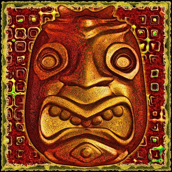
OK, this is kinda off Tiki I guess. Somehow he ended up a teapot. At least I didn't add a handle and spout. The background is pretty abstract. I tend to lean that way. Sometimes a guy feels like mimicking reeds or thatch and other times you just gotta go a little Picasso ......
|
|
Z

ZeroTiki
Posted
posted
on
Fri, Sep 9, 2011 12:12 PM
Remember Gene... If you are passionate about it, that's what matters. There are definitely aspects that correlate to Tiki in your work. Keep it up. |
|
GSM
Gene S Morgan
Posted
posted
on
Sat, Sep 10, 2011 7:37 PM
Thank you for your encouragement Zero ... I think I am starting to get this tiki stuff a bit. Now I need to get comfortable enough with them to go to another level. I like the way your art is so impressionistic. Early on, when I first started this thread, Sven told me that Tikis were a bit like cubism. They were not meant to represent reality. I am starting to believe that what the old islanders created looked the way they did because of the limitations of their tools. What would they look like with today's tools? I think maybe kinda like your art, with it's broad brush strokes and imaginative use of color. I think they must have understood your kind of impressionism but lacked your modern tools. Sven would probably tear into this theory. Thanks much and I do really like your work .... Gene |
|
GSM
Gene S Morgan
Posted
posted
on
Sat, Sep 10, 2011 7:45 PM
I'm starting to figure out how to get a more carved look. It helps when I use a strong wood grain surface treatment. More abstract background.
|
|
HOK
HOUSE OF KU
Posted
posted
on
Fri, Oct 7, 2011 1:59 AM
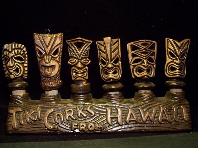
These bottle toppers from Tiki Isle/Hana Isle are some examples of Hawaiian style tikis which may be useful for your quest :) Aloha, Freddie
http://www.tikicentral.com/viewtopic.php?topic=1099&forum=5&vpost=388068&hilite=hana isle |

