Beyond Tiki, Bilge, and Test / Beyond Tiki
Test Design(s) for my new homepage...Whatcha think?
Pages: 1 13 replies
|
TH

Thorsten Hasenkamm
Posted
posted
on
Thu, Mar 13, 2003 6:23 PM
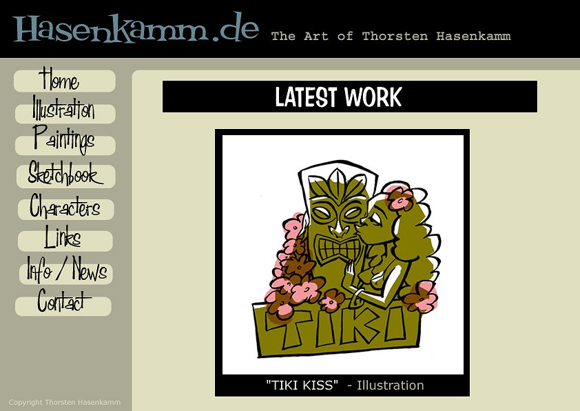
Well, this isn't really about artwork, but I can't decide and need your input... Here's a test design for my new homepage...
Here's another version...hmm...I think I like the first one better...or...
|
|
K

kahukini
Posted
posted
on
Thu, Mar 13, 2003 8:06 PM
i like the second one better.. just make "latest work" look like in the first one For non tiki-talk: [ Edited by: kahukini on 2003-03-27 11:53 ] |
|
P

PolynesianPop
Posted
posted
on
Fri, Mar 14, 2003 8:35 AM
I like the second one As-Is. |
|
E

emspace
Posted
posted
on
Fri, Mar 14, 2003 12:51 PM
I like the 2nd color scheme better too. Typography...yes, have something different from the navigation-bar type for teh "Latest Work" heading. then use the same type for each individual page as the type in the navigation bar, so people make the connection between navigation and page being viewed. I should also add: your art, and taste in type is fantastic! em |
|
TH
Thorsten Hasenkamm
Posted
posted
on
Fri, Mar 14, 2003 1:46 PM
Thx a lot! Here are another 2 updated versions (used the bg colors the other way round)...What do y'all think? Is it better the other way round (with "dark" as the main part under image?)...
|
|
T

Tiki_Bong
Posted
posted
on
Fri, Mar 14, 2003 9:41 PM
The first and second ones were cool, but I really think you should go with the third one. |
|
K
kahukini
Posted
posted
on
Sat, Mar 15, 2003 8:02 AM
thor, is that a free true type font you've got there, if so could you email me a copy :) |
|
E
emspace
Posted
posted
on
Sat, Mar 15, 2003 11:54 AM
Sweet! Retro fonts, rounded rectangles...I love it! And yeah, what is that font? One of those great House Industries or Font Diner ones? It has the look of a bought font for sure...looks like one from the Font Diner Casino Buffet set. kahukini, check it out at http://www.fontdiner.com/ . If I was ever to pay for fonts, these guys would be the first to get my money... aloha, emspace |
|
TH
Thorsten Hasenkamm
Posted
posted
on
Sun, Mar 16, 2003 11:24 AM
WHICH font do you mean? |
|
TH
Thorsten Hasenkamm
Posted
posted
on
Wed, Mar 19, 2003 7:07 PM
Finally, it's online... [ Edited by: Thorsten Hasenkamm on 2003-03-19 19:10 ] |
|
E
emspace
Posted
posted
on
Wed, Mar 19, 2003 7:59 PM
It rocks. Period. Byooteeful! em |
|
TH
Thorsten Hasenkamm
Posted
posted
on
Thu, Mar 20, 2003 2:02 PM
Thanks! |
|
I

Ikit
Posted
posted
on
Fri, Mar 21, 2003 1:14 AM
I like the second one better because of the black box draws attention to that part of the screen. It is a great looking retro page either way but the second one looks more functional. Make the cell for the black box less wide and I think that is a compromise between both. [ Edited by: Ikit on 2003-03-21 01:15 ] |
|
TH
Thorsten Hasenkamm
Posted
posted
on
Sun, Mar 23, 2003 1:05 PM
Thanks for your input, it's online already... |


Pages: 1 13 replies