T

Joined: Feb 01, 2005
Posts: 735
|
T

On 2006-08-08 17:34, Tangaroa wrote:
No! They are not "sweet"!!!! The are ugly as hell, neon atrocities! And they don't represent Polynesia (Pop or otherwise) in any way.
Whoa whoa whoa! Hold on just one second before you jump down my throat! I didn't post to start an argument or get in a fight. I thought we were all just posting to have a conversation about un-tiki garishness, etc. I think you misunderstood my initial comment. I found things, very similar to the keyrings, which I said. I also said that my dogs use them as chew toys. You read that part, right? I found it ironic that someone else on TC ran across these same things. I never thought anyone would find these in a million years. I was hoping someone would get some enjoyment out of knowing my dogs have completely destroyed them.
On 2006-08-08 17:34, Tangaroa wrote:
If I have the choice between that neon sign and a Budweiser neon sign - I'd really rather see nothing at all.
I just knew you were going to say that.....
Let me be very clear about something, Tangaroa-- I absolutely agree with you that neither the neon sign nor a Budweiser sign is very "tiki" as defined by whether it's Polynesian Pop. It's definitely not representative of '60s style. I still think a neon sign can be more "tiki" than a Budweiser sign.
Here's my example:
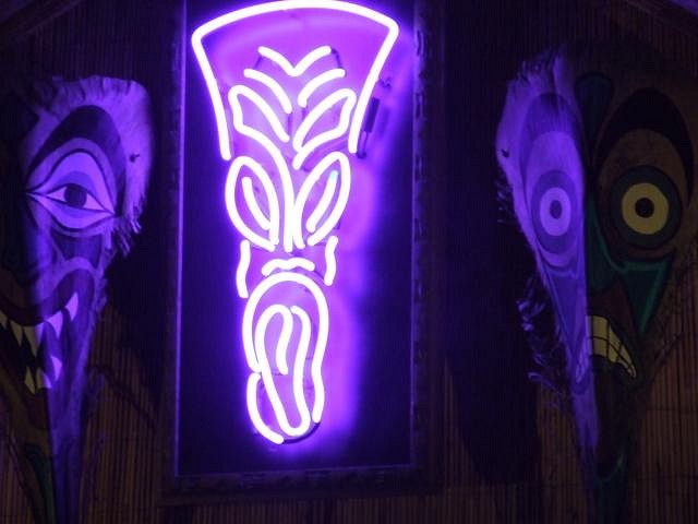
The neon sign in the purple orchid. It's not terribly far removed from the one Tangaroa posted. However, I think that in the environment at the PO, it fits just fine.
The photo is from Rupe33's post on the PO. I hope Rupe33 doesn't mind me stealing. Humuhumu posted a pic on critiki of the sign in its actual place, but the detail wasn't as clear.

For the sake of comparison, here's the un-tiki neon sign:

No one in the past has made a comment about how hideous the PO sign is, or how it isn't "tiki". In fact, any comments about it usually state how cool everyone thinks it is. Now since it's not "tiki" by a poly-pop definition, why is this okay? Why isn't everyone up in arms over it? Because it's part of the modern expression of "tiki", right? The "celebrating classic and modern polynesian pop" says that we celebrate the modern expression of tiki. So if the PO neon is a modern expression, what about the un-tiki neon sign. Why is that one so wrong? Where, in fact, did it go wrong?
Is it the extra detail in the PO neon? I'd say the extra detail makes the PO neon sign cooler, but not necessarily more "tiki". So why is it more "tiki"? What makes it so much better?
Or maybe I've got it wrong-- the PO neon isn't tiki! Should it be taken down? Is all neon automatically "un-tiki"?
I'm NOT trying to start an argument. I'm not even trying to say that we shouldn't have the byline for tiki central. I think it's a fine idea.
I do know that this sort of neon light tiki vs non-tiki "contradiction" is the exception rather than the rule, so don't think I'm being intentionally inflammatory, either. I am trying to have some civilized dialogue about an issue that seems to be provoking quite a bit of heated response.
|


