Tiki Central / General Tiki / That's just wrong! The un-Tiki thread:
Post #249336 by Feelin Zombified on Wed, Aug 16, 2006 4:36 PM
|
FZ

Feelin Zombified
Posted
posted
on
Wed, Aug 16, 2006 4:36 PM
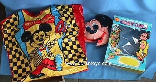
Agreed. And here's a non-tiki example to illustrate the point. the example that comes to mind is when I was a kid and I was all excited when I got a Darth Vader costume for Halloween. Imagine my disappointment when I opened the box to find not blinking buttons on the chest plate, not even a picture of the buttons on the chest, but a cartoon Darth Vader waving "Hi!" as if Lord Vader was your buddy. Gee, that's authentic. I don't have a picture of that costume, but here's the same idea with Mickey Mouse:
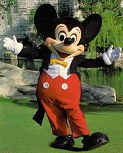
How obvious does the artwork have to be to get the point across? It even has Mickey's name plastered on the front incase you couldn't figure out who the person is dress up to be. Similarly, Does every tiki bar have to contain a sign that reads TIKI BAR just incase you didn't know where you were? maybe it's me, but I prefer Mickey to look like this:
-Z |


