Tiki Central / General Tiki / Critiki's latest new features: Themed Image Galleries, username photo credits
Post #252202 by Humuhumu on Sun, Sep 3, 2006 4:38 PM
|
H
Humuhumu
Posted
posted
on
Sun, Sep 3, 2006 4:38 PM
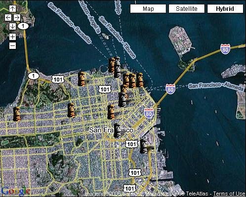
I just made a MASSIVE, MASSIVE improvement to Critiki Maps. The old one worked in Firefox, but just barely (it was painfully slow to load), and didn't work at all in Internet Explorer. Now, not only does it work across different browsers, it's much quicker -- downright zippy! If you tried Critiki Maps before and it didn't work for you, try it again -- it's much more likely to work for you now (though it still is restricted to the browsers that work with Google Maps). Check out this view of San Francisco: You can drag the window to move around, and you can zoom in and out, and you can switch between Hybrid (that's the default) to Satellite and Map views. Color tiki icons are for places that are still in business, gray tiki icons are for the places that have closed. Clicking on a tiki pops up an info window that includes a link to its Critiki entry, and its current Critiki rating. The further you zoom out, the longer it will take to load (because there are more locations). It will work, but it might be slower. It's more of a concern in places that have a high density of tiki spots (like So Cal). Most locations in Critiki have a Critiki Maps link (nearly 90% of them); look for the links that says "See this location on Critiki Maps" under the address. If there isn't a link to Critiki Maps, then it's because I haven't been able to find accurate enough latitude & longitude information. Give it a whirl, and let me know how it works for you! |

