Welcome to the Tiki Central 2.0 Beta. Read the announcement
Tiki Central logo
Celebrating classic and modern Polynesian Pop

Tiki Central / Tiki Marketplace / Upcoming New Line - not Tiki

Post #284507 by Lukeulele on Fri, Feb 9, 2007 3:26 PM

You are viewing a single post. Click here to view the post in context.
L

On 2007-02-05 15:26, MakeDaMug wrote:
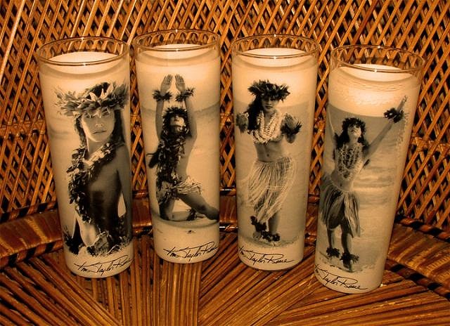
cool - I'm likin' what I'm reading! Check out the glass on the far right & see how I've grained the transition to the right. I felt it looked a lot less forced & a lot less like "a photo against a white background".

Any suggestions/recommendations are always appreciated.

Love 'em!! I'd buy a set!
Just my .02, but maybe a sepia tone to warm them up a bit? Here's my feable attempt for an example....