Tiki Central / General Tiki / Interview with Kern Mattei of the Mai Kai
Post #329325 by bigbrotiki on Fri, Aug 31, 2007 11:49 AM
|
B

bigbrotiki
Posted
posted
on
Fri, Aug 31, 2007 11:49 AM
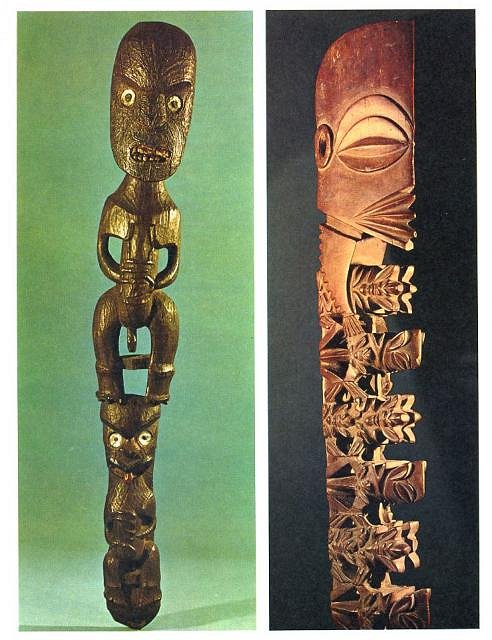
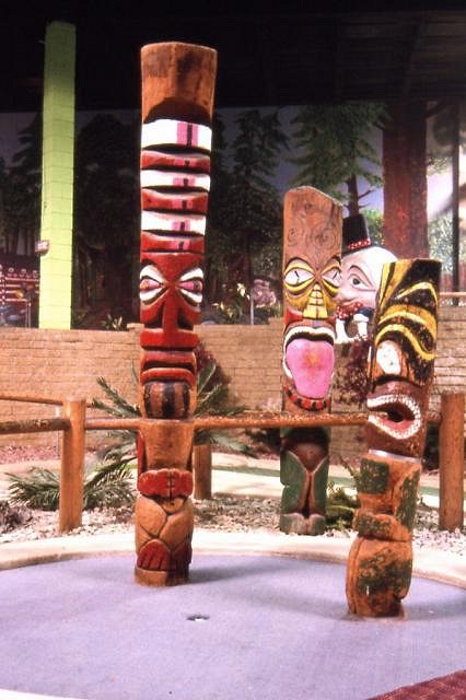
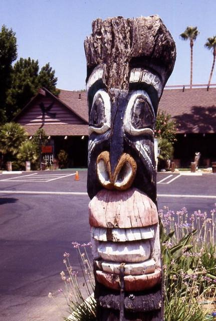
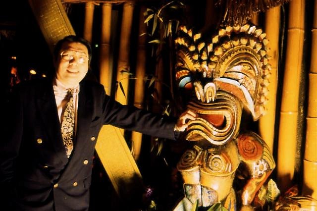
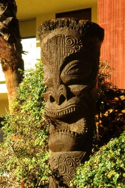
Will, you are doing a great deed! To recast the original Tikis is a great way of preserving the authentic look of the Mai Kai. But it is also a challenge. Please allow me to offer some advice. I believe I am in the position to do so because I am the author of the "Book of Tiki" which inspired much of the understanding and revived interest in Tiki culture today (there are some people here who get annoyed by me pointing this out repeatedly, but because the book [after it's 3rd printing had sold out] has been out of print for over a year now, I cannot assume that everyone has it, and I need to convey that I have some expertise in the matter). Please be assured that this is no critique of your personal talents, but intended as constructive and supportive advice: The heyday of American Tiki culture lasted from the mid 50s to the mid 60s, and it survived relatively unphased into the 1970s. But when by the late 70s, and through the 80s, customers began to stay away from the Tiki Temples because of changing tastes, restaurateurs felt pressed to find ways to liven up their establishments. They thought that the happy face generation of the 70s might be turned off by the dark brooding idols that decorated their lounges. So not only did they sometimes re-name their establishments (for example from "TIKI TABOO" to "TIKI ALOHA"), but they turned to painting their Tikis in bright colors. Also, since the wood Tikis had to be varnished or painted to protect them from aging anyway, why not spruce them up with some color and make them look NEW and INVITING!? I coined the term "Tiki devolution" for this phase, because it hastened the downfall of mid-century American Tiki style. Most of the paint that you see on the Mai Kai Tikis today was applied during that period. (There is an exception to be made with all Papua New Guinea style carvings, which should have a limited, earth tone color palette). The thing is, part of what is so cool about Tikis, is that they were intended to install awe and fear in the viewer, and that they represented man's creative urges back to the beginnings of time. They are NOT Mexican fiesta style folk art, and they do not have human features like red lipstick lips, white teeth, or pink tongues. Like much of primitive art, they are meant to look like of heavy age, and of darker times. That is what is wrong with the "Party City" look of many new Tikis today. Terence Barrow, eminent scholar of Maori culture had this to say in 1969 about the practice of painting auhtentic Maori house carvings: Now the challenge you face with Mai Kai Tiki recasts is that they are not of wood, which looks naturally dark and old, but of an artificial compound. You would need to apply some kind of texture and variation in tone to them to make them look less slick and monochrome, and maybe a semi gloss so they do not look either completely dull, but not too shiny or glossy either. To get an idea of an authentic look, go and find photos in Oceanic Art books, that is how the original carvers of the Mai Kai's Tikis worked. Kern should have some books in the Mai Kai archive. Here are two examples from one, a Maori and a Rarotongan Tiki (imagine THESE painted, it would be as if painting rosy cheeks on the Mona Lisa!): I am not saying that ALL color is ALWAYS wrong, either. The photo you are showing in your post above is a Tiki based on a Maori Tiki, very much like the one in this thread: To support the point I am trying to make here, here are some examples of post-Tiki period painted Tikis I photographed in the 90s:
Now here is a Tiki at the Tropics Motel in Palm Springs. To preserve it against the elements it had to be painted, but it was kept in its original wood color. Together with the other Tikis that dot the grounds, it looks very regal and imposing!: This is why Kevin Kidney and Jody Daily, when they made a Tiki Kids Coloring Book for visitors of their Miehana Exhibit, provided only one crayon color with it: Brown. |