Tiki Central / General Tiki / Interview with Kern Mattei of the Mai Kai
Post #329654 by bigbrotiki on Sun, Sep 2, 2007 12:24 AM
|
B

bigbrotiki
Posted
posted
on
Sun, Sep 2, 2007 12:24 AM
Considering the above info, a few splashes of paint seem inconsequential in the big picture. But, not knowing what the future will bring, we might as well plug away at improving the present. Kudos to Will for being such a good sport. He understands that we all love the Mai Kai, and that, it being the last authentic Tiki temple and prime example of the heyday of the style, we are all very concerned about it retaining its unique and rare character.
I considered that also, but please look again at the Mobile Home and the Mini Golf Tikis that I posted earlier, and the Barney West Moai that Teakey put up: Their paint jobs are all well weathered, but...they still simply look wrong.
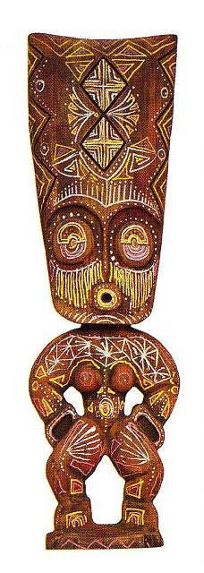
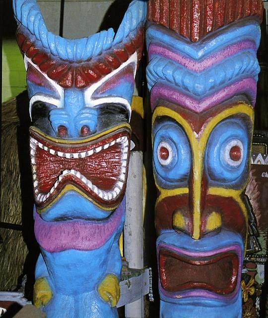
That all sounds very easy. But it's a little more complicated. When was "then"? That Moai paint job, and some of the other Tikis like that giant Maori by the sign were clearly applied after the 60s, and are wrong. Does that mean these mistakes will be repeated? And the fact that Leroy is a Tiki veteran does not necessarily make him infallible. He, like all veterans that had to survive the 80s, adjusted to "what the public expected", too. Just like some of the old mixologists who lost their incentive and care in making the original cocktails. As a matter of fact, brightly painted Tikis are the equivalent of too much grenadine-red, overly syrupy Mai Tais in the history of Tiki culture, both occurring at the same period, marking the devolution of Tiki. Here is an example, an early Oceanic Arts carving, with tastefully restrained "naive" paint accents that have a limited palette (white/black/and an earthy red) in an aged look: (I realize the eyes are black, the lips are red :) ...but this is a different carving here!) ...and the same carving, overly decorated by Leroy for an art show: Leroy did this to "personalize" the otherwise lathe-carved pieces for the show. Did that make them his own art? Perhaps. Would he have done them like that 30 years ago for a restaurant? Never. In the same book, THESE two Tikis, which I fortunately had been able to admire in their natural brown color at the entrance to the Las Vegas Sahara Hotel Don The Beachcomber, were pictured as examples of Tiki style :( Ouch!:
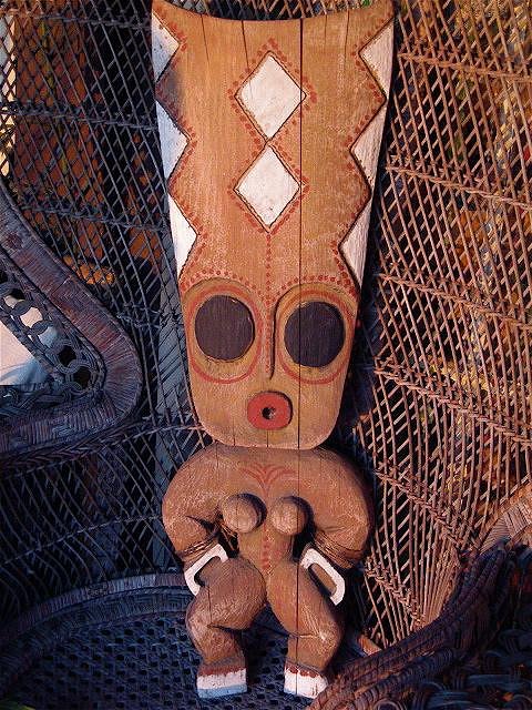
After the Beachcomber closed, the inventory was taken over by O.A., where they were painted in this way in the early 90s, because that was what the party rental business customers went for. I sincerely believe that since then, Tiki awareness has grown in leaps and bounds, making such drastic measures unneccessary. Just like with the cocktails, the time and effort spent on what O.A. used to call "polychroming" (used mostly for their New Guinea style carvings) seemed not worth it anymore in the 80s and 90s...nobody seemed to notice the difference. Here is an example of a unique Oceanic arts piece that shows their old, lovingly applied "polychromed" paint style:
The paint is distressed, bleached and dirtyied up which makes the carving look like straight from the jungle. Plus the paint scheme is tasteful and somewhat in keeping with traditional Oceanic art, not a coloring book free-for-all. I can only re-emphasize the importance of looking at Oceanic art books for reference. The original native artists had very specific reasons why and where they chose which paints, and to neglect that completely makes the Tikis look wrong even to the un-educated viewer, not so much on a conscious, but on an instinctive level. Sorry about being so seemingly anal about this, but it's my job. Being supportive and complimenting on TC is all good and fine, but when it comes to preserving the quality of mid-century Tiki culture, I prefer to make a clear point without skirting around the issue. :) I know there are some folks out there who understand me and who appreciate this. [ Edited by: bigbrotiki 2007-09-02 00:29 ] [ Edited by: bigbrotiki 2007-09-02 00:36 ] |