Tiki Central / Locating Tiki / Tiki Aloha, Torrance, CA (apartments)
Post #377672 by bigbrotiki on Fri, May 2, 2008 2:27 PM
|
B
bigbrotiki
Posted
posted
on
Fri, May 2, 2008 2:27 PM
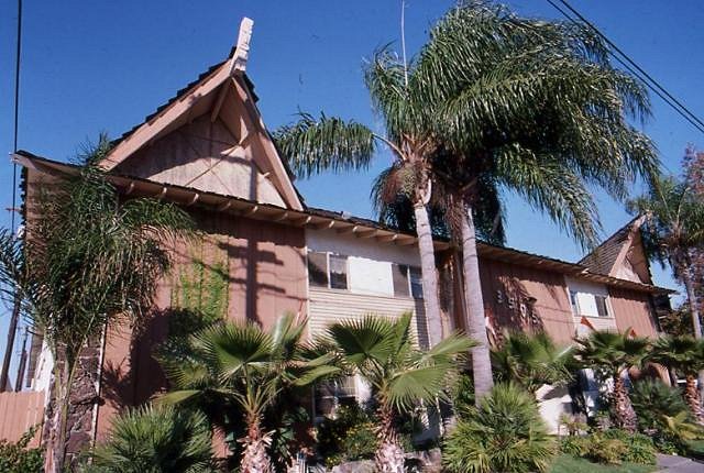
The Tiki Aloha apartments are unique to me for several reasons: One is the hilarious re-naming from "Tiki Tabu" to "Tiki Aloha", which is such a tell tale sign of the changing of sensibilities from the Tiki period to it falling out of favor. Where the original name tried to evoke the mysterious, dark and exotic mood of Polynesia and primitive art, the later re-christening was a symbol of the abolition of Tiki, aimed to make the name more palatable by choosing a politically correct, more generic term associated with Hawaii...yet at least they kept the title "Tiki".
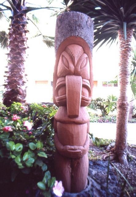
And there are much more impressive, swooping A-frame examples, more elaborate landscaping and rec rooms in other Tiki apartments in the South land, PLUS Tiki Tabu's Tikis are not necessarily the best stylistic examples of the craft:
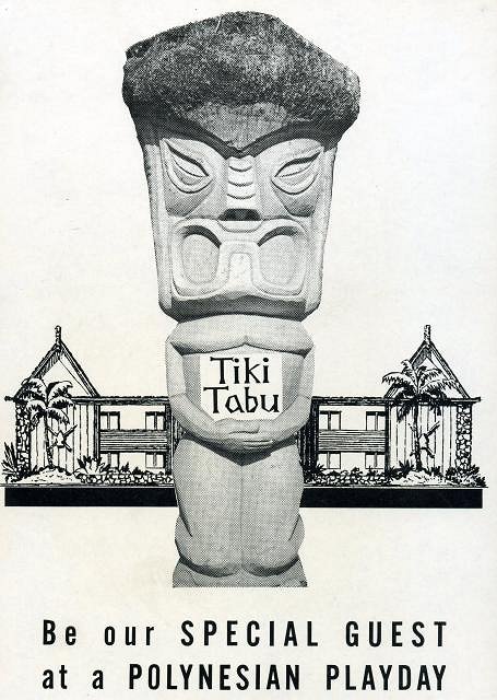
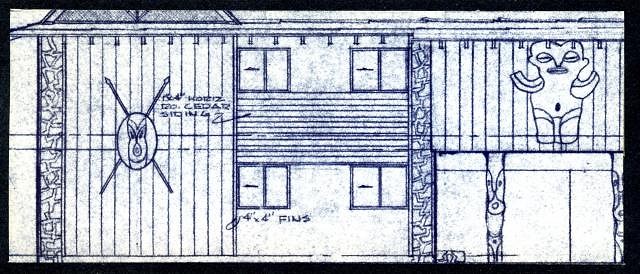
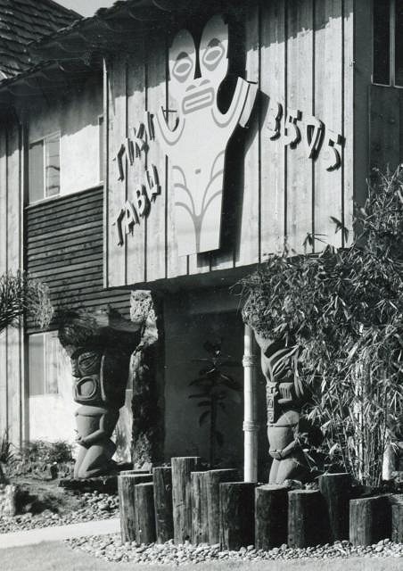
But the other reason the Tiki Tabu (which is how I prefer to refer to it) is special is because I was able to obtain so much original material on it, which is rarer to find for apartments than for restaurants and motels, who back in the day produced more promotional paper products to market themselves. Not only does the splendid Tiki cut-out brochure exist in Puamana's archive, but thanks to being tipped off by a TC member, and a gracious collector bowing out of the e-bay auction, I was able to win a large format architect's portfolio containing otherwise unattainable material on this apartment building, of which I can now share the best bits with the TC brethren. The original rendering of the Tiki Tabu can be seen on the apartment page in Tiki Modern, but here is a drawing made for an ad: and clippings from the blue prints found in the portfolio: The front facade logo was one of the very few that actually depicted a Tiki, one of the most modernist Marquesans I have seen done in the period:
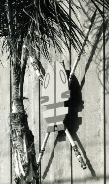
...and the Janus faced Tiki shields on each side were pure Polynesian pop too:
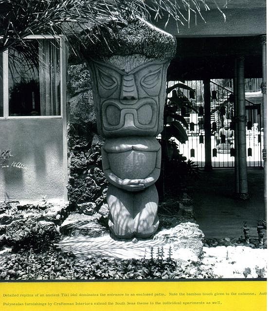
This entrance Tiki, the one shown on the brochure,...
...does indeed look similar to the Islander apts one, as noted by Sabu earlier:
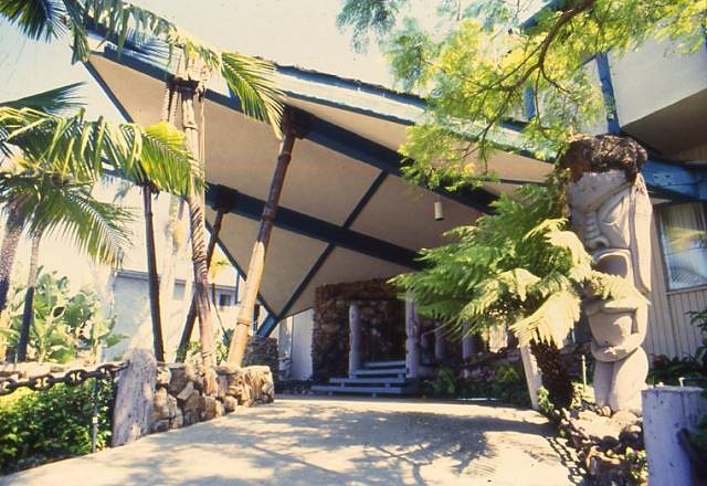
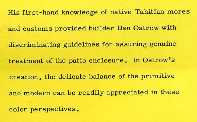
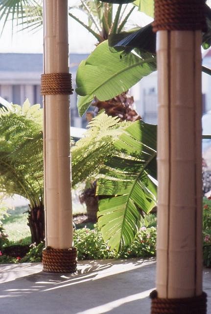
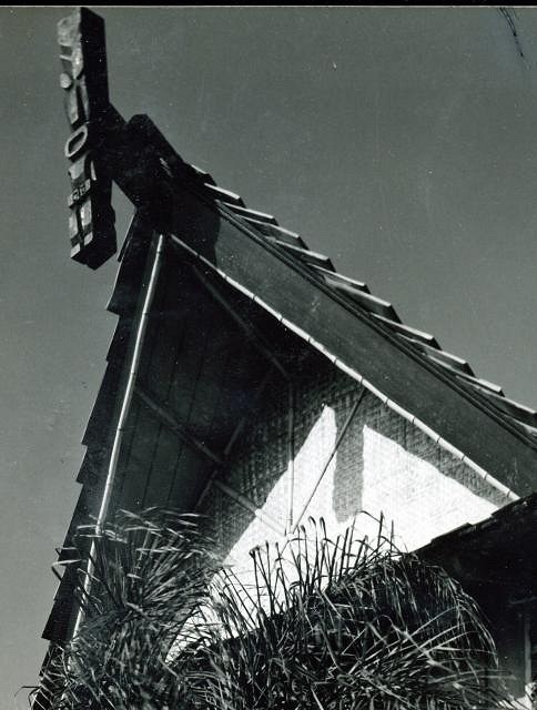
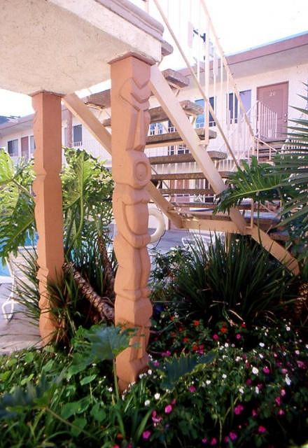
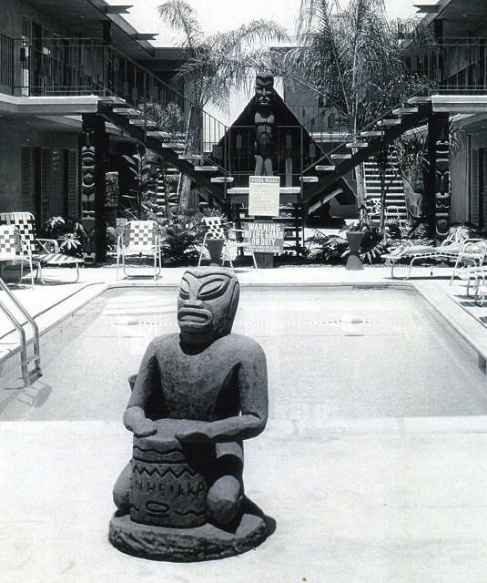
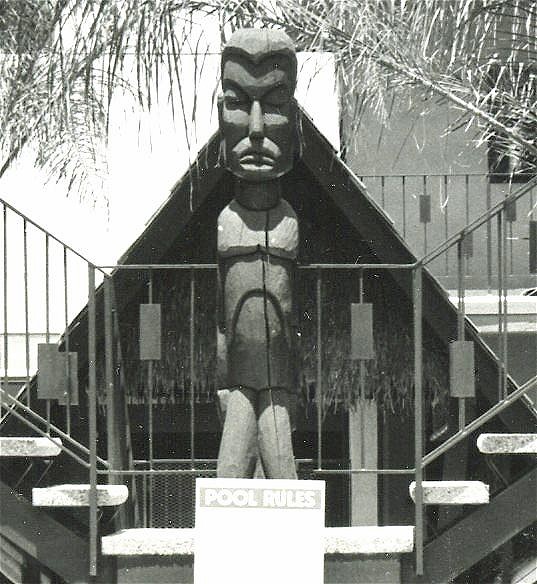
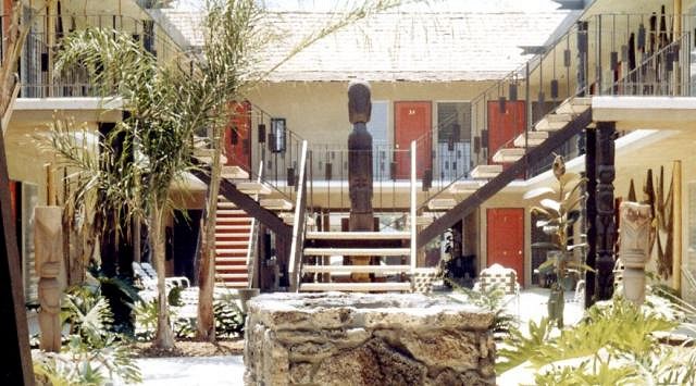
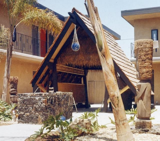
The portfolio contains some great Poly pop poetry such as the caption above. Here is another sample, mentioning the "modern/primitive" connotation I am so fond off: Among the few details left in the mid-90s were the rope-bound bamboo coverings of the support posts (like they used to have at the Islander apts too)... ...the Tiki outrigger beams (here in a vintage photo): ...and the Tiki posts holding up the stairs: But once the now barren courtyard was nicely dressed up and populated with many Tikis, here is a different version of the courtyard shot shown in Tiki Modern: Here is a close up of the Tiki latched to the stairs railing: And here a reverse, as seen from the rec room: Here is the nice but tiny rec room, the size of which really shows that this was not one of the bigger budget Tikifications done in the period:
I do like THOSE Tikis, and seeing these images today makes us swoon at this Tiki paradise, but objectively speaking, though the "window dressing" label could be applied to all Poly pop, here it really was not much more than that. Nevertheless, these images are rare glimpses at the BIRTH of a mid-century Tiki dwelling, and I hope they will thrill you as much as they excite me. :) |

