Tiki Central / Other Crafts / The Lurid low-brow Tiki-Art of Brad (tiki-shark) Parker
Post #645661 by Tiki Shark Art on Thu, Jul 26, 2012 7:58 AM
|
TSA
Tiki Shark Art
Posted
posted
on
Thu, Jul 26, 2012 7:58 AM
Aloha tiki Tribe!
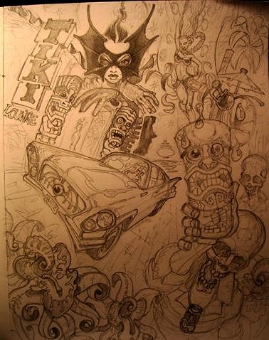
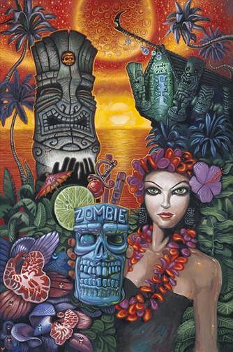
I warped all the perspective lines to meld the elements together *& I think it really helped bring it all in to a nice composition, instead of leaving a bunch of disconnected elements. ... now to think about light sources, warm light, cool shadows... Let's see.. well, there's a warm red/orange/yellow sunset. So, they She-Bat will be green/Blue to stand out along with much of the Tiki Bar and Palm Trees... or do I have She-Bat a red color too, so she becomes part of the back ground and looks more like a phantom watching over the city? Hmmmm....If the Tiki Bar is cool colors, the inside of the tiki bar it has to be warm colors... the car can be warm colors to stand out from a cool toned street - it's metal reflecting the red sun set sky I guess. I suppose I should once again try the layering effect: do a monochromatic under-painting and then laying in thin tints of color over that till I get what colors I want... this might save me from major screw ups. But, it's a tricky process, and you can end up just re-painting instead of "tinting". Eating up lots of time. Like painting the painting twice. ... it takes practice. Hmmmm. So, to break it into a foreground - creating framing devices. Then a middle ground area. & then a back ground, .. it's all about creating depth, depth depth... and... More to come! [ Edited by: Tiki Shark Art 2012-07-28 02:17 ] |


