Tiki Central / Other Crafts / Tiki Tiger Studios: Big long Egyptian trip report!
Post #696426 by tigertail777 on Tue, Oct 15, 2013 10:08 PM
|
T
tigertail777
Posted
posted
on
Tue, Oct 15, 2013 10:08 PM
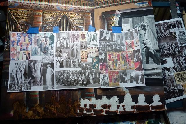
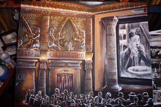
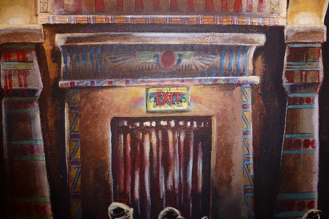
First off, thanks again for dropping by Wendy! I have tried to repeatedly get more information or better photos, and it is a complicated situation. The end result is I have what I have and there probably won't be anything better forthcoming. My solution is that I am going to paint hieroglyphics on the arch, but ones that if you can read Egyptian say silly things, and I will also be putting my signature in a cartouche on the arch. This helps fill the gap of what I know was there, without obligating me to have it be accurate because it says in so many words "I don't know" without being distracting to the rest of the composition. Let us once again cross the desert sands to that mystifying ancient place of magnificence. I am so very nearly finished with this very long journey. It's been over three months, longer than I have ever worked on any single art piece. I am very restless to finish this darned thing and start something new. The main thing I worked on was touch ups, adding some blue tinting to the areas where it would be darkest, and of course that oh so difficult audience. And awaaaaay we go! First off I filled in those gaping white audience "holes", and taped a bunch of 1920's period research above for inspiration. I really didn't have a very definite audience sketched out so just decided to wing it for the most part.
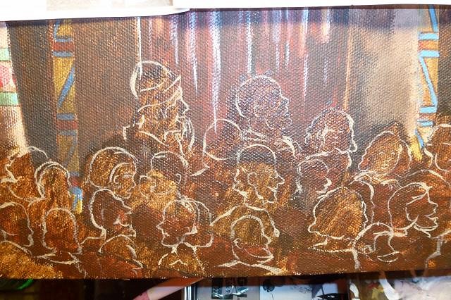
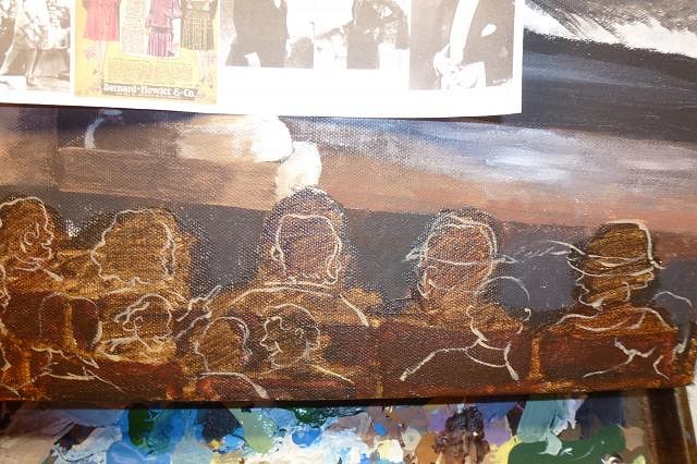
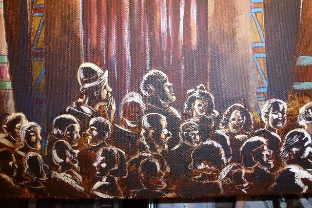
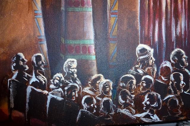
I took my handy liner brush and started making outlines of audience members. I didn't want them to all be just watching the movie though, I wanted to have little story vignettes like Norman Rockwell used to do. Very few of the photo reference pictures were outright copied, I made an exception for the lady by the exit with her hand to her mouth grinning in excitement. I thought that particular pose was perfect as it was. One of my favorite made up vignettes is also by the exit sign: the father absorbed in the movie while one of his twin girls is trying to talk to a boy behind her seat, and other with a disapproving look is trying to tattle on her. I've noticed pretty close to that exact situation play out numerous times in public spaces. It is quite amusing to watch when it is someone else it is happening to (first rule of comedy), but not at all funny if it is happening to you (I've had many occasions where nieces and nephews have tried to do this exact thing to me).
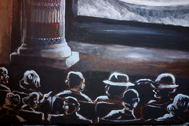
Another vignette I found amusing was the couple behind the two in the front seats trying to peer around the hats they are wearing to see the movie. The posture says it all, and I am sure we have all experience something like it. I often wear a 1940's style fedora which I remove as a courtesy in theaters for this very reason.
Towards the back of the audience I screwed up a little bit, but did not find out till later... so we will get there shortly.
I am really starting to get into film noir, which has been helpful in understanding how light and shadow plays upon the face. This is a dark auditorium with an audience in the dark, the only lighting being the bounce of light from the screen in front, the projection of light towards the screen OVER the audience, and the fake torches and upper lights on the wall. So the shapes of the audience members are composed entirely out of light and shadow. There is very little color that shows of the flesh or clothing.
And there there is the back of the audience. I like the couple in back laughing, and the col. Sanders old guy, but I committed a few cardinal sins I need to correct. Some of the heads towards the back by the wall are too big, some are too small. To bring off the perspective of a "deep view" the heads should be uniformly smaller as they recede away from the eye. And I could not find the precise reference I needed so some of the head shapes are not right, and little boy next to the laughing couple looks too old, and is impossibly twisted around in the seat. Worst of all the seating grid starts to lose its coherence towards the back and some seats are where they should not be. This is a difficult seating grid because it is in a slight curve shape, not a straight line. The real seating in the theater has this curve, most theaters historically did this until anamorphic widescreen came into being in order to provide the best viewing situation per seat. What this means for me is essentially taking a straight row grid of seats and bending it slightly into a half moon shape, which makes the sight lines of the seats all over and head placement must be strategic in order to show all the vignettes and expressions correctly without one head completely blocking another.
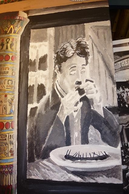
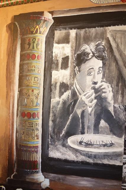
I saved the audience for last because I knew it was going to be ridiculously difficult to pull off. I still need to work on the audience corrections, but meanwhile I went back and made Charlie Chaplin a zombie. Which, around THIS place would mean I mixed him a drink.... but no... not exactly what I meant. :wink:
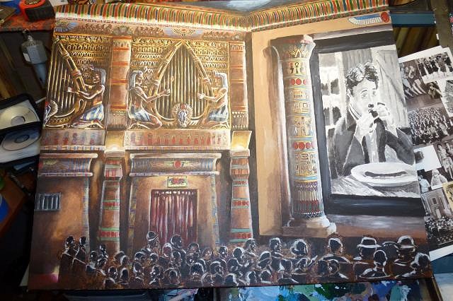
I still didn't like the eye direction and some of the shape so I redid them. I also thought that the Chaplin image was in too sharp of a focus for a projection, so softened it and added some grain. In photoshop speak: I added a gaussian blur and grain filter. :wink:
That's about where I stopped for now. Don't have much more to go; crowd correction, and adding foot lights to the stage (unlit). I may also add a small slice of the Wurlitzer organ at the front of the stage, on the edge of the painting. I have been working under my special arm lamp that has both fluorescent light, and incandescent in order to balance the color spectrum.... but dummy that I am I did not realize the overhead lights are also fluorescent tubes, which would be why things seemed so blue to me. I will need to add an overhead incandescent in the future to balance out the light color fully. After realizing this, I wanted to get a truer sense of the color under proper light so I turned off the overhead lights and only used the balanced light to take the last photos. These give a much truer sense of how it really looks.
End of the line for now, everybody off! |

