Tiki Central / Other Crafts / Tiki Tiger Studios: Big long Egyptian trip report!
Post #698742 by tigertail777 on Thu, Nov 7, 2013 7:33 PM
|
T
tigertail777
Posted
posted
on
Thu, Nov 7, 2013 7:33 PM
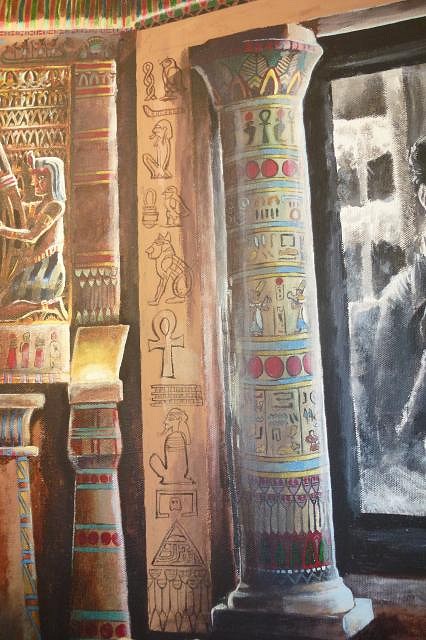
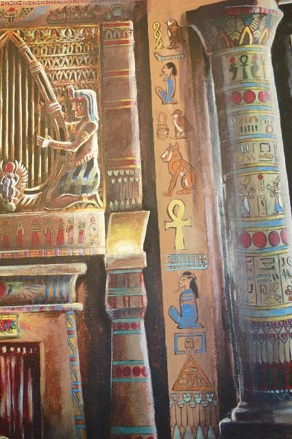
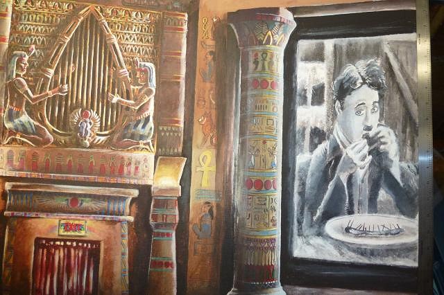
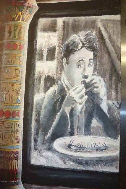
OK, so I am better and got a bit more done...man, we are getting ever so close to the finish line here folks! I did what I said I was gonna do about the side of the arch, and put some nonsensical (but meaningful to me) hieroglyphics, I just have to figure out what I am going to do with the top part of the arch now. I also did yet more changes to Charlie and the theater screen. And so... away we go... First I painted the outlines after penciling them in.
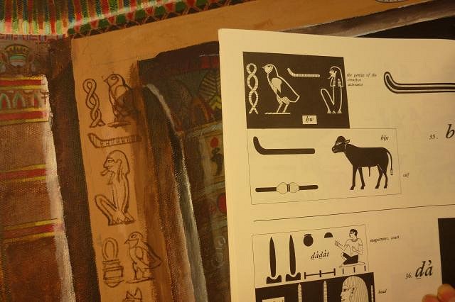
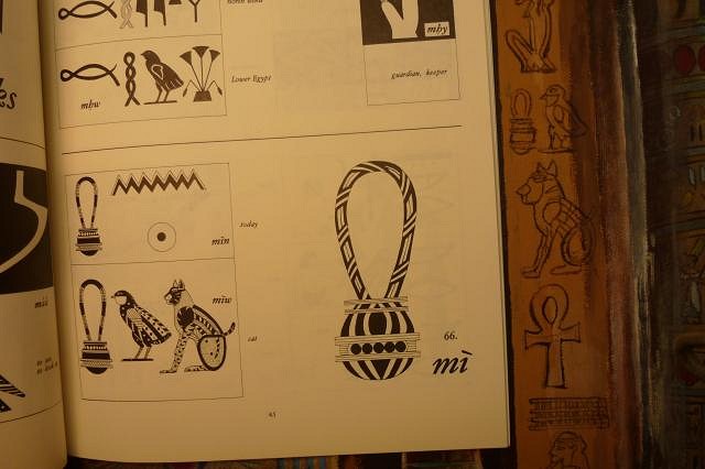
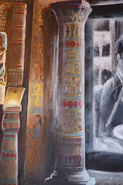
Research. More research as always. I have about 8 books on hieroglyphics checked out from the library right now. The Egyptian Hieroglyphic system has an order to it, but is ridiculously convoluted, there are not just symbols for sounds, but also groupings which change the sound meanings depending on their order and placement. Even with the famous Rosetta stone, it took quite a while to crack, and some things we are still not quite sure of. So rather than try and put sounding hieroglyphs together into words and hoping I got it right, I decided to use phrases already confirmed and published. These might be hard to read at this size, the first one is "the genius of creative utterance". What could be more apropos for a painting of a theater, in which both are creative endeavors that start with words and bringing into reality through them?
I couldn't find a tiger, so I used the next best thing, a cat.
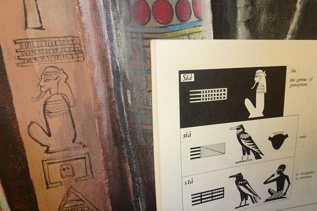
The next one goes in hand with the first: "the genius of perception", the ability to perceive both the normal and abnormal and how they interrelate, something that could be said of many movies and particularly the genius of Charlie Chaplin. You may also notice a little in-joke: a pacman ghost monster inside the little regeneration box from the game. It is a double joke, because there is a Egyptian hieroglyphic that looks exactly like the regeneration box, that means "home", or "dwelling". I normally put several in-jokes in my art but restrained myself on this one because I wanted it to be as historically accurate as possible. I figured the arch area was perfect because there is no way of knowing from the documentation I have what was actually there. There is a further personal joke there was well; with the combination of "the genius of perception" and "home" you get an approximation of "clue" and "house". My comic characters I have drawn since I was a kid and hope to launch as a web comic soon are called "Cluehouse Kids".
So the hieroglyphics were colored in, and my signature was added in.(The triangle/mushroom thing is my signature, it is my initials inside a triangle).
Then the painful part comes. You see, as is the hieroglyphics stand out too much. They have to be in dark shadows and as such barely perceptible. So shadows were added.
Now, I softened up Charlie a bit more. I wanted the screen to have that soft hazy glow that theater screens give off.
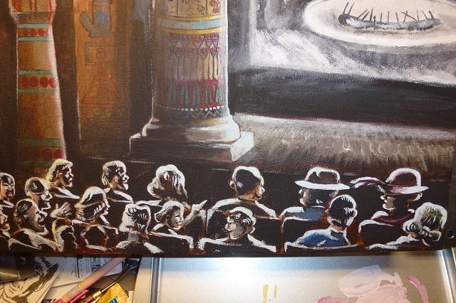
Originally I was going to have a full stream of light towards the screen, like you see from the projection booth due to particles in the air. But I felt it would ruin the dark ambiance I had built up, so instead I made some subtle streams around the screen, and added some distinctive light bounce around the pillar.
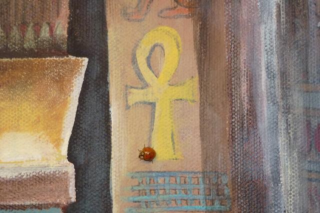
At this point, I noticed a little visitor to the studio that seemed to have a great fascination with my painting traveling all over it as I worked. Not a scarab, but close enough. :wink:
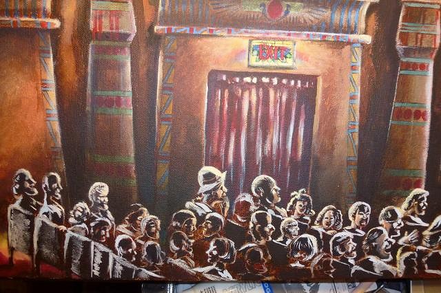
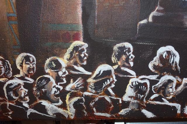
Finally, I strengthened the light on the crowd, and added some little hints of color. Now I think the light is too bold and I will need to go back and touch it up. I also need to fix more of the crowd still so the seating looks more natural.
So, all I have left is finish sorting out the crowd, and the overhead arch, and adding footlights to the stage. I am undecided if I should have any curtains showing above the screen or not as I am not entirely sure how the fire curtain and the stage curtains worked together. I have a hunch there were probably small curtaining above the screen, and closing stage curtains (as there are now) that were probably in front of the fire curtain which rolled up on rollers hidden within the backsides of the pillars. Not sure what color the curtains would be either, but they would probably match the exit curtains. Currently in the theater the exit curtains appear to be burgundy velvet (a very traditional theater color and cloth for curtains), while the stage curtains are yellow gold. It's possible these are the original curtains, but I highly doubt it because I worked in our local theater for a while and went through our bins of curtains from when they started (50's/60's) and those curtains just shredded under your bare hands (granted they probably were not brand new when they started... I'm guessing 1940's era). So for original curtains to survive from the 1920's.... I very highly doubt it. It is possible of course that they had curtains remade exactly the same as the originals over the years, but I know a thing or two about how theater budgets work: usually they go for whatever is the easiest and cheapest at the time because budgets are slim, if that means a color change from the original then so be it. Usually in the 20's drapes and curtains matched, it was rare to have differing colors within the same room/setting, so my theory is one of those curtain colors is the correct one historically, but not both. So what to do? add curtains? If so... which color? Well, that's it kids until next time you see me go crazy trying to pick out curtains. :wink:
|

