Pages: 1 46 replies
|
S

sushiman
Posted
posted
on
Sun, Sep 7, 2008 7:15 PM
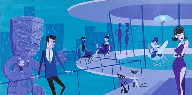
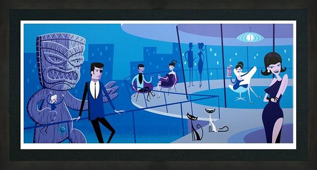
As some of you know , I am in the market for a Shag serigraph . I've been looking at a couple , but noticed some differences between the pics on Shag's site and the photos of the prints for sale , and I'm not just talking colors here . Take a look at these two photos of AN EXTRAORDINARY EVENING . In the photo from Shag's site you'll notice the top of a building directly behind the Tiki monster which is NOT in the print for sale . Also , take a look at the woman at the far right . In the Shag pic much more of her leg is shown than in the for sale print . The roof of the building is also different . I emailed Piet Agle for info but haven't gotten a reply .
|
|
S
sushiman
Posted
posted
on
Sun, Sep 7, 2008 7:18 PM
BTW , the Shag site photo is supposed to be a photo of a serigraph , but I suppose it is possible that they used the painting photo . |
|
H

Hakalugi
Posted
posted
on
Sun, Sep 7, 2008 10:54 PM
|
|
BB

Bora Boris
Posted
posted
on
Sun, Sep 7, 2008 11:07 PM
The lights shining thru the window are different also. |
|
S

sasquatch
Posted
posted
on
Mon, Sep 8, 2008 3:49 AM
Top post. I've noticed that sometimes serigraphs have different colours which I'm assuming are generated through the printing process, but to have different features. Thats another thing... I know someone who might be able to help! For information... The most recent price for a sale of that print I've found is US $510.00 (AU $629.09) Fan of Shag? - Check out The Shag Pile [ Edited by: sasquatch 2008-09-08 03:52 ] [ Edited by: sasquatch 2008-09-08 03:53 ] |
|
S
sushiman
Posted
posted
on
Mon, Sep 8, 2008 3:57 AM
I've emailed Piet Agle . Hope he will come through with an explanation . [ Edited by: sushiman 2008-09-08 18:21 ] |
|
EB

Eddy Brazil
Posted
posted
on
Mon, Sep 8, 2008 7:22 AM
Also interesting, if you compare the two examples - is that the carpet behind the woman on the right is square in the first photo, and oval in the second photo. As well, the top of her head is in line with the base of the roof in the first example (lower in the second), and the inner (lighter blue) roof support rods stop at the edge of the roof on the second photo. Definitely a different composition. |
|
EB
Eddy Brazil
Posted
posted
on
Mon, Sep 8, 2008 7:22 AM
[ Edited by: Eddy Brazil 2008-09-08 07:23 ] |
|
S
sushiman
Posted
posted
on
Mon, Sep 8, 2008 2:49 PM
Can you give me contact info for the guy who might be able to clear this up ? Haven't heard from anybody in Shag's organization yet and I sent photos .
|
|
M

Mo-Eye
Posted
posted
on
Mon, Sep 8, 2008 3:17 PM
It's not that uncommon for artists to alter an image before printing. It is almost standard for most to do some color correcting and turn up the contrast a bit for the print, as can be seen in your example. I have also seen images altered so that they fit a certain size paper. On this one it looks like there was a desire to print it at a certain width, which ended up cropping off some at the top. That is probably why the building was shorten, as opposed to having the top of it run off the image. That is also most likely why the woman in the corner's position was altered, to just better position her in the final print size. You can also see that Shag's signature in the lower left of the original was removed - another very common thing done with prints that are going to be signed later. None of these things should lead you to believe it is a bogus copy. People who are going to copy artwork illegally are not going to go through this much trouble to alter it. |
|
S
sushiman
Posted
posted
on
Mon, Sep 8, 2008 5:01 PM
Mo-Eye , Thank you for your input . I have viewed photos of this serigraph on a variety of websites . Two examples below . ALL show the print as per original . I know there is at least one member who owns this print . I have emailed him to ask if his is per original or like the other . Haven't got a reply . Hoping he'll weigh in soon . |
|
M
Mo-Eye
Posted
posted
on
Mon, Sep 8, 2008 5:21 PM
One other thing to remember is that what is shown on the websites is not necessarily an image of the actual print. When I ran the Thor art program, there were many times that we were selling the prints before they were actually printed. Since we didn't have a photo of the actual print, we would still use the photo/scan of the original on the website, since there weren't any real noticeable differences that could be seen on the computer screen. So you may want to double check with some one on the site about that. However, if you can actually find 2 physical prints that are different, then that might be a little shady and may warrant further research. Aloha! |
|
S
sushiman
Posted
posted
on
Mon, Sep 8, 2008 6:28 PM
Yes , I'd thought of that . Assuming for a moment that the serigraph in question is authentic , I just find it hard to understand why Shag felt it was necessary to make so many changes to the orignal , and I'm not just talking contrast and color . The changes are numerous :
|
|
G

Gromit_Fan
Posted
posted
on
Mon, Sep 8, 2008 7:13 PM
I collect serigraphs specifically because I love the process, and Shag There are almost always changes, some more subtle than others. Sometimes it is a concession to the printing process. I own Shag's "The Extraordinary Evening" and it is like the second picture, Why? Well, there are going to be multiple reasons: The original painting was created in 2002 and can be seen Round rug change seems to be a compositional consideration, I also suspect that the mug in the woman's hand I also own Shag's serigraphs of I haven't seen the original painting for "The Sun Also Rises," but all This is just part of the process of creating serigraphs from paintings. Shagmart, and other Shag distributors, seem to more often than not show images The other artist I collect, Patrick Nagel, also has variations between the Serigraphs are still the Rolls Royce of fine art prints, and I much Serigraphs also lay down a lot more pigment, and are much less prone The final serigraphs are the way Shag wants them. Any variations from Best,
|
|
G
Gromit_Fan
Posted
posted
on
Mon, Sep 8, 2008 7:30 PM
Here is another Shag example of original painting vs serigraph. "The Queen's Bathroom" original: "The Queen's Bathroom" serigraph: Clearly, in this case, there is evidence of simplifying the image to make Gromit Fan [ Edited by: Gromit_Fan 2008-09-08 19:33 ] |
|
S
sushiman
Posted
posted
on
Mon, Sep 8, 2008 7:30 PM
Gromit Fan , I was hoping to hear from an owner of the print ! Thank you so much for all the information ! You and I share similar Shag taste . I'm also interested in The Elegant Thief and the Raft Of The Medusa ! Muchos Mahalos ! S |
|
G
Gromit_Fan
Posted
posted
on
Mon, Sep 8, 2008 7:44 PM
Happy to help! I should have mentioned I bought "The Extraordinary Evening" I tend to think of it as "Hostage Exchange" or "Tiki Attack!" :) Gromit Fan
[ Edited by: Gromit_Fan 2008-09-08 19:44 ] |
|
S
sushiman
Posted
posted
on
Mon, Sep 8, 2008 8:06 PM
Hehe..." Attack Of The Giant Tiki " perhaps ? Somebody Shag collector in Oregon just sold both " Evening " and " LA Night " on Ebay . Fetched $ 510 and $ 710 respectively . |
|
G
Gromit_Fan
Posted
posted
on
Mon, Sep 8, 2008 8:54 PM
Yep. That seller is in Salem. "LA Modern (Night)" has had its value jump a lot in a short time span. "Extraordinary Evening" seems like it is the best of Shag's urban culture Having said that, Only approximately 24 copies made it out Gromit Fan
[ Edited by: Gromit_Fan 2008-09-09 16:16 ] [ Edited by: Gromit_Fan 2008-09-24 19:13 ] |
|
G
Gromit_Fan
Posted
posted
on
Mon, Sep 8, 2008 9:20 PM
The star on the belly is there on the print, just faint: I left this image of mine big because Last big image for a while! Enjoy! :) Gromit Fan
|
|
S
sushiman
Posted
posted
on
Mon, Sep 8, 2008 10:51 PM
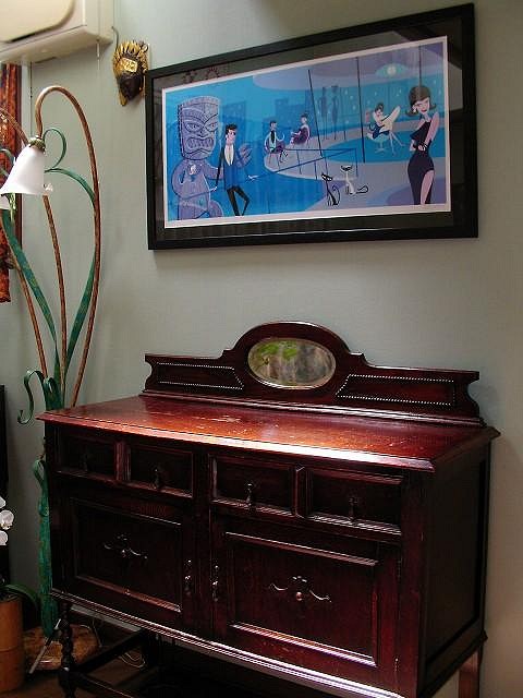
Gromit , Wow ! Thanks for uploading the pics . Fabulous ! I'm about ready to snag An Extraordinary Evening . Seller wants $ 200 for this simple wood ( supposedly handmade by a frame maker ) frame . What do you think ? The odd size of the print is going to make it a little difficult for me to find a reasonably price frame around these parts . I do know a couple of artists in Tokyo though who might be able to help me out .
|
|
S
sushiman
Posted
posted
on
Mon, Sep 8, 2008 10:52 PM
Only the FRAME is $ 200 . Print is around $ 400 . |
|
S
sasquatch
Posted
posted
on
Tue, Sep 9, 2008 1:19 AM
A really interesting thread guys. I've had a reply from Partycrasher who puts together http://shagwatch.blogspot.com/ (Well worth a look by the way!)and I think he hits the nail on the head as have many posts here, that the original and the serigraph are two separate pieces of art. Shag therefore has the opportunity to make significant re-workings to suit the serigraph printing process and/or things which in hindsight may have not be quite right in the original painting. This may have been obvious to most, but certainly something I've found out today! Thanks guys... Fan of Shag? - Check out The Shag Pile [ Edited by: sasquatch 2008-09-09 01:40 ] |
|
S
sushiman
Posted
posted
on
Tue, Sep 9, 2008 4:54 AM
Gromit , You have The Elegant Thief , correct ? Which does yours resemble color-wise - Shag's artist proof , or the one with more blues in it ( in frame ) ?
|
|
T

Tahitiki
Posted
posted
on
Tue, Sep 9, 2008 6:14 AM
Did anybody noticed that the guy in the middle sitting is also different in both paintings? |
|
S
sushiman
Posted
posted
on
Tue, Sep 9, 2008 6:17 AM
To be honest , yes I did notice the darker face , but neglected to mention it . Thanks for the post . |
|
G
Gromit_Fan
Posted
posted
on
Tue, Sep 9, 2008 7:20 AM
DISCLAIMER: Mine seems to be somewhere in between the two. Here is an image, but my camera tends to over brightness: Artist's Proofs used to be pieces where the colors might vary from the final product, Gromit Fan
|
|
G
Gromit_Fan
Posted
posted
on
Tue, Sep 9, 2008 7:25 AM
That seems like an adjustment to prevent him being lost in the background because the color values were too close.
|
|
G
Gromit_Fan
Posted
posted
on
Tue, Sep 9, 2008 7:27 AM
I tend to prefer simple framing, so I like the example you offered and $200 seems pretty reasonable.\
[ Edited by: Gromit_Fan 2008-09-09 07:50 ] |
|
G
Gromit_Fan
Posted
posted
on
Tue, Sep 9, 2008 4:21 PM
sasquatch, Shagwatch is a GREAT blog for Shag fans! Thanks! Gromit Fan
|
|
G
Gromit_Fan
Posted
posted
on
Mon, Sep 15, 2008 12:16 AM
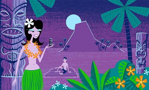
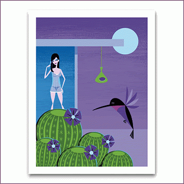
Since I know Sushiman is looking for Shag's ORIGINAL PAINTING: THE SERIGRAPH: I hope you find one soon! It was the print that got me hooked on Shag! :) |
|
K

Koolau
Posted
posted
on
Mon, Sep 15, 2008 12:50 AM
I have "The Raft of the Medusa" (still in the box) - when I got it and rolled it out, I was vaguely disappointed, but couldn't really verbalize why. Now I see why - it's not the image I ordered! There are truly significant, and in my opinion detrimental, detail and color differences between the painting and serigraph. That's a problem. Is it really all that technically difficult to accurately reproduce the painting? Shouldn't we expect better? I mean, this isn't exactly a $20 print from WalMart. . . |
|
S
sushiman
Posted
posted
on
Mon, Sep 15, 2008 2:20 AM
Wow ...I didn't realize HOW different the print was from the painting until now , after viewing Gromit's side by side pics . No WONDER you were disappointed . Shagcorps really should do something about all the painting images being used on Shagmart and on gallery sites to sell prints which are usually significantly different . Must be more happily unaware buyers like Koolau who end up not totally pleased . The print is cool in its own right , but pales in comparison to the painting . [ Edited by: sushiman 2008-09-15 02:24 ] |
|
G
Gromit_Fan
Posted
posted
on
Mon, Sep 15, 2008 2:20 AM
Koolau, I get what you are saying. The backgrounds are always going to be simplified. My jpeg is a bit overblown, with the colors slightly off, The trick is, vendors need to show images of the actual print, and The way you feel about this print Still, I LOVE The Raft of the Medusa print. Now if you want to sell yours, I suspect Sushiman might be interested... :wink: Regards, Gromit_Fan
[ Edited by: Gromit_Fan 2008-09-15 02:30 ] |
|
S
sushiman
Posted
posted
on
Mon, Sep 15, 2008 2:28 AM
You know , I PREFER the print version of AN EXTRAORDINARY EVENING to the painting . How about you , Gromit ? |
|
G
Gromit_Fan
Posted
posted
on
Mon, Sep 15, 2008 2:33 AM
I prefer the print as well...except the mug. Everything else seems like
|
|
S
sushiman
Posted
posted
on
Mon, Sep 15, 2008 6:30 AM
I'm noticing minor differences in detail between your photo of the print and the one I have which is not of the painting . So all the prints aren't exactly the same either I guess . Pardon me , I know little about the silkscreening process .
|
|
G
Gromit_Fan
Posted
posted
on
Mon, Sep 15, 2008 4:32 PM
With color, I have noticed my camera tends to enhance blue tints and tones, Serigraphs can have slight variations, but usually just in registration The image you have is the one that I saw when I ordered the print, Gromit Fan
|
|
G
Gromit_Fan
Posted
posted
on
Tue, Sep 16, 2008 10:29 PM
LA MODERN -DAY (original): LA MODERN -DAY (serigraph): Changes in this one are subtle, and seem most notable in the loss of Enjoy! Gromit Fan [ Edited by: Gromit_Fan 2008-09-16 22:41 ] |
|
S
sushiman
Posted
posted
on
Tue, Sep 23, 2008 7:16 PM
|
|
TM

The Monitors
Posted
posted
on
Tue, Sep 23, 2008 10:21 PM
Hey Sushiman, You have to show us that print once it's framed. I can only imagine its grandeur. |
|
S
sushiman
Posted
posted
on
Wed, Sep 24, 2008 1:03 AM
EYE didn't buy it - too rich for my blood and pocketbook . Just watched the auction to see how high the print would go after Gromit said it was bound to increase in value almost overnight , which it has . |
|
G
Gromit_Fan
Posted
posted
on
Sat, Oct 11, 2008 8:06 PM
Just adding more comparisons: The serigraph version, as posted at Shagmart: Note that Shagmart is showing the serigraph in this case, :) As for the image itself, I thought the show was called "The Immoderates" I like the pumped up contrast in the serigraph, most notably, the figure [ Edited by: Gromit_Fan 2008-10-11 20:12 ] |
|
G
Gromit_Fan
Posted
posted
on
Sat, Nov 29, 2008 10:06 PM
I know I am beating a dead horse, And it is a great way to announce another Shag Painting on the left; early approximation of the serigraph The original was at the "Merchant of Menace" show, Gotta say I agree with their selection of a image to release as Best, [ Edited by: Gromit_Fan 2008-11-29 22:09 ] |
|
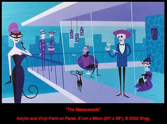
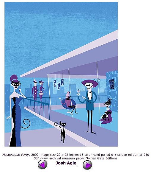
C

Cultjam
Posted
posted
on
Thu, Dec 4, 2008 12:16 AM
Me too! The Masquerade original as posted on Shag's site: Masquerade Party print from the gallery website: Happy hunting! |
|
G
Gromit_Fan
Posted
posted
on
Thu, Apr 2, 2009 2:37 PM
This change really perplexes me. I am not sure what they gained by adding all the sky. I do love how the cat is now outside (and closer) to the woman with the cat mask.
|
|
G
Gromit_Fan
Posted
posted
on
Mon, Aug 17, 2009 12:37 PM
Just found out that Outre Gallery is releasing another exclusive Shag serigraph: I sure hope Shag's American fans get a chance to purchase this one. The Marauder was my favorite image from Shag's "Voyeur" show, Of course, having stated that, it was pretty clear that [ Edited by: Gromit_Fan 2009-08-17 15:57 ] |


Pages: 1 46 replies