Tiki Central / Other Crafts
Trying something new...
Pages: 1 34 replies
|
M
MarvinTheMonkey
Posted
posted
on
Tue, Feb 23, 2010 4:59 PM
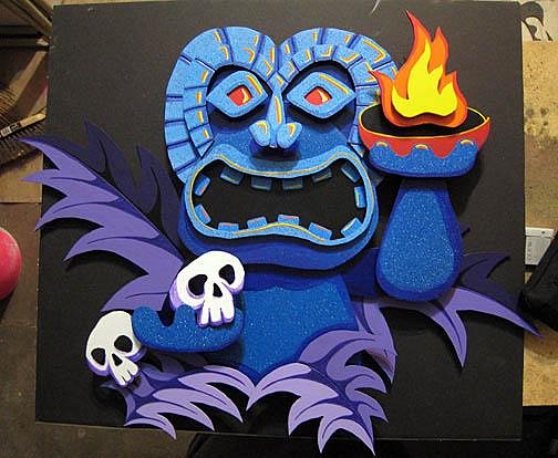
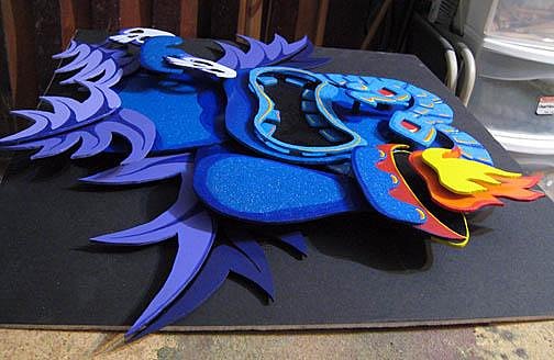
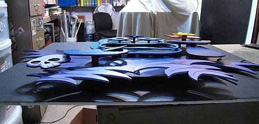
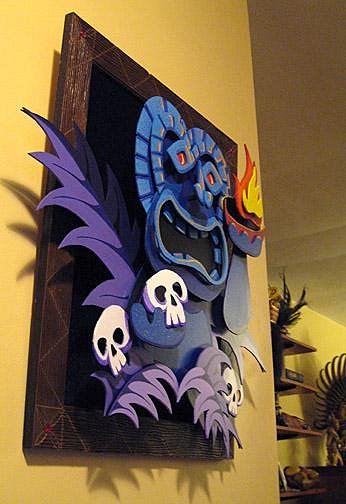
Okay... time to try something new and different. I've been playing around with adding dimensionality to some pieces - still painting, but getting away from the standard flat surface.I thought this would be a good time to try it on something tiki. |
|
LLT
little lost tiki
Posted
posted
on
Thu, Feb 25, 2010 8:04 AM
Nice piece! |
|
M
MarvinTheMonkey
Posted
posted
on
Thu, Feb 25, 2010 8:50 AM
This one I did on my own! |
|
M
MarvinTheMonkey
Posted
posted
on
Sat, Apr 3, 2010 8:23 PM
Okay, nearly finished....
|
|
TBBMT
tiki beat by marcus thorn
Posted
posted
on
Sat, Apr 3, 2010 8:32 PM
i just love it keep up the good work |
|
LLT
little lost tiki
Posted
posted
on
Sat, Apr 3, 2010 10:21 PM
3-Freakin-D! |
|
T
TikiMango
Posted
posted
on
Sun, Apr 4, 2010 1:53 AM
Looking good! Is that foam board or something different? I'd add the disks (even the square works), seems to ground the piece better. |
|
Z
zerostreet
Posted
posted
on
Sun, Apr 4, 2010 7:33 AM
Very cool! |
|
BK
Big Kahuna
Posted
posted
on
Sun, Apr 4, 2010 7:49 AM
I saw the original image & thought, "kinda neat", but the finished product is just plain WOW! Nice work. |
|
BT
Badd Tiki
Posted
posted
on
Sun, Apr 4, 2010 8:44 AM
That is pretty cool. What kind of material are you using? I've been thinking of doing something similar with scrap sentra foam board from work. Maybe you should make a black piece for the back that is cut kindof like the leaves. Kindof a star burst, but uneven and droopy, would add a solid backdrop, but also make it look like he's in a dense jungle. |
|
T
Tikilizard
Posted
posted
on
Sun, Apr 4, 2010 3:45 PM
Sweeeet 3-D! And you don't even have to have the glasses. Very nice. |
|
M
MarvinTheMonkey
Posted
posted
on
Sun, Apr 4, 2010 3:53 PM
Thanks for the encouragement, all! TikiMango and Badd Tiki: It's Sintra board - 3 mil |
|
L
leleliz
Posted
posted
on
Sun, Apr 4, 2010 4:21 PM
wow love this ! I am a big fan of 3D artwork...fantastic and looking forward to seeing what else you come up with! |
|
Z

ZeroTiki
Posted
posted
on
Sun, Apr 4, 2010 4:23 PM
Wow wowwy WOW! |
|
K
Krisdrama
Posted
posted
on
Thu, Apr 22, 2010 6:39 PM
Nice job, Mike! I love it! Adding the depth really does a lot for the piece! I would agree with the others; some sort of background would help define the space. Really cool! |
|
H
hewey
Posted
posted
on
Thu, Apr 22, 2010 8:06 PM
Looks cool mate :D |
|
T
tikigodz
Posted
posted
on
Thu, Apr 22, 2010 8:39 PM
NOTHING BUT LOVE THOT PIECE IS AWESOME!!! |
|
M
MarvinTheMonkey
Posted
posted
on
Sun, Apr 25, 2010 7:56 PM
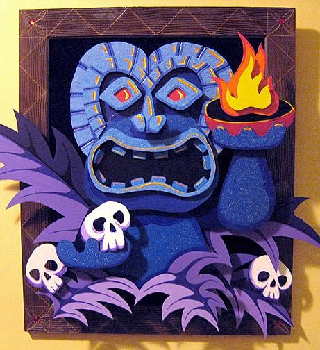
Okay, I tricked up a frame, threw down a black velvet backing, and added a few more details to fill things out:
|
|
M
MauiTiki
Posted
posted
on
Sun, Apr 25, 2010 8:11 PM
WOW that came out sweet! |
|
T
tikigodz
Posted
posted
on
Mon, Apr 26, 2010 4:08 PM
VERY COOL!!!! |
|
RH
Robb Hamel
Posted
posted
on
Mon, Apr 26, 2010 4:27 PM
Super-sweet! |
|
T

TikiDaye
Posted
posted
on
Wed, Apr 28, 2010 7:54 PM
nice... I've been playing around with some 3D ideas as well, but yours rox! |
|
H
hewey
Posted
posted
on
Thu, Apr 29, 2010 3:59 AM
Looks great with the frame :D |
|
A
ashman_atl
Posted
posted
on
Thu, Apr 29, 2010 8:19 AM
Awesome! Very clever! |
|
J
Jungalero
Posted
posted
on
Thu, Apr 29, 2010 8:44 AM
That's super-cool. I'd love to see more pieces done it that style. |
|
LLT
little lost tiki
Posted
posted
on
Thu, Apr 29, 2010 11:21 AM
Nice Job Matey! |
|
T
TikiG
Posted
posted
on
Thu, Apr 29, 2010 11:59 AM
Very spiffy technique and execution of art. Thanks for sharing! G |
|
MT
Makiki Tiki
Posted
posted
on
Sat, May 1, 2010 12:37 AM
Super cool. Love the blue, it just POPS! |
|
T
TikiMango
Posted
posted
on
Sat, May 1, 2010 3:09 AM
Great looking way to finish off this piece. |
|
M
MarvinTheMonkey
Posted
posted
on
Tue, May 4, 2010 10:18 PM
Thanks for the encouragement - you guys are the greatest! |
|
K
Krisdrama
Posted
posted
on
Thu, May 6, 2010 11:25 PM
Dig the frame you made! An awesome piece. So... what's the next challenge?! |
|
RH
Robb Hamel
Posted
posted
on
Sun, May 9, 2010 7:28 AM
I've never seen anything exactly like this... Mega Cool. |
|
B
BUFFBAD
Posted
posted
on
Sun, May 9, 2010 12:11 PM
AWESOME !!! LOVE THE LAYERS, its gonna be a booger to dust. |
|
Z
zerostreet
Posted
posted
on
Sun, May 9, 2010 1:14 PM
Great, fun piece! |
|
T
Tikilizard
Posted
posted
on
Sun, May 9, 2010 4:09 PM
Looks great finished! Really like the 3D. |
Pages: 1 34 replies


