Tiki Central / General Tiki
Crossroads of the Pacific Sign
Pages: 1 26 replies
|
T
tigertail777
Posted
posted
on
Tue, Sep 27, 2011 7:46 PM
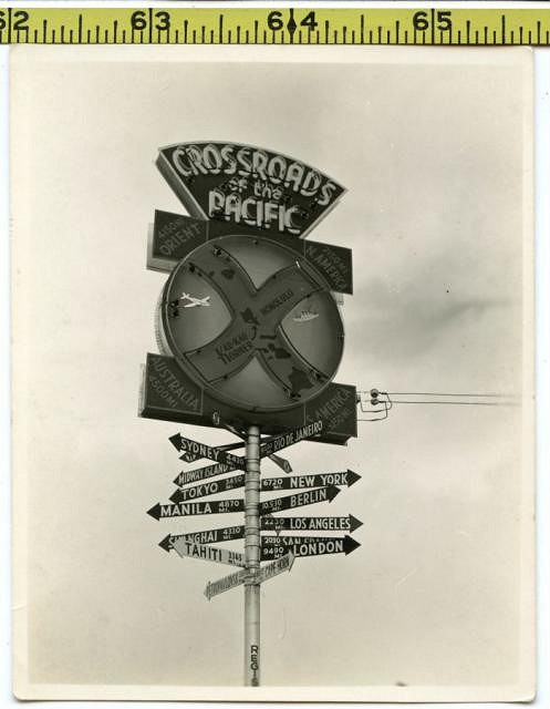
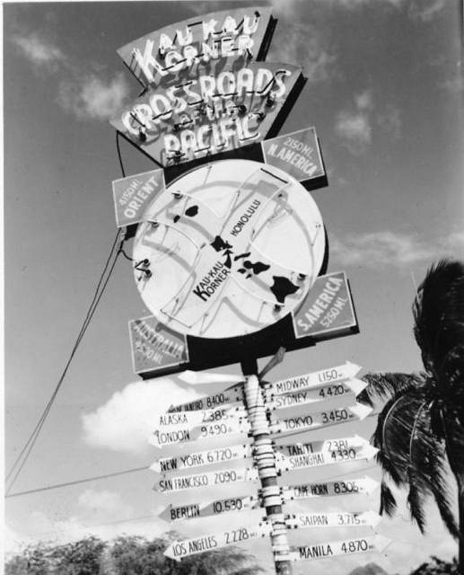
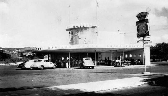
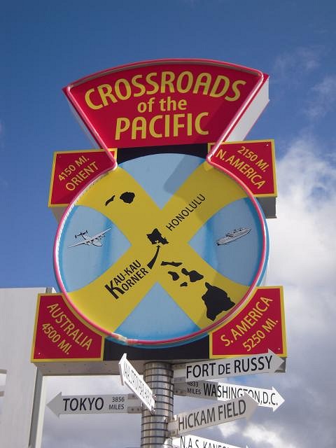
I ran across this photo on ebay: And I am curious because I have never heard of it before; is it still there (according to the 'net' it was at Kau Kau Korner, located at the intersection of Kalakaua Avenue and Kapiolani Blvd) and if not what happened to it? I love the late 30's/early 40's style it has, does anyone know any history or anything about it? I would love to see a color photo of the neon lit up at night. I figure if anyone knows the history behind it or any color photos, people on TC will. |
|
SF

Slacks Ferret
Posted
posted
on
Wed, Sep 28, 2011 8:00 AM
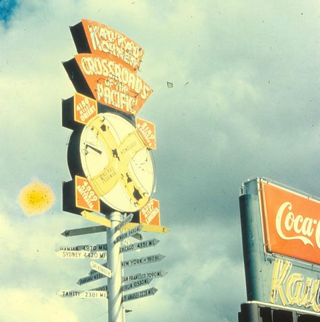
http://waikikitimemachine.blogspot.com/2010/06/crossroads-of-pacific-sign.html The above link has a photo in colour and a bit of info as well. There are others out there on the interrupting-webs, I just google image search "crossroads of the pacific sign" and found these too: http://www.flickr.com/photos/katclay/6142066728/ http://www.flickr.com/photos/lfur/5907864018/ But, yeah, I couldn't find anything in colour with a night-time shot of the neon. Cool Picture BTW! Thanks for posting this. [ Edited by: Slacks Ferret 2011-09-28 08:14 ] |
|
A
arriano
Posted
posted
on
Wed, Sep 28, 2011 8:54 AM
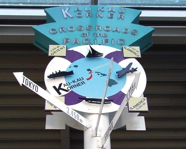
Looks like it may be gone, but a replica is now outside the O‘ahu Gallery. |
|
T
tigertail777
Posted
posted
on
Wed, Sep 28, 2011 10:36 AM
Slacks, and Arriano: Thanks for the replies I appreciate it.:) I still can't find a neon lit up picture as well, nor can I find any history of what happened to the original sign. How does something so historically significant just disappear? The replica is close, but not exact. You will note in particular the extra neon around the "crossroads of the Pacific" words on the original: on the replica they only did the neon around the edging. The original had neon around the yellow "X" missing on the replica too. Also the original had an extra part on the top (added at some point as it is not in the black and white pic) that read "Kau Kau Korner" that is missing entirely. And I think even withstanding time wear etc that the paint colors on the new sign are brighter and a little more garish. From that one color photo of the real sign, the background in the circle area is either very light blue or silver, not that bright blue they put on the new version, but I would need more than one original color photo to compare. [ Edited by: tigertail777 2011-09-28 10:48 ] |
|
D
Dustycajun
Posted
posted
on
Fri, Oct 7, 2011 8:53 PM
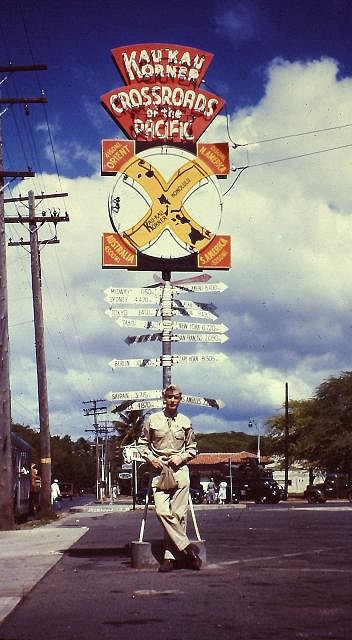
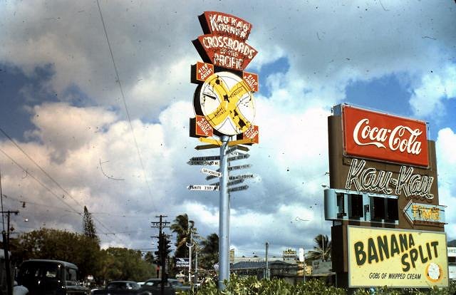
A few color photos of the original sign.
DC |
|
T
tigertail777
Posted
posted
on
Fri, Oct 7, 2011 9:54 PM
Awesome! Mahalo Dustycajun for the wonderful pictures! I love how it shows not only the sign but it's surroundings. Really appreciate the post. :) I still wonder what became of the original sign though? Anyone have any idea? |
|
B
bigbrotiki
Posted
posted
on
Sat, Oct 8, 2011 12:21 AM
Probably what happened to most great neon and motel signs of the 40s and 50s: A new owner takes over the business, the sign is dilapidated and the neon is broken, he gets a quote how much renovation would cost, and decides to scrap it. There is nobody present right then and there who would be aware of its value, so it just disappears as scrap metal. Iconic value or popularity are rarely a deciding factor on if a some architectural gem gets saved, ownership and cost is. Preservation organizations have won some battles, but most of the time it is a question of who is willing to pay for it. Later on, when time has passed, and in retrospect, enough people have become aware of the intrinsic value of what has been lost, there is a big uproar of "How could they?" and "Why didn't somebody...?", but it really is a matter of being there at the right time, and stepping up to the plate of taking over responsibility. |
|
T
tigertail777
Posted
posted
on
Sat, Oct 8, 2011 1:51 AM
Sadly, what you say is more than likely true BigBroTiki. I suppose we must be grateful for the numerous photos of it. Though I would still like to find one photo with the neon lit up at night, not sure why that is proving so elusive. On a side note, that replica is even worse than I previously thought after taking more looks at the original and comparing. Even the fonts are wrong for the part where it says "Kau Kau Korner" and points to the island (look at the horrible "K") and I think the font is also wrong on "Honolulu". And they didn't even bother to do the airbrushing around the edges of the circle that is present in the original. It's a botched job all around that adds up to a garish nightmare; not at all what the original was and is a mockery of the original 40's art deco look it had. (Sorry... the graphic designer in me is coming out I can't help it; these kinds of things make me silently scream inside.The kerning and leading not to mention the size of type on ALL the type are all wrong too....AAAAAA!!!!) [ Edited by: tigertail777 2011-10-08 01:58 ] |
|
K
kraken
Posted
posted
on
Sat, Oct 8, 2011 2:18 AM
Often the case, but not always. A resident of Walnut Creek, City government, prodded by a few of his neighbors, seems (re BigBroTiki's pessimistic analysis above.) [ Edited by: kraken 2011-10-08 02:26 ] |
|
B
bigbrotiki
Posted
posted
on
Sat, Oct 8, 2011 6:07 PM
No pessimism, merely pragmatism, forged by 20 years of experience in observing and preserving midcentury architecture. Just the facts, ma'm. |
|
D
Dustycajun
Posted
posted
on
Sun, Oct 9, 2011 10:07 AM
Now where have I heard that phrase before?
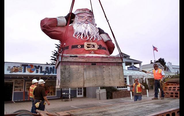
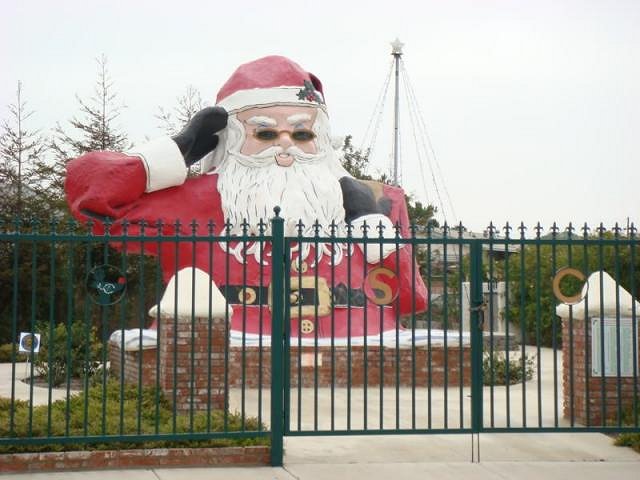
There is a greater appreciation for preserving historical icons these days, particularly in California. But, as Bigbro points out, some one (or group) needs to step up to save the day. Case in point, the Santa Barbara Santa Claus that lived on a roof next to U.S. 101 for many years. It was about to be destroyed when a group formed to save the Santa.
He was given a pair of shades and now resides in Oxnard next to U.S. 101.
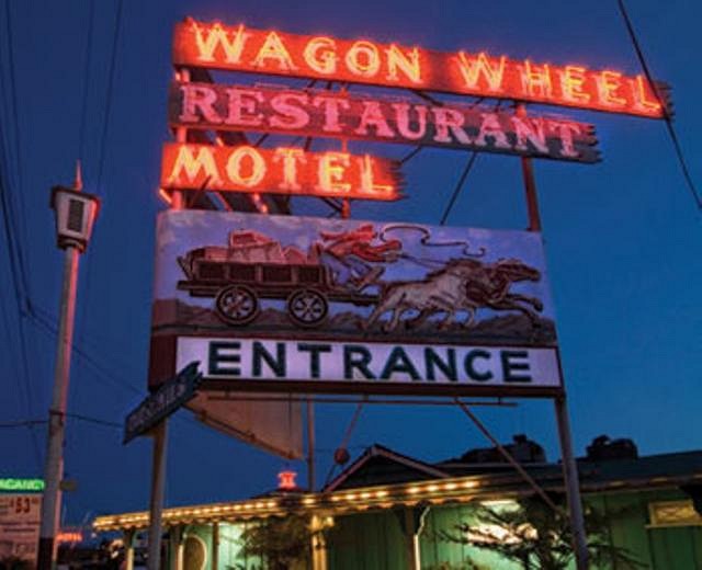
We can see a similar effort to resurrect for the Redondo Beach Barney West Tiki in this thread. http://www.tikicentral.com/viewtopic.php?topic=41150&forum=1&hilite=redondo Next up for saving in my area are the Wagon Wheel sign in Oxnard - the buildings are gone but the sign remains - for now.
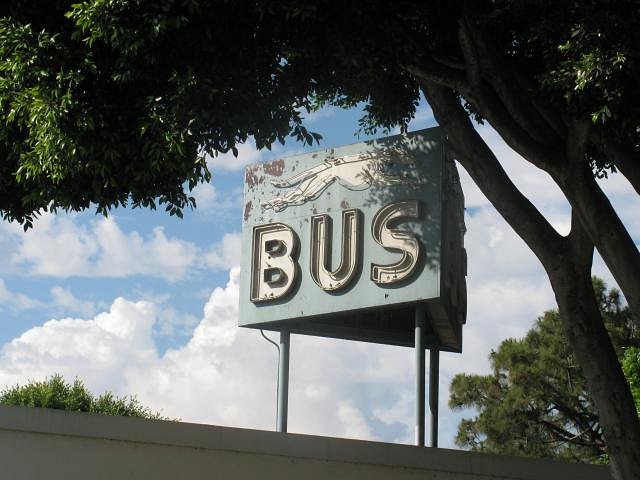
And the old Greyhound bus station sign in downtown Santa Barbara. The building is set for razing.
A little bit of a derail here, back to the Kau Kau Korner sign. Lets see that night-time color image.
DC |
|
PR
Phillip Roberts
Posted
posted
on
Sun, Oct 9, 2011 1:14 PM
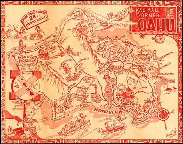
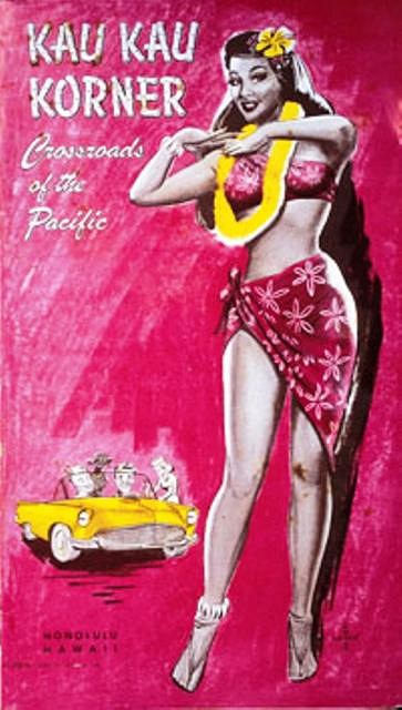
Aloha, ...And there below the sign on the Ted Mundorff drawn carhop place mat is owner of the Kau Kau Korner, Hanley P. "Sunny" Sundstrom and his dog. His partner was Clifford Kau. The business started in 1935, was at that location until it lost its lease in 1960. He kept it open 24 hours, even during World War II. He complied with wartime blackout regulations by putting up blue denim curtains. Interior shot here shows all of it's diner glory. In fact there's a load of interesting images here. Fixed link There is another replica Kau kau Korner sign in Honolulu. It is at Aloha Tower Marketplace.
Waikiki Tiki; Art, History, and Photographs. [ Edited by: Phillip Roberts 2011-10-09 13:55 ] |
|
P
phenix76
Posted
posted
on
Sun, Oct 9, 2011 1:33 PM
Link doesn't work, here it is again: http://hawaiiantimemachine.blogspot.com/2010/10/interiors-kau-kau-korner.html |
|
T
tigertail777
Posted
posted
on
Sun, Oct 9, 2011 4:48 PM
WOW! Thanks for all the wonderful info and pics, Dustycajun and Phillip Roberts (and Phenix for pointing out the broken link originally). Now I am all confused and wondering how many times in it's lifetime this sign was changed. If you look at the black and white photo I posted originally off ebay, the airplane is on the left, the ship on the right and they are pretty small. I am really wondering what the original design was now. The larger ship and airplane are more iconic and have a more art deco feel to them to me, but the first photo is obviously also quite old and possibly the first version. :-? Logically I think it must be, because it doesn't have the additional "Kau Kau Korner" neon topper. So probably when they added the topper they changed the design scheme. [ Edited by: tigertail777 2011-10-09 16:53 ] |
|
D
Dustycajun
Posted
posted
on
Sat, Jan 21, 2012 6:03 AM
While not featuring the sign, here are a few menus from the Kau Kau corner.
And a few more photos of the sign.
And an early photo of the sign and the drive in building.
The Kau Kau Corner building was actually enveloped with the Coco's Coffee shop, as discussed in this thread. http://www.tikicentral.com/viewtopic.php?topic=39185&forum=2&hilite=coco's DC |
|
PR
Phillip Roberts
Posted
posted
on
Tue, Jan 24, 2012 9:46 AM
Aloha,
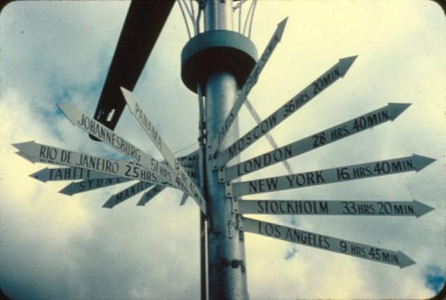
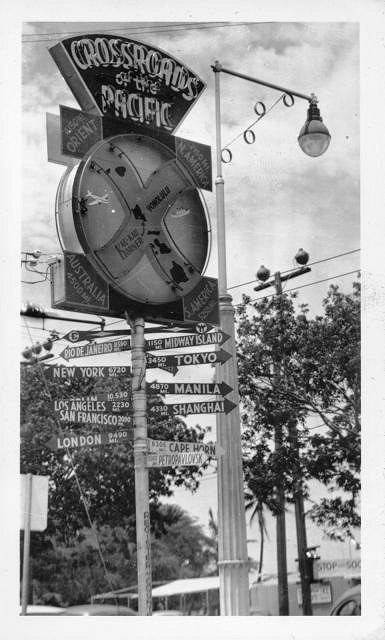
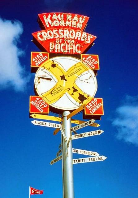
Are we sure this photo is of the same sign? All of the other arrows are in miles. |
|
D
Dustycajun
Posted
posted
on
Tue, Jan 24, 2012 4:42 PM
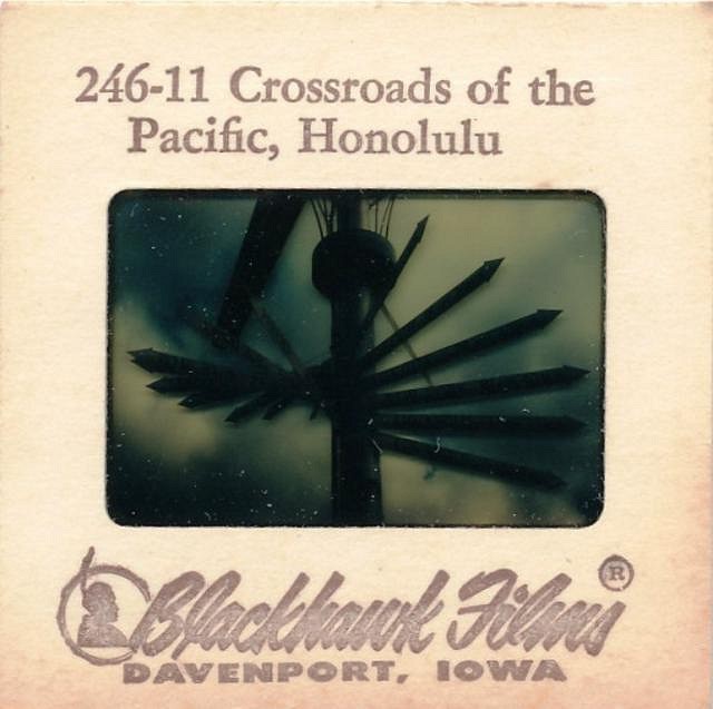
Your right Phillip, it is different. Maybe an upgrade to the sign in the later 1950s? It came from this tourist slide on ebay.
It claims to be the Crossroads of the Pacific in Honolulu. Have you ever seen a facsimile like this before? DC |
|
PR
Phillip Roberts
Posted
posted
on
Tue, Jan 24, 2012 5:22 PM
aloha, I have a sneaking suspicion that this is a wholly different item then a sign. I suspect it is a air direction turbine, perhaps at Hickham, Tripler or Pearl. Flight times, air speed and direction would have been important to pilots of the day. Looking closer at the sign, (and after a few hours of additional thought) it's 9 hours to Los Angeles, so could this have been at the Honolulu International Airport? Crossroads of the Pacific is a generic term used then and didn't only apply to the Kau Kau Korner.... Blackhawk Films apparently made travel slides from their travel films for home use in the 1950's... Thoughts? Waikiki Tiki; Art, History, and Photographs. [ Edited by: Phillip Roberts 2012-01-24 19:57 ] |
|
D
Dustycajun
Posted
posted
on
Fri, Sep 7, 2012 8:07 AM
I picked up this old photo of the crossroads sign.
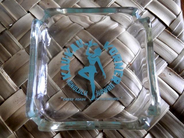
And saw this ashtray from the Kau Kau Corner.
DC |
|
A
aquarj
Posted
posted
on
Fri, Sep 7, 2012 9:35 AM
It's a fun sign, not just as an icon of Honolulu history, but also fun to see what locations are considered significant at the time, and how they change over time. In the WWII photo, they've got Saipan on there, but not on some of the others. DC's most recent image has an arrow for Petropavlovsk??!
Not to sidetrack on this one, since it really looks like a different thing, but I'd just add that the directions are clearly not supposed to be accurate either. I don't think there's any place on earth where you could have those directions for pointing to Los Angeles, Rio, and Tahiti from the same origin. Probably just entertainment value anyway. It is kind of fun when they try to be roughly accurate like the Kau Kau Corner sign though. -Randy |
|
D
Dustycajun
Posted
posted
on
Fri, Nov 9, 2012 12:11 PM
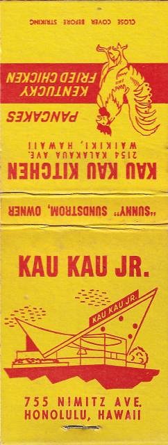
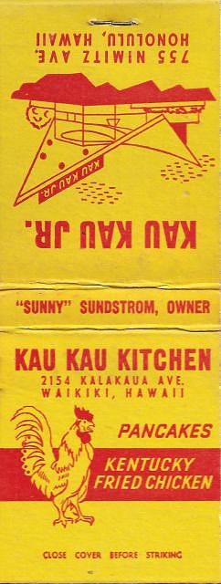
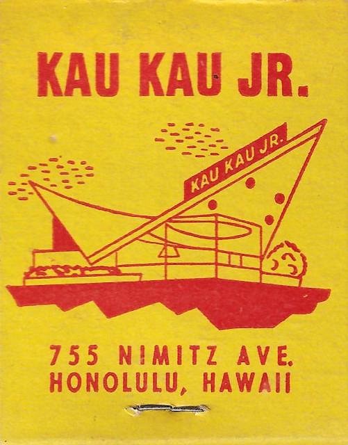
I picked up this nice little matchbook from the Kau Kau Jr. It was a hamburger stand opened by Sunny Sundstrom, the owner of the original Kau Kau Corner.
The building was designed by Pete Wimberly and was described as follows: “The Kau Kau Jr. hamburger stand on Nimitz Highway (1956), with its little glass kitchen huddled beneath a fantastical, arrow-shaped, concrete-slab roof was certainly Honolulu’s most fanciful small building.”
I tried finding a photo of the building to no avail. May Phillip Roberts could help out on this one. DC |
|
D
Dustycajun
Posted
posted
on
Sat, Jul 6, 2013 5:56 PM
Nice color photo of the sign.
DC |
|
D
Dustycajun
Posted
posted
on
Wed, Jul 2, 2014 6:52 AM
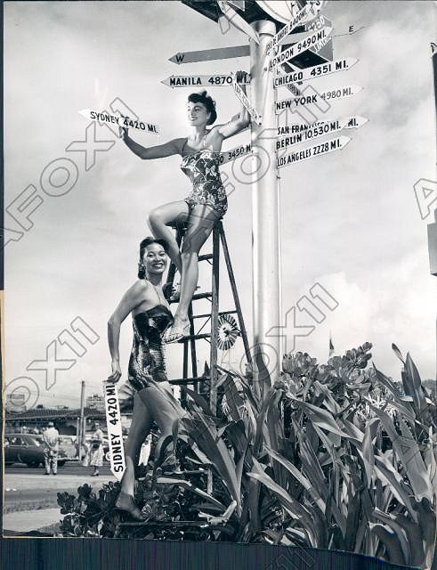
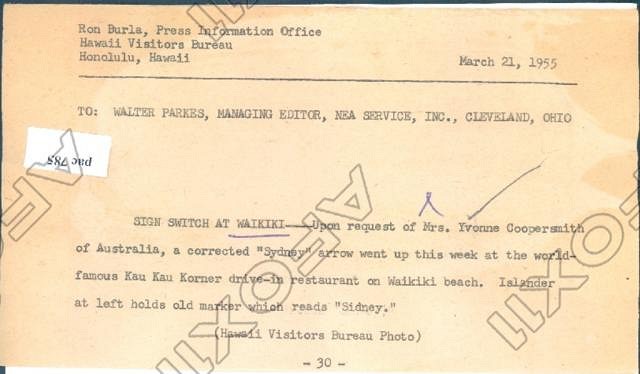
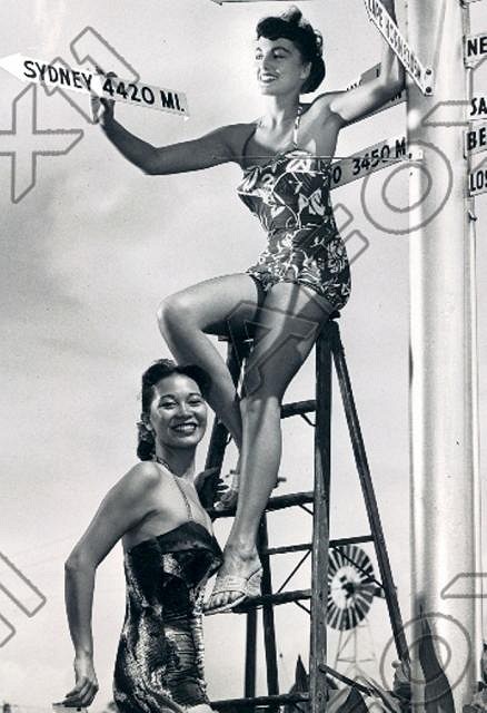
A news press photo showing Mrs. Coopersmith from Australia replacing the misspelled "Sidney" arrow on the sign.
DC |
|
B
bigtikidude
Posted
posted
on
Wed, Jul 2, 2014 7:34 AM
If much rather have Ms. Coopersmith correct my spelling than Grog any day. Thanks for continuing to post here DC. Jeff btd [ Edited by: bigtikidude 2014-07-02 07:35 ] |
|
D
Dustycajun
Posted
posted
on
Wed, Jul 2, 2014 9:18 PM
I agree, Mrs. Coopersmith it is for spelling corrections!
DC |
|
BK
Bubba Kingfloat
Posted
posted
on
Wed, Jul 30, 2014 6:12 PM
I can't find pictures right now but there's a replica of the sign at the visitor's center at Pearl Harbor. |
|
BK
Bubba Kingfloat
Posted
posted
on
Fri, Aug 1, 2014 6:14 PM
Here it is...this was taken in February 2012. It looks almost the same as the replica shown earlier in this post.
[ Edited by: Bubba Kingfloat 2014-08-01 18:15 ] |
Pages: 1 26 replies

