TM

Joined: Nov 21, 2004
Posts: 3685
|
TM

On 2007-11-16 10:16, Unkle John wrote:
On 2007-11-14 21:11, Tipsy McStagger wrote:
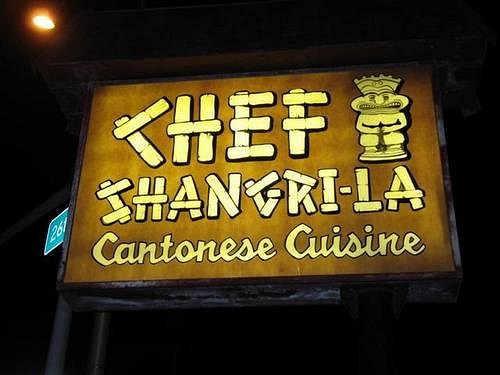
BEFORE!!!!!!

As a sign designer/maker I can say this sign is pretty classy. It has great colors and looks awesome lit up. I can tell that the flex-face was painted (shown by the variations of parchment colors), and normally that is a sign no-no because you can see the coats, but for this sign, it looks great! Another positive about the sign is that it tells you What it is and by the "look" if you didn't know anything about south pacific restaurants, you would see that sign and think it was...
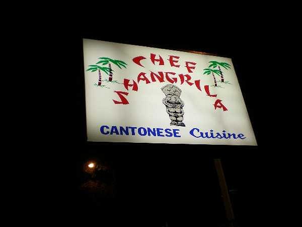
AFTER!!!!

TOTAL SHIT!
I pray the owner or family member didn't design this (it does happen when they want to save money). However, if the sign shop designed this sign, it must be a cheap place like SignsASAP, FastSigns, or any strip mall dwelling sign shop. They care about profit than the customer. If this sign was designed by a sign shop, I won't do business with them and they should fire the graphic artist. This sign has broken many "sign rules". There is a lot of wasted space, small type style (AND ARCHED FOR NO GOOD REASON), a stereotypical "Asian" front, and horrible colors. This sign smacks the customer in the face with bad taste. It screams "We are cheap b/c we got a cheap sign and we added palm trees so you would think it's tropical food because we don't think our patrons or would be patrons are smart enough to figure that out." What is also annoying is that they tried to get the word "cuisine" in the same type style as the older sign... why not the word "Cantonese"? This sign is an embarrassment for this establishment. They seem to have been around for a long time, they should take pride in that. If I worked close to them I would try my best to get them a deal on a new sign that looked like the older one (if the old panels had been destroyed).

Texas Tikiphiles Unite!
[ Edited by: Unkle John 2007-11-16 10:23 ]
..i know what ya mean...like you, john, i was a sign maker for a few years out of college so i understand a few things about it as well...if I had had advance knowledge that they intended on changing the sign, i would have definately kept an eye on what they planned on doing and offered whatever help i could, whatever way I could....shit,i would have done it free of charge, just to see something decent lighting the way to those tropical drinks and cantonese food....
[ Edited by: Tipsy McStagger 2007-11-16 12:07 ]
|


