Pages: 1 17 replies
|
TM

Tipsy McStagger
Posted
posted
on
Wed, Nov 14, 2007 9:11 PM
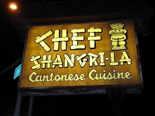
BEFORE!!!!!!
AFTER!!!!
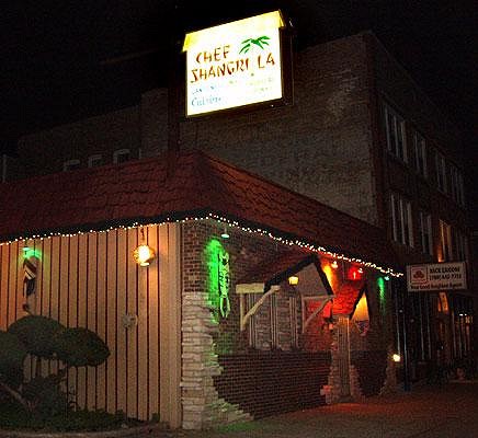
..well..i guess it could have been worse. but lemme tell ya bout the one that got away!!..last night we were comin home from hala kahiki when we noticed the sign was gone at chef shangri-la. It was midnight and no one was around..so we moved in for a closer look....The old sign panels were leaning up against the building, and the shingled faux roof was in the parking lot as well. we weren't sure if it was garbage so we decided to wait til morning to find out...i called the chef first thing and mentioned the sign.....they said that they were replacing it with a new one and if i wanted the old sign i was welcome to it...they were throwing it away and whoever wanted it could have it, so i thought-cool, i'll swing by after work and pick it up with a friend of mines truck.....well, some time around 3 p.m. my girlfriend called and said the old sign was gone and they were installing the new one as she was driving by...i called the chef and they said i missed the boat and that the company that dropped off the new sign, took the old one away, which basically was destroyed from what i was told....oh well...it would have been nice to have that piece of tiki history...even though it was about 8 ft tall and 10 or so feet long!! we went to the chef tonight to also find that all the carpet had been ripped up and replaced with tile.....they said the ceiling tiles were going to be replaced this week, so stop in for a brand new chef experience!!!!.......oh yeah, the washrooms are finished too and man are they blinding bright!!! "I may not always be right...but i'm never wrong" [ Edited by: Tipsy McStagger 2007-11-14 21:11 ] [ Edited by: Tipsy McStagger 2007-11-14 21:16 ] |
|
C

croe67
Posted
posted
on
Wed, Nov 14, 2007 9:17 PM
Major bummer on missing that sign - would have been a great score!!!!!
But do they still look & smell like a bus terminal? (albeit, a bus terminal with reallly bright lights!) |
|
I

icebaer69
Posted
posted
on
Thu, Nov 15, 2007 3:36 AM
it´s worse enough . the "chef" should have given the money for the new sign |
|
B

BambooLodge
Posted
posted
on
Thu, Nov 15, 2007 3:46 AM
No, the washrooms are actually clean smelling now! PS. We knew the sign was coming down, and Suzie had offered it to us, but where the hell were we going to put a 10ft sign? Plus, it had some cracks and was quite brittle. The fact that we did not post it here on a public forum probably makes us huge scumbags in some folks eyes, oh well, we'll have to live with that. BaMbOoLoDgE...where the South Pacific meets the Great White North! [ Edited by: BambooLodge 2007-11-15 04:19 ] |
|
B
BambooLodge
Posted
posted
on
Thu, Nov 15, 2007 3:52 AM
The village made her change the sign, saying it was un-safe. |
|
TM
Tipsy McStagger
Posted
posted
on
Thu, Nov 15, 2007 4:57 AM
..i have to agree with bamboolodge.....the chef needs support!!...and the washrooms ARE clean! We try to get out there when ever we can...would be nice to see more faces round the bar. ...yeah, the sign was really brittle, but i had this crazy idea to maybe carefully cut out the little tiki frogman from the sign and build a lightbox behind it so that at the very least i could have had a small part of the sign illuminating my tiki room..... |
|
T

tikibars
Posted
posted
on
Thu, Nov 15, 2007 2:31 PM
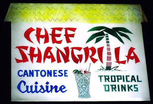
Someone needs to get up on a ladder with a red Sharpie, and put a dash between "Shangri" and "La". As Shangrila, it now rhymes with Magilla Gorilla having a mai tai at Chef Shagrila. |
|
LS

Lake Surfer
Posted
posted
on
Fri, Nov 16, 2007 1:13 AM
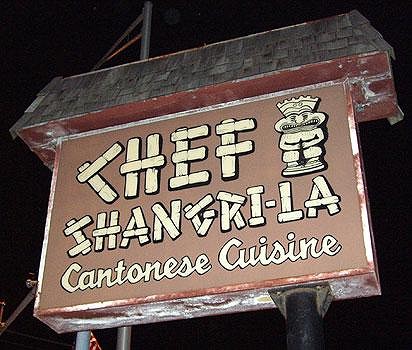
So that's the third sign... Dug this one out of my photo files from Exotica '05
(Though I imagine there's been many, many more before this one. Would be neat to see all the signs through the years gone by!) [ Edited by: Lake Surfer 2007-11-16 01:14 ] |
|
B
BambooLodge
Posted
posted
on
Fri, Nov 16, 2007 3:22 AM
|
|
TM
Tipsy McStagger
Posted
posted
on
Fri, Nov 16, 2007 5:34 AM
..it's weird..even though the sign above the bar is newer, it's always had a sort of vintage quality to it....probably cause they used the same design...i wish they would have done something alittle bit more like this one for the parking lot sign.....maybe if they went with a yellow plexiglass background so that the white background wasn't so stark.....oh well, no one called me up for design consultaion so i guess we'll have to live with it as is....but if that sign comes down in 30 more years and the place is still up and runnin', i'm gonna put my 2 cents in!! LOL [ Edited by: Tipsy McStagger 2007-11-16 05:35 ] |
|
T

tikiyaki
Posted
posted
on
Fri, Nov 16, 2007 8:34 AM
The sign may be worse, but it least it still has a tiki on it. We in the LA area are not so lucky as to STILL have a place like this that time forgot. I mean, a 30 year old tiki restaurant that serves "Cantonese Food" and "tropical drinks". Everything cool here gets decimated and replaced with a frikken Olive Garden or some other lame chain Chef Shangri La looks GREAT ! http://www.critiki.com/cgi-bin/pictures.cgi?loc_id=499 [ Edited by: tikiyaki 2007-11-16 08:36 ] |
|
UJ

Unkle John
Posted
posted
on
Fri, Nov 16, 2007 10:16 AM
As a sign designer/maker I can say this sign is pretty classy. It has great colors and looks awesome lit up. I can tell that the flex-face was painted (shown by the variations of parchment colors), and normally that is a sign no-no because you can see the coats, but for this sign, it looks great! Another positive about the sign is that it tells you What it is and by the "look" if you didn't know anything about south pacific restaurants, you would see that sign and think it was...
TOTAL SHIT! I pray the owner or family member didn't design this (it does happen when they want to save money). However, if the sign shop designed this sign, it must be a cheap place like SignsASAP, FastSigns, or any strip mall dwelling sign shop. They care about profit than the customer. If this sign was designed by a sign shop, I won't do business with them and they should fire the graphic artist. This sign has broken many "sign rules". There is a lot of wasted space, small type style (AND ARCHED FOR NO GOOD REASON), a stereotypical "Asian" front, and horrible colors. This sign smacks the customer in the face with bad taste. It screams "We are cheap b/c we got a cheap sign and we added palm trees so you would think it's tropical food because we don't think our patrons or would be patrons are smart enough to figure that out." What is also annoying is that they tried to get the word "cuisine" in the same type style as the older sign... why not the word "Cantonese"? This sign is an embarrassment for this establishment. They seem to have been around for a long time, they should take pride in that. If I worked close to them I would try my best to get them a deal on a new sign that looked like the older one (if the old panels had been destroyed).
[ Edited by: Unkle John 2007-11-16 10:23 ] |
|
TM
Tipsy McStagger
Posted
posted
on
Fri, Nov 16, 2007 12:04 PM
..i know what ya mean...like you, john, i was a sign maker for a few years out of college so i understand a few things about it as well...if I had had advance knowledge that they intended on changing the sign, i would have definately kept an eye on what they planned on doing and offered whatever help i could, whatever way I could....shit,i would have done it free of charge, just to see something decent lighting the way to those tropical drinks and cantonese food.... [ Edited by: Tipsy McStagger 2007-11-16 12:07 ] |
|
T

tikijackalope
Posted
posted
on
Fri, Nov 16, 2007 5:54 PM
|
|
TM
Tipsy McStagger
Posted
posted
on
Fri, Nov 16, 2007 6:14 PM
they threw the roof away.... |
|
M

moondog426
Posted
posted
on
Sat, Nov 17, 2007 8:57 AM
Upon first look I thought the ''before'' sign was the ''after'' sign. I too am in the sign business and the ''before'' sign looks more pleasing and rich with color. Hard to imagine what the owner was thinking...probably got three bids and took lowest bid....You get what you pay for. |
|
A

aquarj
Posted
posted
on
Sat, Jul 5, 2008 9:34 AM
I'm resigned to the modern rule that all good things must be either destroyed or replaced with something inferior. FWIW, here's my daylight pic of the sign from Exotica 2003 (and here's the post with some other Chef Shangri-La pics).
-Randy |
|
C

Chinarose
Posted
posted
on
Sat, Jul 5, 2008 6:35 PM
It's really sad that they replaced a good looking sign that had a little pizzazz with a generic white sign with ugly clip-art. |


Pages: 1 17 replies