Tiki Central / General Tiki / The Gallery of Regrettable Tiki Paint Jobs
Post #374420 by bigbrotiki on Thu, Apr 17, 2008 8:44 PM
|
B

bigbrotiki
Posted
posted
on
Thu, Apr 17, 2008 8:44 PM
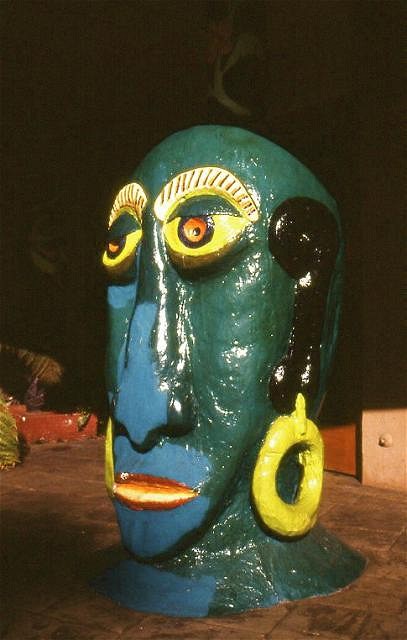
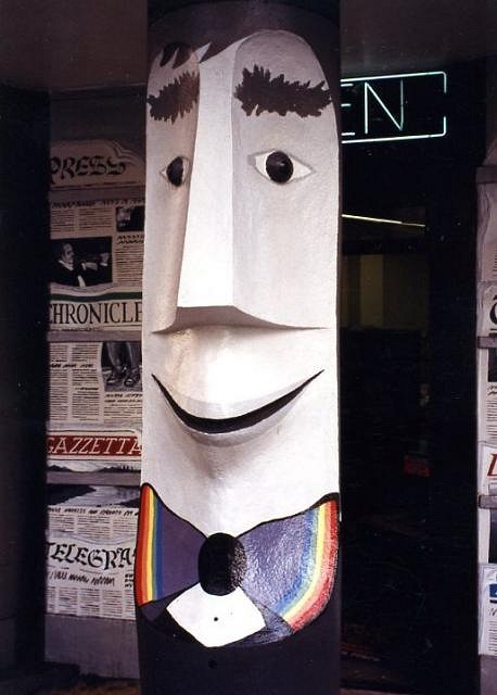
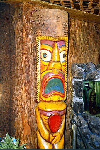
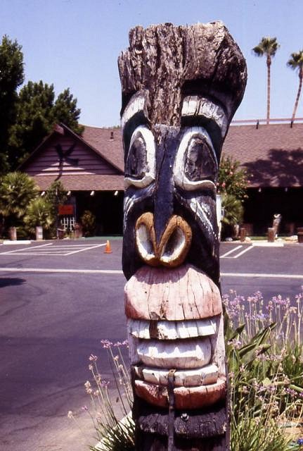
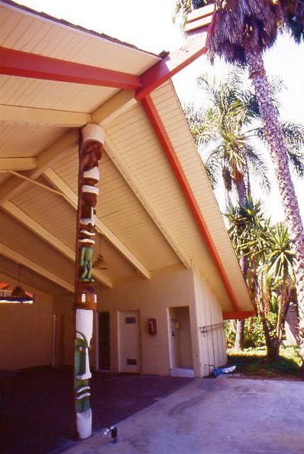
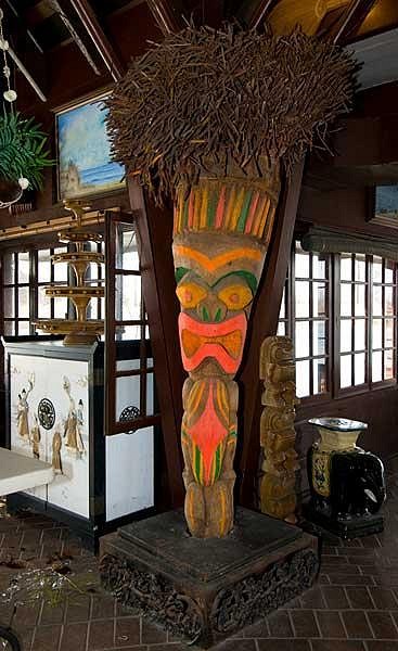
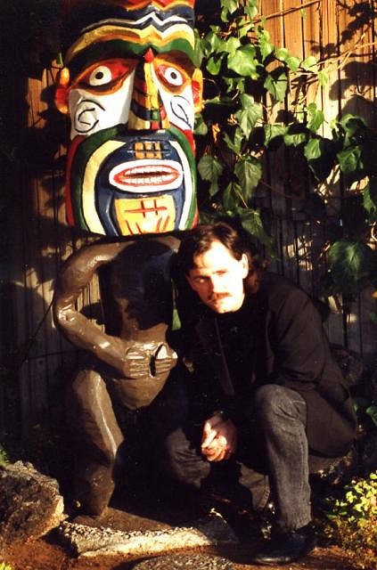
As the promotion of "good taste in Tiki" (not as much of an oxymoron as some people might think) is my constant aim, I wanted to open a thread that makes my point of WHY it is a bad idea to paint Tikis in garish colors very clear, in the simplest manner: By showing examples that speak for themselves. I have pointed out on several occasions that I judge it as a sign of Tiki devolution to paint Tikis garishly, and I will repeat myself here, as this thread is meant to supersede all previous ones, so it can be referred to whenever the question of "Why is bold paint bad?" arises here. Historical causes for slapping paint on Tikis: Practical and psychological causes for slapping paint on Tikis: Noted Polynesian scholar Terrence Barrow, Ph.D., speaks on the mistake of painting Tikis with wrong colors: As our first example I choose a classic icon of Polynesian pop, the famous Mr. Bali Hai:
Green in the face is a bad decision for a restaurant logo, and this abomination was so glaringly offensive that it moved two renowned Tiki artists to volunteer their time and expertise to restore the beloved godhead to its original color scheme. Phew! Another Tiki icon, the incomparable Tiki Bob, also fell victim to the "creativity urge":
Although not as offensive in its color palette, stylistically it was just AS wrong. Luckily, this aesthetic misstep has been corrected by some merciful soul since.
Some folks thought that RED and PINK would add that needed touch to these miniature golf guardians:
The painter of this fine Milan Guanko Tiki at the Royal Hawaiian in Laguna Beach obviously had only three paints available, who knows what the rest of the carving would have looked like if not:
Musing about that is a moot point now anyway, since the whole Tiki has long disappeared since. When all is needed is a simple one tone coat, why would one make such an effort to reach such an unproductive result:
These Tiki posts at the Hanalei Hotel atrium had been brown for over 20 years...for a good reason. This Tiki's expression appears frozen in permanent shock over having been painted "Black Face" style:
Its physical downfall probably followed swiftly after its aesthetic demise (at the Kona Kai Mobile Home Park, Los Angeles). Eli Hedley probably never imagined his Islander Apartments pool hut post being painted in white and green:
And though part of a spectacular recent urban archaeological find, this Tiki is an example that day-glow colors and primitive art do not mix:
And just in case there is any doubt about this issue left among the "Tiki should have no rules" crowd, I say take THAT:
A striking example of the misbegotten Injun War Paint/ Coloring Book free style paint job if I ever saw one. NOTE": This thread shall be reserved for examples of classic mid-century Tikis having been painted over, and is NOT intended for the following: Any stupid joke and obvious "exceptions to the rule" examples will be ignored. Genuine questions about borderline cases and other uncertainties will be addressed in time. Thank you very much. |