Tiki Central / General Tiki
The Gallery of Regrettable Tiki Paint Jobs
|
B

bigbrotiki
Posted
posted
on
Thu, Apr 17, 2008 8:44 PM
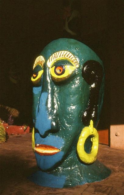
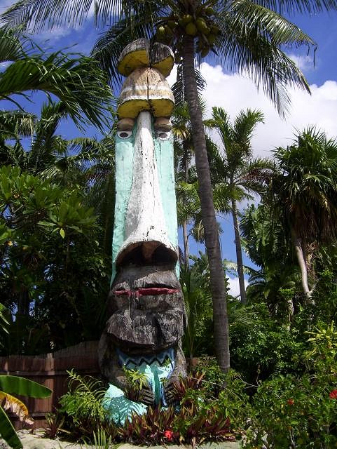
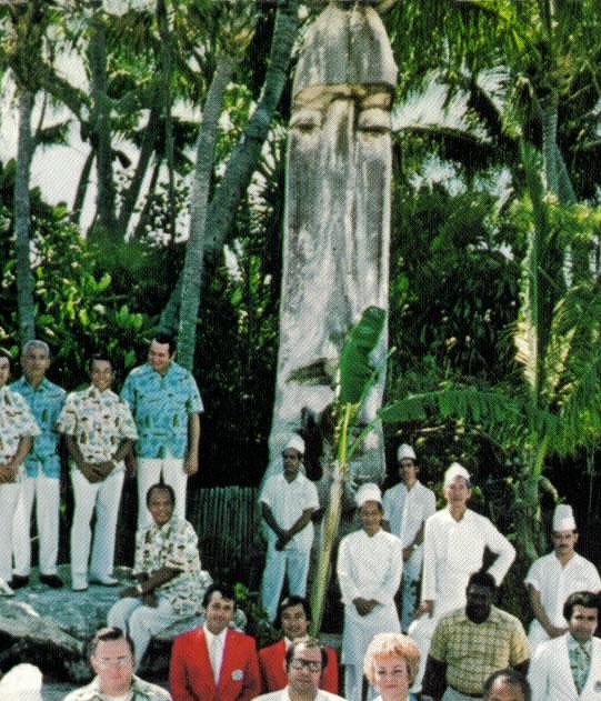
As the promotion of "good taste in Tiki" (not as much of an oxymoron as some people might think) is my constant aim, I wanted to open a thread that makes my point of WHY it is a bad idea to paint Tikis in garish colors very clear, in the simplest manner: By showing examples that speak for themselves. I have pointed out on several occasions that I judge it as a sign of Tiki devolution to paint Tikis garishly, and I will repeat myself here, as this thread is meant to supersede all previous ones, so it can be referred to whenever the question of "Why is bold paint bad?" arises here. Historical causes for slapping paint on Tikis: Practical and psychological causes for slapping paint on Tikis: Noted Polynesian scholar Terrence Barrow, Ph.D., speaks on the mistake of painting Tikis with wrong colors: As our first example I choose a classic icon of Polynesian pop, the famous Mr. Bali Hai:
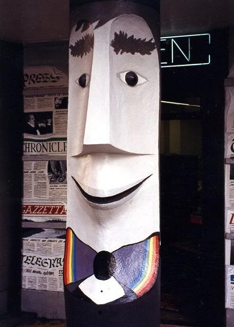
Green in the face is a bad decision for a restaurant logo, and this abomination was so glaringly offensive that it moved two renowned Tiki artists to volunteer their time and expertise to restore the beloved godhead to its original color scheme. Phew! Another Tiki icon, the incomparable Tiki Bob, also fell victim to the "creativity urge":
Although not as offensive in its color palette, stylistically it was just AS wrong. Luckily, this aesthetic misstep has been corrected by some merciful soul since.
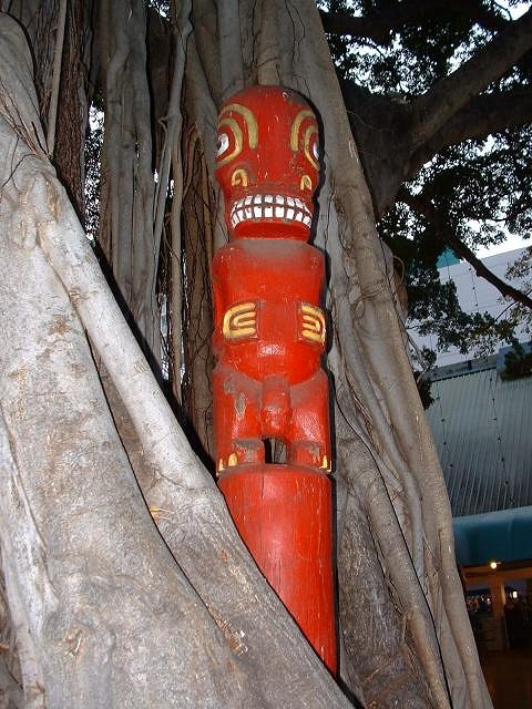
Some folks thought that RED and PINK would add that needed touch to these miniature golf guardians:
The painter of this fine Milan Guanko Tiki at the Royal Hawaiian in Laguna Beach obviously had only three paints available, who knows what the rest of the carving would have looked like if not:
Musing about that is a moot point now anyway, since the whole Tiki has long disappeared since. When all is needed is a simple one tone coat, why would one make such an effort to reach such an unproductive result:
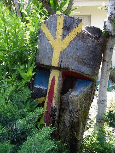
These Tiki posts at the Hanalei Hotel atrium had been brown for over 20 years...for a good reason. This Tiki's expression appears frozen in permanent shock over having been painted "Black Face" style:
Its physical downfall probably followed swiftly after its aesthetic demise (at the Kona Kai Mobile Home Park, Los Angeles). Eli Hedley probably never imagined his Islander Apartments pool hut post being painted in white and green:
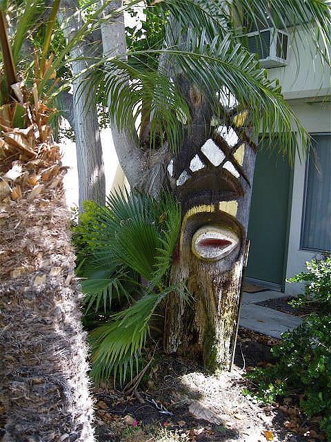
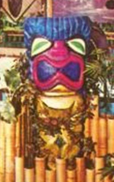
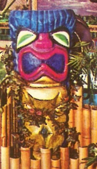
And though part of a spectacular recent urban archaeological find, this Tiki is an example that day-glow colors and primitive art do not mix:
And just in case there is any doubt about this issue left among the "Tiki should have no rules" crowd, I say take THAT:
A striking example of the misbegotten Injun War Paint/ Coloring Book free style paint job if I ever saw one. NOTE": This thread shall be reserved for examples of classic mid-century Tikis having been painted over, and is NOT intended for the following: Any stupid joke and obvious "exceptions to the rule" examples will be ignored. Genuine questions about borderline cases and other uncertainties will be addressed in time. Thank you very much. |
|
T

TikiPhil
Posted
posted
on
Thu, Apr 17, 2008 9:11 PM
Trader vics - International Marketplace - Hawaii
But I do like the colors on the one in the middle :) [ Edited by: TikiPhil 2008-04-17 21:13 ] |
|
P

Polynesiac
Posted
posted
on
Thu, Apr 17, 2008 9:29 PM
My favorite is the Moai fisherman from the former Aku Aku in Cambridge (posted originally by tikisgrl)
The newer creative take on the beautiful Richard Ellis tikis from Sam's Seafood:
most of the tikis in the bar area look like this. I'll just post this one image, but there could be MANY more posted (sorry, I forget who originally posted this and took the picture. Feel free to PM me if you want the credit)
[ Edited by: Polynesiac 2008-04-17 21:32 ] [ Edited by: Polynesiac 2008-04-17 21:34 ] |
|
K

Kaiwaza
Posted
posted
on
Fri, Apr 18, 2008 12:18 AM
While I agree pretty much in principle here, I have to say I do LOVE the day-glo painted tiki. I just recently picked up a $2.99 Bali souvenir at my local Goodwill, some type of sand or some rough material in a long bar, with a 3-D Balinese scene painted in bright day-glo colors, matted on a straw mat & framed. Somehow those colors work on that as well. |
|
B
bigbrotiki
Posted
posted
on
Fri, Apr 18, 2008 7:39 AM
Dayglo does have a small place in Tiki history, yes, but it still does not mean that it ever was a desirable facet of Tiki style. I respect your childhood memories, but bright colors do not belong on Tikis, then and now. |
|
BM

bb moondog
Posted
posted
on
Fri, Apr 18, 2008 8:01 AM
I just realized that these establishments were probably bought or inherited by people who gave NOT A THING for the whole tiki scene and are now probably coming up for resale, People of the tiki community MAY be buying them up and refurbishing them...so there is hope for the whole day glo REMOVAL at least for whatever icons still remain and are not beyond repair |
|
B
bigbrotiki
Posted
posted
on
Fri, Apr 18, 2008 8:28 AM
Not necessarily so. Some of the above places that painted their Tikis were still under the original ownership. Please realize that most of that painting was done with GOOD INTENTIONS. People get tired of a thing, their tastes and perceptions change. People FORGET what it was that they liked about something in the first place. Tiki veterans are no exception. Plus, do not kid yourself to think that all owners necessarily did understand or were aware of Tiki as a style. Often it was the designers and the carvers that were the determining factor in maintaining the stylistic quality of a place. Nowadays there is the added small community of us crazies that are the only ones that give a rats ass about it. :) [ Edited by: bigbrotiki 2008-04-18 08:32 ] |
|
I

ikitnrev
Posted
posted
on
Fri, Apr 18, 2008 8:36 AM
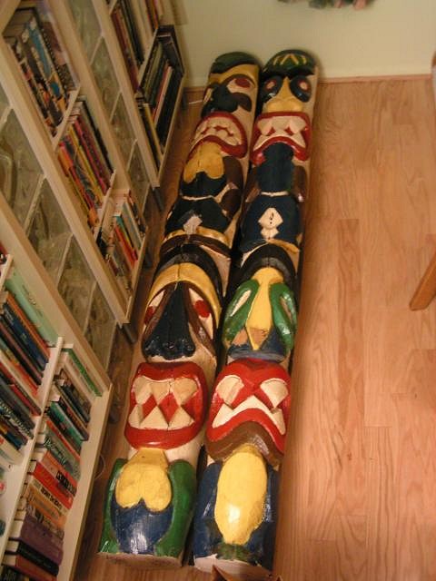
My dilemma: I obtained a pair of 7 foot tiki poles from the former Honolulu Restaurant outside of Washington D.C. When I first visited the Honolulu in 1998, these poles were painted in rather bright primary colors. All of my memories of the Honolulu took place when these poles were painted in these colors. I obtained these poles as a final souvenir of the Honolulu. My question .... Should I keep the bright colors of the tiki poles as they currently exist, and thus preserving the final heritage of the Honolulu? or should I strip the paint, and try to create a more traditional look? I myself am OK with the look of these poles, and am leaning towards keeping them as is, but am curious to hear of other people's opinions. Vern |
|
TM

Tipsy McStagger
Posted
posted
on
Fri, Apr 18, 2008 9:07 AM
strip those suckers!! their original condition is natural stained wood....which would not be in violation of the honolulu heritage....however it would be a violation of your memories.....hmmmmm..choose to keep the memories and the past alive.....or step boldly into the future and give those poles back the look and life they deserve....nay, that they were born with!!! [ Edited by: Tipsy McStagger 2008-04-18 09:07 ] [ Edited by: Tipsy McStagger 2008-04-18 09:08 ] |
|
JT

Jungle Trader
Posted
posted
on
Fri, Apr 18, 2008 9:18 AM
HEY VERN.....strip 'em. |
|
CS

Capt'n Skully
Posted
posted
on
Fri, Apr 18, 2008 9:23 AM
I'll leave this one for Bro Tiki to describe better.. I just posted it to make his hairs stand on end twice! :) Kahiki Witco- under bright, florescent lights: Personally- I don't agree with it exactly, but wouldn't doubt that the painting of tikis seemed ok sitting next to PNG imports being adorned with color. Combine that with the dark lighting in tiki bars (where the bright colors don't show up as much), Orchids of Hawaii schwag (the Party City tiki of the era), North Pacific totems and the 60s psychedelic movement - With all that going on, something's going to get painted when it starts looking aged.. |
|
B
bigbrotiki
Posted
posted
on
Fri, Apr 18, 2008 9:51 AM
They are standin', they are standin'!!! If I could, I would post one of those Ren & Stimpy moments, where first the eyes bug out, than they explode, leaving only empty eye sockets with smoke fizzling from them. That would more aptly describe my reaction. The Papua New Guinea colors certainly do have a place in Tiki Style, as was discussed on TC before, and the discussion should continue here, as I do not postulate that ALL colorization is bad. Basically, they are earthen, washed and muted tones. I do not see any PNG color concepts in the above posted Tikis. |
|
O

Ojaitimo
Posted
posted
on
Fri, Apr 18, 2008 12:15 PM
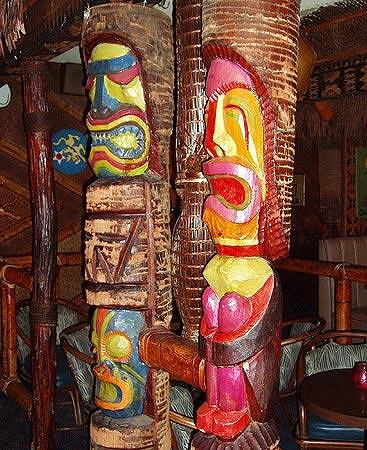
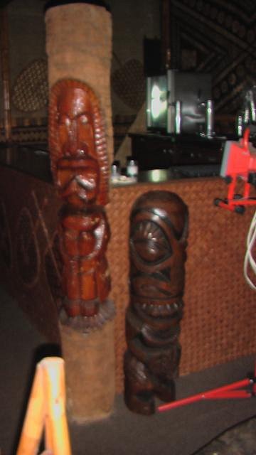
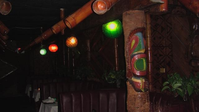
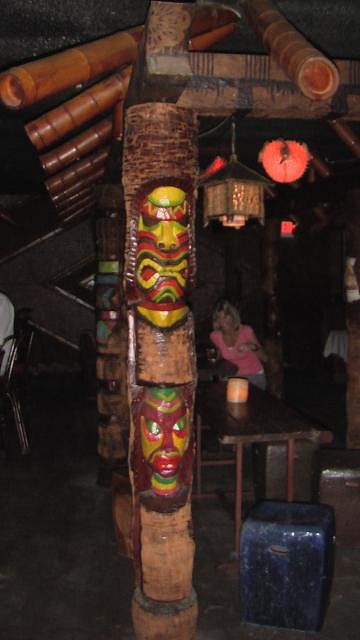
Here is the Tiki in the back banquet room st Sam's Seafood that escaped the paint job in the eighties in the bar. So who carved these originally? Here are the poor Tiki that didn't escape the LSD disco painting party.
|
|
K
Kaiwaza
Posted
posted
on
Fri, Apr 18, 2008 1:02 PM
|
|
P
Polynesiac
Posted
posted
on
Fri, Apr 18, 2008 4:27 PM
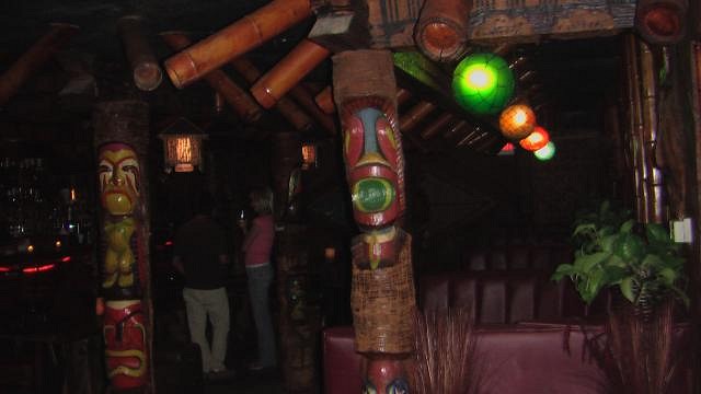
Ojaitmo - Most of the original tikis at sam's seafood were carved by Richard Ellis. HOwever, in this picture:
The tiki on the right was carved by tikidiablo. Vern - I say (as much as I don't like the dayglow effect) leave them as they are. I think if I were in your shoes, I'd have more fond memories with the tikis painted as they are and how you remember them. If I were ever fortunate enough to get a garishly painted tiki from an establishment that I frequented (while it was painted the whole time), I would probably not strip it. edited because I posted the wrong picture [ Edited by: Polynesiac 2008-04-18 16:29 ] |
|
PTD

Psycho Tiki D
Posted
posted
on
Fri, Apr 18, 2008 4:31 PM
[ Edited by: Psycho Tiki D 2008-04-21 14:36 ] |
|
J

JenTiki
Posted
posted
on
Fri, Apr 18, 2008 5:17 PM
|
|
PTD
Psycho Tiki D
Posted
posted
on
Fri, Apr 18, 2008 5:30 PM
[ Edited by: Psycho Tiki D 2008-04-21 14:37 ] |
|
K

Koolau
Posted
posted
on
Sat, Apr 19, 2008 2:29 AM
Is there really any effective way to remove paint from those tiki? Most look to be carved out of palm wood, which is highly porous and probably just soaked up the paint. Maybe all that can be done is to fade the colors to more natural tones. |
|
T

Tamapoutini
Posted
posted
on
Sat, Apr 19, 2008 2:39 AM
Great thread. You are SO right (Terrence & BigBro) - they are SO wrong! my 2c Tama :) |
|
I
ikitnrev
Posted
posted
on
Sat, Apr 19, 2008 11:31 AM
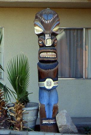
Here is a picture of the two tiki poles I obtained from the former Honolulu Restaurant, before I stood them upright. The flash does make them appear brighter than they were in the restaurant.
I did talk with the Chans, the former owners of the Honolulu. These tiki poles were already painted in these bright colors when they purchased the restaurant in 1978, and were never repainted or retouched from then until the closing in 2004. The poles must have been painted by the original owner/designer, who only ran the Honolulu for 10 months before selling it to the Chans. So I will keep these poles colors as they currently exist. My sentiment is for the Honolulu, the Chans, and my memories of the place, and for this unique case, leaving the bright colors seems to be the best thing to do, especially since I promised them that I would treat them well. I guess someday, I will pass away or transfer ownership of the poles to someone else, and it might be easier for that person to repaint/stain the poles, since they might have no personal memories of the Honolulu itself. By the way, there were two outside poles that were once brightly colored, but then later painted in a single brown color around 1979/80. Sabina is the proud owner of those poles. Vern |
|
B
bigbrotiki
Posted
posted
on
Sat, Apr 19, 2008 11:55 AM
Vern, I think we discussed this before: In my time frame of the history of Tiki culture, 1978 is smack tab in the middle of the "Devolution" phase, so it makes sense that these babies came like that, probably from Orchids of Hawaii, which at that time had fully gone over to the clown color side. So in a sense they are historically correct, and if you have pleasant memories associated with them, it is what it is. :) |
|
MB

Mr&Mrs BPHoptiki
Posted
posted
on
Sat, Apr 19, 2008 2:51 PM
Just my own personal experience and opinions that I am speaking here. I want to reply to this point of view: "we're not talking about Van Gogh or Rembrandt here, tiki art was POP art made for commercial purposes and often only distantly connected to any "real" cultural relevence." This in not my recollection of the Tiki that I experienced during the 60’s. We knew the difference between PoP Art and Tiki, and the two were rarely mixed. There was a keen interest in authenticity and the cultural background of Tiki. Painted tikis, which were extremely rare, were viewed as a commercialized abomination. I understand that for some, especially those younger than myself, memories of garishly painted tikis were their first encounter with what was supposed to be tiki and it left them with a fond impression. All I can say to that, and please don’t take offense, is that what you experienced was unfortunately part of what Sven correctly calls “Tiki devolution.” MrsHoptiki |
|
G

GatorRob
Posted
posted
on
Sat, Apr 19, 2008 3:07 PM
I'm surprised nobody has posted the often-photographed Mai-Kai Barney West yet. (Kern, if you're reading, close your eyes.)
This is the only picture I have of him without the paint job:
[ Edited by: GatorRob 2008-04-19 15:17 ] |
|
B

beadtiki
Posted
posted
on
Sat, Apr 19, 2008 4:10 PM
I think a lot of people associated the Tiki Totems with Native American Totems which WERE highly colored. I'm not surprised as there are some similarities in their appearances - the two Honolulu Tikis of Vern's are a good example. We weren't exactly "hip" to cultural differences in the early part of the 20th century; "mashing" together art from different cultures was pretty common - not to mention the people themselves (e.g. "Orientals"). |
|
IDOT

I dream of tiki
Posted
posted
on
Sat, Apr 19, 2008 10:53 PM
All that unnecessary color. How sad. Makes me want to commit graffiti to put it all bad to muted monotone. (Not that I would. Laws and all) |
|
K
Kaiwaza
Posted
posted
on
Sun, Apr 20, 2008 4:22 PM
I would like to respond/comment on this statement. I'm 46, and have grown up enjoying "tiki" culture. I'm just not sure how I could possibly consider a "movement" or "style" that combined Polynesian artifacts (many bearing no resemblence to any actual diety or personification, some made as trinkets specifically to sell to tourists), monkeys, fezes, animal prints (all unknown in Polynesia), music written & performed nearly completely by Mainland Americans (intentionally having "fun" with Oriental, Polynesian, Latin, African music), drinks with names like "Zombie" and "Missionary Downfall", Caribbean Rum, relocating geographic entities (Bali Hai) as being "culturaly authentic." |
|
A

alohacurrent
Posted
posted
on
Sun, Apr 20, 2008 8:27 PM
Here's a tree-dweller tiki from the international marketplace, Waikiki
|
|
B
bigbrotiki
Posted
posted
on
Sun, Apr 20, 2008 9:50 PM
That is exactly what I have tried (in many people's eyes successfully) to prove and to establish with the "Book of Tiki": Some people get this, others don't. |
|
K
Kaiwaza
Posted
posted
on
Mon, Apr 21, 2008 11:24 AM
Well, this is getting off the thread, but I don't want to be misunderstood. Paradise is a state of mind. [ Edited by: Kaiwaza 2008-04-21 11:26 ] |
|
MB
Mr&Mrs BPHoptiki
Posted
posted
on
Mon, Apr 21, 2008 4:42 PM
Hi Kaiwaza, I’m just saying that “my experience” while it very well may not have been the norm, didn’t include painted tikis. The subject is “Regrettable Tiki Paint Jobs” right?. So I think I wasn’t clear that that’s what I was speaking about. Also, I’m a little bit older than you and the “tiki” that I was originally exposed was much more including of authentic Polynesian culture and didn‘t include things like fezzes and painted tikis. We didn’t even call it tiki back then. I know that your discovery and experience of tikis was somewhat different. It’s all good darlin'. The fantasy part has always existed. MrsHoptiki |
|
B
bigbrotiki
Posted
posted
on
Mon, Apr 21, 2008 9:15 PM
Oh good, now that all the misunderstandings have been cleared up, let's get back to our scheduled program :) Below are two examples of what has been mentioned here earlier, found in situ TODAY on a Tiki apartment expedition with fellow urban archeologist Zulu Magoo:
|
|
TT

Tiki Trav
Posted
posted
on
Mon, Apr 21, 2008 9:18 PM
Wow bigbro, those last two are(were) really nice carvings... |
|
V

virani
Posted
posted
on
Tue, Apr 22, 2008 11:05 AM
So what do you think of those poles, made by the great french carver Bonobo : link Personnaly, I love those.
|
|
B
bigbrotiki
Posted
posted
on
Tue, Apr 22, 2008 1:27 PM
May I recap:
..so please lets keep contempo examples out of this thread. But to answer your question, these are certainly much better than some of the recent Floridian examples posted on TC, mainly because they are monochrome, not clown faces, and they are based on classic Polynesian pop style. I still do not like the green and blue ones. For mugs or graphics sure, but not for carvings. |
|
B
bigbrotiki
Posted
posted
on
Tue, Apr 22, 2008 2:17 PM
I was thinking a little about this statement, and finally the coin dropped, it now makes total sense in the context of the time:
Even to me, just like Kaiwaza, it seemed a little too idealistic at first. But we actually tend to forget the following: A.) Today we, me being in the first row, have realized and demonstrated that mid-century Tiki Style was UN-authentic (in comparison to real Polynesian art), and that we like it BECAUSE of that. And because of its OWN creativity and variety, we can view it as an art form in its own right. We judge it from today's informed and understanding perspective. B.) HOWEVER, back then, the image projected by the Polynesian palaces that harbored these carvings was one of AUTHENTICITY! People BELIEVED! Carving demonstrations were always done with chisels, not with chain saws. Now if back then, the carvings would have been painted garishly, it would have overstretched that fine balance between proprietor and customer united in the unspoken agreement to be gently deceived! THIS is exactly what Ms Hoptiki was getting at. The majority of people took these carvings for authentic, and the loud colors would have destroyed that illusion. This is why some of the California Tiki manufacturers looked down on Witco, because, back in the day, authenticity was the GOAL! Now looking at the evolution of cultural consciousness, by the 70s it had become more commonly realized that the American Tikis were just copies, and so painting them seemed OK in a "why not, they are all in on the joke now" sort of a way. Yet TODAY, the naive starry-eyed romanticism of mid-century Tiki appears much cooler and desirable again than making them OVERTLY fake. Actually, come to think of it, that's what really is a big part of my whole beef with that certain facet of the Tiki revival that is purely self-referentially based on cartoony big tooth Tikis. When current Tiki art contains no traces of the original Polynesian genius, OR of classic mid-century Tiki style, it lacks that intelligent effort of the artist to be an art forger. It is not an homage, has no sense of history, and is thus one-dimensional, un-amusing and falls flat for me. Gee, thinking about this stuff is still fun! :D] [ Edited by: bigbrotiki 2008-04-22 18:49 ] |
|
T
TikiPhil
Posted
posted
on
Tue, Apr 22, 2008 3:47 PM
This beauty was posted by Dustycajun over on the "Polynesian Murals and Dioramas" thread. Its from the Pacific Hut, with locations in Brockton and Burlington Mass: |
|
M

MakeDaMug
Posted
posted
on
Tue, Apr 22, 2008 4:02 PM
Personally, I like them, too. They're tonal - kinda like mugs. The Tiki Bob-esque one though isn't working for me. |
|
T

teaKEY
Posted
posted
on
Tue, Apr 22, 2008 4:22 PM
I love the style of the tonal tikis. Just then they reminded me of these
|
|
B
bigbrotiki
Posted
posted
on
Tue, Apr 22, 2008 4:39 PM
Yes, very nice. But if we would want to discuss the use of color in TODAY'S Tiki art, we would end up with another highly subjective, totally all-over-the-place thread. That is WHY I tried to, and had high hopes for, keeping this particular thread limited to pictures of classic, vintage Tikis that have been defaced by loud paint jobs ....as a sort of clear and simple visual statement that a majority here would understand and could agree on. Apparently, that is hard to do. [ Edited by: bigbrotiki 2008-04-22 16:40 ] |
|
D

dibroc
Posted
posted
on
Tue, Apr 22, 2008 5:03 PM
Ok I am not trying to show disrespect to bigbrotiki's thread, speak for anyone else, nor start up anything here. I find this thread interesting but I have not found anything to add as of yet. With that being said, |
|
D

Dustycajun
Posted
posted
on
Tue, Apr 22, 2008 5:12 PM
Here is a better picture of the Tiki paint job from the Pacific Hut in Mass. They only chose to paint the face and left the rest intact.
The sad part about this one is that everything else in the restaurant was left in it's original form without the garish colors. |
|
B
bigbrotiki
Posted
posted
on
Tue, Apr 22, 2008 5:40 PM
Here is the difference: I specifically described in the very first post of this thread WHAT it was that this post was NOT about. After something being clearly spelled out like that, even I would not post something that would run counter to this request (if I ever did, I began my reply with an apology, to show that I was doing it for a reason). The problem is that nowadays a lot of people read over posts HASTILY, and do not fully take in all that is said. That not only leads to misunderstandings (mea culpa here), but to simply posting things mistakenly. Holden didn't read the text, maybe Virani didn't either. So I reiterate. And I have gone over to type some key text words in ANNOYING CAPITALS :) , in the hopes that my text will be more fully assimilated. I know I am prone to post what could be called "off topic" sometimes, but I feel that this board would become very dry and boring if all cross-referencing and contextualization with other subject matters that come to mind would be totally omitted. If I would have not used my ability to free associate subject matters in my books, they would have ended up as stodgy collectors books. Teakeys post is a great example of that: He saw those French Tikis and was reminded of Al's. Wonderful! ....IF I had not clearly stated that such a visual would be misplaced here. |
|
MB
Mr&Mrs BPHoptiki
Posted
posted
on
Tue, Apr 22, 2008 6:27 PM
I sincerely apologize for my part in getting this thread off topic. Please, do continue. MrsHoptiki |
|
B
bigbrotiki
Posted
posted
on
Tue, Apr 22, 2008 6:39 PM
But you didn't! Your post and the resulting discussion with Kaiwaza made me re-trace my steps, reconsider my reaction, and eventually led me to a new insight! Thank you! It's those other hosers that are still fast asleep on their respective continents, yet unaware of what they have wrought here! :wink: [ Edited by: bigbrotiki 2008-04-22 18:53 ] |
|
S

SilverLine
Posted
posted
on
Tue, Apr 22, 2008 7:46 PM
My mistake. The tiki had posted here doesn't really fit the theme of this thread. [ Edited by: SilverLine 2008-04-22 19:50 ] |
|
B
bigbrotiki
Posted
posted
on
Tue, Apr 22, 2008 7:55 PM
That brings to mind this previously posted Marquesan Tiki IN JEANS, at the Tropics Indio.
|
|
B
bigbrotiki
Posted
posted
on
Tue, Apr 22, 2008 7:58 PM
...but but...WHY? I thought it was a vintage Marquesan lawn Tiki that had been mistakenly overpainted "black face" style, no? [ Edited by: bigbrotiki 2008-04-22 19:59 ] |