Tiki Central / Other Crafts / Paul Day Clemens' Tiki Art
Post #407649 by KreepyTiki on Sat, Sep 13, 2008 1:04 AM
|
K

KreepyTiki
Posted
posted
on
Sat, Sep 13, 2008 1:04 AM
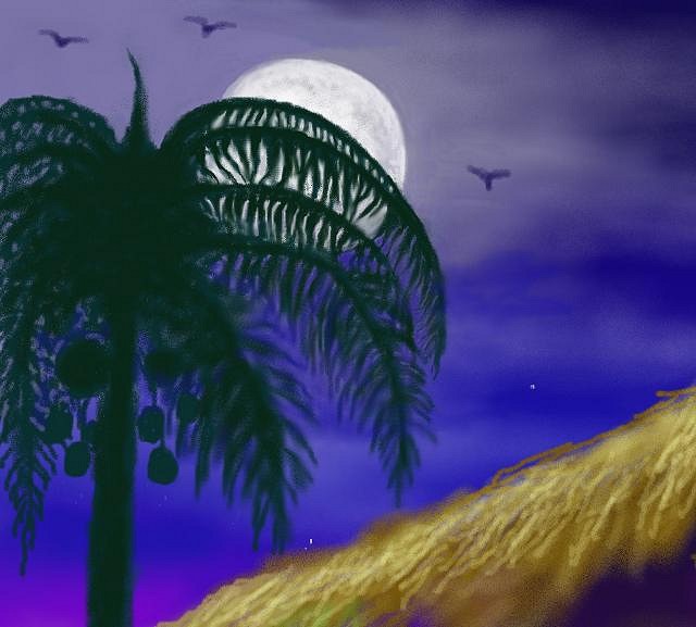
Well, Tiki Trav, you certainly have given me a lot to think about, and I am appreciative of your constructive criticism. As to the clash of stylistic elements, I certainly won't argue that point with you because your observations have merit. Most of my figures are scanned in from drawings I've done, which then have color added in PaintShop Pro (the only program I use -- I don't even have Photoshop). But all of the color work, shadows, and light reflections on the skin are done exclusively in PaintShop Pro with a mouse. Then, as you correctly observed, the tikis and botanical elements were done exclusively in PaintShop from beginning to end. And I agree that some of the tikis and botanical details do have a rougher, less finessed, more simplistic quality. And, in those instances, I've also been bothered by the inconsistency. And, for that reason, I consider my best pieces to be "Wild Thing", in which the overall feeling I wanted (and, I think, achieved) was of a heightened, stylized "magical realism" somewhat akin to some of the work of Frida Kahlo. And in that piece I think the cat-girl is commensurate with the background and other details around her. For example, here's a detail of one of the flowers in "Wild Thing"...
Now, this comes from a rather small area of the painting, yet I approached it and, I think, executed it, with a fair amount of care and detail -- not just quick, haphazard strokes of the mouse. I believe I "painted" it as much as I did the cat-girl's anatomy and facial details. Yet, with an element like the erupting volcano, I went for a deliberately stylized representation, for which purpose I intentionally avoided trying to replicate an actual volcanic eruption. And, as far as the tiki in that painting, it also has a semi "abstract" quality in terms of use of paint-texture and color that was an entirely conscious choice. In other words, I deliberately avoided going in and adding all the wood-grain and other naturalistic detail, because I didn't want something photographic looking. In my painting "After Hours", I also took a lot of time and care with each of the four tikis, and am quite pleased with them. For, while the tikis in a few of my paintings are, I think, guilty to some extent, of the "Etch-A-Sketch" charge, the ones in "After Hours" are, I feel, exceptions to that. As are the botanical details, I think...
I really don't see any evident lack of care or glaring absence of realistic detail there. The only thing that did escape me was some finishing detail work along the edge of the thatched roof where some errant mouse lines are, indeed, apparent. I will admit I didn't give the flowers in the girl's lei or the one in her hair the full amount of attention-to-detail that I might have, but that's because, as small as they are, I really didn't think it necessary. And her body and face are somewhat stylized as well, with a level of detail deliberately left out -- i.e. impressionistic. And in that painting it seems to me that the girl AND her environment are all symbiotic. So, when it comes to the appearance of conflicting techniques in my work, sometimes that does arise from a certain lack of care or expertise with the computer medium, and sometimes it was a matter of deliberate choice -- experimenting a bit. We're basically talking about stylistic choices here, after all. And a lot of that, by its very nature, is basically subjective. Finally, in my most recent painting, "Lickatiki", as in "After Hours" before it, I think all the elements -- the girl(s), floral details, and the tiki -- are really all of a piece and don't at all seem to come from different technical approaches or programs. There's really nothing major I feel I would change or do differently with that. Whereas, some of what you said I think DOES apply to CERTAIN aspects of "Idol Worship","Island Enchantment", and "Afterglow". And, re. that latter piece, for example -- the big rootball tiki with the flames in its mouth has never completely pleased me, though I like it more since I toned down the garish colors and the overall brightness. Still, what you said about the obvious mouse-strokes applies, no doubt, to the rootball tiki's "hair" -- it WAS done using quick swirling lines of the mouse in various colors. And, frankly, I'm not ABOUT to take the time required to make each separate root-strand a finished, botanically accurate representation of reality. Because I really don't think it's necessary. The IMPRESSION is that of a chaotic mass of roots catching some of the colored light from both the torches and the brasier of greenish-blue fire. Anyway, Trav, I do appreciate the time you took to express your thoughts in careful detail, and wanted to reply in the same considered, detailed vein. Cheers & Mahalos :drink: [ Edited by: KreepyTiki 2008-09-13 10:04 ] [ Edited by: KreepyTiki 2009-05-06 11:25 ] |