Tiki Central / Other Crafts
Paul Day Clemens' Tiki Art
Pages: 1 39 replies
|
K

KreepyTiki
Posted
posted
on
Tue, Sep 2, 2008 3:09 PM
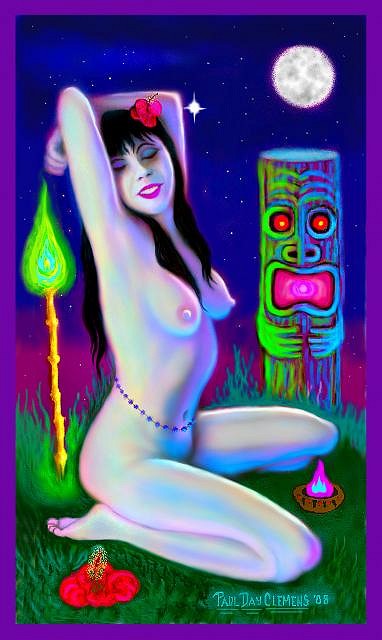
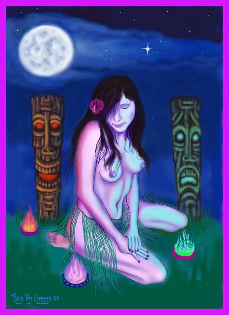
NOTE: I would like to point out that this is NOT the work of the "KreepyTiki" company in Florida. Apparently, my username has caused a degree of confusion, for which I apologise. But when I chose the name I had no idea there was another KreepyTiki out there! I'm considering switching my TC handle to "Castaway Clemens" but am uncertain about the method and/or feasibility of doing it. Aloha all! Well, though I've been drawing, painting and sculpting all my life -- and though I grew up in the first Golden Age of Tiki -- this is the first time I've attempted a tiki theme in my own work. And, hence, this is the first time I've posted any of my artwork on TC. And I decided to keep the moniker I've always used on my work -- my actual full name: Paul Day Clemens. My very favorite art subject has always been the female nude, and that seems to fit in naturally (so to speak!) with tiki. So I decided to finally combine two of my favorite subjects and I feel excited by the results. These are all digital pieces, painted entirely with a mouse, as it gives me so much flexibility and wiggle room re making changes along the way. But I always start with a black & white pencil sketch of whatever wahine (or other female form) will appear in the painting, and then I scan it into my PC and use the drawing as a starting point. So, here are my first three tiki-themed pieces, in the order I did them: First up is "Idol Worship"...
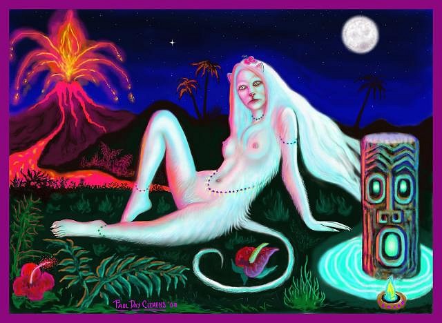
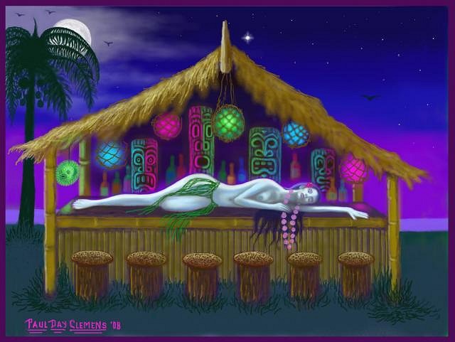
Then comes "Wild Thing"...
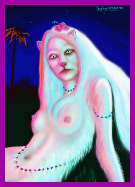
And a detail of same...
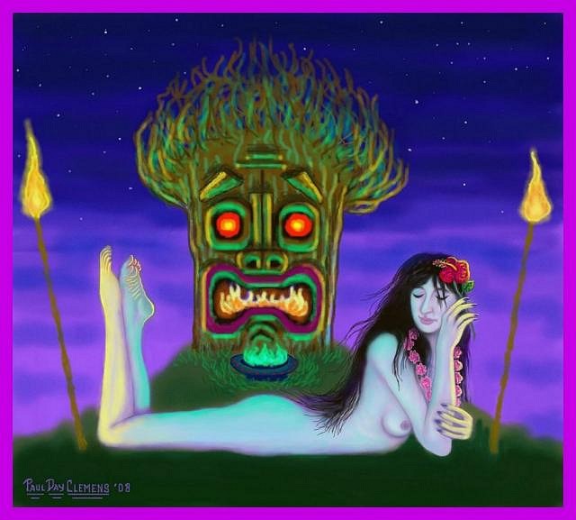
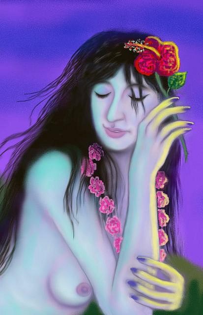
And, finally, "Afterglow"...
Well that's it for now, but I've got a lot more in the hopper. So lemme know whatcha think! These are all quite large image files, by the way -- for example, "Wild Thing" could easily support being movie-poster sized or larger -- so I might include more details of sections of the paintings in future posts so you can get a better idea of the various elements in the pieces. Cheers & Mahalos! :drink: :tiki: [ Edited by: KreepyTiki 2008-09-02 17:21 ] [ Edited by: KreepyTiki 2008-09-02 17:40 ] [ Edited by: KreepyTiki 2008-09-03 01:02 ] [ Edited by: KreepyTiki 2008-09-04 17:15 ] [ Edited by: KreepyTiki 2008-09-10 08:18 ] |
|
TSA

Tiki Shark Art
Posted
posted
on
Tue, Sep 2, 2008 3:25 PM
Brilliant! I was, believe it or not, just sketching a hybred cat/woman for a future painting. You bet me to it! I think there is an interesting "exotica" link to such fantastic creatures like this. Well done! |
|
K
KreepyTiki
Posted
posted
on
Tue, Sep 2, 2008 3:39 PM
Thanks Tiki Shark! Much appreciated, especially as I'm a big fan of your work! I like the magical qualities you evoke with reflected light and the feeling of mystery in your pieces. I think we have that in common. And, speaking of things in common, that's pretty wild (pun intended) re. your also working on a hybrid cat/woman! I'll be eager to see your version. Believe it or not, mine actually came to me in a dream. I don't know what it says about me, but she and I indulged in some hanky-panky on a tropical beach! (I'll manage to refrain from a crude and rather obvious joke at this point!) Anyway, thanks for the props -- and for being the first to post a response! |
|
T
teaKEY
Posted
posted
on
Tue, Sep 2, 2008 4:28 PM
cool, but that last one, if you look fast, looks like her head is in her hand. Like its over too far. |
|
K
KreepyTiki
Posted
posted
on
Tue, Sep 2, 2008 5:06 PM
Thanks for the tip -- and for noticing that! It's because of the line of her hair which does create that illusion if you don't look closely. When the pic is seen larger I don't think it'd give that impression. But I'll be sure to make that alteration nonetheless. |
|
TT

Tiki Trav
Posted
posted
on
Tue, Sep 2, 2008 8:39 PM
[ Edited by: Tiki Trav 2008-09-02 20:39 ] |
|
K
KreepyTiki
Posted
posted
on
Wed, Sep 3, 2008 12:55 AM
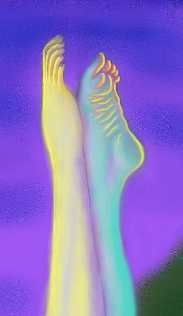
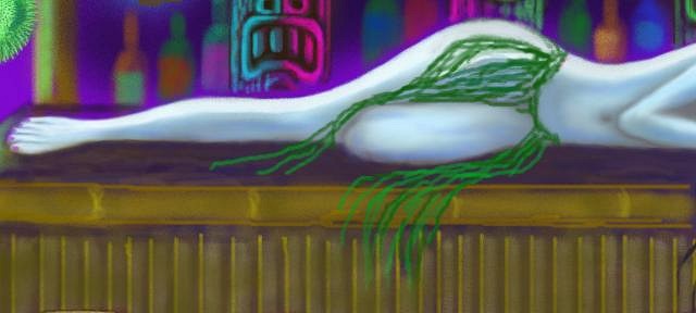
Here's a couple details of "Afterglow" (with the alteration made to her hair and neck area)...
[ Edited by: KreepyTiki 2008-09-04 16:52 ] |
|
T

TikiLaLe
Posted
posted
on
Wed, Sep 3, 2008 10:47 AM
Oh my, the nudity. Do you think this is HBO? |
|
K
KreepyTiki
Posted
posted
on
Thu, Sep 4, 2008 1:54 AM
I would call this "tasteful nudity", to be honest. I mean, it's certainly not pornographic. Have you ever seen the black velvets of Edgar Leeteg and how many nude or bare-breasted wahines are in THOSE paintings? (Or how much nudity appears in Michelangelo's work, for that matter? And some of THAT was commissioned by the Vatican! lol) Anyway, I have seen TONS of bare breasts and nudity in the art posted on Tiki Central, so I really don't think I'm violating any rules or standards here. Besides, nudity of this type appears in tiki bars all over the place. And in Europe no one would even blink at this. |
|
K
KreepyTiki
Posted
posted
on
Thu, Sep 4, 2008 3:48 AM
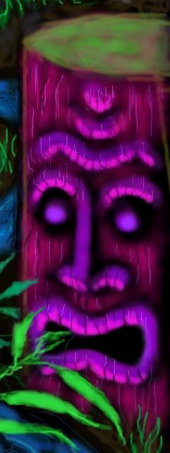
Here's my newest piece -- "Island Enchantment"...
And a detail...
Cheers & Mahalo :drink: :tiki: [ Edited by: KreepyTiki 2008-09-04 04:10 ] [ Edited by: KreepyTiki 2008-09-04 04:23 ] |
|
K
KreepyTiki
Posted
posted
on
Thu, Sep 4, 2008 4:47 PM
Okay, here's my newest one -- Hope ya like it! It's called "After Hours"...
Man -- I sure wish these images could display LARGER! But, since they can't, here's some details...
Cheers! :drink: |
|
H

Howland
Posted
posted
on
Thu, Sep 4, 2008 8:37 PM
Wow! You are MULTI-talented, my friend. They have a sleepy, dreamy look to them while at the same time they have a subdued brightness (oxymoron?) coupled (or tripled) with the excitement that tasteful erotica brings to some of us savages. Ryaaaaar (cat noise). You said you're using your mouse. You should get a graphics tablet with a stylus. I use mine daily, although not often in the painterly manner. It makes a huge difference though and you would really dig it--very close to the real thing as far as drawing/painting go. What program are you using? Photoshop, Painter, Paintshop? Cheers, http://www.myspace.com/bhowland [ Edited by: howland 2008-09-04 21:08 ] |
|
K

Kewlava
Posted
posted
on
Thu, Sep 4, 2008 8:52 PM
Wonderful exotic, blacklight-dreamland quality! Kelly |
|
K
KreepyTiki
Posted
posted
on
Fri, Sep 5, 2008 2:45 AM
Hey there, Howland and Kewlava -- I am humbled by and deeply appreciative of your generous and evocative words! It's very gratifying when one's private visions made public connect with others in a similar way as to one's own "Theater of the Mind"! What else can I say guys, except major mahalos to you both (oh-so-talented that you yourselves are!) for the kudos and encouragement! And as for prints, I do indeed tend to make those available in future, but it'll have to wait a bit. (Partly because I need to do some research as to the best and most cost-effective means to approach that in these rather tight times -- i.e., lithos and giclees may also have to wait a bit!) Double Cheers! :drink: :drink: |
|
K
KreepyTiki
Posted
posted
on
Sat, Sep 6, 2008 12:54 PM
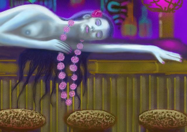
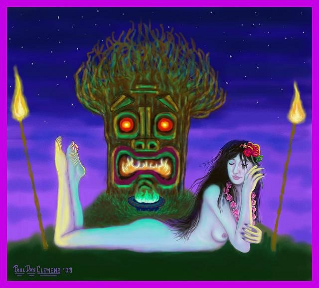
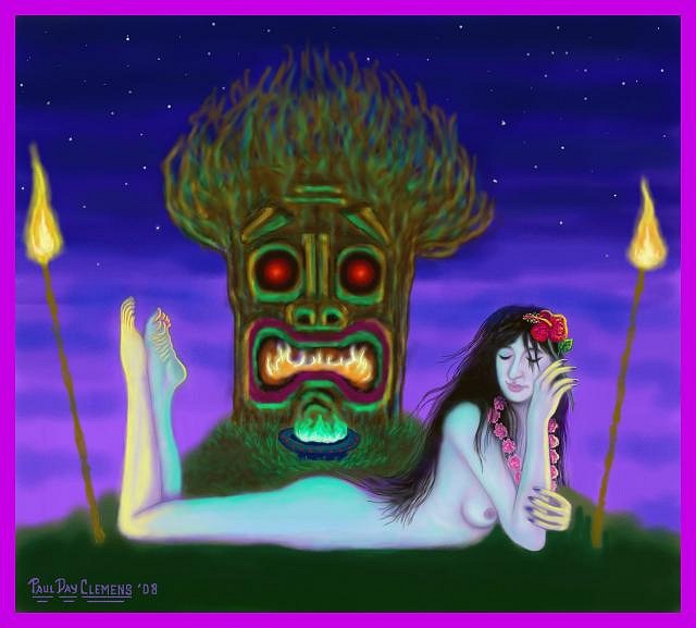
First of all, Howland, I realized I didn't answer your question re. what program I use. The answer is Paintshop Pro Version 7, which I LOVE because it seems intuitively designed for ARTISTS, unlike Photoshop which, though a superb tool for a lot of work, just doesn't compare, for me, with the way tools and palettes are arranged for easy access in Paintshop. And I loyally STICK with version 7 (the "Anniversary Edition") which I MUCH prefer to the more recent incarnations which have been (sadly) made much more like Photoshop. Also, re. the drawing tablet... I have actually tried it out and, for whatever reason, still prefer my trusty ol' mouse. Perhaps because I got SO used to using it! (Well, whatever works for ya, right?) And, finally, something had been bothering me re. my piece "Afterglow". And then I realized what it was... The big, scary rootball tiki behind the wahine was just TOO damn bright and colorful. Almost garish, really, which I felt detracted both from the girl and from the overall mood of the piece. SO -- I decided to revise it and darkened the wood way down, changed to red in the eyes to a deeper hue, and the same with the purple on the lips, etc. And I'm much happier with it now. Though the tiki may STILL be too colorful. But I'm okay enough with it for now that it ain't botherin' me the way it was. So here's the new, somewhat less colorful incarnation of "Afterglow"...
Cheers & Mahalos! :drink: :tiki: Castaway Clemens |
|
ETG

Enchanted Tiki Guy
Posted
posted
on
Sat, Sep 6, 2008 3:39 PM
Paul, these paintings are just breathtaking! I love the color schemes you used as well! Excellent my friend! |
|
EIE

Easter Island Elvis
Posted
posted
on
Mon, Sep 8, 2008 12:54 PM
Paul, those pieces are great! That After Hours one is my favorite. I really like the way you use the bright/neon colors. Great job! |
|
K
KreepyTiki
Posted
posted
on
Mon, Sep 8, 2008 2:04 PM
Thanks for all the kind words and encouragement! (The fragile egos of us artists need that once in a while to keep a goin'! :lol:) And mahalos for takin' a peek! Cheers! :drink: Castaway Clemens |
|
K
KreepyTiki
Posted
posted
on
Tue, Sep 9, 2008 2:16 AM
Regarding prints of my work... I've been experimenting. And while I can't yet afford to do lithos or giclees, I've been getting surprisingly good results with first doing a CMYK conversion on Photoshop and then doing a high-end laser print on glossy card stock. I think folks should be pretty okay with that. And, of course, I'll charge accordingly -- i.e., NOT what a litho or giclee would bring. Cheers! :drink: |
|
K
KreepyTiki
Posted
posted
on
Tue, Sep 9, 2008 2:18 AM
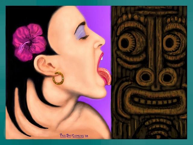
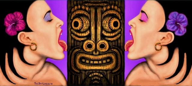
Okay -- here's my new one -- I call it "Lickatiki"...
...'cause it takes a lickin' and keeps on tikin'! (Sorry! :roll:) Cheers! :drink: :tiki: [ Edited by: KreepyTiki 2008-09-09 08:42 ] [ Edited by: KreepyTiki 2008-09-09 14:01 ] |
|
M

MadDogMike
Posted
posted
on
Tue, Sep 9, 2008 7:36 AM
Lickatiki! Have mercy!!! I need a cold shower :blush: I play with graphics a bit (nothing like this) and I too prefer Paintshop Pro (I think I have version 5 or 6), much better than Photo Shop. I'm sure you know, but the reason that the new versions of Paintshop are jacked up is because they sold out to Corel :( |
|
JC

Jeff Central
Posted
posted
on
Tue, Sep 9, 2008 7:49 AM
Great stuff Paul!! Keep up the good work. I think I need a cold shower too! :wink: Cheers and Mahalo, |
|
K
KreepyTiki
Posted
posted
on
Tue, Sep 9, 2008 10:20 AM
Thanks, guys! And now I think I'll go and jump in a cold shower MYSELF before thrusting myself into my next piece... Uhhh, errr, what I MEANT to say was... Oh, forget I even POSTED this! :wink: Cheers! :drink: |
|
TSA
Tiki Shark Art
Posted
posted
on
Tue, Sep 9, 2008 8:23 PM
KREEPYTIKI~ |
|
K
KreepyTiki
Posted
posted
on
Wed, Sep 10, 2008 8:36 AM
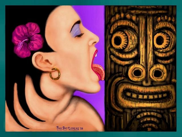
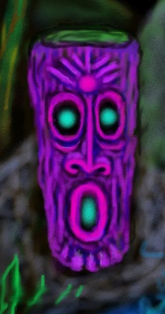
Thanks for your post, Tiki Shark! VERY appreciated! And here's a revised version of "Lickatiki" in which I brought out the features of my tiki a lot more and made a few other barely noticeable alterations as well.
Some friends and I are going to be using this image on some business cards for a project we have in development, and the original tiki just doesn't read well when it's reduced down to that small a size. What do YOU folks think? I'm kinda split on which version I like best. |
|
M
MadDogMike
Posted
posted
on
Wed, Sep 10, 2008 9:31 AM
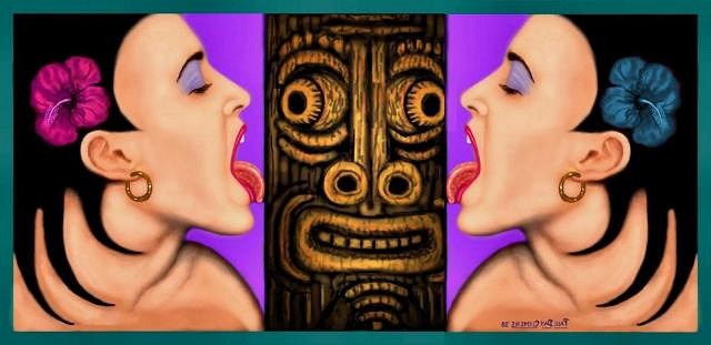
I like the highlighted tiki better. The only way it could get any better now was if she was twins!!! :o
|
|
JC
Jeff Central
Posted
posted
on
Wed, Sep 10, 2008 10:10 AM
Now there's a business card!!!!!! :D Cheers and Mahalo, |
|
K
KreepyTiki
Posted
posted
on
Wed, Sep 10, 2008 12:02 PM
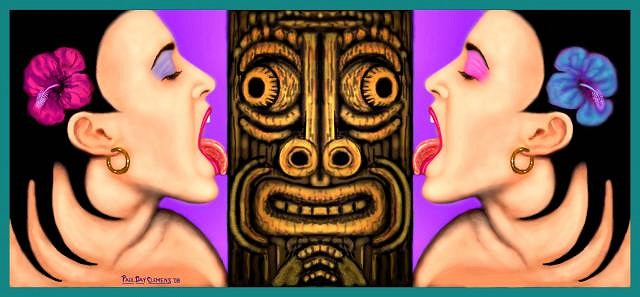
Hey MadDog! Far out! Talk about a "double-header"! Weirdly, I've used that mirror technique before on a few of my other figure and head-study pieces, but hadn't thought of doing it with this one. Anyway, your "twin" idea is pretty damn koolamundo! And so here's my own, further developed version...
And if you don't mind, I'd like to "appropriate" the concept for possible use in my upcoming project (which I can't talk about just yet). After all, the original artwork IS mine! :lol: Also, after some consideration, I've come to agree with you about the highlighted version --the other one just gets too overshadowed by the girl's half of the painting. Cheers and Mahalos! :drink: :tiki: Castaway Clemens |
|
TT
Tiki Trav
Posted
posted
on
Wed, Sep 10, 2008 12:14 PM
|
|
M
MadDogMike
Posted
posted
on
Wed, Sep 10, 2008 12:17 PM
By all means :). Your refined version is much better than my 5 minute massacre of your artwork |
|
K
KreepyTiki
Posted
posted
on
Wed, Sep 10, 2008 12:58 PM
Nonsense, MadDog! What you did was in NO way a massacre! And thanks for not minding me stealing your own "appropriation"! I think it might be a great poster concept as well as a nifty business card! And here's a further revision, because I still wasn't pleased with the twins' flower. Now I'm happy with it.
Double Cheers!! :drink: :drink: [ Edited by: KreepyTiki 2009-05-06 11:16 ] |
|
M
MadDogMike
Posted
posted
on
Wed, Sep 10, 2008 4:52 PM
:) I like the mirrored eyeshadow/flower colors [ Edited by: MadDogMike 2008-09-10 17:00 ] |
|
TT
Tiki Trav
Posted
posted
on
Fri, Sep 12, 2008 3:38 PM
After much thought, I would like to offer some criticism.. There is something bugging me about your work and I really had to think to figure out what it was (yes it hurt)... There appears to be almost 2 styles in use which clash, The female figures are reasonably finished/polished/semi-realistic and show a degree of experience, thought and a proficiency in the medium used, where the tikis and flowers etc have a naive and slap-happy appearance, almost like the girls were created in Photoshop and the rest in Microsoft Paint. You can easily tell that a lot of time was taken on the figures to make the color transitions/blends smooth and appealing, The argument could be made that the "simpler style" parts are done this way to enhance the foreground/predominant area of the composition however with the flowers on the hair and leis this would suggest an awkward confusing layering which I doubt is the case. I encourage you to visually research the tiki and botany aspects further and sincerely look forward to watching your skills grow, I know you are familiar with Brad Parker's (tikishark) work and you can certainly learn from his consistency in spacial, tonal, and third dimensionality. Let's see you step it up! |
|
TT
Tiki Trav
Posted
posted
on
Fri, Sep 12, 2008 10:30 PM
[ Edited by: tiki trav 2008-09-13 01:45 ] |
|
K
KreepyTiki
Posted
posted
on
Sat, Sep 13, 2008 1:04 AM
Well, Tiki Trav, you certainly have given me a lot to think about, and I am appreciative of your constructive criticism. As to the clash of stylistic elements, I certainly won't argue that point with you because your observations have merit. Most of my figures are scanned in from drawings I've done, which then have color added in PaintShop Pro (the only program I use -- I don't even have Photoshop). But all of the color work, shadows, and light reflections on the skin are done exclusively in PaintShop Pro with a mouse. Then, as you correctly observed, the tikis and botanical elements were done exclusively in PaintShop from beginning to end. And I agree that some of the tikis and botanical details do have a rougher, less finessed, more simplistic quality. And, in those instances, I've also been bothered by the inconsistency. And, for that reason, I consider my best pieces to be "Wild Thing", in which the overall feeling I wanted (and, I think, achieved) was of a heightened, stylized "magical realism" somewhat akin to some of the work of Frida Kahlo. And in that piece I think the cat-girl is commensurate with the background and other details around her. For example, here's a detail of one of the flowers in "Wild Thing"...
Now, this comes from a rather small area of the painting, yet I approached it and, I think, executed it, with a fair amount of care and detail -- not just quick, haphazard strokes of the mouse. I believe I "painted" it as much as I did the cat-girl's anatomy and facial details. Yet, with an element like the erupting volcano, I went for a deliberately stylized representation, for which purpose I intentionally avoided trying to replicate an actual volcanic eruption. And, as far as the tiki in that painting, it also has a semi "abstract" quality in terms of use of paint-texture and color that was an entirely conscious choice. In other words, I deliberately avoided going in and adding all the wood-grain and other naturalistic detail, because I didn't want something photographic looking. In my painting "After Hours", I also took a lot of time and care with each of the four tikis, and am quite pleased with them. For, while the tikis in a few of my paintings are, I think, guilty to some extent, of the "Etch-A-Sketch" charge, the ones in "After Hours" are, I feel, exceptions to that. As are the botanical details, I think...
I really don't see any evident lack of care or glaring absence of realistic detail there. The only thing that did escape me was some finishing detail work along the edge of the thatched roof where some errant mouse lines are, indeed, apparent. I will admit I didn't give the flowers in the girl's lei or the one in her hair the full amount of attention-to-detail that I might have, but that's because, as small as they are, I really didn't think it necessary. And her body and face are somewhat stylized as well, with a level of detail deliberately left out -- i.e. impressionistic. And in that painting it seems to me that the girl AND her environment are all symbiotic. So, when it comes to the appearance of conflicting techniques in my work, sometimes that does arise from a certain lack of care or expertise with the computer medium, and sometimes it was a matter of deliberate choice -- experimenting a bit. We're basically talking about stylistic choices here, after all. And a lot of that, by its very nature, is basically subjective. Finally, in my most recent painting, "Lickatiki", as in "After Hours" before it, I think all the elements -- the girl(s), floral details, and the tiki -- are really all of a piece and don't at all seem to come from different technical approaches or programs. There's really nothing major I feel I would change or do differently with that. Whereas, some of what you said I think DOES apply to CERTAIN aspects of "Idol Worship","Island Enchantment", and "Afterglow". And, re. that latter piece, for example -- the big rootball tiki with the flames in its mouth has never completely pleased me, though I like it more since I toned down the garish colors and the overall brightness. Still, what you said about the obvious mouse-strokes applies, no doubt, to the rootball tiki's "hair" -- it WAS done using quick swirling lines of the mouse in various colors. And, frankly, I'm not ABOUT to take the time required to make each separate root-strand a finished, botanically accurate representation of reality. Because I really don't think it's necessary. The IMPRESSION is that of a chaotic mass of roots catching some of the colored light from both the torches and the brasier of greenish-blue fire. Anyway, Trav, I do appreciate the time you took to express your thoughts in careful detail, and wanted to reply in the same considered, detailed vein. Cheers & Mahalos :drink: [ Edited by: KreepyTiki 2008-09-13 10:04 ] [ Edited by: KreepyTiki 2009-05-06 11:25 ] |
|
TT
Tiki Trav
Posted
posted
on
Sat, Sep 13, 2008 1:58 AM
Wow you took that well! (I deleted my pre-defense-from-the-nicey-nicey-crowd after reading your reply) Regards |
|
K
KreepyTiki
Posted
posted
on
Sat, Sep 13, 2008 11:35 AM
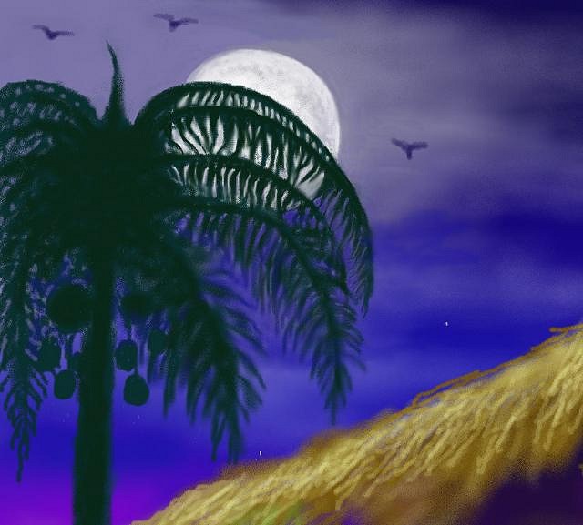
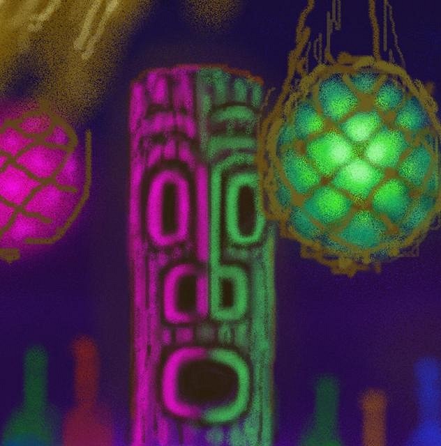
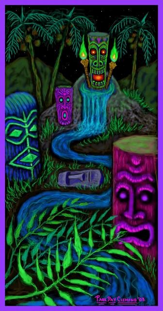
First of all, thanks for YOUR reply, Trav. Glad we were each able to get something really beneficial from our exchange. It's amazing, sometimes, the needless flaming that can go on in internet forums simply because of egos getting in the way of actual communication! And now, folks, here's my newest piece -- "Mystic River" or "The Moai The Merrier"!
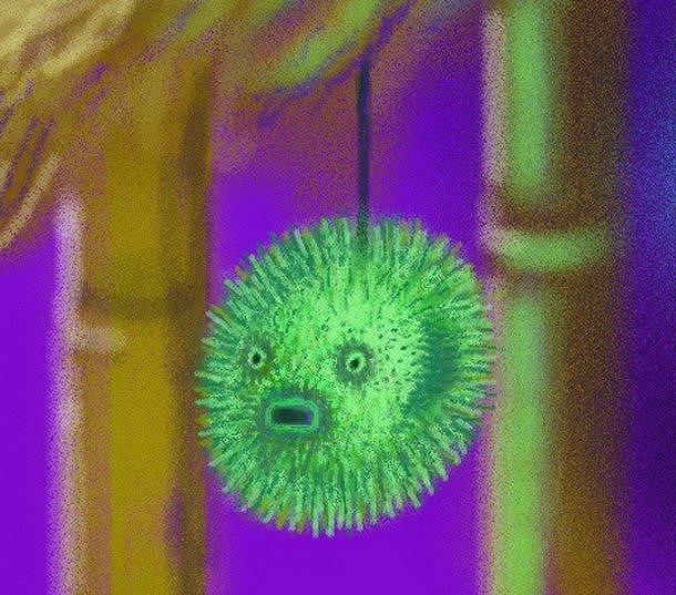
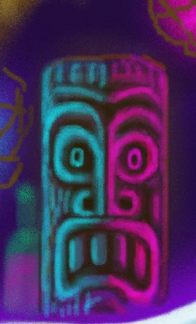
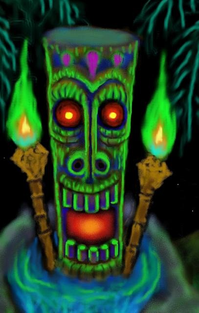
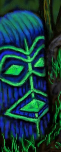
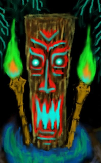
By the way, the original file-size on this is SO huge that I could generate a SIX FOOT TALL print and it would STILL not be pixelly! So it's always a bit galling to me that I can't display some of my images a bit larger on the art forums. Anyway, this newest piece is a departure into new territory, for me, in a number of ways. To begin with, as you'll readily notice, there is no erotic element -- no bare-breasted wahines in sight! Just lots-o-tikis! This was done entirely on black and is my first attempt at an amalgamation of a black velvet painting and one of those 60's black-light posters. And I was definitely going for a playful, almost cartoonish sensibility, so a lot of the landscape elements are pretty stylized, as are the tikis. And though I'm usually a stickler on there being noticeable lighting sources for the various reflected colors on my tikis, I dispensed with that almost entirely here, opting instead for a directly supernatural vibe -- not caring WHY the tikis are glowing all those wild colors. The one exception I made was to the central tiki in the water flanked by the torches. With that one I let his glow be a direct result of the eerie greenish-yellow flames. And here's a detail of him...
And the other four tikis...
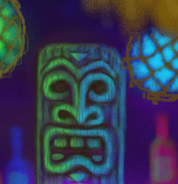
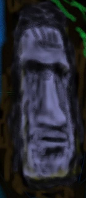
(NOTE: I wonder why it is that the images that I post here, no matter HOW sharp and clear the originals are, always come out somewhat soft and out-of-focus looking? That really does bug me, because the original images are significantly more detailed. Oh well...) Interestingly, there was a totally different central waterfall-tiki originally, which, after a fair amount of work I decided to scrap for two reasons. One was that the design made it look like a Halloweenish Jack-O-Lantern kind of thing, which I felt wasn't really in keeping with the kind of vibe I was trying to create here, and, secondly, that something about the color scheme on him didn't really say "tiki" to me, but, instead, something closer to the colors on some Native American totem poles or on certain African tribal masks. And here's a peek at what that looked like...
Then there was the matter of the original moai I'd done, which I actually painted in its sideways position, only realizing later that the semi-finished product bore more than a little passing resemblance to Richard Nixon!
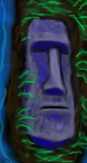
So, needless to say, I went right to work re-doing him!
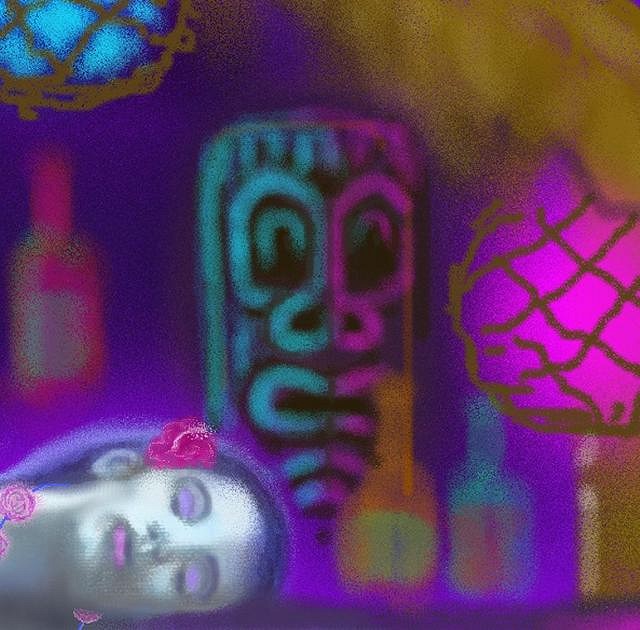
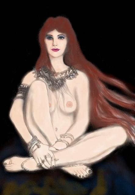
Ah! Now THAT'S moai like it! (Sorry! :lol:) And then, lastly, and most interestingly, when I first started working on this piece I did indeed have a semi-nude young lady -- a kind of sorceress/priestess figure -- in the painting, sitting atop a rock in the midst of the waterfall.
She was from a black & white drawing I'd done, and I was just beginning to add colors to her and rough in some of the tikis around her when I realized that she REALLY looked like she'd wandered in from some other painting! Her sedate solemnity and naturalistic look would be completely at odds with the more playful, slightly psychedelic quality I was shooting for in this piece. Basically, even though she was a fantasy-style figure as well, we're talkin' two distinct TYPES of fantasy here. And she just wasn't gonna fit! And the rest is hysteria! Cheers & Mahalos! :drink: :tiki: [ Edited by: KreepyTiki 2008-09-13 11:40 ] [ Edited by: KreepyTiki 2009-05-06 06:56 ] |
|
DY

Dirk Yates
Posted
posted
on
Sun, Sep 14, 2008 5:43 AM
Aloha kâkou !! Its great to finally get a chance to see your work. Keep up the experimentation, your style will morph many times, enjoy each style for its merits and foibles. Talk to you soon. Dirk |
|
K
KreepyTiki
Posted
posted
on
Mon, Sep 15, 2008 6:03 AM
I've finally gotten a version of "Afterglow" that I'm basically happy with. It turned out to be my Mom, of all people, who clued me in to what had been continuing to bother me when she observed that she continually kept being drawn to the blazing eyes of the big rootball tiki as the focus of the piece. And she was right. So now that I've toned that element down considerably, I'm much more satisfied with the overall balance.
Cheers! :drink: :tiki: |
|
K
KreepyTiki
Posted
posted
on
Mon, Sep 15, 2008 9:10 PM
If y'all wanna take a look at some of my NON-tiki stuff, I just posted a new thread in the "Beyond Tiki" section. Here's the direct link: http://www.tikicentral.com/viewtopic.php?topic=29834&forum=6&1 Lemme know whatcha think. Cheers! :drink: |


Pages: 1 39 replies