Beyond Tiki, Bilge, and Test / Beyond Tiki / Tim Biskup or Shag?
Post #420908 by The Monitors on Tue, Nov 25, 2008 7:50 PM
|
TM

The Monitors
Posted
posted
on
Tue, Nov 25, 2008 7:50 PM
Hey Guys, Here's a link I found on the web regarding Tim Biskup and Ren and Stimpy http://www.heliomag.com/7-things-you-should-know-about-tim-biskup.html 7 THINGS YOU SHOULD KNOW ABOUT TIM BISKUP
Tim enjoyed watching episodes of John Kricfalusi's groundbreaking cartoon series about a tailless, moronic, kind-hearted cat and a peevish, greedy, violent chihuahua. They prompted him to get involved in animation. He says that learning to draw by studying animation was "way more inspiring" than anything he learned in art school. He took his portfolio to Kricfalusi, who hired him and became an important mentor. "I love the guy. He's a genius. He drove me crazy. I had some sleepless nights stressing out because he's so intense and so brutally honest. I told him I wanted to draw storyboards, and he asked me how old I was. I told him I was 30. He said, 'Don't you think it's a little late to be learning how to draw?' But lots of people have told me that that's his way of challenging you, so that you really buckle down and work. And it totally worked. It was the real art school experience that I needed. That's where I really learned how to draw and think about art."
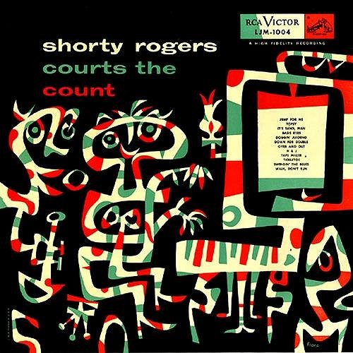
Jim Flora was a prolific jazz record-album illustrator in the 1940s and 1950s. Flora's highly stylized work is flat, fevered and hyperkinetic, often depicting jazz musicians in states of frenzied ecstasy. Biskup had long been aware of Flora's work, but says he didn't "get it." But in the late 1980s, he was in a San Francisco record store and he found a copy of "Shorty Rogers Courts the Count," which Flora had illustrated, and it knocked Tim out. "It was this crazy abstract piano player. I said to my friend, 'This is going to change my art, right here.' My friend who was standing next to me said 'What?' and I said 'This is changing me right now - I can feel it. It's changing the way that I paint.' The shapes, the kind of movement going on. It's something I've been looking for for a long time. I've seen a little bit of it in Miro, I've seen a little of it in Ren and Stimpy, I've seen a little of it in Mary Blair, but... it was just mind-blowing."
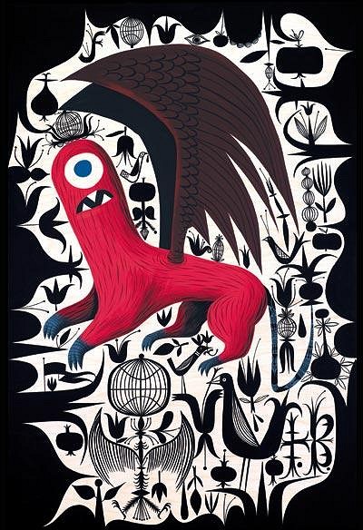
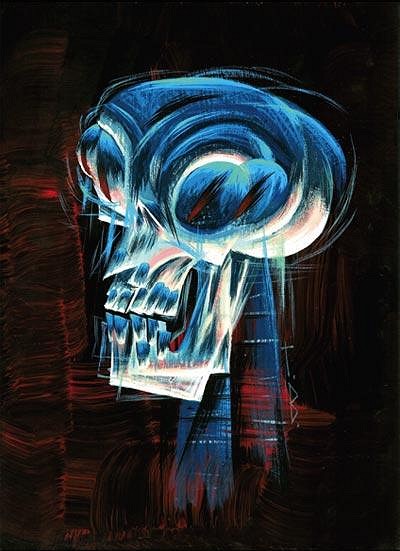
Tim's earlier work was filled with happy monsters and flowers. But as time went on, he began sneaking shaded, more painterly elements into his work: a bleached agonized skull. A stunned, bewildered girl. A decapitated griffin. "I've been doing these more dramatic themes, and putting a lot more of myself into my work. I realized that the intensity of the images wasn't quite matching emotionally what I wanted to put into it. The emotion has ratcheted up for me. I'm exploring some really dark areas of myself."
The Monitors [ Edited by: The Monitors 2008-11-25 19:53 ] |