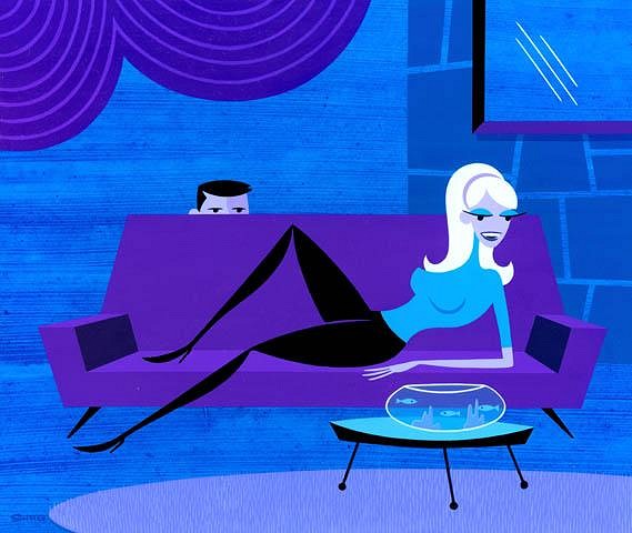
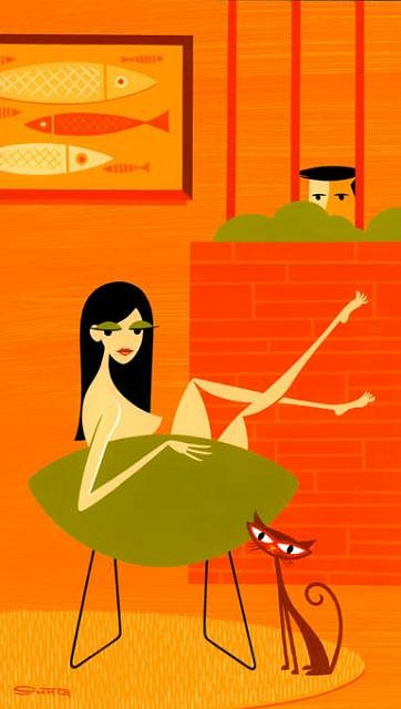
Beyond Tiki, Bilge, and Test / Beyond Tiki
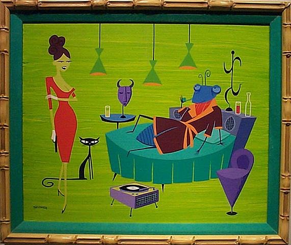
Tim Biskup or Shag?
Pages: 1 46 replies
|
S

saxotica
Posted
posted
on
Sat, Jul 23, 2005 7:50 AM
Who came first? Somebody owes somebody. |
|
SDT

Sweet Daddy Tiki
Posted
posted
on
Sat, Jul 23, 2005 10:55 AM
I don't think it's a case of one "stealing" from the other, so much as both of them having the same influences. I see lots of Jim Flora in Biskup's work. -Sweet Daddy T. [ Edited by: Sweet Daddy Tiki 2005-07-23 10:55 ] |
|
S
saxotica
Posted
posted
on
Sat, Jul 23, 2005 11:45 AM
Wow! No kidding. Thanks for that link ! |
|
T

Tangaroa
Posted
posted
on
Sat, Jul 23, 2005 3:41 PM
To my eye, their styles are very different! |
|
T

TikiGardener
Posted
posted
on
Sat, Jul 23, 2005 7:03 PM
Anybody going to the opening in Pasadena tonight. Sobeiski Gallery. Biskup, Shag, and more. Looked good through the window. http://www.mendenhallsobieskigallery.com/exhibitions/index.html |
|
F

FLOUNDERart
Posted
posted
on
Sun, Jul 24, 2005 12:03 PM
I'm with Tangaroa. The only thing I see that is comparable is the simplicity of their styles. Shag definitely was inspired by Jim Flora which he admits to but I don't really see that in Biskups work. I like Biskups work much better but thats just my opinion. |
|
TM

Tiki Matt
Posted
posted
on
Sun, Jul 24, 2005 12:31 PM
Huh? |
|
T
Tangaroa
Posted
posted
on
Sun, Jul 24, 2005 9:38 PM
Yeah - no offense Flounder - I see a ton of Jim Flora inspiration in Biskups work! |
|
F
FLOUNDERart
Posted
posted
on
Mon, Jul 25, 2005 5:08 AM
That's cool it's just my opinion. |
|
T
Tangaroa
Posted
posted
on
Mon, Jul 25, 2005 9:47 AM
Biskup is awesome - really talented! I wish I'd had the foresight to buy some of his work way back when (or Miles T's for that matter ) - you'd think he'd give me an "alumni discount"! (i.e. free - AHAHAHAHAA - OK - maybe not.) |
|
A

aquarj
Posted
posted
on
Mon, Jul 25, 2005 5:15 PM
I'd say neither one owes anything to each other, and that both practice what's common to many forms of art - taking a variety of influences and developing a personal style that's unique but still shows traces of its lineage. For example, take a look at this (apology for bad scan quality): Another thing that both Shag and Tim Biskup also deserve some credit for is how their efforts helped pave the way for a wider range of "lowbrow" artists to reach people who might not otherwise have ever thought of buying art at all. Tim's Burning Brush art auctions provided a great link between artists and Joe Buyer, in a forum that's pretty hard to duplicate in the regular gallery setting. Shag's work itself has been sort of like the "gateway drug" for many art buyers, providing that first spark of interest in original art as something to actually take home, and an awareness of galleries like La Luz that regularly present works from other talented artists too. Dunno if this makes sense, and I'm not saying they're the main factor or only factor in the success of the "lowbrow" art scene, but I think they both deserve some credit. -Randy |
|
SBOS

Suffering Bastard of Stumptown
Posted
posted
on
Tue, Jul 26, 2005 10:54 AM
Ed Fotheringham's stuff is also inspired by the works of people like Ward Kimball, Andy Warhol and others. But he took it in a different direction. http://www.users.qwest.net/~efotheringham/ SBiM |
|
H

Humuhumu
Posted
posted
on
Tue, Jul 26, 2005 12:13 PM
A great point, and well delivered, Randy! |
|
PPB

polynesian posh boy
Posted
posted
on
Tue, Jul 26, 2005 1:21 PM
They are both amazing artists who are keeping the "low brow" alive and well today. I'd hang either one of their works over my mantle at home. I prefer one over the other but it is totally personal preference. |
|
A

aquaorama
Posted
posted
on
Tue, Jul 26, 2005 6:50 PM
I've got a couple of Shag and a couple of Biskups prints around the house. Although I love Shag I do feel that Biskup is REALLY catching on with people these days. I see his Gama Go clothes all over San Francisco and his prints are going for more and more every day. |
|
T

tiki-riviera
Posted
posted
on
Thu, Jul 28, 2005 4:58 PM
I have been a Shag fan and collector for many years now. On top of being a great artist, Shag is a very nice guy. When I got married 3 years ago, my sister contacted him and asked if he could do an original for a wedding gift. |
|
V

virani
Posted
posted
on
Sat, Jul 30, 2005 2:41 AM
I like them both, but right now, I think I prefer Gary Baseman |
|
U

untamedhighway
Posted
posted
on
Sun, Aug 7, 2005 12:26 PM
Another big influence on those guys, who should be checked out by anyone into that style, is Gene Deitch...an animator and cartoonist from the 50s. YOu can check out his book here http://www.amazon.com/exec/obidos/ASIN/1560975261/qid=1123441017/sr=2-1/ref=pd_bbs_b_2_1/102-2951229-5617762 |
|
TM

The Monitors
Posted
posted
on
Fri, Nov 21, 2008 10:39 AM
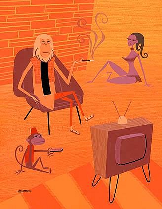
Hey Guys, I know this tread was originally started in 2005, but I think it would be nice to re-visit it. Both Shag and Biskup's work have evolved since then and I think it would be kindda fun to analyze it. I'll get it started. Shag: What I love about Shag's work is his distinct style (who doesn't right), but what I really like about his paintings is the cleaver title. Yes, stupid as it sounds the title. For example, "The Sin Which Cannot be Named". You have Dr. Zeus with a human slave girl and a monkey playing with the remote. What's going on? What was the sin? Did they have sex? If so, with whom, Dr. Zeus or the monkey?
Recently, a fellow TC buddy of mine were analyzing Shag's recent "Voyeur" work at Jonathan Levine Gallery, and we kindda noticed a trend with his recent works. First the title isn't as funny as they use to be. For example his recent titles include: "The Stapler," "The Can Opener," or "The Fish Monger"
Another thing we were noticing is that the scenery is basically the same except different animals and props were substituted. Don't get me wrong I'm not harping on Shag. I would love to own any of those paintings, but I'm just noticing a trend. If you look at the "Voyeur" show, it's basically the same. The title is "The ___" and pattern of the scenery is the same.
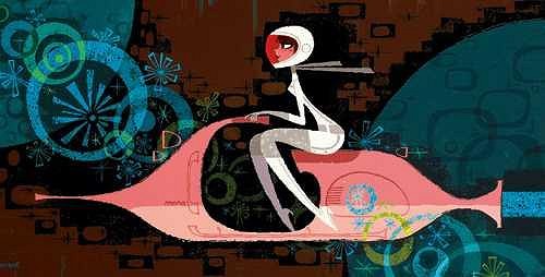
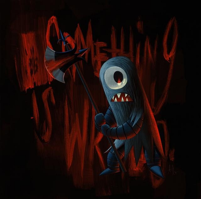
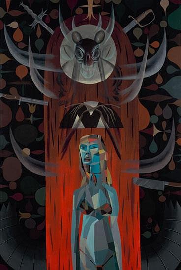
Biskup: Tim's work started out with happy, jazz birds, funny monsters that were colorful, such as "The Channeler", but then it got darker more recently, such as his "Ether" show and the painting, "Right Hand".
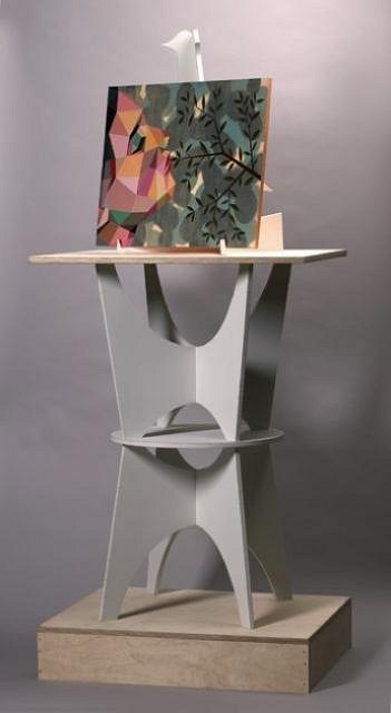
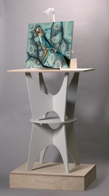
Again, don't get me wrong, I'm not complaining. I actually like his darker work and really believe his pushing his art to another level. His recent work, "O/S Operating System" in Paris' Addict Gallery is a great example. He created an elaborate easel (or sculpture) to put his unframed paintings on and asks the viewer to asses if the painting and easel are one system or does the easel distract you from the painting? Heavy stuff man. I love it.
Well, anyways that's my 2 cents. I would love to hear everyone else. The Monitors [ Edited by: The Monitors 2008-11-21 10:43 ] [ Edited by: The Monitors 2008-11-21 11:07 ] |
|
C

Cammo
Posted
posted
on
Fri, Nov 21, 2008 12:05 PM
I consider all these guys as unimaginative rip-offs of the brilliant Jim Flora...
Jim Flora had a second career as a children's book writer, and wrote some of the best kid's books of all time. The guy was astounding in every way. |
|
TM
The Monitors
Posted
posted
on
Sat, Nov 22, 2008 1:31 PM
No one else agrees or disagrees with me and Cammo? |
|
TS

Tom Slick
Posted
posted
on
Sat, Nov 22, 2008 3:34 PM
I think that the creativity points are all borrowed and then molded into something else. Biskup, Shag, and Derek all have borrowed styles from Flora and Blair and the likes. They specialize in retro-styled art, and to know what that style is, some main elements need to be rediscovered through the new artist by studying, and in alot of cases copying charactures and main focal points to make any sense within their own creations. I highly doubt that if Shag, Biskup or derek painted realist oils, they would be as "pop"-u-lar as they are today. They picked a niche in the artworld that alot of generation X'ers understood and actually got. Whether it be because of fond childhood memories of Disneyland, Hanna-Barbara cartoons, or the children's books illustrated by Flora and Blair, whatever it may be, their success is due in part, simply because GenX'ers grasped the artist's stories within the paintings. I don't think any artist is better than the next. Art is ALL opinionated and taste reflects personal perceptions and preferences, which varies greatly from person to person. |
|
C
Cammo
Posted
posted
on
Sat, Nov 22, 2008 5:03 PM
I think everything Tom Slicko says above is totally true of Derek, but not of Shag or Timmy. Derek is the ONLY artist with as much or more talent than Jim Flora; I think Derek would be successful as an artist in any era your time machine could set him down in, style schmyle. Shag and Timmy just don't show any originality, flavor, or dynamics in their work. It's the same thing over and over, flat and devoid of ideas, something people have been finally noticing not just on this thread but all over the art collecting world. Shag's recent 'cheesecake' stuff just looks desperate. Compare their work with Big Toe's - there's just no life in their work, but Big Toe's jumps right out at you. I saw his sketchbook recently at Babalu's and it was FULL of ideas, it was freakin' outrageous! |
|
TM

Tipsy McStagger
Posted
posted
on
Sun, Nov 23, 2008 8:02 AM
..are we actually debating the artistic merits of what amounts to nothing but cartoon images here????...puh - leeeezee!! ..heh, heh,......bring it, baby!!! [ Edited by: Tipsy McStagger 2008-11-23 08:04 ] |
|
TS
Tom Slick
Posted
posted
on
Sun, Nov 23, 2008 9:47 AM
hah...I forgot to mention the other obvious and influencial artists styles that I see. Here is a small video tour of how I come to the conclusions that I do. I see within Shag's stuff, Hanna-Barbera meets the mid-century and booze like these examples: ....I see within Derek Yanniger's work, more of Jay Ward Studios like these: Which leads me to Tim Biskup...He has more or less the same influences based on some of his earlier works as Derek. I see the Jay Ward and Ward Kimball styles in Tims works. I Even see some hints of Mary Blair and Jim Flora. Great topic, and thanks for letting me share my views and opinions! :D |
|
C
Cammo
Posted
posted
on
Mon, Nov 24, 2008 6:15 PM
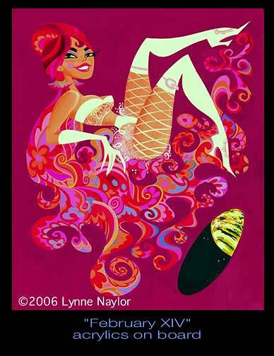
It’s incredibly complicated, but the two artists who seemed to have really started the whole retro design thing were John Kricfalusi and his then-wife Lynne Naylor. They met at Sheridan College and later in 1985 worked on a revival of the Jetsons TV show. Both animators, they shared a burning interest in 1940s thru 1960s animation and design. That was in fact why they had become animators and moved to L.A. – to get involved in what had been the most dynamic art movement of the 20th century, the mid-century marriage of commercial art and design to moving film images and sound. In other words, cartoons. The problem was, it was 1985. That world was long gone. It was gone when they went to work where long line of drones worked on lifeless drawings. It was gone on TV and at the movies. Disney animation was at its lowest creative point in history. Animators were not accepted as illustrators in their spare time, because advertisements were simply not drawn anymore. Nor were they allowed into the ‘fine’ highbrow art world, where depressing collage and abstraction had taken the place of original imagery. John and Lynne had their weekends, though, which they spent hunting down the original animators of the classic age and talking to them as long as either could stand it. Ward Kimball’s place became a hangout. They visited the homes of Disney’s Nine Old Men (or what was left of them) and drank wine with Rolly Crump.
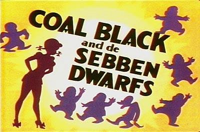
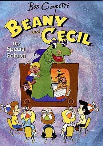
There was a guy John had to meet, though, and he proved to be elusive. Bob Clampett was arguably the wildest artist to ever animate. His long line of work at Warners included the notorious “Coal Black and de Sebben Dwarfs”, a black Harlem jump-blues version of Snow White, and culminated in the incredible TV show “Beany and Cecil”. I screened B&C for some 14 year olds last year, and they DIDN’T GET IT. Actually, most of their parents didn’t either, they just sat there saying “What is this?” and literally “I don’t get it,” while the funniest puns ever written raced across the backyard projection system. Their response was frightening to me.
John knew how good Beany and Cecil was, though. Bob Clampett was a creative genius. Bob was getting old, but still wore this jet-black wig and big Cary Grant hipster eyeglasses. John tried calling him, writing to him, even visiting his house, but he never seemed to be home. Maybe he was inside the house, hiding from the way the world had become, not answering the phone or the door. That made John even more furious, that his idol wasn’t appreciated or respected. Clampett, who had more talent in one ear than Disney ever had in his entire body. He’d drive by Clampett’s home, trying to spot him. One day he saw him. There he was coming out the front, heading to his car in the driveway. John screeched to a stop and ran over to him. “Are you Mr. Clampett?” and the whole crowd is waving to them, hundreds of people, all with their hands up, waving back and forth, smiling, laughing, and Clampett turns to Johnny and says “You know, Johnny, I’m not really the Parade Marshall. But this is fun, huh?” And John finally gets it and laughs. He breaks down and hoots, screams, doubles over with laughter. The whole crowd is laughing and smiling too, and there’s Bob and Johnny choked up on that float, trying to drink beer but its spurting out their mouths, they’re laughing so hard. Clampett hadn’t been hiding from the world after all – he had been out every day having fun instead. The whole parade adventure had proven what had become obvious to John and Lynne and their small but growing circle of animator friends – that the older generation had been wild living, incredibly fun party monsters. Stories were told of how Fred Moore had fallen out of a window in 1942, (or was it 1944?) but was too drunk to get hurt, or how Preston Blair ran a 24 hour party 7 days a week out of his fashionable beatnik home, or how it had always been easy to find Ward on the Disney lot by just listening for the Dixieland Jazz pumping at full volume from his new stereo set. The best legends of all regarded the Disney trip to South America in 1941, where Walt paid his senior design staff to go on a giant holiday in South America, sketching and partying with the locals for ten weeks on end. The result was the incredible cartoon “The Three Cabalaros”, possibly the best thing the studio ever did, and the kick-start ignition for Mary Blair’s revolutionary graphic design work to follow. Where had all the fun gone? Well, one place it had gone was into Lynne’s drawing pad. She was on fire in the late 80s, examining old commercial ads and VHS tapes, sketching, making up characters like crazy, creativity gushing out of her pencil like Niagara Falls, colors in every hue next to each other, inside each other, line, marker and gouache work like nothing anybody had ever seen before, developing a style that was both obviously retro and 60’s space-age futuristic at the same time, sexy and immaculate in conception and form. She’d sell some of these sketches to people at work, and everybody told her she should have a gallery show, but no gallery in the nation would touch her because she was a cartoon artist and thus didn’t know what she was doing.
So now it was more and more horrible for John and Lynne to go back to working on the projects they were told to draw. John kept wondering “What Would Bob Do?” and started pitching story and show ideas to anybody who would listen. Lynne would draw the characters in a crazy 50s-on-drugs style, and finally somebody at the new Nickelodeon Network listened to them and started asking questions about their drawings of an angry drunk and a retarded kid with the two pets called Ren and Stimpy. It was always designed as a retro show, right from the start in 1989. John’s idea was to do the show as three 7.5 minute cartoons, just like Bugs Bunny’s. It was a simple idea, and would work perfectly with the two commercial breaks: Opening Bizarrely, this was the one thing the Network was against from the start. It was never explained why. They wanted two 11 minute cartoons per show, and that was that. After promising to never do anything funny in the show, and draw the characters in a wavy line R.O. Blechman style then popular in NY illustration, and never have the characters actually go anywhere (they had to stay in their yard) John proceeded to do exactly the opposite. The network couldn’t do anything about it, because they had already paid for the show. They HAD to accept the results. Ren & Stimpy not only had 50’s style character design, but it was edited in the milk-the-laughs style of early 1960s TV cartoons, it jumped off character if it was funnier that way, it used corny canned 50’s music, it used opaque gouache backgrounds, it cut to detailed paintings to make a point – all retro, all excellent, totally different than what people were used to seeing. And it changed everything. Most of the retro designers and animators we know of now came from John and Lynne’s camp; Tim Biskup and Seonna Hong, Miles Thompson were gouache animation background artists after Lynne’s influence became an industry standard; Ren & Stimpy’s Chris Reccardi is Lynne’s husband now. Chris Reccardi: Finally, here’s John Kricfalusi, and listen to how impassioned he still is; “You meet young artists now and try to teach them something and they say, 'I could do it that way if I wanted to, but this is my style. I draw club feet because it's my style.' Unfortunately, schools are really bad now. Schools are not only bad in reading, writing and arithmetic, they're worse in cultural aspects, like in music and art. They don't teach you anything anymore. I know this from twenty years of experience hiring artists out of the schools. They get worse every year. They're absolutely ridiculously retarded now. They don't teach you anything and the few things that they try to teach you are completely wrong. They don't teach you construction, line of action, nothing. Illustration from the late-1900s up through the middle of the 20th century was absolutely amazing. In general, American culture was at its highest skill wise in every aspect of human life in the 1940s. It's all been downhill since then. You just open an old magazine from the 1930s and '40s and look at the illustrations in it. There's nobody alive that could touch the way they could draw back then. In old movies, the cinematography is a thousand times better than anything today. Writing, a thousand times better. The standards in the 1940s were extremely high in all aspects of American culture. And they had schools that were like boot camp. They made you learn things. You couldn't walk into a school and say, 'Well, it's my style to draw badly.' You wouldn't get into the school. You'd have to be pretty damn good before you came to the school and then once you get there, they were extremely strict about your learning every technical aspect of art. Not only the obvious things like life drawing, anatomy, perspective, but elusive hard to teach concepts like composition and color theory. You buy any book on color theory today and it's just complete poppy cock. Everybody comes out of school painting pink, purple and green. The whole damn cartoon industry has pink purple and green on their mind.” [ Edited by: Cammo 2008-11-24 18:24 ] |
|
TS
Tom Slick
Posted
posted
on
Tue, Nov 25, 2008 10:54 AM
Very good story! :D Thanks for the share, cammo...It was pretty enlightening. |
|
G

Gromit_Fan
Posted
posted
on
Tue, Nov 25, 2008 4:40 PM
Just felt like commenting that I love this thread. Best, Gromit_Fan |
|
TM
The Monitors
Posted
posted
on
Tue, Nov 25, 2008 7:14 PM
Hi All, Yeah, I didn't think it would generate such interest as it did, but I love it. |
|
TM
The Monitors
Posted
posted
on
Tue, Nov 25, 2008 7:50 PM
Hey Guys, Here's a link I found on the web regarding Tim Biskup and Ren and Stimpy http://www.heliomag.com/7-things-you-should-know-about-tim-biskup.html 7 THINGS YOU SHOULD KNOW ABOUT TIM BISKUP
Tim enjoyed watching episodes of John Kricfalusi's groundbreaking cartoon series about a tailless, moronic, kind-hearted cat and a peevish, greedy, violent chihuahua. They prompted him to get involved in animation. He says that learning to draw by studying animation was "way more inspiring" than anything he learned in art school. He took his portfolio to Kricfalusi, who hired him and became an important mentor. "I love the guy. He's a genius. He drove me crazy. I had some sleepless nights stressing out because he's so intense and so brutally honest. I told him I wanted to draw storyboards, and he asked me how old I was. I told him I was 30. He said, 'Don't you think it's a little late to be learning how to draw?' But lots of people have told me that that's his way of challenging you, so that you really buckle down and work. And it totally worked. It was the real art school experience that I needed. That's where I really learned how to draw and think about art."
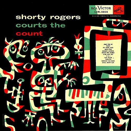
Jim Flora was a prolific jazz record-album illustrator in the 1940s and 1950s. Flora's highly stylized work is flat, fevered and hyperkinetic, often depicting jazz musicians in states of frenzied ecstasy. Biskup had long been aware of Flora's work, but says he didn't "get it." But in the late 1980s, he was in a San Francisco record store and he found a copy of "Shorty Rogers Courts the Count," which Flora had illustrated, and it knocked Tim out. "It was this crazy abstract piano player. I said to my friend, 'This is going to change my art, right here.' My friend who was standing next to me said 'What?' and I said 'This is changing me right now - I can feel it. It's changing the way that I paint.' The shapes, the kind of movement going on. It's something I've been looking for for a long time. I've seen a little bit of it in Miro, I've seen a little of it in Ren and Stimpy, I've seen a little of it in Mary Blair, but... it was just mind-blowing."
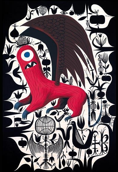
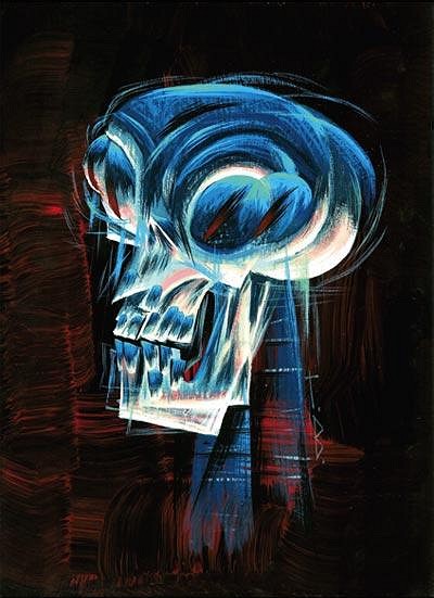
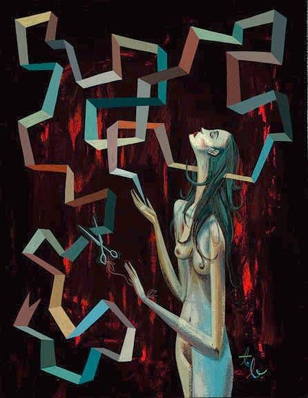
Tim's earlier work was filled with happy monsters and flowers. But as time went on, he began sneaking shaded, more painterly elements into his work: a bleached agonized skull. A stunned, bewildered girl. A decapitated griffin. "I've been doing these more dramatic themes, and putting a lot more of myself into my work. I realized that the intensity of the images wasn't quite matching emotionally what I wanted to put into it. The emotion has ratcheted up for me. I'm exploring some really dark areas of myself."
The Monitors [ Edited by: The Monitors 2008-11-25 19:53 ] |
|
T
tiki-riviera
Posted
posted
on
Fri, Nov 28, 2008 8:46 AM
Shag Rules! Biskup drools... Current count in my house is about 50 to 1 Shag to Biskup. I ain't saying Biskup isn't good, but he's |
|
S

Sophista-tiki
Posted
posted
on
Fri, Nov 28, 2008 8:55 AM
you nut burger! are you tryin to stur up trouble!!! otta asay excellent thread and discussion very inspirational to see the juxtaposition of all the artist, and thanks to those of you who posted the pics and the links. Im being influenced Right Now! [ Edited by: Sophista-tiki 2008-11-28 09:01 ] [ Edited by: Sophista-tiki 2008-11-28 09:02 ] |
|
T
tiki-riviera
Posted
posted
on
Fri, Nov 28, 2008 10:14 AM
Why yes, I do believe I am a nut burger... and no, I'm not trying to stir up trouble, I just personally think Shag is in a whole different league than Biskup. Although both cite similar influences, you could argue than Shag started a new Genre, of which many have tried to emulate. I think the art world as a whole suffers from a lack of opinionated patrons. I digress, but everyone can't be good. These days you have people putting cow crap on a shovel and calling it art. Mark Kostabi is a classic example that a sucker is born every minute, and I think good artists suffer because of a "liberalization" of what good art is defined as. BTW, I think your art is great and should command much more $, but that is just my humble little opinion. |
|
TS
Tom Slick
Posted
posted
on
Fri, Nov 28, 2008 12:41 PM
I would like to acquire some of Miles Thompson works, especially in the theme of the Tiki-Ti prints. I have to always sit in the corner, when I'm at the Ti, so I can gaze at the mixologist print... I'd like to own some of Biskup's and Ryden's earlier tiki works too, but they are for the most part un-obtainable. |
|
S

sirginn
Posted
posted
on
Sat, Nov 29, 2008 7:04 PM
Dig em both, but Shag wins out in the house between those two. But if we include Miles Thompson, he is the grand champion. I like Tim's work, but over the past 10 years of art collecting, we have only picked up a few prints ,and have passed on all opportunities for originals. On the otherhand, we have 50 plus Shag prints (many in storage) as well as four originals, and we still see stuff we would want to swoop up if he was not so expensive now. Mile's Thompson is the man, as far as we are concerned, in addition to several prints, we own about a dozen originals. His energy, originality, and humor top all others in our opinion. |
|
TM
The Monitors
Posted
posted
on
Thu, Dec 11, 2008 11:27 PM
Tim Biskup was featured in an Argentinean magazine called "90+10". He explains the theory of his current work and a hint of the future. What about the idea to create this new work, what were your inspirations? I spent a lot of time on my previous show, The Artist In You, writing and thinking about my place in the art world. What I ended up with was a very complex exhibition and a book full of writing. I was very happy with the results, but it felt a little too scattered and byzantine. It really only worked if people read the entire book and put a lot of thought into it. O/S is a much more centered project. After the intense intellectual challenge that I gave myself with The Artist In You I felt very inspired to use some of that new theoretical understanding and try to make work that communicated it’s theory visually more than in words. What is the message of O/S? The show is based in the connection between the paintings themselves and the sculptural elements (called “Systems”) that accompany them. It is a representation of the the connection between artists and the art world. The system allows an artist’s work to be seen, sold, discussed, transported, etc... At the same time it can be a distraction. That is the key message. It’s funny, I’ve had quite a few people look at the show and say, “Aren’t you worried that the sculptures will distract attention from the paintings?” They clearly had not read the press release, but the message came through. At that point it is really a small leap to see it as a metaphor. I read about O/S in different blogs that "constitute a fusion of Biskup's aesthetic style and his conceptual theories", do you agree? Can you explain us a little more about it? That’s a quote from the press release, actually. My goal at this point in my career is to find ways to blend my visual and conceptual ideas so that they become one thing. O/S is not really a blend of the two, but an expression of the two working together side by side. I think of them in terms of language. The visual language of the paintings is emotional. It’s about beauty, color, design and decoration. The visual language of the sculptures is mainly intellectual. The idea is that the materials would announce to the viewer that they are speaking in that language. Hopefully that invites the audience into an intellectual dialogue while at the same time inviting them to enjoy the work’s aesthetic virtue. There is another meaning to the title, though. The way that I work and think changed so dramatically after The Artist In You that I felt like I was starting over with a new system. It’s like when you upgrade the operating system on your computer. There are similarities, but it’s like your computer had this paradigm shift and does things a little easier. That’s what I was thinking about when I named the show long before I settled on what the work would actually look like. What about the serigraph "Tree of life", what were the inspiration and main idea of this job? The image is very literal. The Cyclops is perched in this beautiful tree holding an ax, ready to chop it into pieces. The character is called Helper. I think of him as a representation of corruption. He is the monster that comes to life when man claims to know the will of God and uses that will to justify his actions, however terrible they may be. The image is about man’s relationship to nature, but metaphorically, it can go in many different directions. I originally made that image for the cover of the American Cyclops book. The gallery show that it chronicled was about early American History: Manifest destiny, Freemasonry, the formation of the US government and the Salem witch trials. It was about the process of corruption. I’m very interested in the way that corruption happens. It made me look very carefully at myself; the way that I think and the way that I justify my actions. Could you see any special idea or reaction towards O/S in the public of Paris? I had a few very interesting conversations with locals. Some of them were very curious about my theories and some were fans of my more character based work. I always get at least a few fans of Gama-Go. That’s always a little strange for me, because I don’t really have much to do with Gama-Go these days. I haven’t done a design for them in years and I don’t even really keep track of what they’re up to. People will show up with something for me to sign that I’ve never even seen! Anyway, I had a great time in Paris. I wish I could have spent more time there. What are your next projects, what are you working on or planning to work on? I’m just starting on a pair of shows that will take place in two different European galleries. They are connected in a way that I’m very excited about. I don’t want to say too much about it. That’s June and July. After that I’m doing a show in Tokyo. Are you planning to come back to ARG or other country in LatAm to show O/S? I’m trying to arrange a show in Buenos Aires at some point, but it will not be O/S. There are no plans for O/S to travel beyond the pieces shipping to their buyers. Any other info you want to add regarding O/S is most welcome. I think that about covers it. Thanks! |
|
TM
The Monitors
Posted
posted
on
Fri, Jun 1, 2012 9:54 AM
"Burning Brushes and the Great Art Machine" "Now that Tim has honed his natural talent and evolved it to his own personal style that defines him. The artist needs to connect to the collector, and the gallery is going to act as the middleman. Around 1997 he preceded to La Luz De Jesus gallery, which Shire owns and handed him a portfolio of his latest work. With his trademark raspy voice Shire calmly says, “It looks like Shag.” Bewildered Tim admits, “I’ve never heard of Shag before and was like…what?” So he immediately went online, Googled Shag and concedes, “I see what [Billy] sees.” At this point he gave up on finding a gallery and decided it wasn’t going to happen. Life is funny sometimes, because the minute you stop looking for something, that something present itself to you." To read more please visit link:
|
|
TM
The Monitors
Posted
posted
on
Tue, Jun 5, 2012 9:58 AM
Tim Biskup Part 4 - Catharsis "In 2006 his work became more serious –but even the word “serious” is an understatement. A more appropriate word is darker. His Berlin show, “Vapor,” contained really disturbing images of his trademark character Helper, who is normally cheery, with an axe and the words “Something is Wrong” painted in the background with blood red vermillion. He concedes that his impulse to paint this way was uncontrollable, “This is what my brain was going through, yet it was also a conscious decision to do work that represent what was visually going on inside.” He was going through psychological training and learning how to connect his emotional life with his art and declares, “This is what art school is suppose to teach people.” To read more click on link: http://www.lowbrowliterati.com/Lowbrow_Literati/Lowbrow_Literati/Entries/2012/6/4_Entry_1.html
|
|
TM
The Monitors
Posted
posted
on
Thu, Jun 7, 2012 11:56 PM
Tim Biskup Part 5 - Critical Mass "Tim summarizes the theory in plain English, “The control is in the hands of the people who talk about art and not the artists.” This explains why there are so many good artists out there that barely sell their work for hundreds of dollars, yet painting sell at auction for millions of dollars and you scratch your head asking, “My kid could paint that?” To read the full article. Click on link:
|
|
TK

Tiki Kaimuki
Posted
posted
on
Fri, Jun 8, 2012 8:26 AM
This is a really cool thread. Chock full of factual contributions and informed opinions. Too bad all internet message board threads couldn't be like this. |
|
TM
The Monitors
Posted
posted
on
Fri, Jun 8, 2012 10:18 AM
Tiki Kaimuki, Thanks for the compliment. My comment button is broken, so this is the only feedback I'm getting. Please spread the word. We need the help. |
|
TM
The Monitors
Posted
posted
on
Mon, Jun 11, 2012 5:33 PM
Part 6 - When Success Hits the Sky was Falling "With his newly found education Tim’s next show was titled, “Operating Systems” or O/S in Paris’ Addict Gallery on October 11, 2008. You may have forgotten, but this was an important week around the world. Lehman Brothers went bankrupt and was sold for 8 cents on the dollar on October 10th. As a result of Lehman’s bankruptcy, the stock markets of European nations began to crash on October 12th. Anecdotally, Tim tells me that not a single painting sold during that show, yet it was a successful art show." To read full article click link:
|
|
R

RevBambooBen
Posted
posted
on
Wed, Jun 13, 2012 12:13 AM
Our own Flounder is starting to make a dent..... His Pink series is pretty awesome!! |
|
TM
The Monitors
Posted
posted
on
Wed, Jun 13, 2012 9:40 PM
You said it Ben! I hope he skyrockets |
|
TM
The Monitors
Posted
posted
on
Wed, Jun 13, 2012 9:42 PM
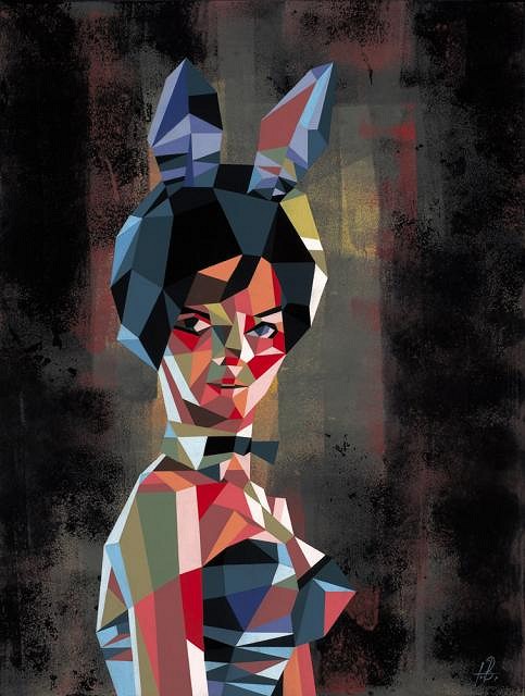
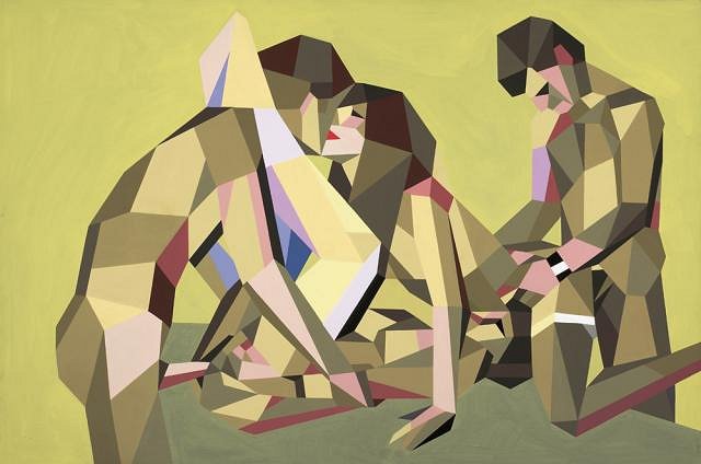
Tim Biskup Part 7 - There is no Art without Risk This is the final installation for the Tim Biskup interview. Please enjoy. "His most interesting and most daring work to date is his submission for the 25th Anniversary of La Luz De Jesus gallery in 2011 appropriately untitled. It is painted in his signature polygon style, which Tim has perfected, but to be delicate, it depicts two heterosexual couples engaged in a pubescent boy’s wet dream. This piece is not to be shown in polite company. Anecdotally, Tim admits that he had to conceal it form his 9-year old daughter whenever he worked on it. There were over 260 artists that participated in the event, and no one was talking anything else, but Tim’s piece. Warily he admits, “I can’t tell you how many people have commented on this painting.” To read the full article please click link:
|
|
F

foamy
Posted
posted
on
Wed, Jun 27, 2012 11:03 AM
The difference between Shag and Biskup is that TB has and is evolving. I don't know why JA won't. Perhaps he's too successful? I've always liked Shag, but I'm getting tired of seeing the same 'ol thing. |


Pages: 1 46 replies