Tiki Central / Tiki Marketplace / Tiki Ti 50th Anniversary Mug
Post #587209 by bigbrotiki on Fri, Apr 29, 2011 10:29 PM
|
B
bigbrotiki
Posted
posted
on
Fri, Apr 29, 2011 10:29 PM
Yes, they let go of the whole batch last afternoon and night. Understandable that hey did not want to tell people that stood in line for hours that they were "too late" once they got there - while holding back mugs for the next two days. And now back to the history of the mug, here is the first part again from page 1 of this thread:
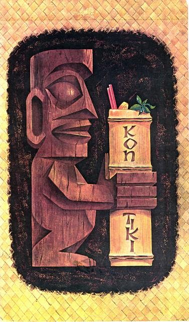
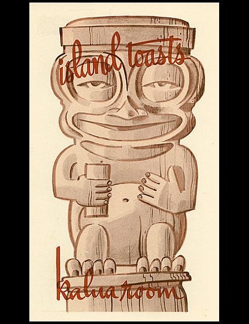
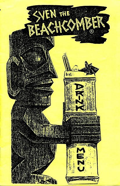
I chose the original Kon-Tiki menu cover inspiration for the mug design because of its more 3D appearance, AND because of the iconic quality it had attained since pictured in the Book of Tiki. I had already appropriated it in 1997 for a (self-xeroxed) menu for my Beachcomber Party for which I had gotten Tony Ramos to be the mixologist:
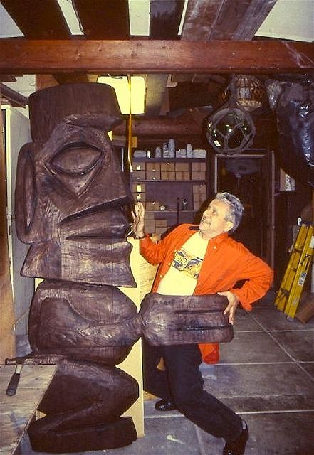
Then, in 200?, Bosko created a great wall carving for San Diego's Mr. Tiki Restaurant - with which I got to pose with before it left his shop:
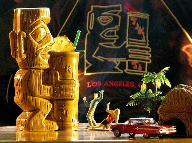
...and here is today's 50 Year Anniversary mug - with the 25 Year Anniversary jacket logo in the background:
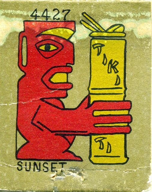
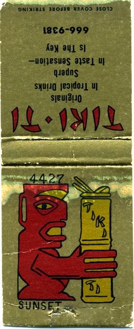
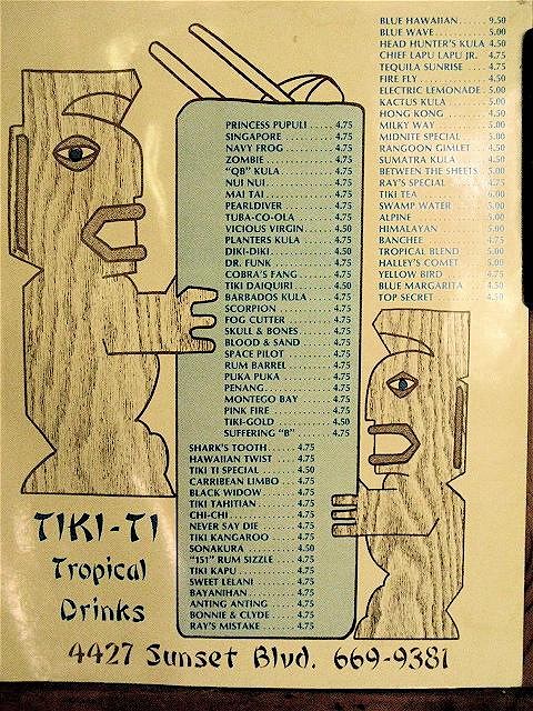
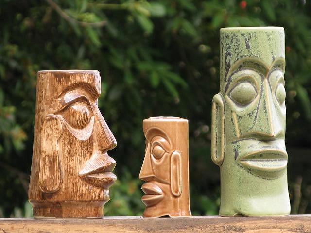
The one thing that struck me as odd about the original menu rendering was the BEAKY NOSE of the menu Tiki. It seemed "un-Tiki" somehow...and it had been flattened for the Tiki Ti logo. One day when visiting DustyCajun at his house in Santa Barbara, I stepped into his motor home, after just having seen some mugs on his mug shelf, and saw the Kon-Tiki menu he had framed up, and it hit me: This Tiki had been rendered from several OTAGIRI MUG designs, most notably the Outrigger in Monterey:
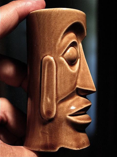
In the direct comparison to the Hawaii Kai salt shaker below it becomes apparent: The artist who rendered the menu Tiki above had mistakenly drawn a straight line, omitting the "dimple" the separates the outer edge of the nostril from the "smile line".
Eureka! I now knew how to "fix" the nose - and that while staying true to the confines of Polynesian pop style! That sealed it: Those who know me know that I am a huge fan of cubist design. Now when the client says "I like the nose", and my best friend in Tiki calls it "cubist", that meant: That beak nose was gonna stay! So that is what you see now on the mug, a genuine, historic design flaw, part of the naive charm of Polynesian pop history! Sometimes it is better NOT to improve on things. :) The only thing that troubles me with my Beaky Nose Evolution Theory is: What came first, the menu or the mug/ S&P shakers? [ Edited by: bigbrotiki 2011-04-29 22:33 ] |

