Tiki Central / General Tiki / Sven Kirsten's book: Tiki Pop
Post #726702 by bigbrotiki on Tue, Sep 2, 2014 2:54 AM
|
B
bigbrotiki
Posted
posted
on
Tue, Sep 2, 2014 2:54 AM
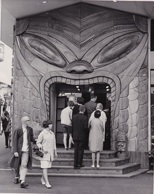
Thank You, Wendy. Nobody else wants to discuss anything about the book? Here's a bit more behind-the-scenes info: As the deadline for the book drew nearer, I was still without a cover image - and without a poster image for the museum. The problem was that all the images that I deemed iconic enough (and that had not been used before) were in B&W. Now that was less of an obstacle for the Musee Quai Branly, they had done some fine posters with black & white photos:
But I knew that TASCHEN was not gonna go for a B&W book cover, deeming it not commercial enough. And of course, ideally the book cover and the exhibit poster would be the same. I tried the ethnographic approach: A museum poster:
My attempt to show how Tiki Pop was inspired by original Tiki artifacts:
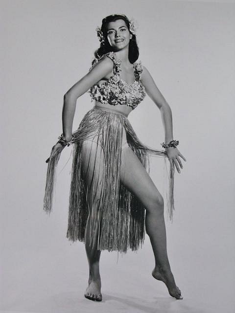
Naah. Too specialist. Even if we would have added a hula babe to spice it up:
I really wanted THIS photo to be the cover:
So my friend Moritz and I played around with colorizing it: The Andy Warhol look:
A softer version:
The problem was that colorization separated the people from the environment, and made it look like photo shop, compromising the all-important impression of authenticity of this image - so NO GO. In the meantime, the museum's graphic department was breathing down my neck with proposals like this:
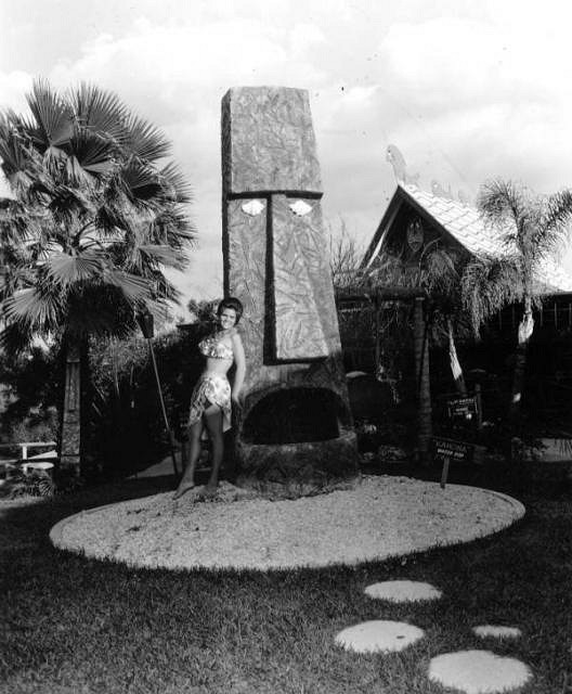
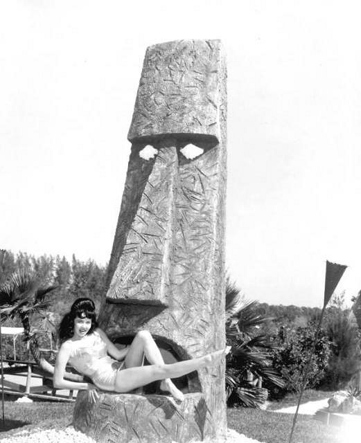
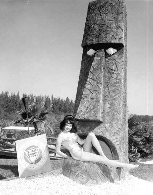
Not bad, but somewhat predictable. Also, they did not know that some of the sources they had used from my materials to make this collage came from postcards, which would not hold up being blown up to poster size -- Hi Res being another requirement for a cover/ poster image. Most of all, this image was lacking a Tiki! :) It was only two weeks before the cover image had to be locked, and I was getting desperate. I was asking everybody for suggestions, and this is when two old friends came through: Ron Ferrell informed me that nowadays there were ways of colorizing B&W images so they did not have this retro hand-tinted look (which I wanted to avoid) but looked like real color photographs, and sent me this link: http://indulgd.com/realistically-colorized-historical-photos/ And then BOSKO came to the rescue by reminding me of THIS series of photographs from a Florida archive, which I had always loved:
This image had everything that was needed: A stylized modern Tiki, a swimsuit babe, and it exuded that happy naivite that constitutes Tiki style:
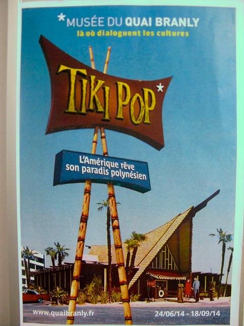
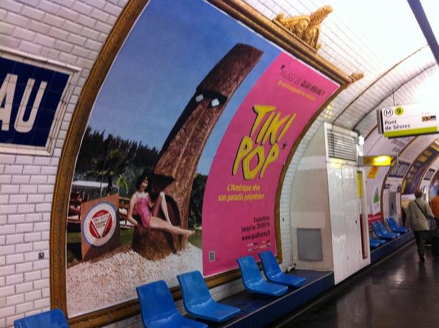
Plus the girl was gonna help me get it approved by Taschen. So I went to work with the museum's art department, and I think we succeeded with creating an image that, as its first impression at least, seems like an authentic period color photo:
Taschen accepted it as the book cover, and everybody was happy, and the damn image was plastered all over Paris! :) :
|


