On 2009-12-23 18:47, Psycho Tiki D received a flash a brilliance and asked:
Big Kahuna recently posted several pictures of dinnerware and items he won from Ebay in the thread entitled "Polynesian restaurant china and server ware".
Second question...
From an artistic standpoint, which logo used on the items he posted most appeals to you?
Third question...
Why?
Thanks,
PTD
Great Question!
these are like Lay's potato Chips!
Can't Pick just one!
Here's my fave....
for it's simplicity and a whiff of some of the old passport/tourist brochure/ Rocket Science magazine ephemera that is purdyderncool....
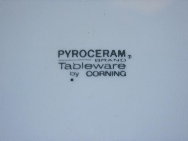
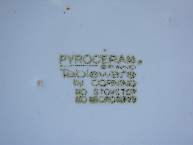
Here's another version with a distress-which is rare in ceramics
but highly treasured when seeking out old manuals and the like
for graphic inspiration....
i like this one for the practicality factor
and sly irony it would produce if taken out of it's present graphic context...
say.... on a tee shirt
This one has a t-shirt neck label kind of feel
the mixing of simply overplayed fonts is saved by the copyright circle
and the slyly kerned U. S. A.
retail brilliance!

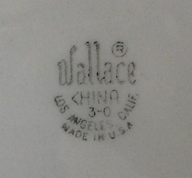
Wallace reeks of musty British porcelein factories
the arch on the bottom saves it...barely!
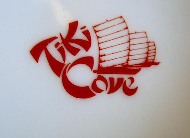
i like this one because of the silly font and font placement
and how the Chinese junk is gently snuggled in it's lap
which creates for an oddly amateurish outer silhouette....
the red color helps
but not as much as needed...
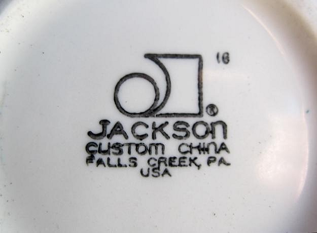
i would have picked this one
except for the fact that
soooo many other companies
used the "deconstruct the first initial of our name into graphic shapes then put our name under it"
almost like a 60's sculptural /graphic sensibility
Still a great powerful graphic logo
solid
and the name... Jackson...
yeeeah.
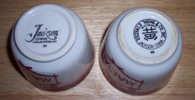
Here is a more pimped out version
next to a trademark/logo that has nice hints of
a bunch of successful elements
old
classic
simple
exotic...
not enough to place it on the top shelf
but nice nonetheless...
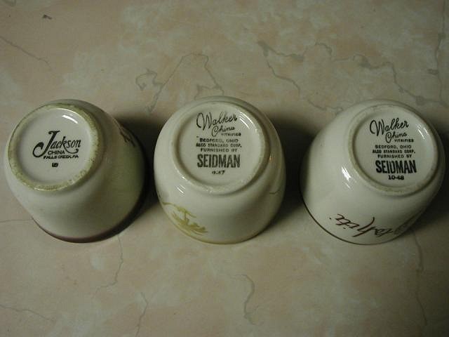
the Walker logo should also be noted
just for the 45 degree angle skew
and fun-ness of it.....
and that Futura Condensed font on the bottom to give it a foundation....
Well, hope that was amusing!
be forewarned...
Don't get me started on design or art
because the babblemode kicks in!
Thanks again for opening my eyes to these!
Merry Christmas!
[ Edited by: little lost tiki 2009-12-24 08:53 ]
