Pages: 1 2 3 4 5 6 7 8 9 10 11 12 13 14 15 16 17 18 19 20 21 981 replies
|
L
leleliz
Posted
posted
on
Tue, Jul 28, 2009 5:39 PM
I was in the airport online when you posted -- lol |
|
UI
Unkl Ian
Posted
posted
on
Tue, Jul 28, 2009 6:26 PM
And well it should. Nice work. |
|
M
MadDogMike
Posted
posted
on
Tue, Jul 28, 2009 6:41 PM
RobbRokks!!! The center pokey part (stamen?) of the flower looks so 3D. Like a firework exploding. |
|
S
Sophista-tiki
Posted
posted
on
Tue, Jul 28, 2009 6:58 PM
wow |
|
RH
Robb Hamel
Posted
posted
on
Tue, Jul 28, 2009 7:16 PM
You guys are just cutting me a ton of slack on this one! Just joking - it turned out okay. Thank you all. This baby was a tough one, I had to keep adding and adding more red. I stuck it on the marketplace if anyone is interested. |
|
RH
Robb Hamel
Posted
posted
on
Wed, Jul 29, 2009 3:56 PM
I've got another one cookin' - I hopa you like.
Sorry I don't have time to show my sketch, the black paper doesn't photograph well and takes a lot of photoshop work to be presentable.
This guy is easy to rough in, hard to make look good.
I don't have time to properly retouch these pics either.
You mighta' noticed there's a bit of a Hawaiian tiki theme going on here... |
|
IK
Iokona Ki'i
Posted
posted
on
Thu, Jul 30, 2009 10:51 PM
That red hibiscus just pops! Congrats on making it |
|
M
mp
Posted
posted
on
Fri, Jul 31, 2009 12:14 AM
Crazy good work Robb. The new one is going to kick ass! |
|
G
GROG
Posted
posted
on
Fri, Jul 31, 2009 2:10 AM
Love the red hibiscus piece. |
|
TM
tiki moon
Posted
posted
on
Sat, Aug 1, 2009 1:13 AM
dynamite |
|
T
TravelingJones
Posted
posted
on
Sat, Aug 1, 2009 10:56 AM
i can smell it! :o |
|
T
TravelingJones
Posted
posted
on
Sat, Aug 1, 2009 11:04 AM
errr, ummm... the fragrant red hibiscus that is... :blush: :lol: :D :tiki: I can smell the tiki too... but thats more like a burning sandalwood! :tiki: :D :lol: |
|
RH
Robb Hamel
Posted
posted
on
Sat, Aug 1, 2009 9:08 PM
Thanks guys, I'm struggling a bit on the new one. |
|
RH
Robb Hamel
Posted
posted
on
Sun, Aug 2, 2009 6:17 PM
And here it is:
"Tiki Vignette 3" - 36x18" - black velvet on stretcher frame. This one is broodier than most I've done lately, I wouldn't put it on a white wall without a spotlight, but if I made it brighter, it would ruin the delicate mood. It's really kinda ominous. I hope y'all likes it. |
|
M
mp
Posted
posted
on
Sun, Aug 2, 2009 6:20 PM
Awesome Robb, I new it was going to kick ass. It feels like it was painted in the sixties. |
|
RH
Robb Hamel
Posted
posted
on
Sun, Aug 2, 2009 6:43 PM
mp - Weird! My wife said the same thing, she said it looked like the retro graphics from the title sequence of "The Venture Brothers"... which is one BADASS show! Thanks Little Lost Tiki for telling me about it. |
|
M
MadDogMike
Posted
posted
on
Sun, Aug 2, 2009 6:47 PM
Wicked cool! The back one reminds me of an alien from some movie but I can't pinpoint which one. |
|
P
Paipo
Posted
posted
on
Sun, Aug 2, 2009 7:15 PM
Definitely got the vintage vibe going on. Pulp paperback cover, drink menu, model kit box art - it would work for anything. Diggin those colours you chose Robb! |
|
IK
Iokona Ki'i
Posted
posted
on
Sun, Aug 2, 2009 7:40 PM
OOh, that's so cool. Way to kick that |
|
B

Babalu
Posted
posted
on
Mon, Aug 3, 2009 9:59 AM
You RULE Robb!! No one does this any better Sir... My hats off to ya! "Everything" you do is an emotional explosion for me. |
|
RH
Robb Hamel
Posted
posted
on
Tue, Aug 4, 2009 5:52 PM
Damn, guys! Your making me feel great! Very colorful comments too... I love you guys. |
|
SG
Sam Gambino
Posted
posted
on
Tue, Aug 4, 2009 10:03 PM
Freaking sweet! Not only the technique but the composition is great here, Robb! |
|
L
leleliz
Posted
posted
on
Tue, Aug 4, 2009 10:32 PM
Your tiki paintings blow me away....fantastic RObb! |
|
TSA
Tiki Shark Art
Posted
posted
on
Tue, Aug 4, 2009 10:45 PM
OH YEAH BABY! Like the old Aurora Monster models! I would be extremely pleased to have TIKI model kits! What a fantastic idea! I think you have touched close to a philosophic reason that I engage in creating and enjoying Tiki Art! This new painting is speaking to me on a deep emotional level, whispering to my inner child who is still busy putting together the Aurora model kit of the Black Knight. Remember those? The Black Knight, the Blue Knight, the Red Knight... perhaps that is what this modern tiki pop art is about: Completing the collcetion of our inner children. The Black Tiki, The Blue Tiki , The Green Tiki... Beautiful work. [ Edited by: Tiki Shark Art 2009-08-04 22:46 ] |
|
P
PalmCityTiki
Posted
posted
on
Wed, Aug 5, 2009 3:21 AM
Man I wish those photoraphed as well as I sure they look. I love your style and the fact that you keep changing subject matter is even cooler. |
|
LLT
little lost tiki
Posted
posted
on
Wed, Aug 5, 2009 7:52 AM
Tiki Vignette 3.... Brock Samson would be proud.... |
|
RH
Robb Hamel
Posted
posted
on
Wed, Aug 5, 2009 8:59 AM
leleliz - thanks yet again! Maestro Gambino - and I was afraid the composition would turn people off. Shark - Yeah, Aurora! I wish someone would put a book out of vintage model kit art... Too bad the parts didn't fit together! But I guess that was part of the experience. I'm thrilled something touched your inner child, that's a big accomplishment for me. I wish I could see the vintage aspects of Vignette 3 for myself, but somehow I can't, I just did it on instinct. |
|
RH
Robb Hamel
Posted
posted
on
Wed, Aug 5, 2009 9:15 AM
PalmCityTiki - thanks, I'd sure like to do some similar stuff, but I know where I want to be in the future and I'm trying hard to get there! LLT - VENTURE BROTHERS, everyone CHECK IT OUT! |
|
RH
Robb Hamel
Posted
posted
on
Wed, Aug 5, 2009 10:34 AM
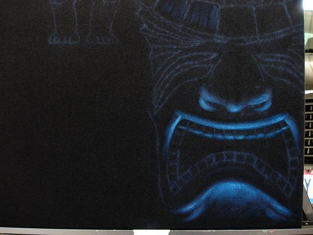
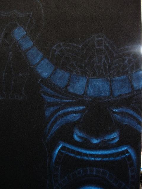
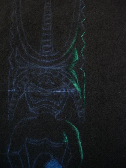
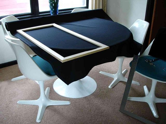
The life of a Tiki velvet painting:
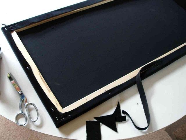
IN THE COMPUTERIZED MILLING ROOM OF R. HAMEL INDUSTRIES, TECHNICIANS OF AT LEAST JOURNEYMAN LEVEL TAPER THE STRETCHER FRAMES. (I sand a taper into all my stretcher bars in this spot so that pressure during shipping doesn't create an impression on the outside of the fabric)
IN OUR ADVANCED TECHNOLOGY CLEAN ROOM, SANITIZED CONDITIONS ASSURE QUALITY. (I wash my dining table before rolling the fabric out, and make sure the bars are square before stretching the fabric. I use this table because of how big it is and how easy to clean)
USING AN EXCLUSIVE, PROPRIETARY METHOD, CORNERS ARE FINISHED. (This is a Tiki Vignette Series piece, so the corners are trimmed and finished and a frame isn't needed. This gives a very clean, modern look on a wall)
CNC CUTTING MACHINES, WORKING ON A 12-AXIS CONTROL GIMBAL, REMOVE UNWANTED MATERIAL. (I just give it a little trim for neatness and to make room for written info after it's done)
ADVANCED DIGITAL MEASURING DEVICES ASSURE SQUARENESS. (I square it one more time, clean the fabric, and examine it for any imperfections that would show up after the painting is done)
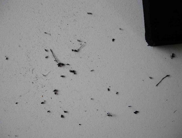
A PROPRIETARY, DIGITAL, EXCLUSIVE, ADVANCED FILTRATION SYSTEM REMOVES PARTICULATE MATERIAL. THIS IS FED TO FELINES AS PART OF THEIR ADVANCED, DIGITAL, PROPRIETARY HAIRBALL RECYCLING SYSTEM. (Jason Sallin outta back me up on this: these little black fuzzballs get everywhere... Yes, even THERE)
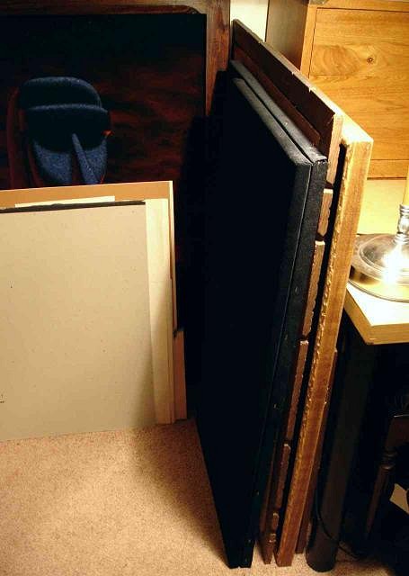
R. HAMEL INDUSTRIES HAS A CUSTOM-DESIGNED, ON-SITE STORAGE FACILITY MANNED EXCLUSIVELY BY TOP MEN. (I put it here till I'm ready for it)
Taking a break from the brochure-speak, Paipo recommended this excellent book to me, and I just pulled it from the mailbox. Thanks Paipo!
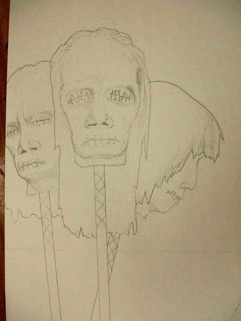
I did this little 2" sketch in mid-June and liked it a lot. I'm gonna do this as a Tiki Vignette so that the focus is on the heads.
This scribble is to see if the design would work at the Vignette proportion of 1 to 2. Looks like a go. Shrunken heads! I've never tried 'em before, should be fun. I've gotta switch gears to work on another project, I'll post more as I go. Thanks. |
|
RH
Robb Hamel
Posted
posted
on
Wed, Aug 5, 2009 10:55 AM
Oh yeah: if anybody has some creative suggestions please let me know, I'll try to incorporate them. |
|
IK
Iokona Ki'i
Posted
posted
on
Wed, Aug 5, 2009 11:00 AM
5 out of 5 Tikis. Three cheers for the "Life of a Tiki Velvet Painting" by Robb Hamel. Highly advanced reading. I must get my Nude Wahine Sweatshop up to speed Velvets by J. Sallin [ Edited by: Iokona Ki'i 2009-08-05 11:03 ] |
|
T
TikiG
Posted
posted
on
Wed, Aug 5, 2009 11:08 AM
Thanks Robb for the in-process pics. Very refreshing to see actual artist spaces for a change. I don't know about you, but for me sometimes the painter's palette is just as interesting to look at as their canvas. Your latest velvet painting posted "Tiki Vignette 3" is lovely in its simple presentation. I love the red, green, blue progression from back to front. This painting does evoke certain emotions from my childhood of the early 60s too - monster model box art - yes!, cereal boxes, brochure art for amusement parks/tourist traps, movie posters etc etc etc. Kinda like the things I tend to collect now that I'm older. Keep up the inspiring work, Robb as I always look forward to any new post you provide us. |
|
RH
Robb Hamel
Posted
posted
on
Wed, Aug 5, 2009 2:38 PM
Thanks, TikiG. I definitely like photos of artists' spaces, gear, palettes too. I'm glad you feel a connection between Vignette 3 and your childhood too. It's so weird that I can't feel it... |
|
SF
Swamp Fire
Posted
posted
on
Wed, Aug 5, 2009 3:32 PM
Oh boy, shrunken heads! |
|
RH
Robb Hamel
Posted
posted
on
Thu, Aug 6, 2009 7:31 AM
Jason - five out of five Tikis? Thanks, wow. Swampfire - I'm concerned about doing a cliche-looking shrunken heads piece, but I'm doing what I can to personalize it. Thanks. |
|
RH
Robb Hamel
Posted
posted
on
Fri, Aug 7, 2009 5:20 AM
Yesterday I went to DaddyKatz (local Tiki/Hotrod shop), to get out of the house. I worked on a fairly detailed sketch of the new shrunken head piece.
This is DaddyKatz' warehouse. It contains several hot rods, including the green one here, which I call "Reptilicus" - anyone out there remember that Dutch monster movie?
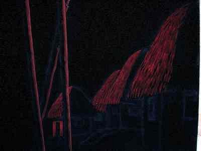
This is the hut layout. I plan on adding more detail to them later.
I'm not sure if these heads are meant to be actually shrunken or heads on poles. I kinda like the decaying whole heads idea. Yum.
Here's some of my newest stuff on display in DaddyKatz' showroom. |
|
RH
Robb Hamel
Posted
posted
on
Mon, Aug 10, 2009 2:18 PM
Here we go, more adventure with my first shrunken head piece.
Several people have said they like palette shots, so there.
In the vivid morning light, my faithful hound companion... acts companiony.
This really is the first stroke of the painting. And I actually took the shot of it... "Hands like a surgeon," the ladies say - YEAH BABY, YEAH! Gotta shrink these big, ugly pics....
I have to admit the truth - this is probably the last day I'd ever want to start a painting, but being a soldier and sucking it up is part of the deal.
Still roughing it in. These rough beginnings jangle my nerves.
The village starts a smidge better.
This is the barely roughed-in image. Velvet, at least the way I do it, is all about adding layer after layer, each time one dries, another is added.
A freak-ass storm blows in. Thunder pounds every few seconds, lightning flashes nearby, over and over.
My dog tries desperately to escape the lightning... Run, Fido, run!
Poor bastard! He didn't make it. He's fried to a crisp. I kick the smoking carcass out of my way and take my gear in out of the weather. I'll find the head later.
At 5:30 my wife comes home from work. I'm gonna tell her about the dog, but her top is about to frag everything nearby when those buttons finally explode... I forget about what's his name. I won't bother you folks with all the layering work I have to do in the days ahead, but from time to time I'll show the image looking a little brighter, a little more complete. [ Edited by: Robb Hamel 2009-08-10 15:30 ] |
|
LLT
little lost tiki
Posted
posted
on
Mon, Aug 10, 2009 8:35 PM
Wow... |
|
RH
Robb Hamel
Posted
posted
on
Tue, Aug 11, 2009 5:59 AM
Tutelage? No, I'm just tired of posting finished pics because I don't take the time to show the process, which people say they like to see. Anal retentive? Absolutely! It's a painful fact that I can't work any other way, which blows. Velvet is not exactly a playful medium! The dog? Now makes good doorstop. |
|
RH
Robb Hamel
Posted
posted
on
Wed, Aug 12, 2009 1:34 PM
Alright, I've made some good progress on the village. It may be done, but I'll have to wait till everything is finished and dry before deciding.
This small hut and the poles didn't photograph well and my software and TCs aren't talking today, so these pics are approximations.
These huts may be Marquesan because the huts are built on paepae, stone platforms that act as foundations. This is the village's "backyard", noticable because the huts have no doors on this downhill side. |
|
L
leleliz
Posted
posted
on
Wed, Aug 12, 2009 7:10 PM
I am surprised you havent gone into this sort of imagery before--it really looks awesome in its earlier stages. Just imagine if your painting and THOR's heads were in the same booth together...it would be a sight to behold! [ Edited by: leleliz 2009-08-13 08:47 ] |
|
SG
Sam Gambino
Posted
posted
on
Thu, Aug 13, 2009 7:00 AM
Looking great as always Robb! |
|
RH
Robb Hamel
Posted
posted
on
Sun, Aug 16, 2009 8:26 AM
leleliz - thanks, that would be wild, his heads are cooler than the real thing. Sam - since my mind is permanently wired to Japanese woodblock design, simple subject matter is my goal, thank you. Plus, I feel strongly that any velvet under 6 square feet is a poor medium for busy designs. I don't know if anybody else has discussed that, but I've rejected several elaborate designs because I knew they wouldn't work. I do have the goal of doing a hyper-elaborate mega design as a roughly 12 square foot piece. Here's the finished heads:
Sorry about the crappy, small pics - time is too short and lighting conditions are too rotten to fix right now. I'll get a good pic and post it as soon as I can. |
|
RD
Rum Demon
Posted
posted
on
Sun, Aug 16, 2009 10:11 PM
Always a fan. Knew there was something about Mr Hamel... [ Edited by: Rum Demon 2009-08-16 22:17 ] |
|
T
tikiskip
Posted
posted
on
Mon, Aug 17, 2009 2:45 PM
Rob great job!!! |
|
RH
Robb Hamel
Posted
posted
on
Tue, Aug 18, 2009 6:08 AM
Rum Demon - you've got an IG too? Cool. It's pretty rare, and that's some pair of peepers he has! tikiskip - that was a blast, I'll get pics of the lamp up soon. It looks like a million bucks. |
|
T
tiki_kiliki
Posted
posted
on
Tue, Aug 18, 2009 3:05 PM
Robb, just went through this thread, great amazing work as usual. I missed you guys at Hukilau this year. I just have hung my painting you sent me in my new pad here in Lauderdale, it's back home and looks amazing on the wall. I'll take a picture in the next few days and post it here. Please be a part of the art show next year at Hukilau and please try to make it!! |
|
RH
Robb Hamel
Posted
posted
on
Thu, Aug 20, 2009 5:53 AM
TK: I will try my best, thank you. |
Pages: 1 2 3 4 5 6 7 8 9 10 11 12 13 14 15 16 17 18 19 20 21 981 replies

