Pages: 1 2 3 4 5 6 7 8 9 10 11 12 13 14 15 16 17 18 19 20 21 981 replies
|
H
hewey
Posted
posted
on
Sat, Jul 31, 2010 2:57 AM
Coming along nice |
|
M
MadDogMike
Posted
posted
on
Sat, Jul 31, 2010 6:26 AM
Robb I don't know anything about classic art but I know you're a class act. Keep up the great work |
|
Z
zerostreet
Posted
posted
on
Sat, Jul 31, 2010 7:32 AM
Beautiful Robb! |
|
LLT
little lost tiki
Posted
posted
on
Sat, Jul 31, 2010 6:06 PM
you done good boy! :) liberating isn't it? this is looking soooo beautiful Robb! |
|
T
TikiG
Posted
posted
on
Sun, Aug 1, 2010 3:21 AM
Let it rip, dear boy! Looking good to me Robb. Don't think about it too much - its fine :wink: G |
|
RH
Robb Hamel
Posted
posted
on
Fri, Aug 6, 2010 4:43 PM
THANKS EVERYONE FOR SUPPORTING MY NON-VELVET WORK!
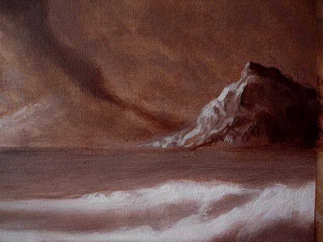
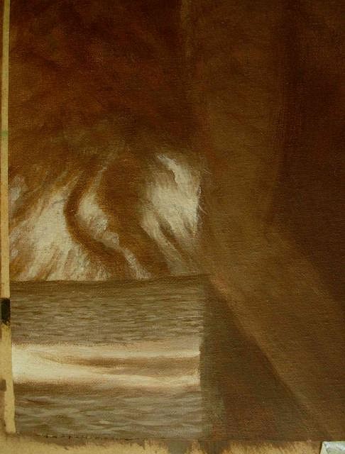
This is where I left off the last time.
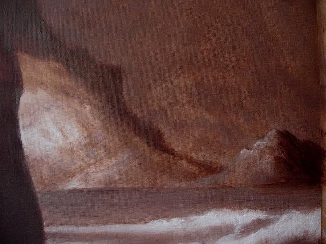
This area on the left is going to be a sunlit patch in the final piece.
The far mountain range is starting to shape up just fine.
I not a fan of the pinnacle yet.
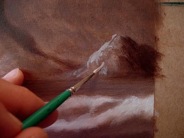
I'm working on this outcropping along the water...
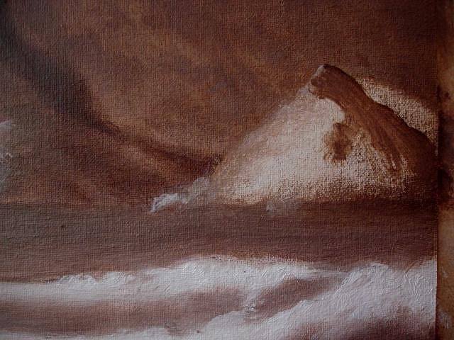
It turns out lousy...
So I wipe it out down to the canvas and start again.
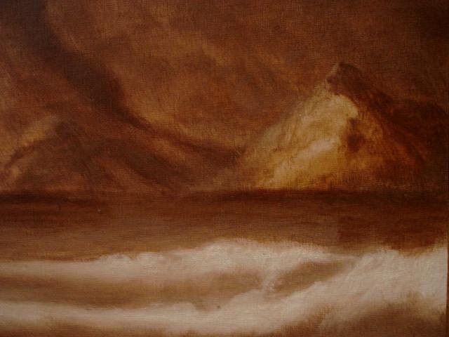
This is where I finish on the second day. I'm changing the name of this from "Classical Art" to "Old Master Style" to hopefully be more clear about the style I'm going for.
NOW the pinnacle looks just fine!
The shadow side of this mountain is meant to gently give a sense of scale without a lot of detail making it distracting.
This area will need a lot more work.
The outcropping looks okay now, but will need to be more sunlit. Looking forward with hope. [ Edited by: ROBB HAMEL 2010-08-23 13:09 ] |
|
RH
Robb Hamel
Posted
posted
on
Mon, Aug 23, 2010 1:22 PM
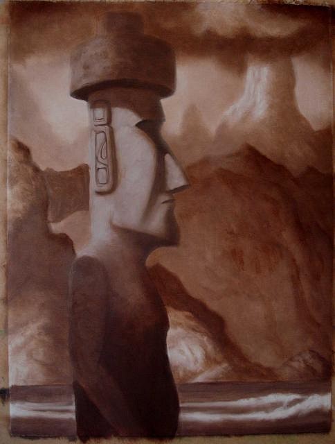
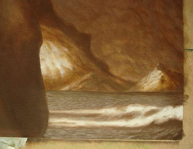
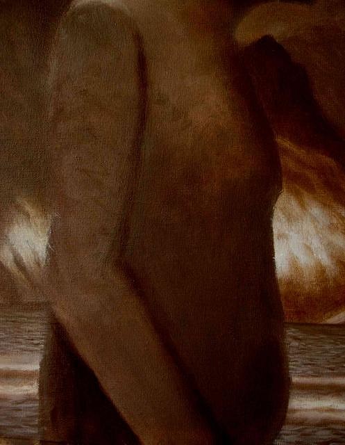
I've finally gotten to work on the surf. It kinda looks better here than in real life.
This is the first time I've worked on the Moai since about February.
I'm slowly building up the contrast so he stands out from the scenery.
I think he's looking decent, but there's still a ways to go before I'm happy. |
|
RH
Robb Hamel
Posted
posted
on
Tue, Sep 14, 2010 8:38 AM
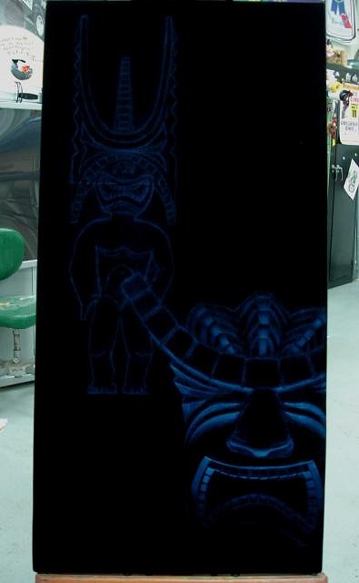
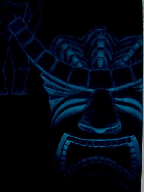
This is the 2nd of my "Tiki Vignette 3" series I started at DaddyKatz last week. It was commissioned by an art collector with an unbelievable floor-to-ceiling one-room collection and a good sense of humor - what a combination!
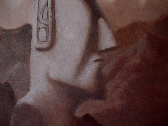
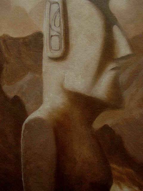
This is layer one for the foreground Tiki. Back to my moai canvas, which is dragging on and on...
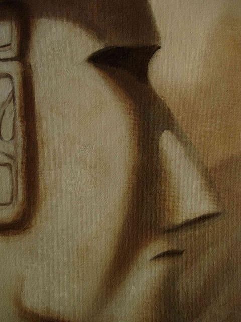
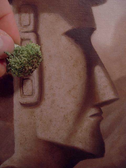
I'm still trying to get the moai texture to look right...
...and have to resort to using broccoli!!
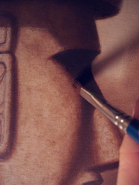
This edge is the most important single element in the painting to me: if I get it right, the moai will have an actual dimensional look. |
|
Z
zerostreet
Posted
posted
on
Tue, Sep 14, 2010 8:39 AM
Looking great! |
|
T
TikiG
Posted
posted
on
Tue, Sep 14, 2010 8:46 AM
Yay! Robb!! Great to see you painting on velvet again - and the moai painting looking superb. Thanks for sharing. G |
|
RH
Robb Hamel
Posted
posted
on
Tue, Sep 14, 2010 9:21 AM
TikiG and zerostreet - thanks for looking, guys. I can always count on both of you to let me know somebody is watching! Here's some new pics I just noticed on my camera:
This guy is hard to do because he wants to look like just a collection of parts and not one whole sculture. |
|
T
Tobor64
Posted
posted
on
Tue, Sep 14, 2010 9:42 AM
Painting with broccoli?! That's one inspired way of getting out of eating your veggies, Robb. The paintings are looking great, by the way. |
|
G
GROG
Posted
posted
on
Tue, Sep 14, 2010 11:22 AM
Here's your problem, you're painting with the wrong hand.
Lovin' the moai painting! GROG |
|
LLT
little lost tiki
Posted
posted
on
Tue, Sep 14, 2010 12:35 PM
THE MOAI IS COMING OUT TERRIFIC.BROCCOLI BOY! |
|
M
MadDogMike
Posted
posted
on
Tue, Sep 14, 2010 1:28 PM
The "Master" part I'll buy but who said anything about you being old!!!??? :lol: I know that clay artists use all kinds of crazy stuff to get textures, but painting with brocolli is a new one for me! Keep up the good work Robb, It's always good to see new stuff from you. |
|
T
tikigodz
Posted
posted
on
Tue, Sep 14, 2010 5:20 PM
That looks to real! |
|
B

Babalu
Posted
posted
on
Wed, Sep 15, 2010 4:42 PM
BROCCOLI BABY...YES!! Lovin' the depth in this one...you the man Robb!! |
|
B
blacklagoon
Posted
posted
on
Fri, Sep 17, 2010 4:50 PM
Hey Robb, Great meeting you at Bill's last night, hope to comission a piece soon! Paul and Kristina
[ Edited by: blacklagoon 2010-09-17 16:51 ] |
|
ATP

Atomic Tiki Punk
Posted
posted
on
Fri, Sep 17, 2010 5:11 PM
Yea the texture is looking sweet on the Moai! (with a New Jersey accent) Looking Good! |
|
RH
Robb Hamel
Posted
posted
on
Mon, Sep 27, 2010 4:08 PM
Look at the back of my head - only Germans can produce that kind of cranium!! Here's the finished item:
"Tiki Vignette 3" - 36"x18" - 2 of 4 Thanks! Looking forward with hope. [ Edited by: Robb Hamel 2010-09-27 16:10 ] |
|
D
danlovestikis
Posted
posted
on
Mon, Sep 27, 2010 4:13 PM
And that kind of talent, Wendy PS they invented most of dentistry too |
|
RH
Robb Hamel
Posted
posted
on
Wed, Oct 6, 2010 3:48 PM
Thanks again, everyone, for the feedback. Blacklagoon, it was a blast meeting you and your wife. Bill was thrilled with your purchases! Back to the "Old Master-style" Moai painting:
I used retouching varnish about 10 days ago, which is obvious from the glare.
Believe it or not, the front mountain has been subtley glazed blue.
I'm still trying to build the stone texture and keep missing the mark.
The topknot gets some attention.
The topknot looks fine, maybe I could transfer the style I used on it to the moai to get it working? |
|
M
MadDogMike
Posted
posted
on
Wed, Oct 6, 2010 4:20 PM
Moai-gnificent! Great work Robb. I admire people who can work on a project for months and until they get it right. I think I have ADD, I have to finish a project in a week or so or else I lose interest. That seems to lead to quantity instead of quality. |
|
IK
Iokona Ki'i
Posted
posted
on
Thu, Oct 7, 2010 4:18 PM
Looking great Robb! Now try that Broccoli technique on velvet! :) |
|
V

virani
Posted
posted
on
Fri, Oct 8, 2010 12:50 AM
My Tiki God !! That moai is so beautiful, Robb. Wow. Really, wow. |
|
V

virani
Posted
posted
on
Fri, Oct 8, 2010 12:54 AM
oh, and that Hawaiian Vignette is Beautiful too ! But, well, we all knew that before you'd even start it. |
|
TSA
Tiki Shark Art
Posted
posted
on
Fri, Oct 8, 2010 3:54 PM
AWESOME work Robb! |
|
RH
Robb Hamel
Posted
posted
on
Mon, Oct 11, 2010 6:04 PM
Mike, your guality is PLENTY high enough. I have the same problem, it really helps if I do big projects in bite-size pieces with gaps in between so's I can come back fresh after not peeking for awhile. Iokona Ki'i - I think I just might do that! Virani - Thank you! Wait till you see it in the frame I painted it to match. Tiki Shark - I've really been digging the hotrod piece you're in the middle of. Here's a little improv sketch I did for an upcoming painting:
"Marqcolorsketch1" - 5.5"x8.5" - oil on watercolor paper. This is a test to determine the setting for a canvas piece. I thought I'd try a little improv before doing pencil sketches. |
|
Z
zerostreet
Posted
posted
on
Mon, Oct 11, 2010 6:06 PM
Wow! That little "test" looks awesome! |
|
TSA
Tiki Shark Art
Posted
posted
on
Tue, Oct 12, 2010 8:05 PM
Great Googly Moogly!!! That's a "sketch"?.... |
|
TSA
Tiki Shark Art
Posted
posted
on
Tue, Oct 12, 2010 8:08 PM
Frickin WOW! |
|
S
Sophista-tiki
Posted
posted
on
Wed, Oct 13, 2010 9:56 AM
I'm sooooOOOoo happy you are sharing prosess pics. I too have a lot to learn. |
|
Z
Zeta
Posted
posted
on
Wed, Oct 13, 2010 10:09 AM
Gorgeous! Mysterious! What's behind that mountain? Probably cannibal... Love it. |
|
M
MadDogMike
Posted
posted
on
Wed, Oct 13, 2010 10:12 AM
Robb, you make it looks so easy! I can get to here OK But it seems like a giant step to here :lol: |
|
A
AlohaStation
Posted
posted
on
Wed, Oct 13, 2010 11:53 AM
Bob Ross would be proud of your"happy little mountains"! |
|
LLT
little lost tiki
Posted
posted
on
Thu, Oct 14, 2010 11:51 AM
Dang! |
|
RH
Robb Hamel
Posted
posted
on
Fri, Oct 15, 2010 4:50 PM
zerostreet - Thanks for liking it, but the final one is gonna be VERY different. Tiki Shark - Very kind words from the REAL master here. Thanks Brad, I wish I could get the real images in my head on paper... maybe the next sketch? Sophista-tiki - Your mountains look just the way they should: like Sophista-tiki's terrific mountains! Zeta - SECRETS are behind that mountain! MadDogMike - I got too involved and forgot to take pics showing the leap from those two steps! AlohaStation - Bob Ross makes excellent USA-made brushes! And the mountains are happy ones! L.L.T. - Every artist here seems to wish they could paint something that someone else can paint! I'm glad I can't do what you do, cuz it'd ruin the experience of having my mind expanded every time I check out your thread. That's flattery beyond imitation!! THANKS ALL. I've got a more Marquesan sketch cooking that I'll put on soon. |
|
G
GROG
Posted
posted
on
Fri, Oct 15, 2010 5:05 PM
Love the "MOOD" of your sketch. |
|
RH
Robb Hamel
Posted
posted
on
Mon, Oct 25, 2010 7:34 PM
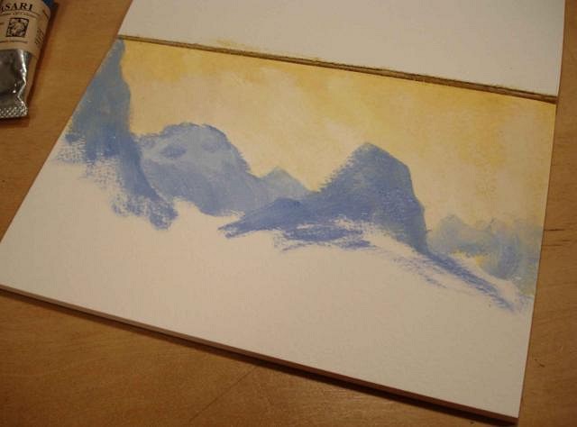
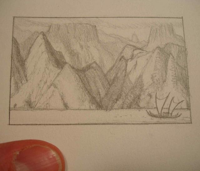
I did another 5 1/2x 8 1/2" sketch based on this thumbnail and it BOMBED!
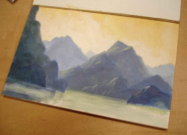
This is the halfway point, I'm not gonna show any further. I wasted a WEEK on this monster. I was frustrated and even had problems sleeping. My response to this failure? DO FOUR PAINTINGS LIKE IT IN A ROW!!
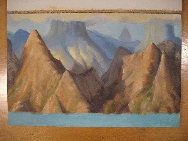
here's the four pieces of paper taped down and sketched in.
I'm actually using acrylic - not my favorite but FAST. I'm not wasting another week on one of these.
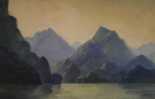
These two are finished enough - they ARE just sketches, playing with ideas and such.
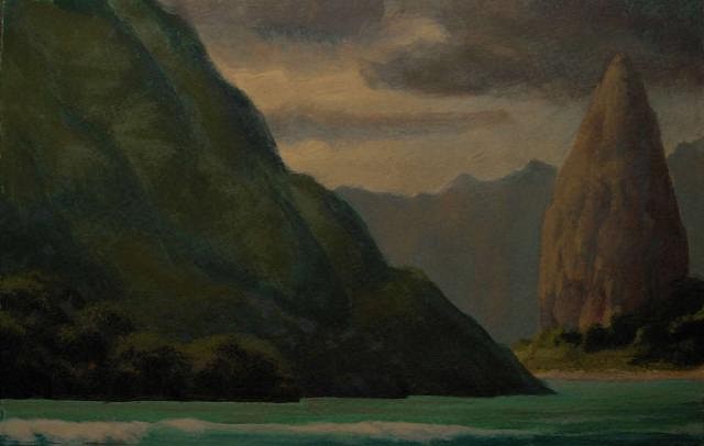
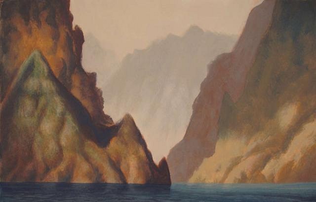
"Marqcolorsketch 2" - 5.5x8.5" - acrylic on watercolor paper. This pic is a little weak.
"Marqcolorsketch 3" - 5.5x8.5" = acrylic on watercolor paper. I'm trying to create my own version of the landscapes of the Marquesas since I don't have any of my own pictures of them, is wish I did!! These are not quite what I'm going to do with my future large paintings... I'm just feeling things out and trying to get a feel for volcanic landscapes. I've lived my life around sedimentary rocks and don't quite have the feel for these otherworldly places yet. |
|
LLT
little lost tiki
Posted
posted
on
Mon, Oct 25, 2010 8:50 PM
Dang! Looks like you MORE than made up for that lil speedbump! these are breathtaking!
[ Edited by: little lost tiki 2010-10-25 20:51 ] |
|
H
hewey
Posted
posted
on
Tue, Oct 26, 2010 2:28 AM
Those are just thrown together tests? Daaaamn! The depth of field, colour and atmosphere in them is great - period - let alone something 'thrown together' |
|
RH
Robb Hamel
Posted
posted
on
Sun, Oct 31, 2010 11:25 AM
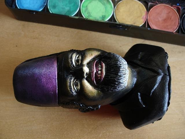
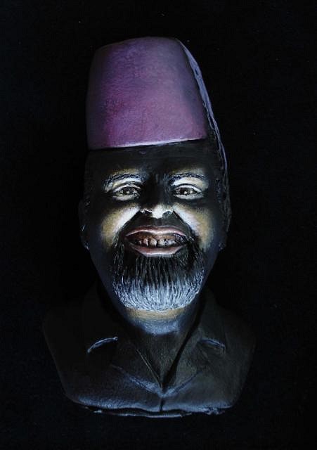
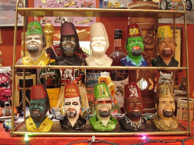
LLT - you are SO perceptive... they ARE meant to be like a naturalists' sketchpad! I'm taking a slightly Hudson River School approach to Polynesia... Maybe I'll call it the Sepik River School! hewey - thanks for the photographic description using terms like "depth of field" 'cause I used to be a photographer and I think in those terms. BILL WINGER, owner of DADDYKATZ retro/hotrod/tiki shop in Dayton, Ohio had his 50th birthday recently and a handful of local artists were asked to paint a custom made bust of him. Here's my approach:
For some insane reason I chose to use watercolors for this.
I felt sticking with a black velvet approach would be best.
The idea is: BILL WITH A FLASHLIGHT. I'm sure he always does this whenever he's in a dark room with someone.
These are the other busts. The ideas range from Bill as local horror show hosts to classic hotrod characters to completely original ideas. |
|
P
Paipo
Posted
posted
on
Sun, Oct 31, 2010 2:10 PM
Kinny nailed it...this one reminds me of the sort of work William Hodges painted from Cook's second voyage (this one is in Tahiti, pretty much the same kind of landscape as the Marquesas): Far better to discard a sketch than get most of the way through a significant piece and discover you haven't nailed down the style you were after...it has happened to all of us! I have a pile of pieces that will never get finished because I didn't think them through properly at the start. I'm digging the different directions you are pushing in Robb...don't stop now! |
|
BB
Bora Boris
Posted
posted
on
Sun, Oct 31, 2010 2:32 PM
That's so great, what a cool idea. Nice job Robb and everyone else involved. |
|
IK
Iokona Ki'i
Posted
posted
on
Mon, Nov 1, 2010 9:10 AM
Sweet landscape studies there fellow lefty (me too!). |
|
RH
Robb Hamel
Posted
posted
on
Tue, Nov 23, 2010 4:02 PM
Paipo - thanks for the feedback, and the link. Bora Boris - thank you, the various artists did give it hell. Iokona Ki'i - I've gotta tell you that I like your avatar-pic better than anything I've seen by Leeteg! These are the next two sketches on the left:
They've been giving me such a hard time I decided to take a break from them! |
|
LLT
little lost tiki
Posted
posted
on
Tue, Nov 23, 2010 4:28 PM
That blue one is gorgeous,Robb! |
|
M
MadDogMike
Posted
posted
on
Tue, Nov 23, 2010 4:44 PM
Robb and Kinny are BOTH back - life is good! Robb, I like the one on the upper right - rough and forbidding. Kind of a PRIVATE paradise to keep the lookie-loos out! |
Pages: 1 2 3 4 5 6 7 8 9 10 11 12 13 14 15 16 17 18 19 20 21 981 replies

