Tiki Central / Tiki Marketplace
sams mugs both new and our maori mug
|
SG

Sam Gambino
Posted
posted
on
Wed, Feb 14, 2007 9:53 PM
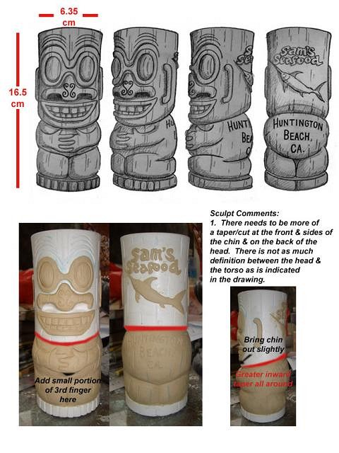
Let me clarify this whole buttcrack issue - I love the buttcrack as much as the next guy. Some of my favorite mugs are buttcrack mugs. Personally, when I see a female buttcrack above the waistline seam of a pair of low-rise jeans, it's like a little treat - a simple pleasure that breaks up a busy or monotonous day. If I had the power, the buttcrack would appear on coins and other official documents. I truly contemplated adding it to the design of this mug. I checked out other mugs - some had the buttcrack - some didn't. Meanwhile, I knew that the "hailing port" or town was to appear on the back. I did a little sketch with the buttcrack below the letters and without. Despite my adoration for the butt, design-wise, the overall "feel" was better without the crack. It seemed to somehow intermingle with the letters, but not in a good way. Tikiwahine is right about it interfering with the city and state. I also tried sketching a short little crack, but it looked like the tiki had a monkey ass - I didn't want that. Furthermore, as a vintage souvenir freak, I liked the look of the larger letters on the back - like some of the vintage souvenirs I've collected over the years. I use quite a bit of lettering and text in my artwork, so I had to weigh my love of the butt and my love of text, vintage souvenirs and lettering. Unfortunately, the butt had to take a backseat in this case. ....but you all just wait until my Harpo and Zeppo mugs come out! :) [ Edited by: sam gambino 2007-02-14 22:21 ] |
|
LS

Lake Surfer
Posted
posted
on
Wed, Feb 14, 2007 10:35 PM
Sam, it's really nice work! Congrats on the design! I hope you were not offended by my comment. Just having some fun. :) Me, I'm still dreaming of my mug. Too much wood carving getting in the way. |
|
SG
Sam Gambino
Posted
posted
on
Wed, Feb 14, 2007 10:53 PM
No harm at all, Lake Surfer- I don't offend too easily - by the way, you do some fine stuff yourself. You carving guys amaze me! If I tried it, I'd probably end up hacking a finger off. I was cutting some dried paint off of one of my stirrers 2 weeks ago and my finger is still healing. Looks like this one is going to leave a reminder on my finger that I'll be able to tell my grandkids about in 20 years or so. |
|
K

Koolau
Posted
posted
on
Wed, Feb 14, 2007 11:15 PM
Sam - that's a great mug, even without a buttcrack. And thanks for putting Huntington Beach in big raised letters on the back. I love that look, which unfortunately appears on far too few mugs - old or new. One quibble - isn't Sam's actually in Sunset Beach? I know Sunset's a part of Huntington, and HB is surely better known than Sunset, but still. I assume that was a preference of the new owners. Nonetheless, I look forward to seeing it in ceramic. Any previews on glaze colors, or will it be unglazed like a PMP peanut? |
|
S

SoccerTiki
Posted
posted
on
Wed, Feb 14, 2007 11:24 PM
I'm glad I'm not the only one with feeling about the buttcrack!?! |
|
H

Hiphipahula
Posted
posted
on
Wed, Feb 14, 2007 11:48 PM
I Dig it! Glad Sam's is back! |
|
TD

Tiki Diablo
Posted
posted
on
Wed, Feb 14, 2007 11:49 PM
I think the notes on the sculpt ,if followed ,would improve the look of this sculpt and look like the drawings.The design is cool. My take on mug design is it should be a "tiki you can drink out of". Ofcourse, this is a high use and abuse mug, so concessions have to be made in the design. This is too severe for restaurant use, but an example of what I am saying. [ Edited by: Tiki Diablo 2007-02-15 09:24 ] |
|
S

samsback
Posted
posted
on
Thu, Feb 15, 2007 10:28 AM
here is one that we found that will look like the old sams mug, this one will be larger in size. Let me know what you think. alan [ Edited by: samsback 2007-02-15 10:28 ] |
|
T

tikihai
Posted
posted
on
Thu, Feb 15, 2007 10:33 AM
Looking good Alan...any further news on the grand opening date yet? |
|
BB

Bora Boris
Posted
posted
on
Thu, Feb 15, 2007 11:04 AM
Yes Please. |
|
T

teaKEY
Posted
posted
on
Thu, Feb 15, 2007 12:11 PM
It seems like everyone is doing those resin necklaces so good. |
|
A

alohacurrent
Posted
posted
on
Thu, Feb 15, 2007 12:14 PM
Alan, the mug concepts look great. Hopefully by the weekend of march 17 you'll be full throttle. I look forward to the new drink menu. |
|
TSW

The Sperm Whale
Posted
posted
on
Thu, Feb 15, 2007 12:59 PM
Sweet!!! |
|
CS

Capt'n Skully
Posted
posted
on
Thu, Feb 15, 2007 1:39 PM
Great mug design Sam (Gambino)!! It's a beauty! |
|
Q

QueenAlani
Posted
posted
on
Thu, Feb 15, 2007 3:34 PM
WOW - that is sweet. I grew up in Orange County and have been to Sam's many times. I'm thrilled to hear it's going to reopen, and that you're producing a mug with the OLD LOGO!!! The new Sam's will be a must-see next time I'm down there, and in the meantime I'm sending a friend over to pick me up a mug as soon as you open. Mucho mahalo and hope to see you soon! |
|
P

Polynesiac
Posted
posted
on
Thu, Feb 15, 2007 6:08 PM
CAn you elaborate a little on this? |
|
SG
Sam Gambino
Posted
posted
on
Thu, Feb 15, 2007 7:31 PM
Thanks for the very kind words, Aaron and Capt. Scully. I'm flattered to have been asked to design the mug. |
|
B

bongofury
Posted
posted
on
Thu, Feb 15, 2007 8:13 PM
What I understand from Holden is they may do a future mug based on the menu/logo Tiki. That will be up to Alan and TikiFarm. |
|
T

tikijackalope
Posted
posted
on
Thu, Feb 15, 2007 8:45 PM
Curiously, Sam's already has a tiki that looks like it's wearing a wrestler mask. |
|
TB

Tiki Bird
Posted
posted
on
Fri, Feb 16, 2007 10:11 AM
Looking forward to drinking out of this mug at Sams! T-Bird |
|
HB

hala bullhiki
Posted
posted
on
Mon, Feb 19, 2007 9:52 PM
very cool |
|
S

shakatiki
Posted
posted
on
Tue, Feb 20, 2007 11:51 AM
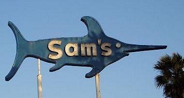
Change the glaze and you got one killer mug!! I agree with most that the design is awesome though. I also agree that Sunset Beach is more PC, but you'd probably then have to identify that it's in Ca. (not up country Oahu!) Can't wait to go to Sams again for pupus and Lapus!! |
|
L

Luckydesigns
Posted
posted
on
Thu, Feb 22, 2007 7:50 AM
The mug looks great. I too, think it should say Sunset Beach, CA. Also, I don't know if it was already posted, but when will these be available for purchase? |
|
SS

Surf Seal
Posted
posted
on
Tue, Mar 6, 2007 5:33 PM
Very cool mug. I can't wait to use one. I also think it should say "Sunset Beach." |
|
Q
QueenAlani
Posted
posted
on
Thu, Mar 8, 2007 10:33 AM
Yes, yes! When are they going to be available? When is Sam's reopening? |
|
S
samsback
Posted
posted
on
Mon, Apr 2, 2007 8:49 AM
Well here is the first of the mugs with 3 color choices, please let me know what you think about it and what color you would like to see. Opening will be sometime in May. Thanks for your support, Alan [ Edited by: samsback 2007-04-02 08:50 ] |
|
A
alohacurrent
Posted
posted
on
Mon, Apr 2, 2007 8:59 AM
If I had to pick just one maybe the green one, but honestly they all look good. Maybe do a run of each color over time. |
|
H

Hakalugi
Posted
posted
on
Mon, Apr 2, 2007 9:12 AM
Green is the colour. |
|
C

croe67
Posted
posted
on
Mon, Apr 2, 2007 9:33 AM
My pick is the Blue one - for sure - the color of the ocean :wink: |
|
B

boutiki
Posted
posted
on
Mon, Apr 2, 2007 9:47 AM
The middle, earthier green looks more old-school and the best to me. Nice mug. |
|
A

arriano
Posted
posted
on
Mon, Apr 2, 2007 9:51 AM
I actually like the aquamarine color (#3). To me that looks like the ocean. |
|
T

TravelingJones
Posted
posted
on
Mon, Apr 2, 2007 5:07 PM
A-V-O-C-A-D-O...retro Cali green and screams Poly-POP! :D Definitely a keeper... Flip-flOp-fLipPp... |
|
T

TikiJosh
Posted
posted
on
Tue, Apr 3, 2007 3:07 PM
I vote for the middle color. It just looks right. |
|
TB
Tiki Bird
Posted
posted
on
Tue, Apr 3, 2007 7:44 PM
I vote for the middle as well |
|
P

PockyTiki
Posted
posted
on
Tue, Apr 3, 2007 8:01 PM
All 3....personally. It would let everyone have their favorite. |
|
SF

Slacks Ferret
Posted
posted
on
Tue, Apr 3, 2007 8:23 PM
I like the one on the right. |
|
R

RockNRollRatfink
Posted
posted
on
Tue, Apr 3, 2007 9:03 PM
guaaaacamole! |
|
BB
Bora Boris
Posted
posted
on
Tue, Apr 3, 2007 9:10 PM
The Middle Mug! |
|
H
Hiphipahula
Posted
posted
on
Tue, Apr 3, 2007 11:01 PM
The Blue! Matches Sam's Famous Blue Sign! |
|
TT

Trader Tom
Posted
posted
on
Wed, Apr 4, 2007 1:50 AM
I like both the blue and the green one, but a guacamole colored swordfish just doesn't seem right...so I guess I have to pick blue. Unless... we could have a guacamole tiki with a blue fish on the back? |
|
T

tikigreg
Posted
posted
on
Wed, Apr 4, 2007 4:09 AM
I agree that the blue looks best, closest to the sign and it stands out best. Nice work! |
|
D

dibroc
Posted
posted
on
Wed, Apr 4, 2007 6:15 AM
all are good but to pick one it would be blue. |
|
T
teaKEY
Posted
posted
on
Wed, Apr 4, 2007 6:40 AM
Middle |
|
R

RevBambooBen
Posted
posted
on
Wed, Apr 4, 2007 7:46 AM
Olive Green, Dark Brown, ...and a hint of Orange. ( new colors on exterior of building. looks real good!) or, all 3. |
|
TSW
The Sperm Whale
Posted
posted
on
Wed, Apr 4, 2007 8:11 AM
I like all three. If you made all three colors I'd buy 3 mugs. Now if I had to pick a favorite color I'd pick the middle one. |
|
S

stentiki
Posted
posted
on
Wed, Apr 4, 2007 8:49 AM
I'm with the Rev, I like darker colors and really like the new paint on the Sam's Seafood Building. Dark brown would be nice. Maybe it's the camera but the mugs look a little bright and more pastel to me. |
|
R
RevBambooBen
Posted
posted
on
Wed, Apr 4, 2007 8:56 AM
p.s. if you added Mauve....... they would be dead on Southwest 80's Decor! How bout RED!? |
|
LLT

little lost tiki
Posted
posted
on
Wed, Apr 4, 2007 10:29 AM
No comments on the colors, but the sculpt looks like this mug is gonna RULE!!! Beeeeeeeaaaaaaauuuuuuuutiiiiiiiiifuuuuuuul! |