Tiki Central / Other Crafts
VanTiki Mugs: Octopus Time Lapse
Pages: 1 2 3 4 5 6 7 8 9 10 11 12 13 14 15 16 17 18 19 20 927 replies
|
L
leleliz
Posted
posted
on
Tue, Feb 24, 2009 1:38 PM
I like the way the Robot is looking...even just in the early stages. Look forward to seeing how it comes out. |
|
M
MadDogMike
Posted
posted
on
Tue, Feb 24, 2009 6:09 PM
I think I read that the gold luster is based on lavender or violet oil, it is an oddly pleasant smell. OO, tell me about "poisoning the gold". |
|
V
VanTiki
Posted
posted
on
Wed, Feb 25, 2009 6:08 PM
Do not fear the robot - it means you no harm!
More info later - I gotta run, I'm supposed to be cleaning the house! |
|
O

OceaOtica
Posted
posted
on
Wed, Feb 25, 2009 6:44 PM
Beautiful work Van! Robot is GO |
|
B

Babalu
Posted
posted
on
Wed, Feb 25, 2009 6:51 PM
That's so cool Henrik. The finish work on this feller is top shelf! The lite up eyes are cool too. The button looks a little to new and perfect maybe? You da man! |
|
M
MadDogMike
Posted
posted
on
Wed, Feb 25, 2009 6:58 PM
Awesome distressed finish, complete with rust streaks! Did you use the "VanTiki Method" of burying the wires? |
|
V
VanTiki
Posted
posted
on
Thu, Feb 26, 2009 1:10 PM
OceaOtia - Mahalo! Babalu - I agree about the button. This fellow is a prototype (hence the name Prototype A1) and I think he's be staying on my shelf as "reference" (i.e. something cool to distract me from work while on my computer). I have a bunch of vintage goodies that I collected specifically for ceramic robots that I am really excited about. And fret not - you will never see a button this shiny again! :) MadDog - I also was stoked to see how the underglazes looked after the firing. I am still getting the feel for the color shift that this paper clay goes through when firing, and how it affects the glazes (starts a mottled tan/brown, bisques to a light pink (of all things) and ends up a kind of tan parchment color). I did indeed run the wires through hollow channels in the mug's clay wall. A bit of a hassle, as after shrinkage the channels were REALLY tiny! Used a very thin wire, and had a heck of a time soldering all the connections. |
|
V
VanTiki
Posted
posted
on
Tue, Mar 3, 2009 12:48 PM
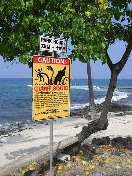
Noticed a strange sign on the beach this morning...
Walked a bit further and found this fellow finishing up its breakfast!
Mahalo for peeking - |
|
L
leleliz
Posted
posted
on
Tue, Mar 3, 2009 1:17 PM
Love those suckers! Killer work as always VT! [ Edited by: leleliz 2009-03-03 13:19 ] |
|
L
Liana
Posted
posted
on
Tue, Mar 3, 2009 2:06 PM
Vantiki, LOVE this! Infact, I don't think there is a Vantiki creation I saw that I didn't like! :D |
|
T
teaKEY
Posted
posted
on
Wed, Mar 4, 2009 6:54 AM
Two ways 2 drink from it? KILLER work |
|
V
VanTiki
Posted
posted
on
Wed, Mar 4, 2009 10:10 AM
Leleliz - A big mahalo - glad you like it! Liana - Thank you so much - but I am sure I'll eventually put together something wacky that you don't care for :) teaKEY - Sorry to disappoint, but you can only drink from this one way. Think of it like a wine glass: the tentacle is the stem and the skull is the bowl. I didn't glaze the tentacle interior so you can't flip it and drink out of it. |
|
M
MadDogMike
Posted
posted
on
Wed, Mar 4, 2009 2:07 PM
Beautiful! Love the coloring and texturing, the crimson inside the skull is great. Those are the blue paperclay tentacles that you made earlier? Did you insert them into the clay wet, dry, or bisqued? |
|
LLT
little lost tiki
Posted
posted
on
Wed, Mar 4, 2009 2:54 PM
just found this and thought it might give you a chuckle! |
|
M
MadDogMike
Posted
posted
on
Wed, Mar 4, 2009 3:19 PM
Is that "Go Van Go" or "Go Van Gogh" ? |
|
V
VanTiki
Posted
posted
on
Wed, Mar 4, 2009 3:21 PM
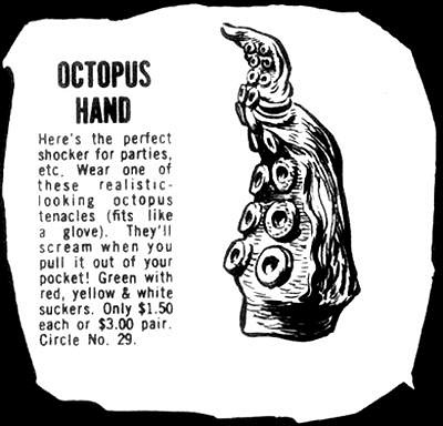
MadDog - Mahalo! The mug is mostly paper clay, with porcelain details (teeth and suckers). I make all the porcelain parts ahead of time, and let them dry out. Any extra that I have I organize in here:
Notice that I add "tread" to the root of the teeth and suckers to give the clay something to grab. When I attach them to a wet clay sculpture, I dip the root of the porcelain in water then press them into position in the wet clay. Its been working well (so far) Ken - That is the greatest! I am always wishing I could go back in time and order stuff from the back of comic books. Of course, I'm sure the actual product would never live up to the add (Sea Monkeys, anyone?). |
|
T
Tabu
Posted
posted
on
Wed, Mar 4, 2009 4:27 PM
I hope you don't mind but I have to print off a copy of that SQUID sign for the rec room. I have a real thing for giant squid. |
|
B
BigToe
Posted
posted
on
Wed, Mar 4, 2009 6:03 PM
another one straight outa sight! love the sign too! mad alohas, t |
|
P
Polynesiac
Posted
posted
on
Wed, Mar 4, 2009 6:28 PM
Van, your designs are amazing - truly one-of-a-kind sculptures (that you can drink from!) The robot is awesome...he reminds me of the "SCUD" comicbook robot. The detail you included really adds to the depth of the figures (mugs) history. It looks old and used- chipped paint, ID numbers the whole 9 yards! Now the squid....very creative! the mug is outstanding (the detailed suckers, the skull) but that caution sign really takes the cake for me. I would love to have that on a metal backing and put it up at the beach and just watch peoples reaction to it!!!! It would be too funny! Have you thought about possibly producing a few of those signs to sell? (hint hint) Great job! |
|
V
VanTiki
Posted
posted
on
Wed, Mar 4, 2009 6:40 PM
Tabu, BigToe, and Polynesiac - Mahalo, and I'm stoked you guys like the sign! The sign idea actually came before the mug - I thought of it while looking at signs along Kailua beach park (they are constantly putting up warning signs for sewage after heavy rain - eew). I'm gonna give a high-rez version of the sign to the buyer of the mug, and I also submitted a version of it to threadless.com (I'll post a link when the voting begins). I want to make one for my office too! I'd LOVE to print a few on a metal. I suppose silk-screening would be the way to go? Any silk screeners out there wanna collaborate on this? It would be a blast! Mahalo- |
|
B

Babalu
Posted
posted
on
Thu, Mar 5, 2009 5:47 PM
Hey Henrik, Really nice work man! Your the Bomb! Question: I know that youe are playing with cone 5 or 6 clays, but have you ever tried to repair a crack in bisque ware with the paper clay you are using then re-bisque? Just wondering if it can be done.... Right now, I bisque cone 06 clay to a hotter cone 04 then glaze fire to a "hot" cone 06, so in reality all the clays shrinkage that I use is going to taking place in the first bisque firing. Seems to me that one could add that non-shrinking paper clay to a crack in the busque and re-fire...what do you think? That paper clay seems to accept glazes well...yes? I must order some. I've never played with it. |
|
V
VanTiki
Posted
posted
on
Thu, Mar 5, 2009 5:54 PM
Good question! I'm about to attempt my first paper clay crack repair on the "Fresh Crab Legs" claw. Sadly, It developed a crack during the bisque fire. Supposedly you can patch with paper clay and paper clay slip. I'm going to give it a go tomorrow (or this weekend) and I'll let you know how it turns out. I'll shoot some photos of the attempt. The paper clay does hold glaze nicely - I love the stuff! Henrik |
|
V
VanTiki
Posted
posted
on
Fri, Mar 6, 2009 1:09 PM
Okey-Dokey! The squid warning sign has received a lot of interest, so I am in the process of getting a few made just like an official beach sign: screen printed on aluminum sheet. Nice rounded corners with holes for you to mount it to a wall or post. Now, I have 3 versions of the artwork, and I'd like to know what you all think. Please note: I've watermarked the images with the VanTiki stamp. Version 1 is the "weathered" version similar to the sign you have already seen. It would be printed with all the pukas (scratches and holes) revealing the aluminum base:
Version 2 is the "factory fresh" version. Nice and crisp - ready for its first day on the beach:
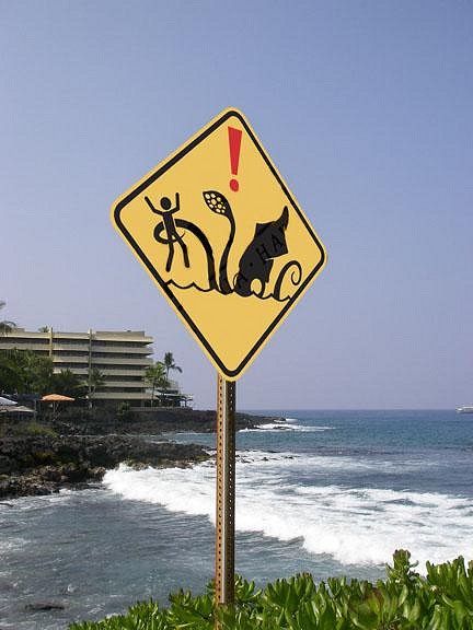
Version 3 is the "International" version. I took out all the text, and re-framed the image into the standard international warning sign shape. This is based on real-world box jellyfish, high surf, shark, and sewage warning signs:
And finally, if you haven't already seen my post in the marketplace thread, I submitted the design to threadless.com. Please take a look and gimme your vote! http://www.threadless.com/submission/199875/Beach_Closed Mahalo, |
|
BT
Badd Tiki
Posted
posted
on
Fri, Mar 6, 2009 2:07 PM
Great signs. The first two are funny but I think I prefer the last. It gets to the point and looks more official IMO just because there is no 'funny text'. I feel bad posting this, I never try to advertise or sell stuff... just offering because you are looking at getting it done and I think your stuff is cool. I work in a sign shop, I could do those signs in vinyl (just like any street sign), could actually do a reflective yellow backing too. The one with wear would have to be something like grey vinyl ontop of the colors (easier than removing it from that many colors., plus our aluminum is powder coated white). Unfortunately it would have to be through the shop though. So full retail price... If you're interested you can drop me a line and I could get a quote. [email protected] |
|
L
leleliz
Posted
posted
on
Fri, Mar 6, 2009 2:53 PM
I like the 1st and 3rd version. But how about the 3rd version without the exclamation point just to see. I voted on Threadless (love that site) and saw that was someone's suggestion and was wondering how it would look without it. Either way good idea...esp since I am a Discovery channel freak who is obsessed with giant squids :) |
|
P
Polynesiac
Posted
posted
on
Fri, Mar 6, 2009 6:07 PM
Van - I think the 3rd design would work as a t-shirt the best. Keep the exclamation point - otherwise I don't see it as being a "warning sign", just a silly street sign and the warning part of it just makes it that much more funny! If you are going to actually produce a metal sign - I would go with the clean version, the beat up version is funny, but the clean version looks more like a real sign. In my opinion, the more "real" it looks, the funnier it is. Also, the text adds to the humor of the art and draws the "viewer" in to take a second or third look to try and figure out if it's an actual warning sign. The warning signs we have on our pier in 'pedro, ca do have some text, so I think the verbage is good!!! please, please let me know if you make this into a sign! I know several people where I work who would probably be interested in this piece (even if you only produce a print, please let me know!!!!) I love it! |
|
F
FreddieBallsomic
Posted
posted
on
Fri, Mar 6, 2009 6:27 PM
Great signs~ H!!! I'm gonna vote on the first sign with the weathered look. I love see'n tourists do double takes.... Back in the day I had a buddy do SnowSnake signs that were weathered and watchin' tourist skiers check these signs out was a trip... Great stuff! |
|
W
woofmutt
Posted
posted
on
Sat, Mar 7, 2009 10:24 AM
Make some full color photocopies of the beat up warning sign, spray mount them to cardboard or poster board, and install them on popular tourist beaches late at night on March 31. After a few freaked out phone calls to the authorities you might even generate some media coverage. I voted YES! on your Threadless submission. I am mixed on the exclamation mark. I can see both sides of the argument. I will consider it with council and issue a statement soon. |
|
M
MNZombie
Posted
posted
on
Sun, Mar 8, 2009 11:02 AM
I'll cast my vote for version 2. I love the full sign but the weathering doesn't speak to me. Then again, up here in Minnesota I don't get to see too many real beach warning signs. Maybe if I saw more weathered signs on beaches I'd feel differently (I also probably wouldn't be so pail). I'd buy it as a tin sign in a heart beat. |
|
K
KungFuTiki
Posted
posted
on
Sun, Mar 8, 2009 4:03 PM
I like the aged looking one, man your mugs are to sweet! |
|
W
weirdphobias
Posted
posted
on
Fri, Mar 13, 2009 2:50 PM
Weird phobias that control your life Weird phobias and fears are an abnormal response to supposed danger. This danger is usually an exaggerated reaction to an imagined or irrational situation. Weird phobias like fear of success, fear of long words or fear of driving are only a few of the weird phobias in the list of phobias that we have prepared in this site. |
|
L
leleliz
Posted
posted
on
Fri, Mar 13, 2009 5:05 PM
Awww VT you should feel honored--your thread got spammed!! |
|
V
VanTiki
Posted
posted
on
Fri, Mar 13, 2009 5:32 PM
I fell so... so... dirty! If anyone needs me I'll be curled up in a corner crying quietly to myself :) |
|
M
MadDogMike
Posted
posted
on
Sat, Mar 14, 2009 8:14 PM
Henrik, that wasn't just random spam - they dug up a pic from an ancient post :lol: |
|
B

Babalu
Posted
posted
on
Tue, Apr 14, 2009 3:40 PM
Bump baby bump... |
|
TSA
Tiki Shark Art
Posted
posted
on
Wed, Apr 15, 2009 7:11 PM
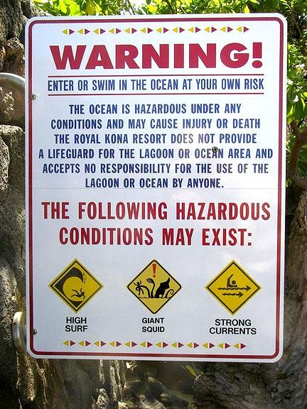
U R 2 COOL! Giant Squid! I want a sign I can post down at Honl beach - the surfing beach by my house. I'm sure someone would take it, as it'd be too cool to not grab. But, it might be worth it. It's too funny! U know tourists would fall for it! |
|
TSA
Tiki Shark Art
Posted
posted
on
Thu, Apr 16, 2009 2:54 PM
|
|
T
Tahitiki
Posted
posted
on
Fri, Apr 17, 2009 7:09 AM
Nice!!!! |
|
TSA
Tiki Shark Art
Posted
posted
on
Fri, Apr 17, 2009 12:27 PM
|
|
SF

Slacks Ferret
Posted
posted
on
Fri, Apr 17, 2009 1:46 PM
I would love to purchase one of these. |
|
K
kahalakruzer
Posted
posted
on
Sat, Apr 18, 2009 8:24 PM
I love the signs man! It's funny because they are about as funny as these signs that were put up in my town a few years back for tsunami zones and evacuation routes and such after they had a ridiculous scare...but the tsunami signs were put up by the state gov't! I might have to buy a few as an "add-on" to the already posted signs! |
|
TSA
Tiki Shark Art
Posted
posted
on
Sat, Apr 18, 2009 9:39 PM
|
|
V
VanTiki
Posted
posted
on
Wed, Apr 22, 2009 12:03 PM
Brad - those beach sign photos are great! I'm still working on getting a run of signs produced - but as you may have noticed I dropped off of the clay map for the past month while cranking away on a "day-job" project. Good news is I am finishing the final illustrations for the job today, and after a much needed 4 days off (relaxing in Volcano village no less!) I will be dusting off my clay table and getting back to the fun stuff! I have a bunch of post-its with mug sketches, as well as a bunch of mug-idea notes on my phone that I've been jotting down that I am looking forward to bringing into the third dimension. On a side note - I have had a bit of clay fun in the past four weeks. I've been Taking classes at the Hawaii Potter's Guild with my dad off-and-on for a while, and we recently decided to switch things up by taking a hand-building class instead of a wheel throwing class. It has been fun - I dunno if I have actually learned anything - but I do really appreciate the chance to make some clay goodies, spend time with my dad, hang out with other artists, and get away from my computer. Most of the pieces I've been making are non-tiki, so I haven't posted any shots. Last week some of the students found my website and wanted to make tiki mugs, and the teacher asked me to do a mug class. Well, how could I refuse! :) I took in a few of my old pongo log mugs to class last night and we all made tiki vessels. It was a lot of fun, and I am very curious as to how my first high-fire mug will turn out. I put it together REALLY fast (as it was a demonstration mug), so I give it a 50-50 chance of surviving the bisque firing. I'll shoot some photos of it at next week's class. Ok - back to work! Henrik "VanTiki" |
|
V
VanTiki
Posted
posted
on
Wed, Apr 29, 2009 12:34 PM
Ok - took some shaky cell-phone shots of the demonstration mug - as is was a demo, I dub it The Great DEMOKU. Took a Pongo log and went to town on it. I slapped the basic shape together fairly quick last week, so I have low expectations of this surviving the firing. Also, I can't baby the drying process as it is a communal kiln set up over there - so fingers are crossed! The mugs that the other students made turned out great - and there is talk of Mai-Tais on the last day of class when we get all the finished mugs out of the kiln.
Mahalo for peeking! |
|
L
leleliz
Posted
posted
on
Wed, Apr 29, 2009 12:51 PM
I love how when you "slap the basic shape together" it ends up being awesome! Everytime you stick up a new design on this thread it blows me away. Amazing as always - even in its early stages. |
|
LLT
little lost tiki
Posted
posted
on
Wed, Apr 29, 2009 12:58 PM
WOWZA! |
|
TSA
Tiki Shark Art
Posted
posted
on
Fri, May 1, 2009 3:03 PM
|
|
B

Babalu
Posted
posted
on
Fri, May 1, 2009 4:44 PM
YUMMY! Thanx for the fix brother Van! |
Pages: 1 2 3 4 5 6 7 8 9 10 11 12 13 14 15 16 17 18 19 20 927 replies


