Pages: 1 2 3 4 5 6 7 306 replies
|
GSM

Gene S Morgan
Posted
posted
on
Wed, Jul 17, 2013 6:44 PM
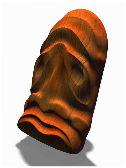
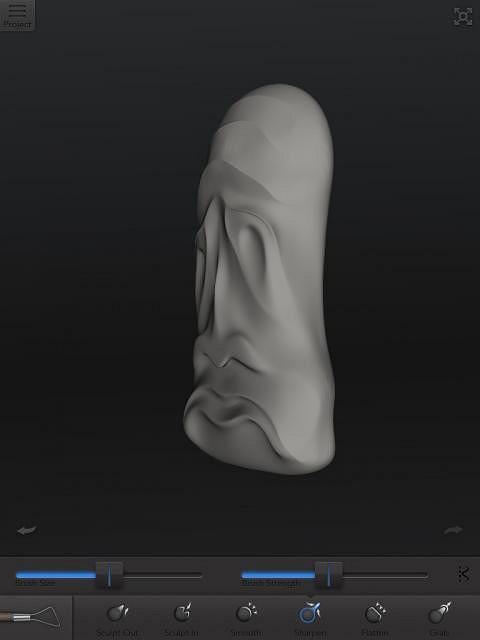
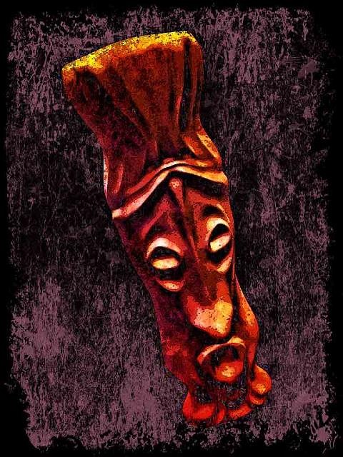
Another angle and lighting. Something that sets this app apart from all other sculpting apps is that it has a built-in menu that allows you to send your file to to a 3D printer. AutoDesk has some kind of deal with a company called Sculteo which will take your 3D file and make a 3D print of it. Anyone who might have followed my 3D printing thread from awhile back will realize that this is so much simpler than the method I explained for doing the same thing on the computer. If you want to get a little more info on that you may want to check out that thread at: http://www.tikicentral.com/viewtopic.php?topic=43359&forum=18&hilite=sculptris
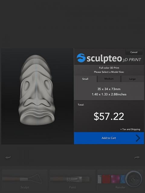
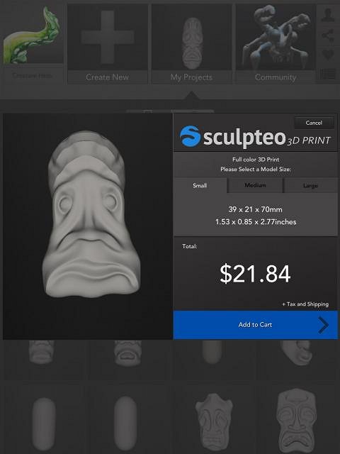
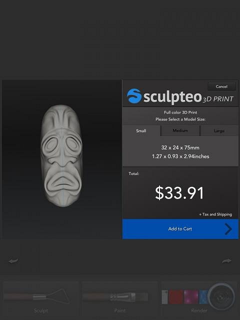
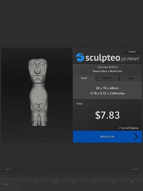
I thought I might get this sculpt made into a pendant. I uploaded it to the Sculpteo site and got this screen which showed me what it would cost to have it printed. As you can see the price was $57.22, a lot more than I wanted to pay. The price they charge is based on size and volume. The smallest size they print at was 1.4 inch by 1.33 inch by 2.33 inch. I decided that I had to do something to reduce the volume of my sculpt.
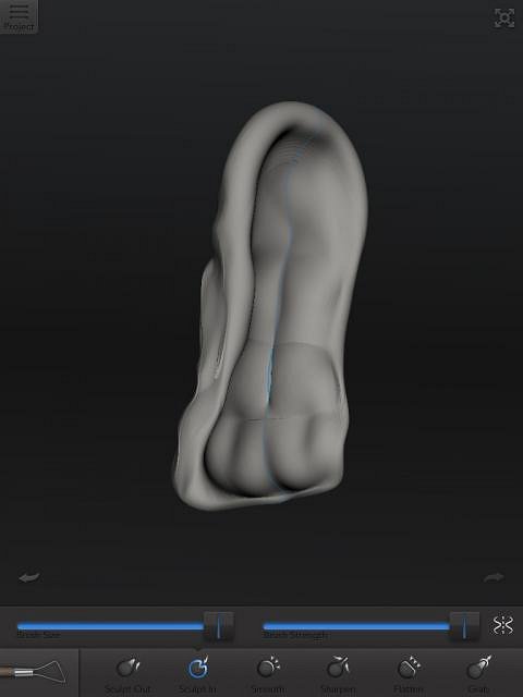
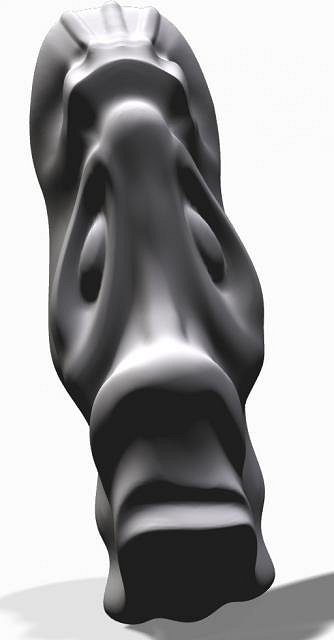
The first thing I did was flatten the back so it wasn't a log anymore. Using the carve tool I dug out the back so it was more like a mask.
Using the smooth tool I cleaned up the hollow back area.
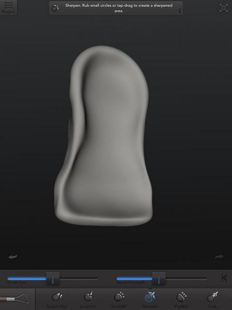
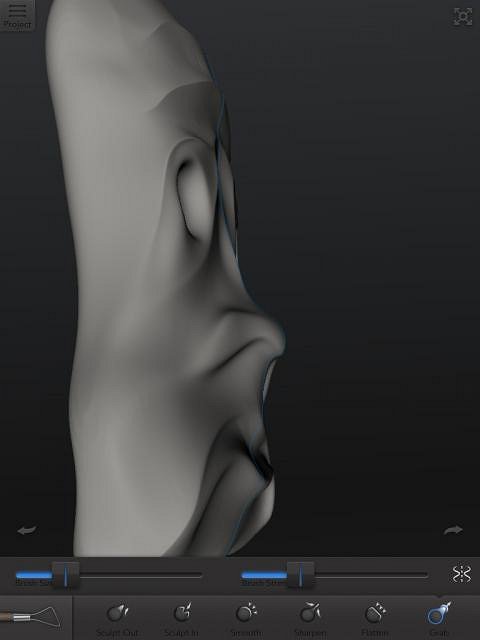
When I turned the sculpt on it's side I noticed that I was loosing detail. I guess I smoothed too strong and the front side got distorted in the process.
Using the grab tool I pulled some of the detail back into the sculpt. Since I thought I might end up making a cast of the final digital print I shaped areas like the nose and mouth so they would not have overhands making casting difficult.
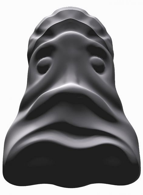
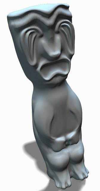
All that shaping kinda made the image look quite different. I thought I would give it a try anyway.
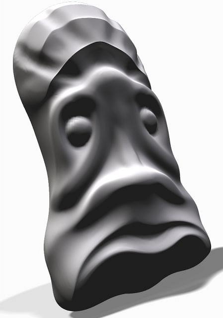
I took a couple of snaps in the render window to recheck the shape.
Another angle.
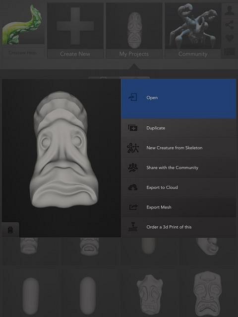
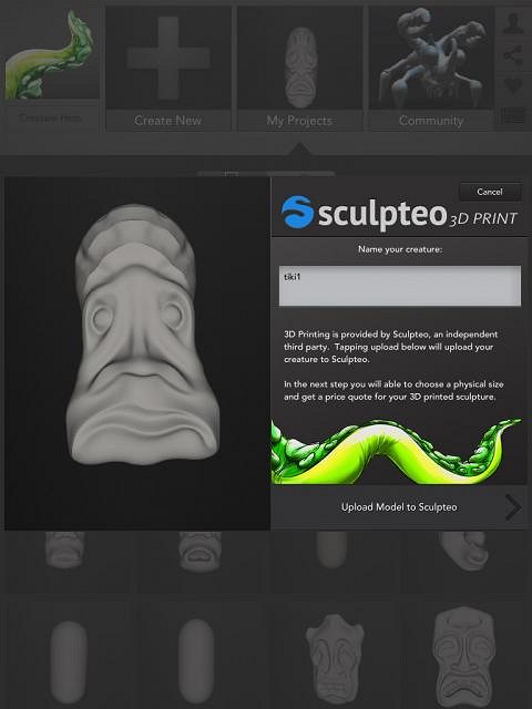
In the main menu you go to the “Order a print” section.
When you get to Sculpteo you name your sculpt and upload it.
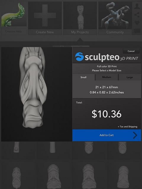
As you can see while the height and width is about the same, the thickness was reduced to half. That brought the price to less than half as well. I decided to try some more.
|
|
GSM
Gene S Morgan
Posted
posted
on
Thu, Jul 18, 2013 9:58 PM
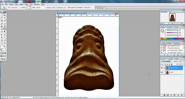
I did it different this time. I created a hollow bowl first and then sculpted it.
I guess I got the walls too thick and the price was still too high.
This strange guy is actually the first sculpt kinda squeezed together and hollowed a bit more.
The price went down even more.
This little guy is even too strange for me. I created him by decreasing the diameter of the original log and hollowed it out again.
With both the width and thickness decreased I got a price I could live with.
Using the same method as the last image I created this guy.
I ordered a 3D print of this one. I will let you know how it looks when I get it.
|
|
GSM
Gene S Morgan
Posted
posted
on
Sun, Jul 21, 2013 6:21 PM
As I have said before, with digital images you are never really done until you decide you are done. With these digital sculpts you can save them as image files and treat the images just like you would any other image. This is another of my Ipad pages. On it there are a large number of apps that can add after effects to any image. Digital art gets a bad name because there are many effects out there that can mimic natural art. Some folks just apply a filter that, for instance, makes your image look like a watercolor, oil paint, or a pencil sketch. My approach is just the opposite. I try to make images that are very hard or impossible to create with natural media. I think digital is a new media and should be explored digitally in new ways.
This is the same image I displayed in the earlier part of this post. I played with color a bit and came up with something I kinda liked.
Next I posterized the image a bit. This reduces the color level and adds some interesting shaping and color levels. I love texture, so I overlayed some grungy textures over the image.
Playing with contrast, saturation, and brightness makes things pop a bit.
Some new color and texture adds add interest. You can do this all day, but with the right apps, it won't take near that long.
Hey, want another size or shape, no problem. There are limits to this kind of distorting. Too much and pixels start stretching and looking weird. And, the image starts looking too distorted and crappy. Next I will show you some of the apps I use to get these kind of effects.
|
|
D

danlovestikis
Posted
posted
on
Sun, Jul 21, 2013 8:40 PM
Very good. The tiki with the body reflects how I feel if I eat too much. I really like the textures. The way you make these digitally is so much like sculpting that I'd like to see you do one in clay too. Wendy |
|
GSM
Gene S Morgan
Posted
posted
on
Mon, Jul 22, 2013 9:27 PM
Thanks much Wendy ... I sure wish I could still work with clay ... I have so many ideas I'd love to try ... Gene |
|
GSM
Gene S Morgan
Posted
posted
on
Mon, Jul 22, 2013 9:44 PM
As I said there are many apps that can be used to filter, change, and add effects to an image. PhotoStudioHD is a good example because it has a bunch of preset filters which you can fine tune, and also allows for many basic adjustments as well. I started by posterizing the image, and then used an antique filter to change the color and tone.
Some slight extra texture is added. Notice how the the sculpt looks completely different. By combining many different effects and paying attention as you go you can develop looks and styles that are all your own.
I added some texture and filtered the colors again. This is called experimenting or just playing around and exercising your imagination.
Is it art? I'm sure someone will say it's not, but it sure looks good to me.
You may notice I like texture. I add some texture overlay to many of my images. It does not have to be strong or over the whole image. I like to make my own texture, but this app called GrungetasticHD (such clever names?) makes the process easier. You can have a couple of textures at a time each with different colors and intensity.
Rough edge framing is a nice effect to add some pop to your image.
I decided I wanted brown instead of green. Easy to do, and I intensified the color as well. I came up with several possible final images with this experimenting. With filtering you can either start with an idea and use your knowledge of filtering to accomplish that idea. Or, as I have done here you can just play until you find something you like. It is possible to go too far and mess things up. That is why I save image files as I go along in case I need to go back to some point and try something different. Of course experimenting and just plain fooling around is important to learning the process and developing your own style.
|
|
GSM
Gene S Morgan
Posted
posted
on
Tue, Jul 23, 2013 8:26 PM
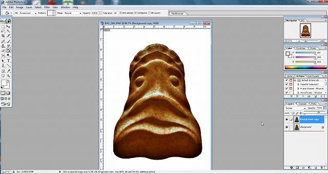
Just because I create on the Ipad does not mean I have to stop with the Ipad. I have been a Photoshop user for decades. There are other computer programs I find very useful in creating images, but Photoshop has a huge collection of tools that are very useful. There is a bit of a learning curve with the program, but you don't have to be an expert to learn many of those tools. You can learn enough to get the job done. This image was completed in Photoshop from an Ipad sculpt. My goal was to get a digital ceramic glaze effect. I love the rough texture. That's my thing.
I use some of my own created filters and other folk's too. This is a very versatile bamboo filter that a talented filter designer from Filterforge made. I also like the hand drawn old book illustration effect that I used on the tiki. I have created several filters that produce a similar result.
I worked pretty hard to perfect this ceramic glaze look on this tiki, It required several different filter effects and color and tone adjustments. This is what I mean by my trying to develop a true digital style that cannot be created with real world tools. Back in the days that I worked in clay I designed many glazes in trying to produce complex and interesting surface treatments. I never came up with anything that came close to the pattern and color detail that I accomplished on this tiki. I love it when I get it right.
This look is a combination of texturing in the 123D Creature app and a number of enhancements in Photoshop. Floating in space, it is an interstellar tiki.
|
|
GSM
Gene S Morgan
Posted
posted
on
Wed, Jul 24, 2013 8:04 PM
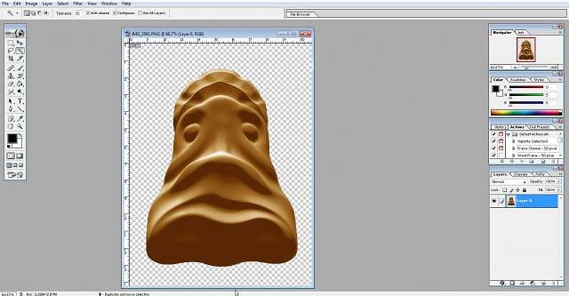
This is what the Photoshop program looks like. It's an Ipad sculpted tiki ready for a little computer work. If I haven't mentioned it before, when you see that checkerboard pattern it means that there is no background in the image. I saved it that way on purpose so I could concentrate on the tiki alone. It will be easy to add a background later.
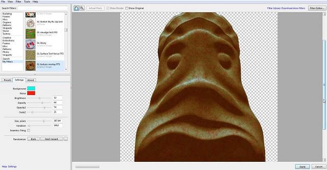
I decided to do a ceramic glaze look on this tiki. I have mentioned FilterForge several times. It is a program that runs inside Photoshop that gives you tools to design your own filters and create original effects. Ceramic glazes are best when they break up on the clay surface producing pattern and texture. Well OK, those are my favorites anyway. I thought I would make a simple filter for adding colored texture to the surface of my tiki.
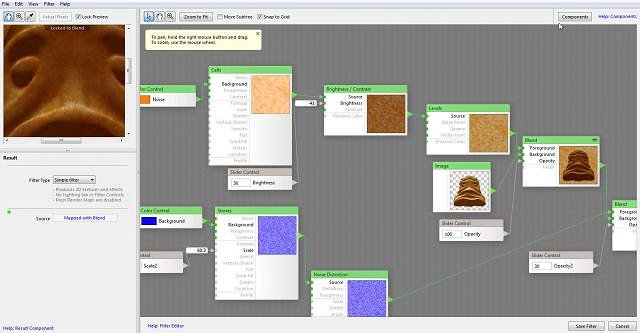
This is what Filterforge looks like inside. There are many nodes or components available that you can hook together in various ways to get something done. There are only a few nodes in this simple filter, but you can have hundreds that can be combined many ways to create effects. In this filter there are two different noise modules that are processed in different ways and blended together and layered over the tiki image. You end up with multicolored patterns applied to the tiki.
Like I explained before in the Sketchclub app, layers can be a powerful tool in digital graphics. In this case in Photoshop I made a copy of the tiki image and combined it back together using one of the layer modes. I will not go into too much detail because it becomes kinda technical, but layer modes is a great and simple trick to do great stuff. What I was doing here is what was once called (back in the KPT days, but that is a long long story) color contrast. Normal contrast just affect the black and white aspects of and image. This method changes the contrast of all colors and seems to sharpen the image in the process. In the end my applied texture become stronger and that is what I'm looking for.
I did another layer trick to lighten the colors. Graphic processing programs and apps have a “lighten” or “brighten” effect. The only problem with doing that is that those effects mostly work by adding white to the colors. The colors easily become washed out that way. By using a screen mode in layers you change the tone of each color producing a lighter image and keeping the color from being washed out.
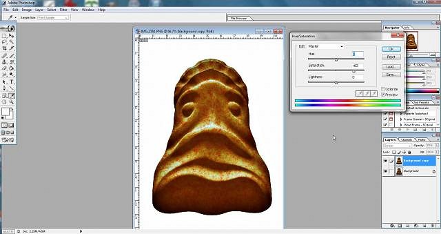
The saturation control makes all the colors stronger. I use it a lot. If you intend to print your images they always look better with more saturated colors.
I ended up sharpening the image a bit. From the beginning I intended the tiki to looked like glazed ceramic. My favorite glazes have always been glazes that break up and have patterned surfaces. In the real world there are certain materials that are added to glazes to get that effect. (rutile, ash, crystals,etc) In the digital world all you need is some Photoshop magic. (or one of the other image processing programs and apps that do digital magic)
|
|
GSM
Gene S Morgan
Posted
posted
on
Thu, Jul 25, 2013 8:54 PM
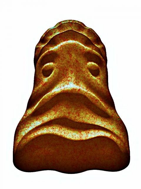
I talk about using texture all the time. I am addicted to texture, but so are many artist. Texture shows in the kind of paints used, how they are used, and also in what the image is painted on. Canvas, wood, gesso board, all give texture to what is painted on them. Digital texture can be anything. I scratch textures on paper and scan them. I scan real world stuff from motel room walls to coffee spills. And, there is a lot of software out there that can produce random textures. That is where this one came from.
This is the same texture tiled to make it smaller. If you have been following this thread for awhile you may remember my use of tiled texture in my fabric patterns. The advantage of computer based textures is that they can be seamless, meaning that a strong seam line will not show when they are tiled.
This is another example of a FilterForge filter. You can't see much because of the size but you can see that it is more complex than the other one. This filter is much about texture. It allows several textures to be overlayed on the image using different colors and contrast. I'm still working on this filter. Not sure how much more it will do when I'm done.
Remember this guy? He has been what I have been using as a test image for this new filter. Yep, my texture is in there somewhere. I like the way he turned out. I don't know how other folks feel, but I find the modern world amazing. You can start with a sculpture. Change it to an image. And, using many complex tools and a little imagination end up with an impressionistic almost work of art.( I say almost because I'm not really an artist you know) You do all this digitally ….Amazing. And, my hands are still clean.
I was going to throw this guy away, but he looked so primitive. Well, I guess that is OK, primitive is what it's all about. Gave it some filter magic and I grew to like it.
|
|
GSM
Gene S Morgan
Posted
posted
on
Sun, Jul 28, 2013 7:07 PM
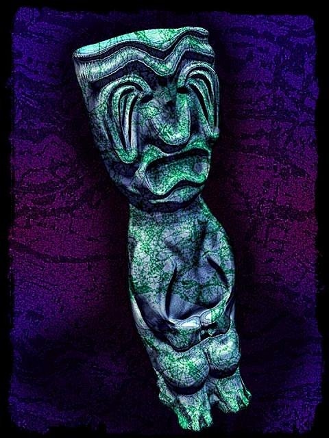
Posing sculpts at different angles and with different lighting can sometimes inspire ideas about how to finish an image. I saw a kind of spookiness with this tiki. I actually experimented with different ideas of color, contrast, and texture looking for the perfect mood. Things transitioned from first brown and then purple and finally some deep reds. Each addition of color and texture with more and more contrast began to swallow the tiki into an abstract world. In the end the tiki became a ghost image floating in a fantasy fire texture. Can you believe that is the way I imagined it?
|
|
GSM
Gene S Morgan
Posted
posted
on
Mon, Jul 29, 2013 8:03 PM
The same tiki as the last, but different angle and lighting. My eye and mouth treatment on this tiki gave great opportunity for a strong and primitive look. The final image here is all about layering. Some texturing of course, and posterizing was added to two different colored images. Then the two were combined using layers. In the end you get the color of one image combined with the rustic texture of the other. You get a kind of rustic abstract impressionism. It comes close to my intended goal of producing a new kind of digital style that does not try to mimic natural real world media.
|
|
T

tigertail777
Posted
posted
on
Tue, Jul 30, 2013 1:54 AM
Hey Gene, been following along off and on for a while I dig your experiments. I normally come pretty close to abhorring digital art because it tries to mimic tools that it can never really look exactly like and people rely far too much on digital tools. But I appreciate and understand that you are trying to push digital to become it's own art form ( I have to say that I liked your handmade clay pieces you posted a while back better, but that is my own personal prejudice showing through.) I gotta say you are very prolific and continue to work hard at evolving the fledgling digital art form and I admire your tenaciousness. Looking forwards to seeing how your 3D printer pieces come out. :) |
|
GSM
Gene S Morgan
Posted
posted
on
Wed, Jul 31, 2013 9:47 PM
Tigertail ... Thanks much for checking out my weird stuff .... I do really understand peoples feelings about digital graphics. It is hard to try to do art that does not get your hands dirty. Pushing pixels is not the same as squeezing mud. The real world can be very satisfying. If I could I would still be sculpting in clay, but I was a Syfy reader in my youth and was ready for a personal computer 20 years before you could actually buy one. I'm an old guy, but never had the fear of, or distaste for, the computer age that other folks do. I guess that is why I started these threads. Just trying to get other folks as excited as I am about digital possibilities. I will post images when I get my 3D print back, but this new company has turned out to be not as easy to work with that Shapeways was. They are so slow. My wife keeps promising me a 3D printer of my own for Christmas. If that happens I will become an even more annoying poster than I already am (I have some crazy dreams about about 3D printed mugs) ...... Gene |
|
GSM
Gene S Morgan
Posted
posted
on
Wed, Jul 31, 2013 9:58 PM
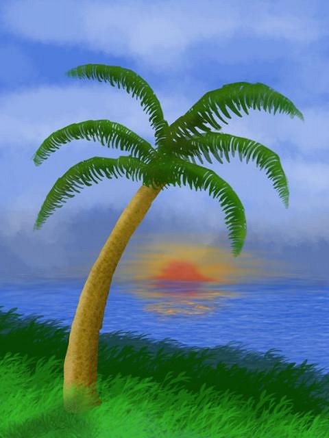
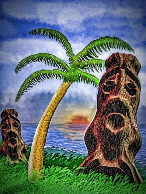
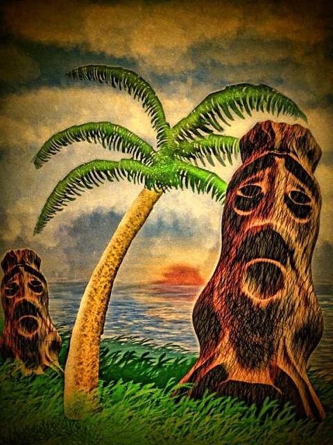
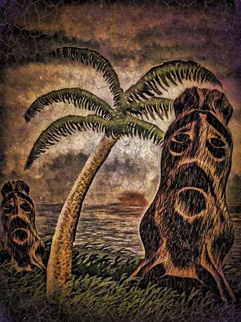
Well this goes way back. This is the island image I made early in this thread to demonstrate creating your own brushes in Sketchclub. I added a little sunset to the landscape and then brought a couple of sculpted tikis in. I used quite a bit of HDR (high dynamic range) filtering to produce the final image here. Strong HDR produces the effect of super detail and contrast. It is a kind of too real reality. It immediately gave me the feeling of an old hand colored postcard from bygone days. So I gave it some texture and color manipulation to age it. It looks like it was found all dirty and bent up in the bottom of and old lost steamer trunk.
|
|
H

hiltiki
Posted
posted
on
Thu, Aug 1, 2013 8:21 AM
I like this one.
|
|
ATP

Atomic Tiki Punk
Posted
posted
on
Thu, Aug 1, 2013 11:51 AM
Why is this bad work? To start, "lighting" you have a sunset behind all your objects What are the sources of these other lights and why no shadows from the sunset? They seem to be based mainly on these.....
|
|
GSM
Gene S Morgan
Posted
posted
on
Thu, Aug 1, 2013 10:13 PM
Hiltiki ... I tend to lean toward the darker less saturated ones as well. It is just that they print a little better with stronger colors .... Thanks for checking it out ... Gene |
|
GSM
Gene S Morgan
Posted
posted
on
Thu, Aug 1, 2013 10:23 PM
I felt this guy needed some real special treatment. Of course a gold tiki was not a normal Polynesian art form, (OK, maybe never) but I have a tendency to say “What If?” Also I saw this as abstract to the extreme. So I piled on the texture and color until it got so far out that that I could not help but love it. Even though it was blanketed with a fog of specks and grunge the tiki jumps right out of the image into the imagination. At least into my imagination, and that is what counts.
|
|
GSM
Gene S Morgan
Posted
posted
on
Sun, Aug 4, 2013 7:19 PM
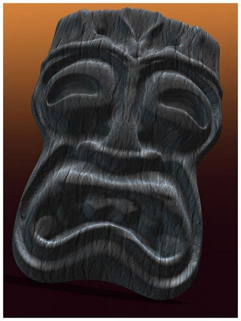
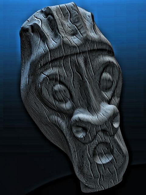
The moai that I applied texture to earlier it this thread. Just experimenting with some different looks to see how the surface texture would look filtered.
|
|
GSM
Gene S Morgan
Posted
posted
on
Mon, Aug 5, 2013 7:52 PM
Using a HDR filter can created an exaggerated increase in detail. I used a number of different filters and effects on this image. One direction I went was with posterization and increased colors. Another direction was to increase the detail and background texture. I was not sure I liked either one, but when I layered the two methods together I ended up with a nicely detailed image with good color and texture. As I say: “You are never done until you decide you are done.” There is always one more possibility.
Man, that was just too many images .... Even I'm confused ... sorry about that ... I will try to control myself better in the future ... |
|
GSM
Gene S Morgan
Posted
posted
on
Tue, Aug 6, 2013 6:53 PM
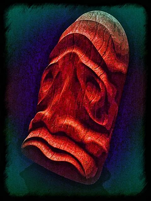
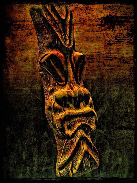
The cool thing about working with sculpted tiki designs is that you can pose them at any angle under many lighting conditions. It is easy for me to see sculpts as real objects even if they exist in a digital world. Different poses often fire my imagination and I immediately see what they are meant to be. I saw the fire god in this guy, but getting there took some odd turns. Sometimes you have go through some strange color mix stages to get to where you want to be. The last two may look the same, but on the last one I blended the base into the darkness at the bottom to add some mystery.
|
|
GSM
Gene S Morgan
Posted
posted
on
Wed, Aug 7, 2013 5:52 PM
I used an overall simple wood like grain on this one. When I increased the detail I felt I got the look of burnt wood. That is an old technique used in crafts where you use a blowtorch to burn the whole surface and then wire brush down to the softer grain. I always liked the effect. After some experimenting I decide I liked all of the last three images. Sooner or later I will have to figure out which one I liked best.
|
|
TG

Trader Gino
Posted
posted
on
Wed, Aug 7, 2013 6:16 PM
Love him or hate him, I gotta say I see where ATP is coming from regarding the tiki resemblance. Maybe if there was a way you could incorporate some deep cuts or more drastic angle changes, that could help? A little more deliberate presentation of the facial planes maybe? |
|
GSM
Gene S Morgan
Posted
posted
on
Thu, Aug 8, 2013 7:34 PM
Thanks Trader Gino for your comments and the hi-five. Textures are my life ..... I was happy you didn't poke me with a sharp stick ..... I must I admit I was not very sure about what was meant by your comment ....." Maybe if there was a way you could incorporate some deep cuts or more drastic angle changes, that could help?" ..... I guessed that you thought my images don't look enough like wood carvings, but they are not supposed to. I try not to mimic real world techniques. I have explained this several times before in this thread, I don't copy exactly tiki forms, I don't mimic natural media, I do not try to copy other peoples styles. What I try to do is create somewhat abstract, stylized, Impressionistic tiki images. I have said before many times, "I do not consider myself any kind of fine artist" But, I am a creator. I must create to live. I think creativity is a fundamental human characteristic. I create to remain human. What I would ask you to do is look at my stuff from a different angle. Try to think of them as tiki mugs. I sculpted in clay for 2 decades and my sculpting style falls back to what I learned in those days. Digital offers many of the same tools that clay does, but there are many added tools that are not possible with clay. My textures that I overlay are like stains, oxides, slips, and glazes I used on my cone 6 sculptures. There are so many possibilities to explore in digital graphics that take you way beyond working with mud. That is my aim ... A new digital art form. They are not really meant to be tiki mugs either by the way ... I don't get the comment that my images are not tiki. I have gone through this before. (check back in this thread to my early days of tiki study) I have looked at thousands of example here on TC, in Tiki Magazine, and in my collected island culture books. I just don't get it. There are many different expressions of tiki and mine are not far removed from most of them. I think the real problem is the objection to my use of digital design. I don't know how to answer that .... As to your first comment about Lance. I have no reason to dislike the guy except that he continually tries to bully me.(touchy me) I do believe he is a moron. His knowledge of art and creativity seems very lacking as is his understanding of digital design, and maybe even his knowledge of tiki. I tend to feel sorry for him but I have no desire to listen to the ravings of a moron. Sorry to all those who actually check into this thread because they don't hate me. I have to explain this stuff far too often .... I will be getting back to the program now ...... |
|
GSM
Gene S Morgan
Posted
posted
on
Thu, Aug 8, 2013 7:44 PM
Sometimes texture can be subtle, creating a kind of ghostly look to the image. Harsh strong texture presents a more grungy look. Combining the two textures can give the look of an embossed rock like surface. I really like that rustic old and worn look.
|
|
T

tikiskip
Posted
posted
on
Thu, Aug 8, 2013 8:29 PM
I want to stay out of this one, I do. As far as him not knowing about tiki I hope he will post a photo of his Now don't get all pissed at me I'm just pointing these things out to you. |
|
S

swizzle
Posted
posted
on
Thu, Aug 8, 2013 9:17 PM
So comparing a grown mans work with that of a 5 year olds is not an insult? If someone insults me i think of that as being a personal attack.
Many times. Even after he posted that he had had enough and was not going to get involved anymore.
Really? It's funny how much other 'art' there is on this forum that i personally think is absolute rubbish and has even less resembelence to tiki than Gene's work does and yet i don't say anything. I look at it, have a chuckle to myself and then move on and ignore it. And i'm fairly confident that ATP would agree with me if i mentioned specific names and yet he doesn't insult/attack other people and their work so why has he singled Gene out? Why is that? Is it because he actually knows the people who's work is crap but won't say it to their faces? And just for the record, i actually agree with several of the points ATP has made and i too personally don't care for Gene's work (Sorry Gene, but it had to be said.) but that doesn't mean if he chooses to post on this forum that he needs to be insulted just because you dislike his 'art'. He has every right to be here as the next person. Bite your tongue and get over it, move on to the next thread. |
|
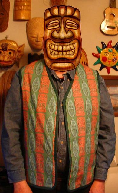
BT

Badd Tiki
Posted
posted
on
Thu, Aug 8, 2013 9:50 PM
I have read some of the posts and pretty much just tried to stay out of any conflict and am doing so now... As far as the vest, it's decent for a vest (not my jam ya know). I guess since I like tiki, if I liked vests it would work. I don't see a reason to rule it out as tiki, sure it's not an island thing, but for someone in cold climes... (I live in Rocky Mtns myself- so I'd be the guy on a tiki snowboard...). No reason people can't enjoy tiki influence in their real life style. Hawiian shirts in Minnesota in the winter, no thanks. Anyway... I am pretty much consumed by clay now and doing tiki stuff with clay is a dream come true. That has (clay, tiki or not) pretty much sucked me away from what I spent the last 10+ years doing. 3d digital art. So from that perspective I'll give some input... It's great that you are trying to work with so many textures and different renders of textures/overlays and whatnot on each. I think what seems lacking to me the most is the composition. Yours seems more like render tests, texture tests, but not complete works. So that will leave people wanting more. Also (constructive criticism) each one does seem incomplete/rushed. If you really want to improve your 3d skills I will recommend polycount.com. It's mainly based on game design, but when it comes to leading edge 3d art, games are where it's at. cgart.com (I think) is another.. more art based than game) Even just looking at others works on those sites will show you what needs improved. IMO you probably need to put more into the base shapes. Then use sculpting to really dig in and define detail. learn how to use different map types (specular for shiny metal, bump maps for fine details, illumination for glow).
|
|
ATP
Atomic Tiki Punk
Posted
posted
on
Thu, Aug 8, 2013 11:54 PM
I really try to avoid your thread Gene & just let you do what your doing When I first saw what you are doing I had a very knee jerk reaction and made the comment I approach society these days with a blunt but honest world view, I am opinionated which few people can deal with any more What this means is go ahead give me hell back, I said something you didn't like (A criticism of your work) and you returned Clearly a few people here don't know the difference between "Criticism" harsh or other wise & outright personal attacks As to your remark about myself not knowing anything about "Digital Art" let me leave you with this I got so involved in Digital Art that it led to a future in the Computer industry which I still do today So with that background I am very clearly knowledgeable on how you are "creating" your pictures and applying As for making "Tiki Art" there is a history & culture that needs to be recognized & acknowledged, Which you seem unaware of To everyone else at no time have I said that Gene was not welcomed here or can't post his work, nor have I returned any insults Gene I will do my best not to "Bully" you in the future, now have a nice day. |
|
G

GROG
Posted
posted
on
Fri, Aug 9, 2013 8:53 AM
"Whatsoever" is one word as is "backslap". You had a few more minor spelling mistakes like using YOUR for YOU'RE a couple of times. But overall well-worded, pretty straightforward, and not quite as blunt for an ATP posting.----The Spelling Police. |
|
G
GROG
Posted
posted
on
Fri, Aug 9, 2013 8:56 AM
Badd, your post was goodd. |
|
T
tikiskip
Posted
posted
on
Fri, Aug 9, 2013 11:39 AM
Quote:On 2013-08-08 20:29, tikiskip wrote: But I don't think ATP attacked you personally.So comparing a grown mans work with that of a 5 year olds is not an insult? I guess I was wrong. |
|
T
tigertail777
Posted
posted
on
Sat, Aug 10, 2013 2:43 AM
Not that I care to get into the fireworks on either side, but if I recall ATP was commenting on the work, and not the man. Picasso's work was often compared to that of a five year old as well, and indeed for a very long time I hated his work. Now that I understand more of what he was trying to accomplish I can appreciate the man, and perhaps his work a little...although I still have to say I really am not much of a fan of Picasso but I will defend it for what it is. All that is to say, is that it IS possible to have a separation of feeling between the artist and the art. I greatly appreciate all the pains Gene goes through to show his process, and his experimentation. I am a fan of the man, but less so of the work. But that is my own personal prejudices showing through. I am constantly amazed at how people can view the same piece of art through completely different eyes. I often have friends point out things to me in my own work that I really don't think I intended, but subconsciously it came through all the same and is there to see once it is pointed out. Other times I will have details pointed out that they will try to describe that for the life of me I cannot fathom and may never understand. Art is by it's nature highly personal, and it takes someone of a very similar nature to your own to see what you intended. I cannot see in some pieces of Gene's any semblance to tiki, but yet in others I do indeed see it. I think more what I see is his passion for a subject that really interests him, and his interpretation of it. I used to make mini art portfolios based on Pink Floyd's music that I sold through a fan magazine, one of my customers wrote me back stating "how fascinating it is to hear music through someone else's ears by viewing your art". I felt that was a peculiar phrase at the time, but I understand it now; they saw my filtering of someone else's art through my own personal experiences, and knew it was as close as they could come to hearing the music in the exact way my own brain and ears would. I feel like through Gene's posts I am seeing what he feels is tiki, and his passion for it. However no artist works in a vacuum and the best art in my opinion is highly researched first. I enjoy seeing Gene's posts, but I feel like currently at least he is stuck on the single idea that he thinks of as tiki. Gene I encourage you to open yourself up to new insights through more research. No matter how much of a master artist someone is, no matter what level they have achieved, higher artistic heights can be attained through more research and a deep curiosity to want to find out more about your subject. I am not disdaining your work, I am wanting to see you dig deeper into the history and beauty of your subject so I can see those interpretations through your eyes. Never be satisfied with your work, always feel there is more to explore because there always is. I am always excited to see an artist break through and reach new plateaus in their work, it always happens when they try a new direction. Gene I want to see what new places you explore in your work. I will keep following and watching to see where your path leads. |
|
GSM
Gene S Morgan
Posted
posted
on
Sun, Aug 11, 2013 6:57 PM
Tigertail ... I just wanted to say I really enjoyed your post. You seem to think things through before you write. Even if I don't always agree with you, it does not bother me because your points are well made. Your comments about Picasso were quite interesting. Lots of artist would not admit that they did not care for his art even if they didn't. He was a master after all. As you said everyone looks at art differently. Early this year I went to the Chicago Art Institute for a Picasso exhibit. They had 300 of his art works from all stages of his different styles. While I don't always like some of his later stuff too much either, I found my eyes opened up about where he came from and where he went. Below is an Ipad painting I made of the sculpture he designed for the Daley Center. It is not based on the actual work, but of one of the many preliminary sketches he produced. He made so many of those. I think it looks kind of tiki ........ Smile ........ I did always somewhat admire his intense imagination and creativity and drive ... He got up one morning and painted a picture and drop dead in the afternoon.
People don't seem to believe me when I say I know I am no artist. I did art and crafts for years. I sculpted in clay and sold it. Maybe that was all crap as well, but the profits bought me some nice musical instruments. I knew coming in that there would be some backlash to what I did and I was willing to take it and I have no bad feelings about your attitude to my images. You are a fine artist and your opinion is worthwhile to me. I will never be an artist at your level, but as hard as it is to believe, I am fine with that. I've done lots of stuff in my life that i was pretty good at. Ain't got time to be good at everything, I'm very old. One of your comments that I see quite differently than you do is the fact that folks think I never studied tiki enough. I think the problem is just the opposite. I started studying tiki back when we called it the fifties. (here in the Midwest we never say mid century modern) I covered this before earlier in this thread, but in the seventies I sculpted tiki mask based on info from a book called "Oceanic Art". It was written in 1966 by an Italian during the time the first tiki movement was going on. None of the island art (real stuff from museums) looked much like most of the stuff that is called tiki today. That was not the only book I read. I am a collector. When I first came here a couple of years ago I again researched through Tiki Magazine and the artist here. I tried for awhile to fit in, but I just could not force myself to create endless angry looking warriors with big teeth. My imagination went elsewhere and now it's very stylized crappy not very tiki tikis for me. In the end you must realize I just design t-shirts and that is no big deal. Thanks again for your comments ... it made me feel better after a couple of days of drama hijacked my thread again. ..... Gene |
|
GSM
Gene S Morgan
Posted
posted
on
Sun, Aug 11, 2013 9:16 PM
Starting with minimum almost monochrome color variation I like to slowly add slight color and contrast increases. I really like the very primitive final image.
|
|
T

TikiTacky
Posted
posted
on
Sun, Aug 11, 2013 10:13 PM
My suggestion would be to focus less on quantity and more on quality. Rather than posting 10 color variations of the same thing, try them out for yourself, find one that you really like, and then keep playing with until its perfect. When I did graphic design we would go through hundreds of variations when creating a logo. In the end, the client saw three of them. We'd only show the three we liked the best that met their needs. I'd suggest being your own harshest critic and whittling out the stuff you're not thrilled about. I think you'll really start to see rapid improvement in your work. Keep having fun with it! There's been a lot of growth since page 1. :) |
|
GSM
Gene S Morgan
Posted
posted
on
Mon, Aug 12, 2013 9:07 PM
TikiTacky .... Thanks for your comments ... It is nice to hear calm sensitive voices who are actually trying to help .... I'm sorry that my communication skills seem to fail me at times .... What I post are not meant to be variations of an image, but steps gone through to reach a final look, much as you suggest. Originally I described each step as I passed through them. I thought that I was repeating myself too much and started doing a shorthand version of the process at the beginning of the series. The last image is usually the one I think is best. Perhaps I have a faulty eye and I am wrong much of the time. Me using the same sculpt throughout several process demos is really what you are talking about of having several examples to chose from. I know none of my work is fine art and some of the in-process images can be viewed as bad art, but that is my whole point of what I'm doing. I don't think it is any different from what other folks do here to show how they create what they do. I don't mean to be saying, "Hey, look at my cool art. Isn't it great." I am aware of my ability and limitations. My goal from the beginning was always to demonstrate a couple of Ipad apps that I thought were nice in hopes I could encourage others to give them a try and come back and show some cool stuff they did that was sure to be far better than mine. I visited your t-shirt shop. I would hope you have great success with the shop. Your shirts sure fit into modern pop tiki culture. You capture a real appealing vintage look. I always like fun designs like that ..... Thanks again ..... Gene |
|
GSM
Gene S Morgan
Posted
posted
on
Tue, Aug 13, 2013 6:28 PM
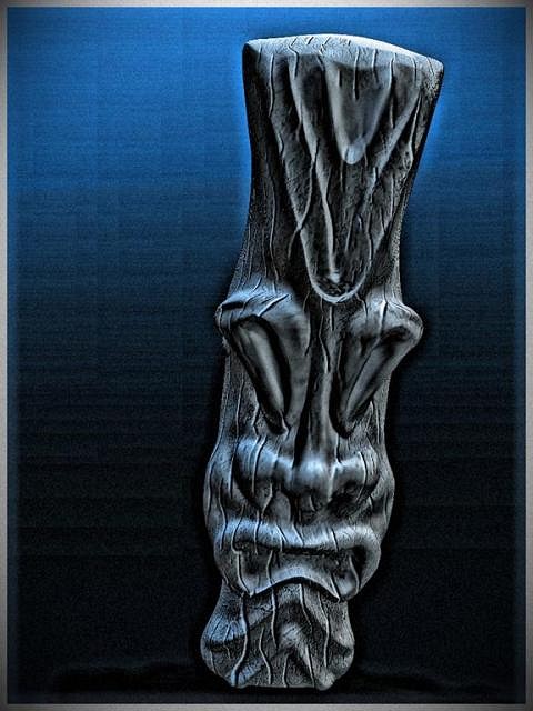
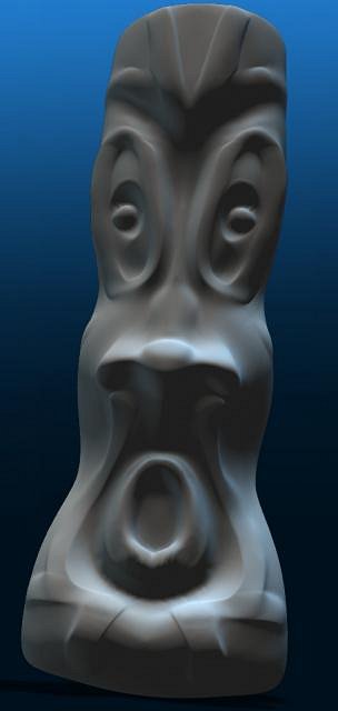
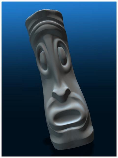
In my early post about sculpting I discussed the how Ipad sculpts using the 123D Creature app could be 3D printed using a company called Sculpteo. I had never used that 3D printing service before, so I wanted to come up with a sculpt that would be cheap to produce. It was just a test after all. This is the sculpt I finally sent them. I really would have preferred another tiki, but this one had the proper amount of detail for testing the quality of the print and was the cheapest. It was my choice.
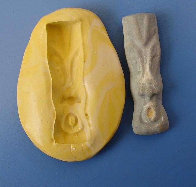
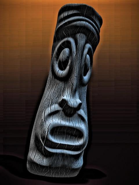
Well this was an adventure, some good and some bad. I didn't know I was ordering from France until I saw the return address on the package. I mean, I have nothing against France, but it took a month and a half to get my tiki print. Shapeways, who I have used before took half that time. Another problem was that there were voids in the pendant in several places. They had sent me an e-mail saying there were some weak spots in my design but they could print it anyway. Well the weak spots were more like holes. You can see by the photo I did a fix using some air dry clay and wood putty. The thing that I really liked about the print was the material they used. It was almost stone like with a nice fine pebble grain surface. When I made the mold this surface transferred quite well.
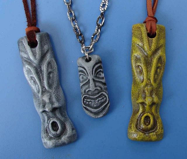
I got a couple of real good tiki cast. The rough surface was perfect for the final dry brush effect. My wife really liked the larger size of these pendants. The one in the middle is and older design of mine that my wife wears all the time. Just put it in for a size comparison. I will probably use these folks again if I can figure out how to come up with sculpts that are cheap enough without cutting into the back so much that they get all holy …...
|
|
GSM
Gene S Morgan
Posted
posted
on
Wed, Aug 14, 2013 8:23 PM
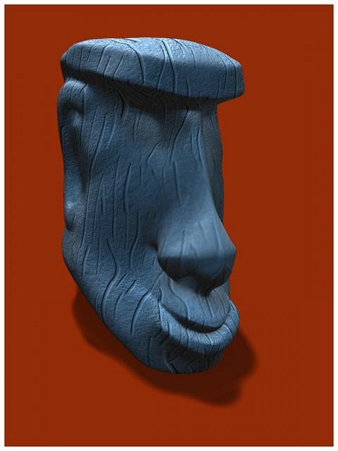
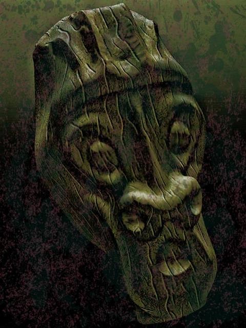
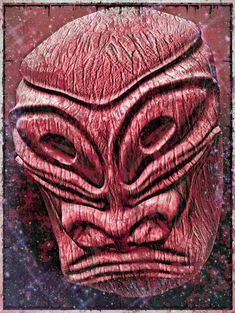
A new sculpt of a kind of monkey man tiki. I really liked the face shape. I used my usual methods to add effects, but the final image was given some extra detail, sharpness, and contrast. In the end I obtained a nice subtle light source which brought more reality to the image.
|
|
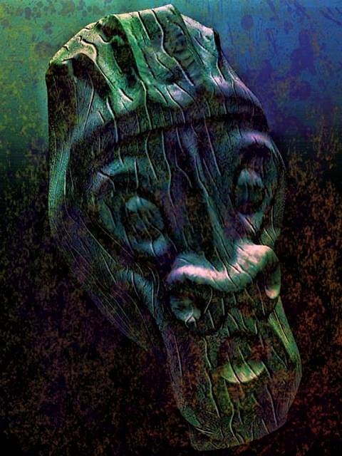
GSM
Gene S Morgan
Posted
posted
on
Thu, Aug 15, 2013 6:28 PM
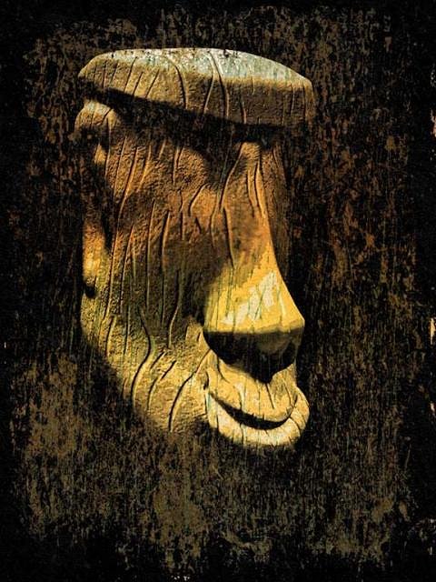
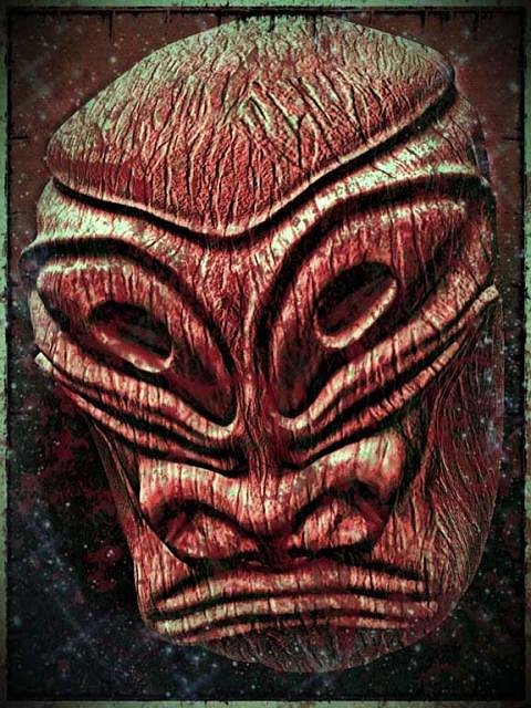
This different monkey man tiki was just as I wanted it. The minute I tried this side pose I knew just how I wanted the final image to look. It turned out exactly like it looked in my imagination. It is so much fun when that happens.
|
|
T
tigertail777
Posted
posted
on
Thu, Aug 15, 2013 7:07 PM
Really like how your sculptio sculpts turned out. The real texture and depth make all the difference in the world. The digital version I really don't like much, but the real cast one is cool, I dig it! Really reminds me a LOT of those awesome old cereal or Cracker Jack toys I have seen from the 50's and 60's. I want to see more of your 3D printed stuff it has a "daddy-O" vibe (if you know what I mean) that is really great! I can't get over the difference between looking at the digital version and a real version it's like night and day. :) |
|
GSM
Gene S Morgan
Posted
posted
on
Mon, Aug 19, 2013 7:09 PM
TigerTail ... Thanks for your comments .... finally someone likes something I did .... I do have another pendant coming from shapeways this time. Might get it this week yet....... |
|
GSM
Gene S Morgan
Posted
posted
on
Mon, Aug 19, 2013 7:16 PM
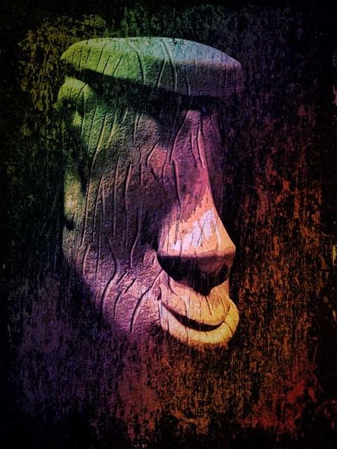
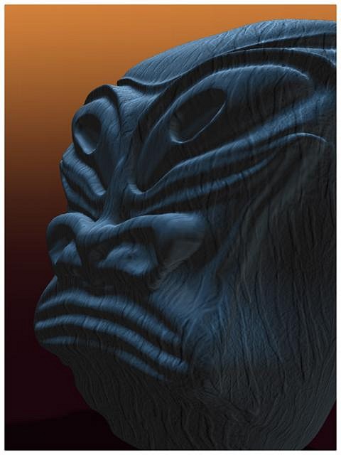
Same guy as the last image, but looking like a whole new man. I learned that from watching makeover shows on daytime TV.
|
|
D
danlovestikis
Posted
posted
on
Tue, Aug 20, 2013 7:26 AM
I'm just back from a wonderful time at Tiki Oasis 13. I've just caught up on your thread by reading the back posts and viewing your digital art. I love the larger pendants, that tiki face clicks with me. I hope you'll do more of these casts. I want you to know that I appreciate all the time and effort it takes to do your thread. I spend an hour each morning updating mine. It gives me joy to connect here on Tiki Central. I can see it does that for you too. Keep it up, Wendy |
|
GSM
Gene S Morgan
Posted
posted
on
Tue, Aug 20, 2013 9:13 PM
Thanks so much for your comments Wendy ... Yes I am working on more pendants .... Hope to get a couple more done before the cold weather sets in ..... Glad you had another nice trip .... You and Dan have so much fun at all this tiki stuff. It is so cool when someone can retire from a job and continue having fun and being so creative with something they love. It has always amazed me how much you get done in a day and still have time to post pictures. It is kinda time consuming for me to keep posting and I did not intend to keep this thread going this long, but I have been having just too much fun to quite. |
|
GSM
Gene S Morgan
Posted
posted
on
Tue, Aug 20, 2013 9:21 PM
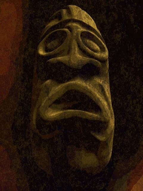
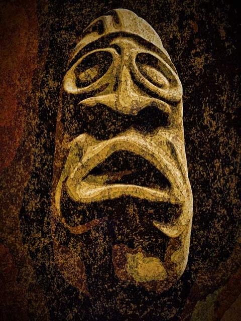
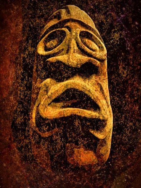
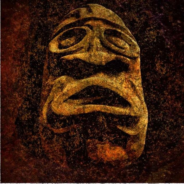
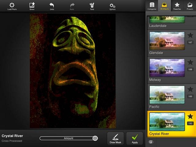
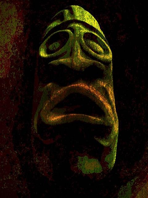
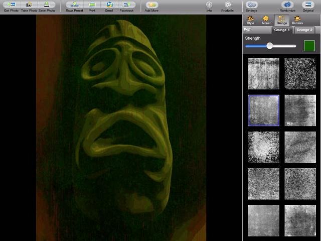
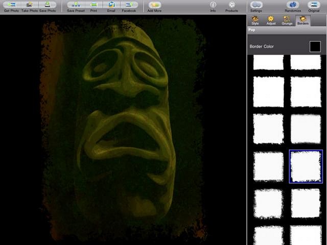
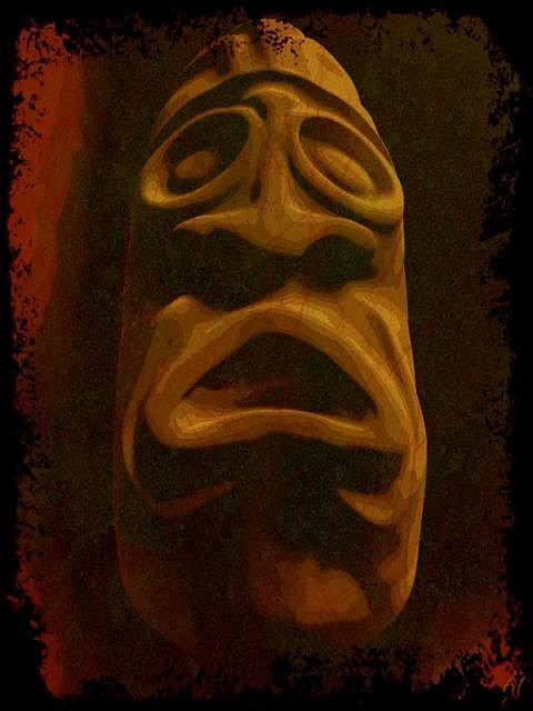
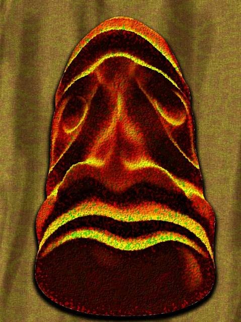
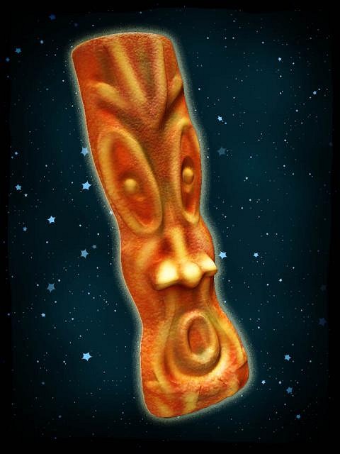
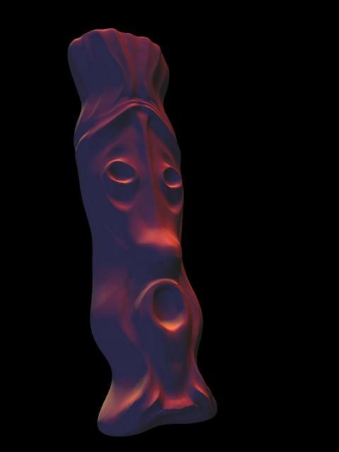
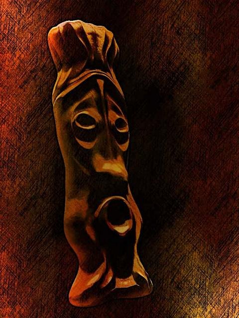
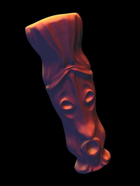
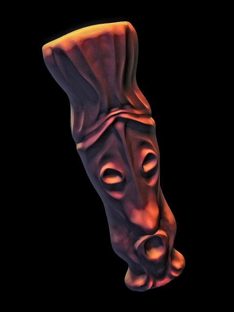
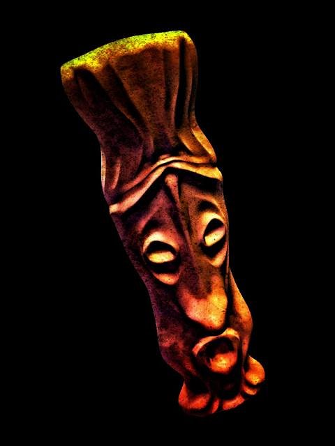
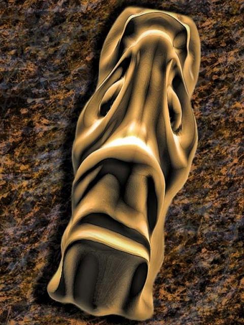
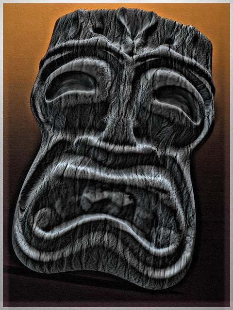
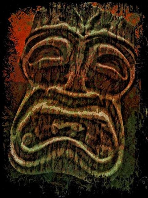
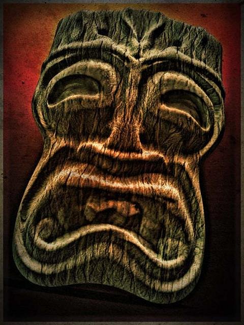
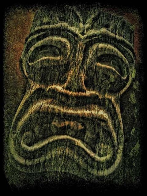
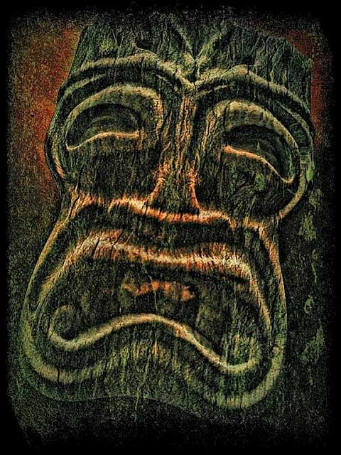
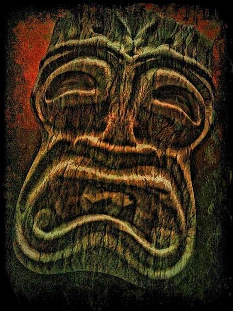
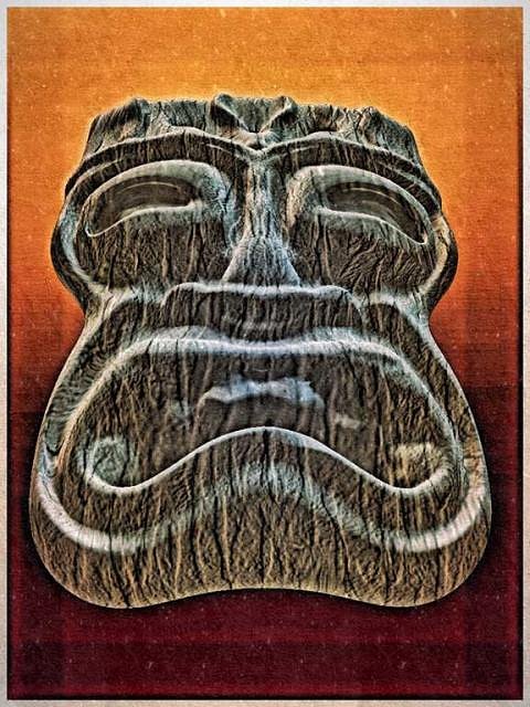
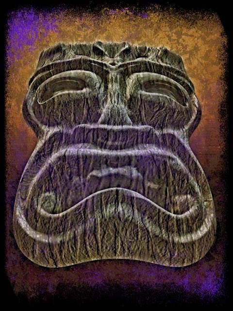
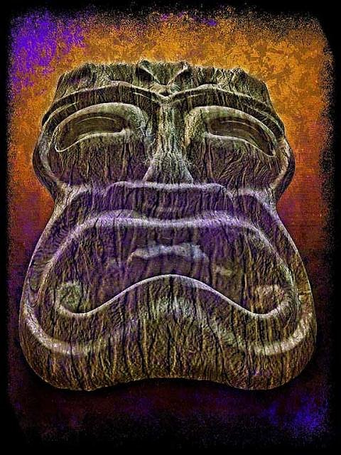
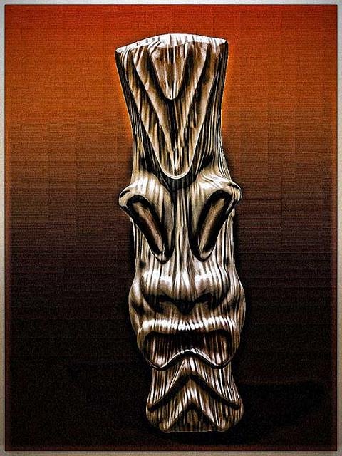
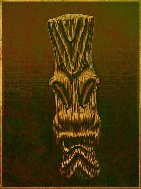
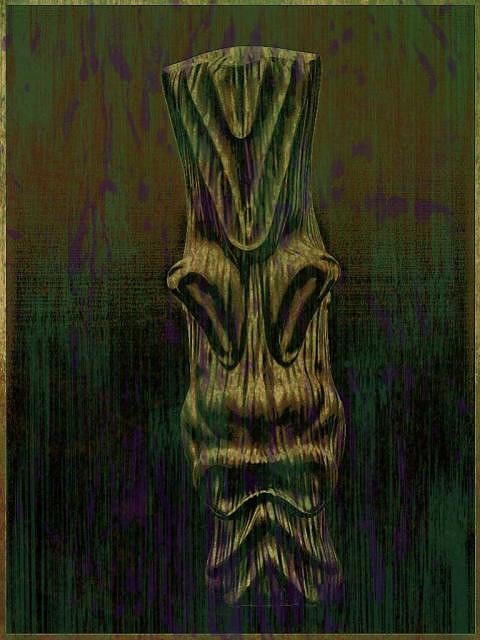
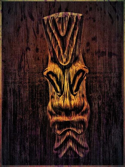
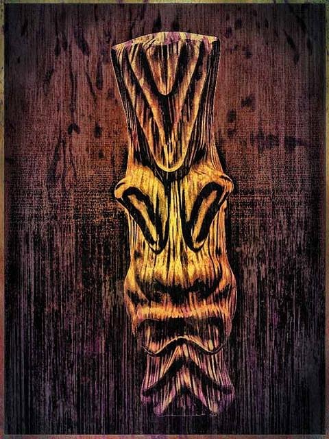
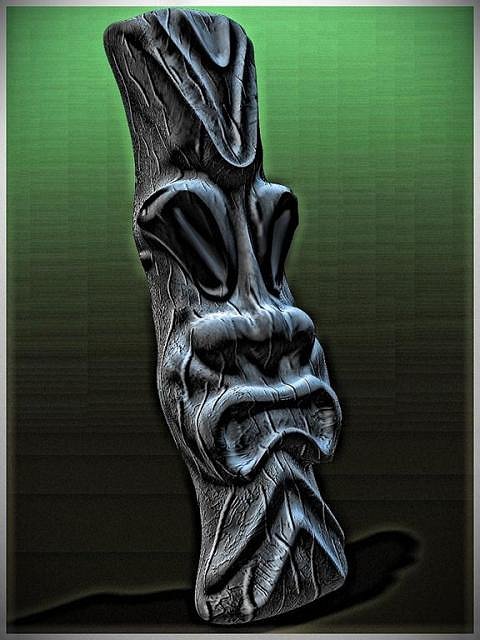
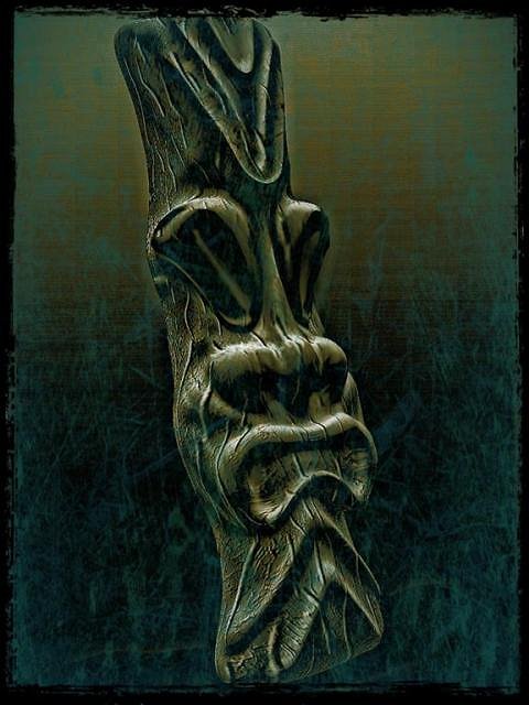
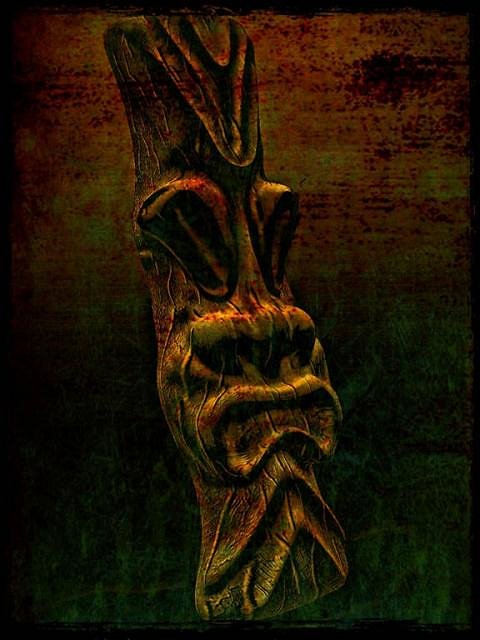
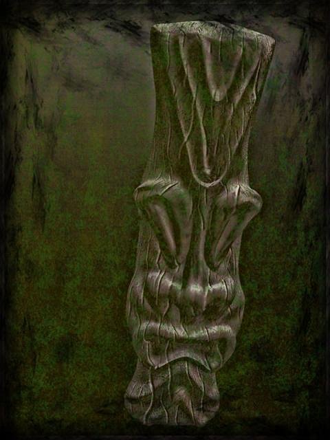
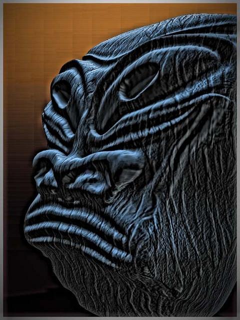
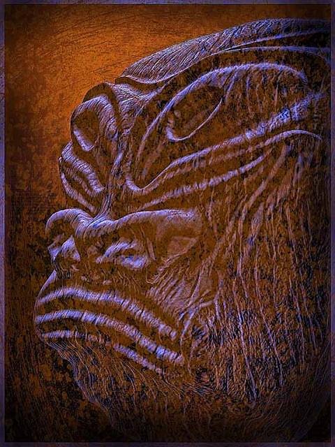
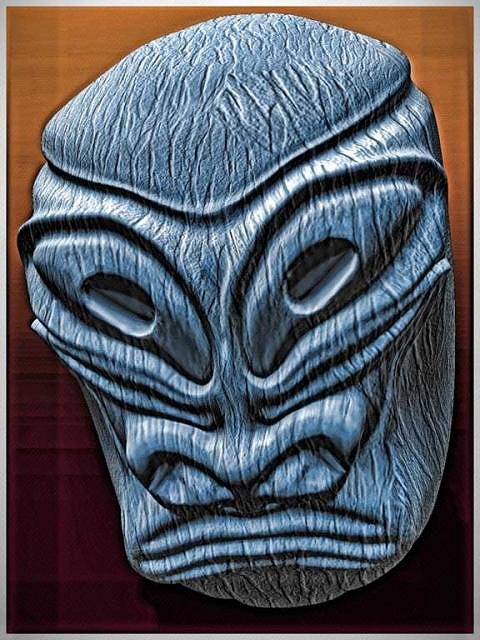
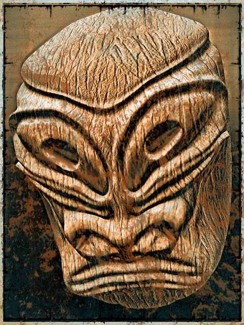
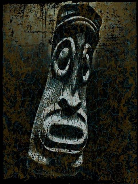
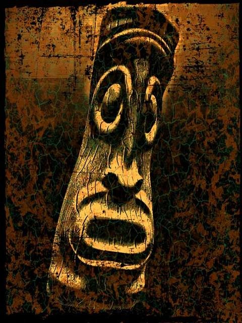
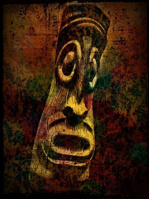
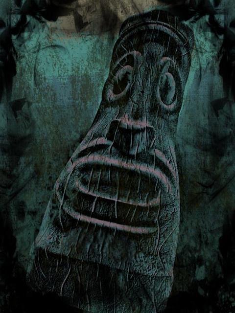
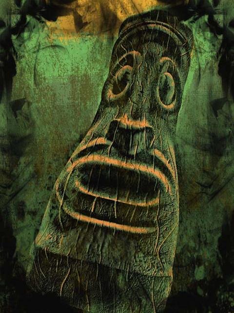
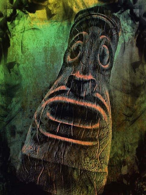
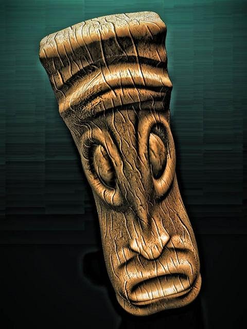
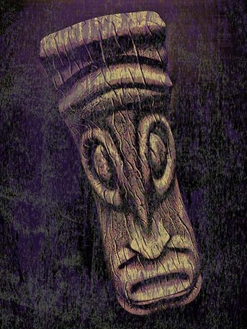
This is my latest tiki design sculpt that is destine to become a pendant. I like the simple but strong primitive look of it. It will probably go through a couple of different detail fazes before I get to that point. I added some surface texture and brought out the detail. I wanted to try several quite different surface effects on the images. In this one I wanted something with both strong color and texture. As always, the beginning effects do not give hint to what the final image looks like. I think the rustic colors enhance the age and surface of the tiki.
|
|
GSM
Gene S Morgan
Posted
posted
on
Wed, Aug 21, 2013 7:01 PM
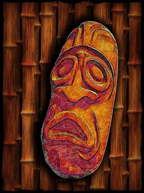
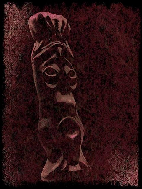
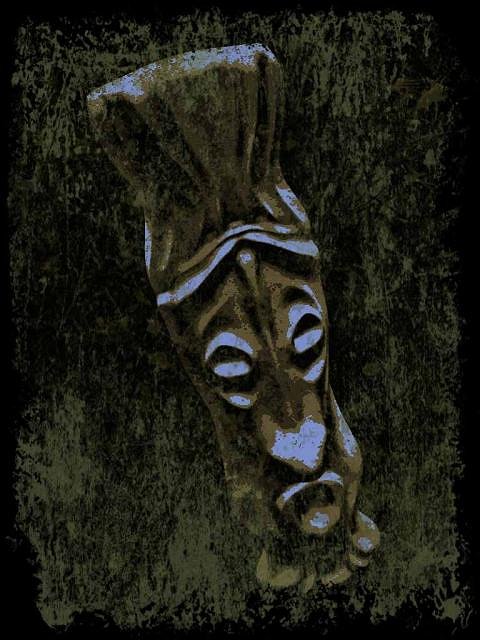
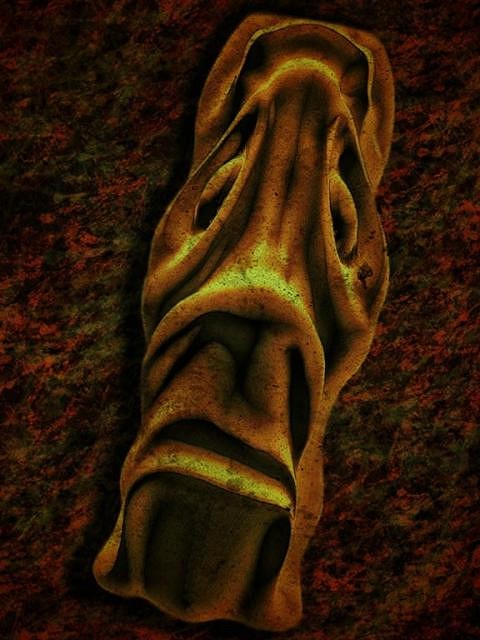
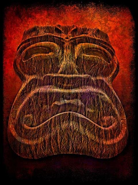
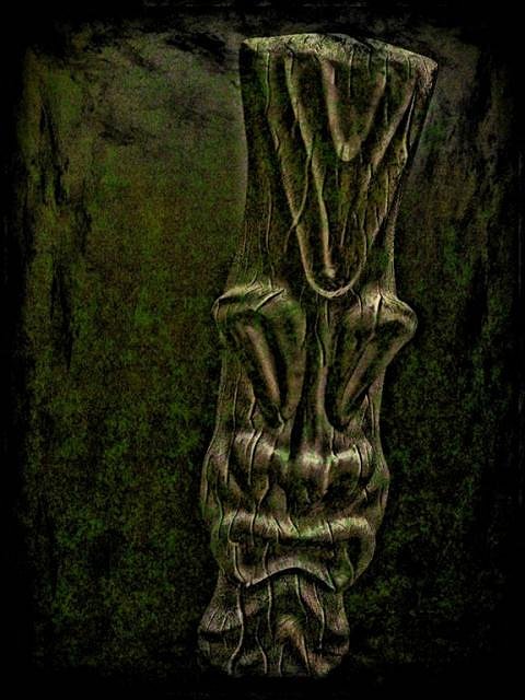
Dramatic angles and lighting lead to dramatic images. I really like the sloppy strange background. It is not defined enough to be able to guess what it is. I liked the mystery. For more mystery I colored the lighting kind of strangely. In the end strange is what the image became.
|
|
GSM
Gene S Morgan
Posted
posted
on
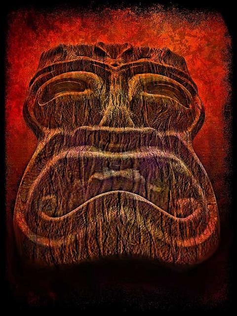
Thu, Aug 22, 2013 6:56 PM
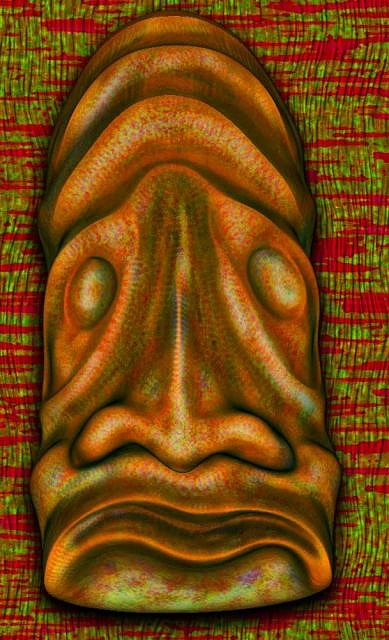
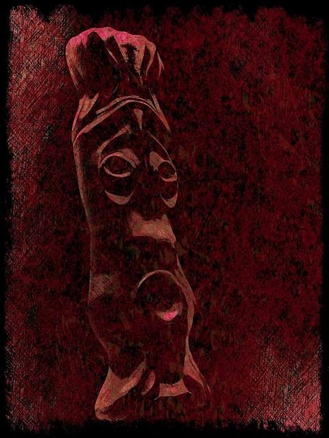
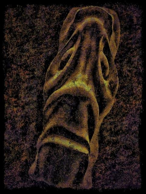
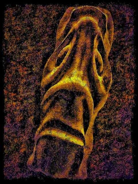
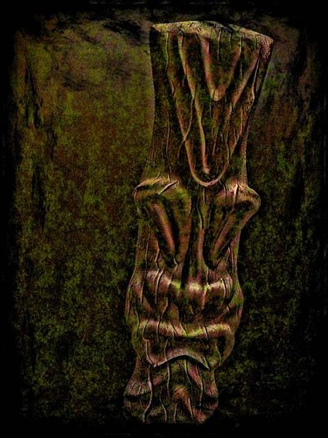
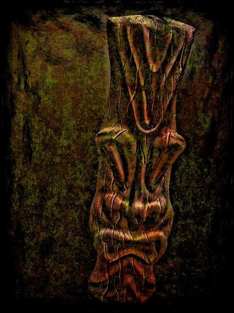
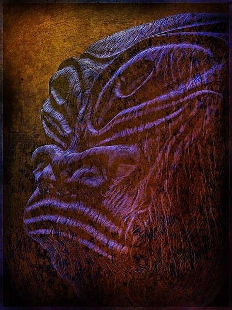
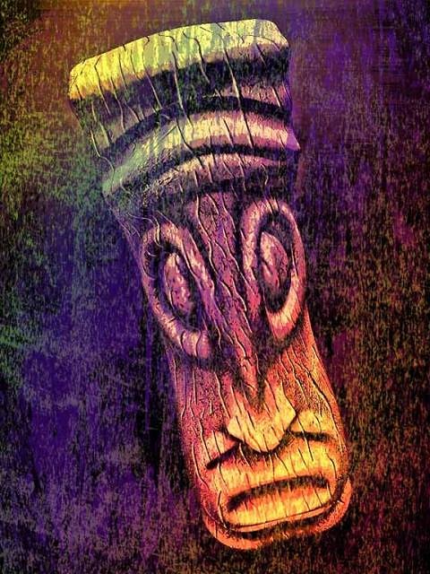
With this different pose I wanted to explore different color balances. As usual I started with a basically monochrome color balance. I experimented with several modes and saturations. I kept coming back to my basic purple blue limited color image. Even though I always say that strong color prints better, I couldn't help but like the simple almost monochrome second image best. I haven't printed it yet, but here is hoping.
|