Tiki Central / Other Crafts
Tiki Tiger Studios: Big long Egyptian trip report!
Pages: 1 2 3 4 5 6 7 288 replies
|
D

danlovestikis
Posted
posted
on
Sun, Jul 28, 2013 7:51 AM
This is the most impressive project that I've had the honor of witnessing. I don't think you are insane instead you are a great contributor to the success of this project of saving the theater. |
|
GSM

Gene S Morgan
Posted
posted
on
Sun, Jul 28, 2013 6:55 PM
I'm really impressed by your dedication to history and detail in in this project. Great work and I am anxious to see the final .... Gene |
|
T

tigertail777
Posted
posted
on
Mon, Jul 29, 2013 6:25 AM
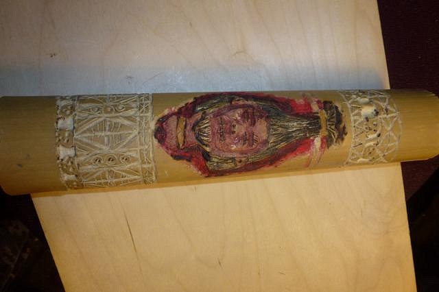
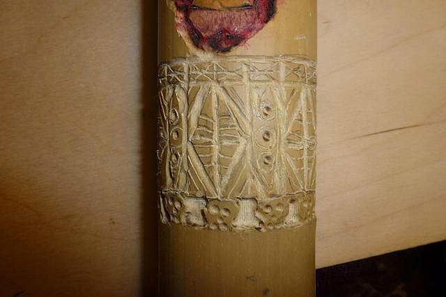
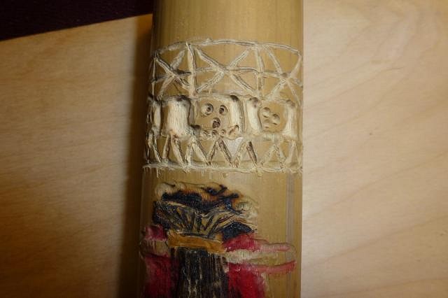
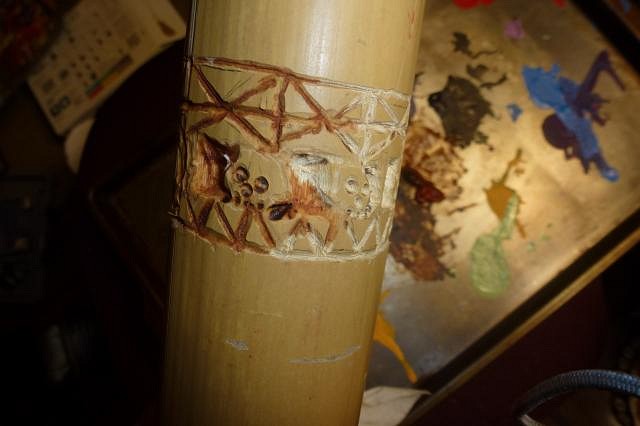
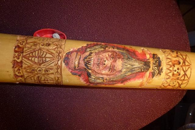
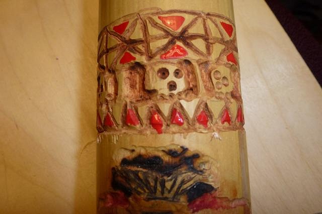
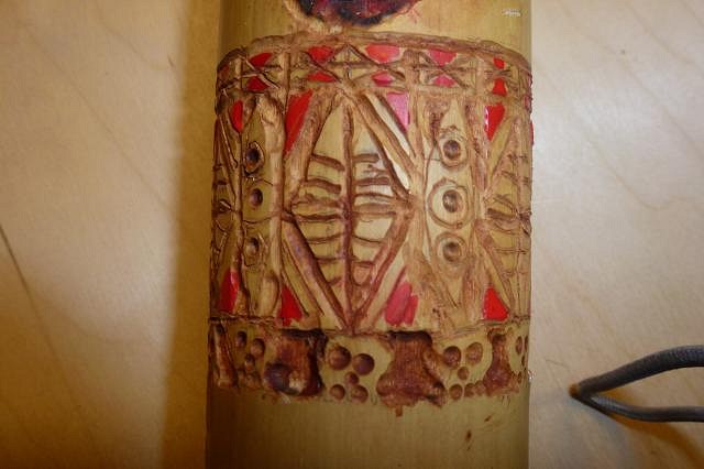
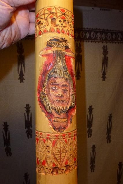
Thanks for the kind words Wendy and Gene, really appreciate them. :) well once the tiger has his fires lit he has a hard time stopping. I got more work done on two projects: the cannibal art swap piece, and more on the Egyptian one. Trouble is time has no meaning for me once I start I just now left the studio and have not gone to bed yet. I will right after this post. First off... the cannibal art swap which was my first time carving anything of a wood variety, namely bamboo I had leftover from the studio build. If I do anything more with the dremel tool I am going to have to get the easier to handle extension that the people in the swap thread recommended because once again my hand went numb working on this. I decided to go easy though and just do basic sort of line art carves except for the little skulls on the border which were fairly easy with a different broader dremel tip. I have always liked the look of bone scrimshaw art so thought it would be relatively easy to emulate that and have a nice piece.
Then I added another border of tapa and skull designs on the top to balance it out... but my hand simply could not take the intricate detail I did on the bottom so it had to be simplified.
After the carving was done I added a light wash of brown acrylic paint which I rubbed into the grooves and wiped off the excess while still wet with a paper towel. This created the scrimshaw effect I was going for.
The top looked awfully simple compared to the bottom, so to make it seem more complex I added the same red paint in spots as what I used for around the shrunken head. After that to balance it I added a little more red spots to the bottom design.
And... viola! It is done. I am still not sure if I should leave it as is, or turn it into something more utilitarian like a desk caddy... although it would be an awful tall caddy. Also I am not sure if I should seal with anything and if so... what?
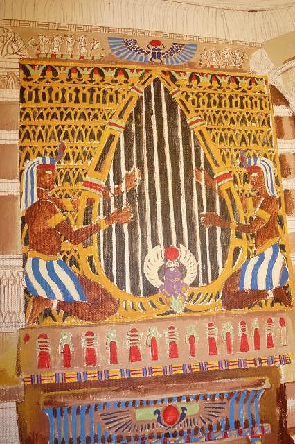
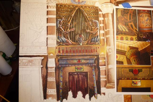
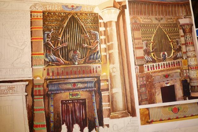
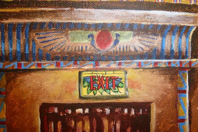
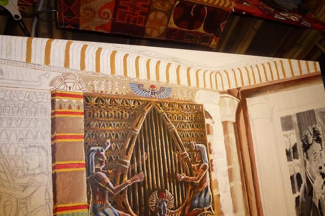
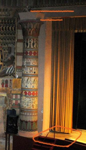
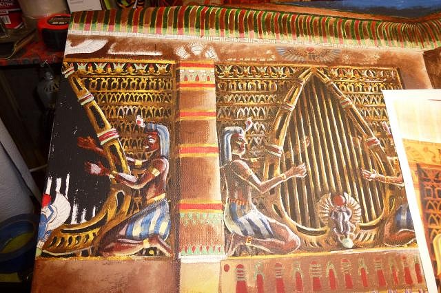
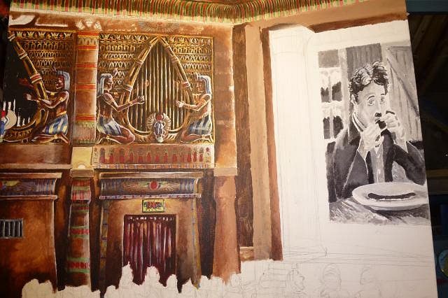
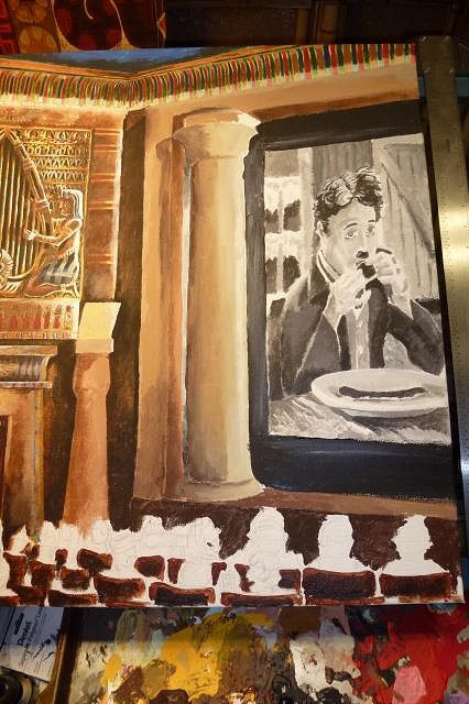
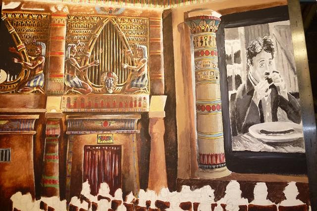
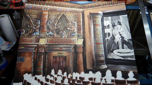
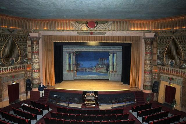
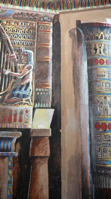
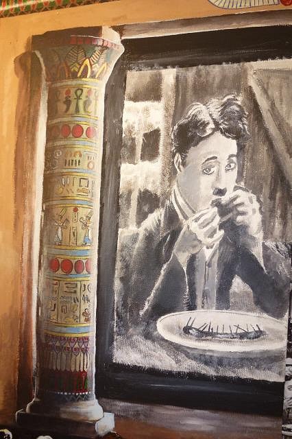
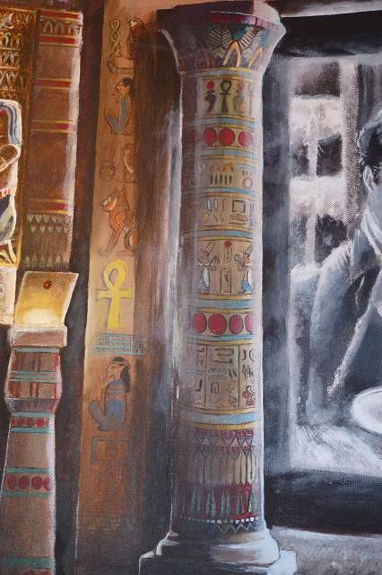
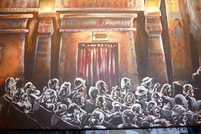
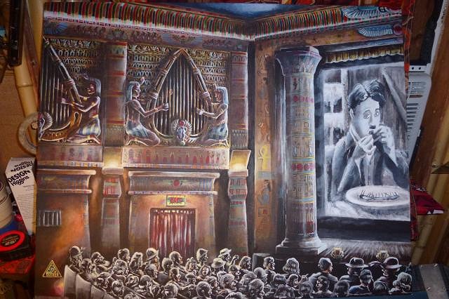
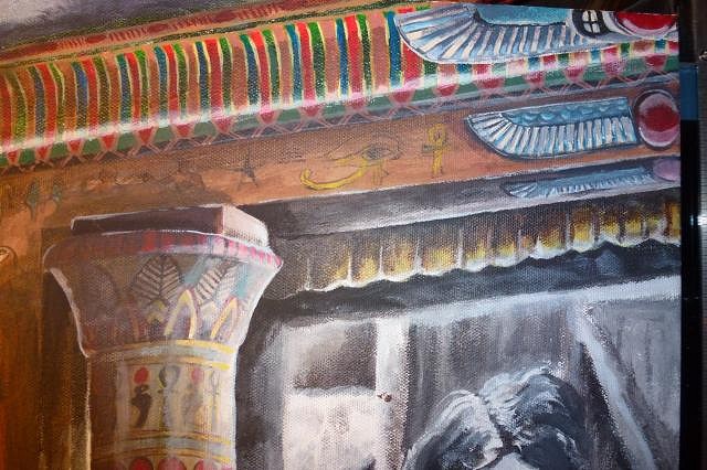
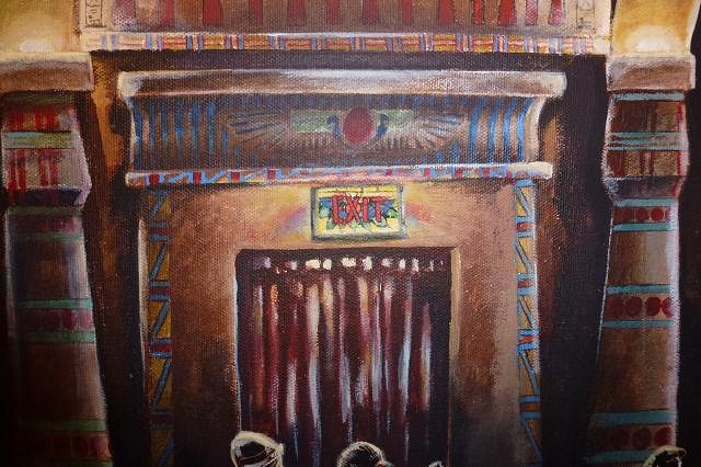
Now... time to cross over the desert sands again... I started trying to work out more of the light sources and dark areas on the Egyptian painting. Especially the lit exit sign above the doorway arch. There are several light sources to consider; the fake lamp torch lights above the first level pillars, the over all house lights way up above near the ceiling (these probably would not be lit during a show, but I need as much lighting as I can muster to show the details) the little side lights on the end of the seat aisles, and of course the projected light of the movie on the screen which is the main light source. Several of these will have bounced secondary light in pooled areas. Because it is a dark scene though, it will have a film noir sort of look where the light bounces off edges of objects and not all edges will be clearly discernible. Here is the main part I was working out the lighting on...
The main exit door close up.
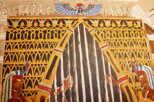
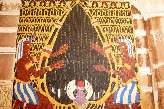
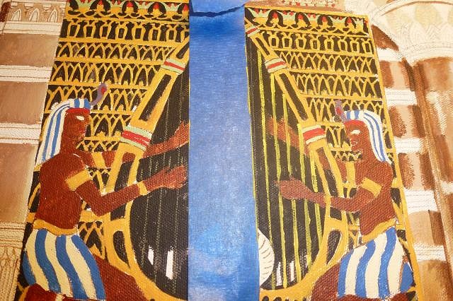
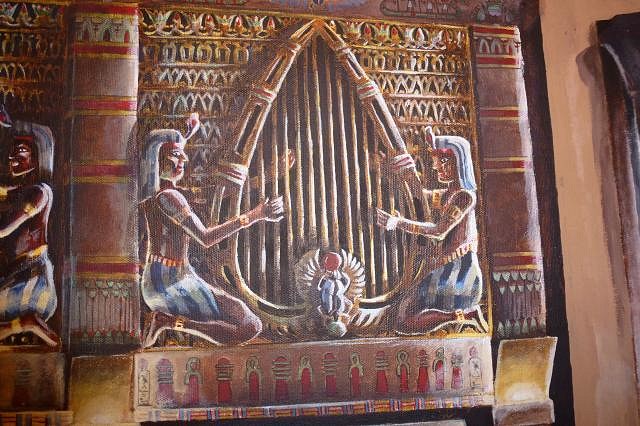
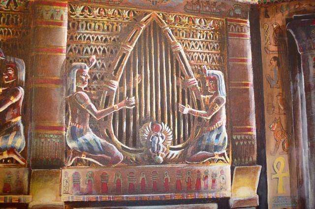
And the organ loft.
And since I have already broken tiki taboo by not exclusively having tiki art, I may as well go straight to tiki hell and show off my current baseball card size pieces of work themed to 80's arcade games that are up on ebay for sale right now ( I know I am such a shill).
The centipede one is my favorite.
Come on down to carny huckster Tigertail's auction and let me get you into a fine new little pocket painting (run tiki faithful RUN! They have nothing to do with tiki! You have been warned!) http://www.ebay.com/itm/321172370284?ssPageName=STRK:MESELX:IT&_trksid=p3984.m1555.l2649 Until next time when we once again cross the desert sands and view the ancient tombs of splendor, tiki friends. |
|
M

MadDogMike
Posted
posted
on
Mon, Jul 29, 2013 9:03 AM
Great progress on the painting Tiger. Love the attention to historical details and to all the light sources. The Swap project turned out perfect, it has been fun to see everyone's Swap projects for this theme. |
|
T
tigertail777
Posted
posted
on
Wed, Jul 31, 2013 6:08 AM
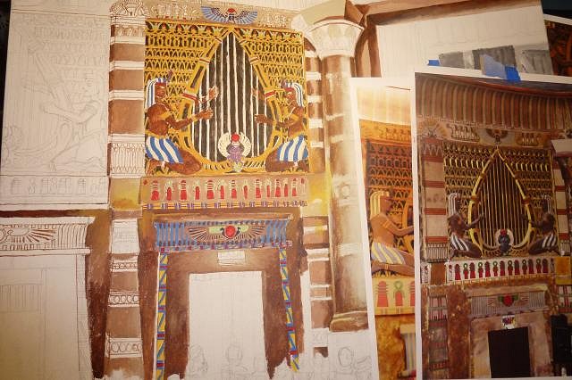
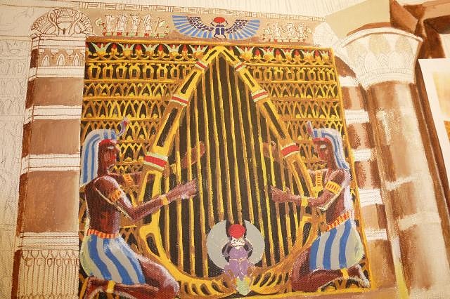
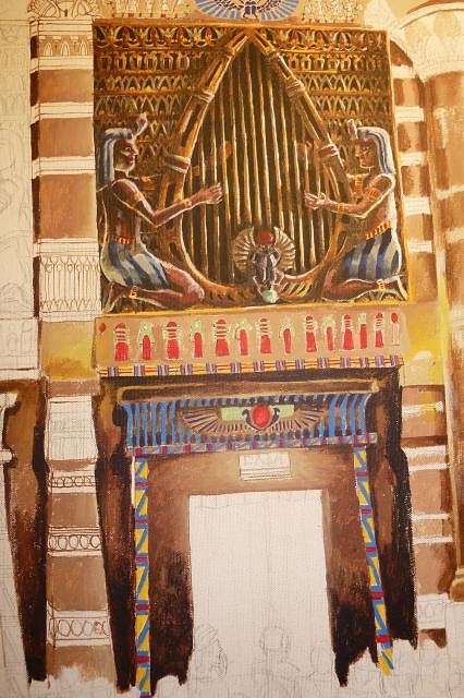
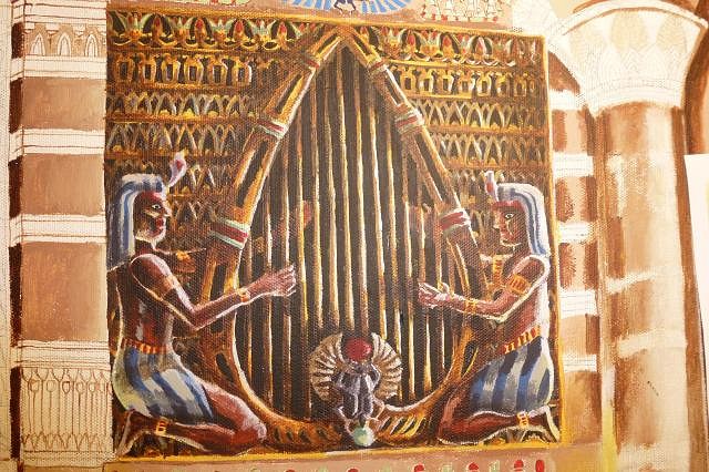
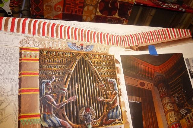
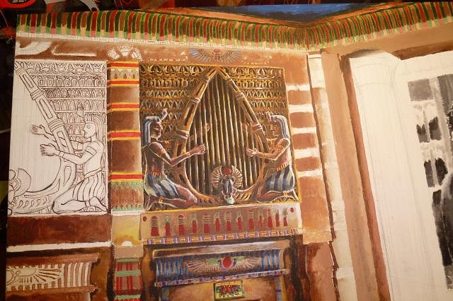
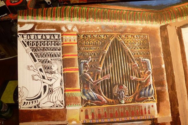
Thanks Mike! Appreciate you stopping by, the cannibal piece was both fun and painful but I am fairly happy how it turned out. :wink: Well I got up my steam and could not stop again, just NOW got in from the studio and will head to bed soon as I post this so I can get some rest before work. I gotta say I am really having fun with this painting now that I have entered into the part I like doing the most: light and shadows. First off, I needed to clear up skipped spots and clarify all of those crazy shapes in the background of the organ loft. So I got a darker black (lamp black) and went to town. One side is mostly done in this photo the other is not touched yet to show you the difference.
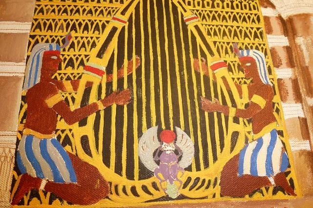
Then it was time to black out the harp middle and restring it. I had to redo it a couple of times because I wanted the exact number of strings the theater actually has (14) and also needed it to have a slightly forced perspective so the right side strings would be closer together and thinner as they receded from view, and the left side would be farther spaced and wider. Plus they are slightly thinner at the top again as they go away from view. This all gives it that "large" sort of towering over you feel. This photo shows the penciled lines before I painted them.
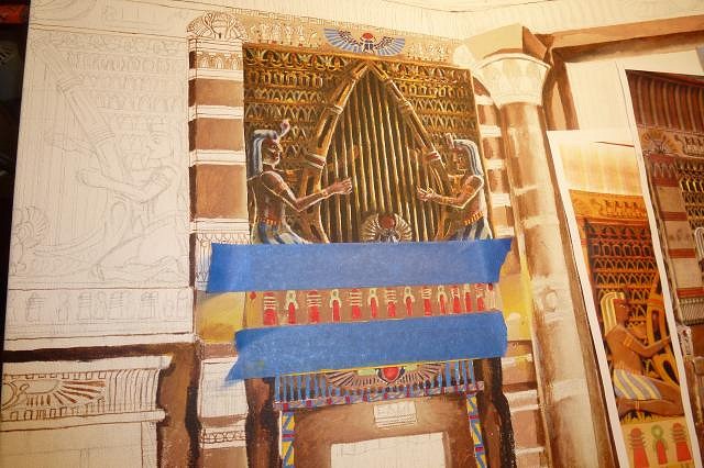
Then I used painters tape to make straight lines when painting. I used this trick a lot when I painted theatrical backdrops. Painters tape is sticky, but comes right off without leaving any residue.
Thickening the lines and blocking in the shapes more.
Starting to add a bit of shadow and highlights.
And where I got to tonight with most of the shadow and lighting done. I will need to add a bit more golden highlights it feels a bit dark right now, but I think it does capture the reflective feel of a movie being played in a dark room. I am very happy with the shadows in particular, and managed to capture the "flicker" feel to the movie light.
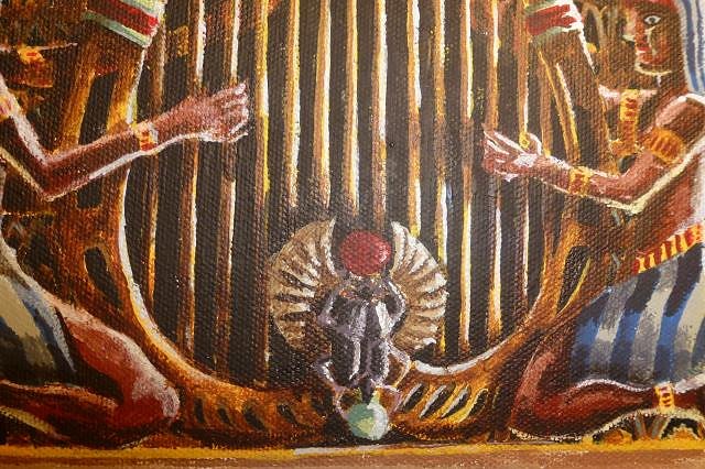
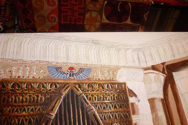
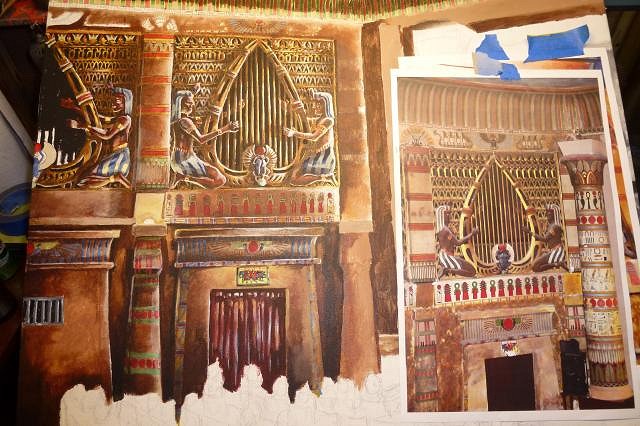
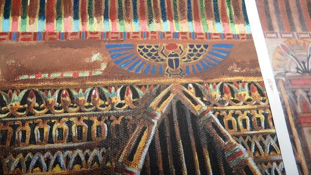
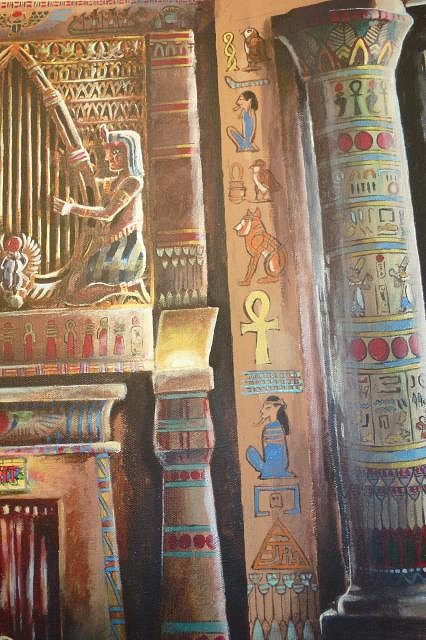
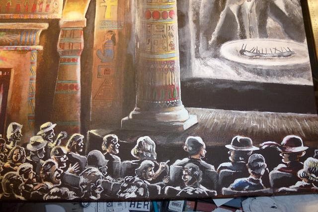
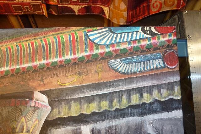
I did finally manage to find a photo of good enough resolution to blow up, and discovered those are indeed double snake head canopic jars. I have never seen a picture of such a thing, it may exist but I kind of doubt it. Usually only a single snake head was used to represent Uraeus (rearing cobra figure representive of the Patroness Wadjet, protector of lower egypt). The reason only one snake is because there were two main "cults" that ruled Egypt: one ruled the upper (god Nekhbet represented by a vulture) the other lower Egypt. They were fiercely competitive in their religious following, and with many followers. There were other religious cults like this not as strong that would become consolodated into the main religions later, but these two were so strong they could not be. The pharaoh usually only wore the Uraeus to represent his right as ruler, but by the time of Tutankhamen they had to incorporate both to appease both cults into a kind of peace. That is why the golden death mask of Tutankhamen has the snake and vulture together on the crown. Some historians have theorized this may be partially why he was killed: someone from one or both of the cults were angry about them being "put" together as they were and having to "share" the power. Until next we meet the curse of the mummy my tiki friends! :) |
|
D
danlovestikis
Posted
posted
on
Wed, Jul 31, 2013 9:44 AM
The 3D effect in your painting looks deeper than the photo. This is going to be over the top excellent. Wendy |
|
T
tigertail777
Posted
posted
on
Fri, Aug 2, 2013 9:34 AM
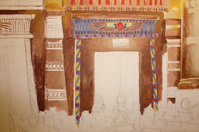
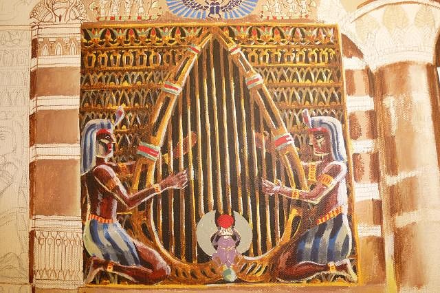
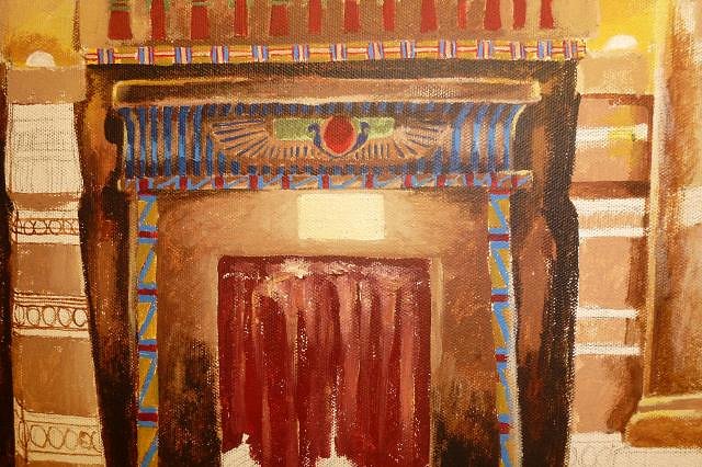
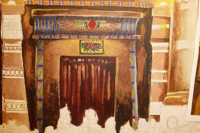
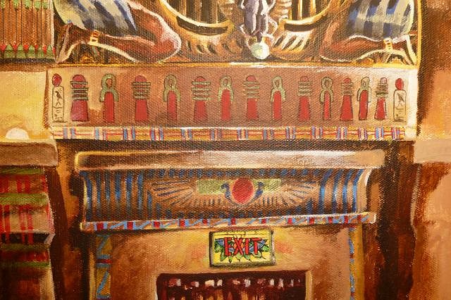
Thanks Wendy! Yeah... that is why I don't like flash photo's: it sucks all the color and contrast out. Mine also stands out a bit more because it is in the dark, and I have light bounce from the theater screen going on. :) Well things are coming along. I am slightly frustrated with the angles and how they are turning out, it is super difficult to get it right and I just found out that the theatre walls are not straight on they sort of angle inwards towards the stage. So maybe with the knowledge of that it actually will work out okay. I am pretty pleased with the exit sign, I really like the play of light and shadows around it and on the velvet curtains in the exit. If you haven't figured it out by now, light and shadow is absolutely my favorite part of painting I always get a huge kick out of the little dance of light and shadows that happens in dramatic lighting. This painting I was not sure how I was going to handle so many light sources until I thought of the idea of having each of them have a slight tint of color. Movie projections of black and white film would naturally have a blue tint to them, and the fake "torches" would definitely have a very yellow cast. The exit sign is stained glass so has a rainbow cast of colors which I might enhance a bit more. To begin with... I darkened a lot of the organ loft, it was just too light for a darkened theater. I also added some more blue tinted light bounce from the screen, and some yellow light reflective highlights.
And I finally almost finished the poor little scarab beetle. Just have to make some "cuts" in his wings more to feather them.
More tape magic to try and get the hieroglyphics straight.
Getting the velvet curtains in the doorway.
Putting the stainglass in the exit sign.
Finally before I left the studio I started the striping and side pillar decor. Plus I added some of the blue tint light coming off the theater screen to the drapery folds in the exit.
I'll leave you with a close up of the exit sign rainbow reflection.
Until we mount our camels and cross the heated desert sands again my tiki friends! |
|
T
tigertail777
Posted
posted
on
Mon, Aug 5, 2013 5:10 AM
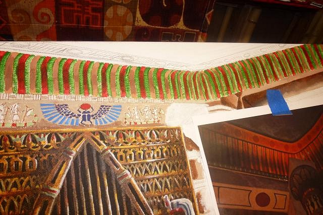
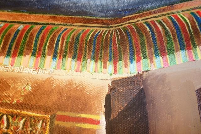
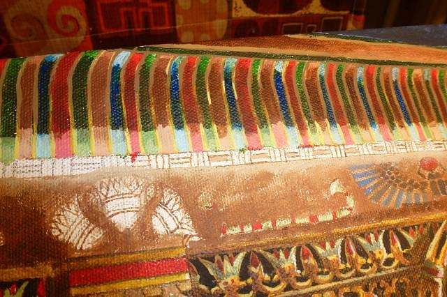
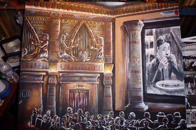
Annnnd Awaaaaay we go! Didn't get as much done this weekend as I would have liked. Those doggoned stripes at the top of the walls encompassing the the ceiling area nearly drove me insane. I know tigers are supposed to like stripes because... well duh. BUT this was completely off the scale NUTS! I almost went blind and it's not over yet by a long shot. :wink: First off, the stripes I had previously penciled in had to be completely whited out they were ALL wrong. See, the thing that is so difficult here is I am doing this slight forced perspective, which means the stripes have to progressively get larger and farther apart as they come towards the eye, and smaller and closer together as they recede. Because of this I really couldn't measure it out and had to eyeball it all. And to make things more fun those stripes go up in a curve. Stripes can make or break the optical illusion of forced perspective (just look at the stretching room in the Haunted Mansion at Disneyland). If they are not spaced right, it will ruin the entire perspective. While I was at it, I started whiting out the old pillar position because now I could clearly see what was supposed to go there. More on that in a bit.
I also got some new mechanical pencil lead so I could darken and correct outlines on the next upper organ loft part.
Then the insanity of the stripes began. First yellow/tan...
Then the red stripes...
Finally, green.
Then all the extra shading, very carefully done so as not to screw up the stripes.
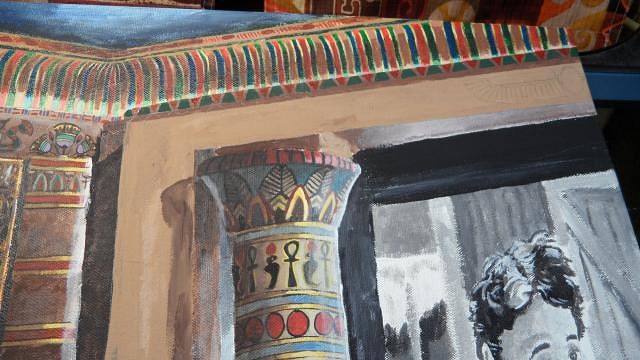
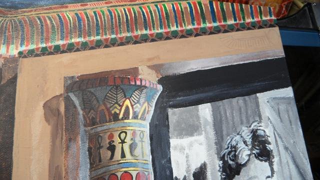
I still have the really thin stripes to add, but I just could not take anymore I was seeing stripes all night. I thought more would push me to the brink of insanity and allow Cthulu to somehow get into our world through the dizzying shapes. I knew any moment the mad arab would come trotting into the tomb from the hot desert, so it was time to stop lest the earth and myself perish. :wink: Remember I mentioned the original pillar position? I finally pieced two and two together. I was told after inquiries, that the pillars were moved from their original position in the 50's due to larger more modern movie screen sizes, but was uncertain exactly WHERE those pillars originally were. I kept asking questions. I found out there originally were no stairs on either side of the stage. So I looked closely over and over at the handful of photos I have to work with, and the AHA! moment came. I saw a place by the stairs where there is a lip that forms a square slightly different color than the rest of the floor. This was obviously where the pillar was originally it would fit there perfectly and coincides with the fact of one of the board people telling me it was under the arch (trouble was I was not sure how deep on the stage). BUT! That would then make the pillar too tall to go under the arch with that odd boxy thing on top. All along I felt those were later add ons, they just didn't "feel" right. If you remove those they fit under the arch quite well. But there still is a puzzle: if it was JUST the pillar as it is now with the round base (discounting the box that extends the stage they are currently on, also a later add on), it would have left a ROUND discolored impression NOT a square. They had to have had either different bases that were small squares, or at least a thick "resting piece" in the shape of a square. There is also just a LITTLE room if you move the pillar under the arch so that it does not meet the arch precisely but has space between. I surmise that it originally had decorative blocks under it like the Boise Idaho theatre ones does, which would emulate the actual pillars in Karnak and other places in Egypt more closely OR a more decorative square base about a quarter the size of the ones they now rest on. Either way there had to be something more than just the pillar to make the square impression on the stage floor, and it is obvious those blocky things on top the pillars now would not fit under the arch. There was something else puzzling me; see that decorative "dot" painted under the arch? You would not see that if the pillar was in it's original position. Why paint a decoration no one will see? Answer: the arch was repainted when the pillars were moved to be less "plain" looking, because once you move the pillars you only have the arch as a frame for the movie, changing the original aesthetic of the proscenium arch. If you look closely at the photo you will see the paint flaking away on the bottom of the arch, and it seems to be of a different quality than the other paint flaking off I have seen in other photos. Of course it would be if it was later paint with less lead content and would not adhere as well on top a coat of older paint. I personally think from all this that the arch actually was painted much more decoratively originally. Maybe not as crazy detailed as the Boise Idaho one, but I am betting it was not just plain as it is now. I think when they "remodeled" that arch, they painted around the center emblems and over top decorations that went with the emblems. I could be wrong, and without seeing it in person there is no way to tell for sure but it just seems to stick out to me as odd.
As you can see here, not only would those dots be completely covered and they are EXACTLY where the center of the pillars rest, but if they were back in their original position the arch side fronts would be fully exposed. I am having a hard time buying the fact it was so plain looking during the art deco era. I am betting there were at LEAST a few motif decorations on that arch. Again, I could be wrong. I only have photos to go by right now. I would love a peek in there to confirm my suspicions, but it ain't gonna happen till the place can be fixed up. There IS one other possibility, again hard to tell from the photos. If you look in the one with the floor impression you can see that square floor part with a lip, THAT could also be where the pillars rested which would push them almost an entire pillar length farther inwards and not cover the decorative dots. However, some of the backdrops would also be covered when in that position. In a way, it does sort of make more sense, that lip is about the right height to lift the pillar much closer to the arch top. I was told that the pillars have slots on the back to originally hold a fire curtain mechanism and the "asbestos" backdrop they found is as far as I can tell the same size as the other backdrops. According to wiki: "A safety curtain (or fire curtain in America) is a fire safety precaution used in large proscenium theatres. It is usually a heavy fibreglass or iron curtain located immediately behind the proscenium arch. Asbestos-based materials were originally used to manufacture the curtain, before the dangers of asbestos were discovered. The safety curtain is sometimes referred to as an iron in British theatres, regardless of the actual construction material." I am trying to find pictures of how such a mechanism would work, some kind of rollers? Anyways I know that it was DIRECTLY behind the arch, and had to block off the entire proscenium opening due to fire codes so I am pretty damn sure my approximation of the position is correct as the pillars would also help block the arch opening. It is also possible that the boxes the pillars rest on now are just a wee bit taller than the stage, if so then those weird blocky things MIGHT very tightly fit under the arch...again hard to tell from these photos and all this conjecture is driving me mad. At least I am pretty sure I know the original position from all this. Sooooo....
So more detective work, and two dimensional renovation when next we meet again tiki friends. |
|
D
danlovestikis
Posted
posted
on
Sat, Aug 10, 2013 7:28 PM
I'm so impressed with your progress. I wish that we could see the faces of those involved in this project when they see your work. I love what you have done so far. This is the hardest kind of painting to do. So many challenges and you are tackling them very well. Thank you for all the lessons, Wendy |
|
T
tigertail777
Posted
posted
on
Mon, Aug 26, 2013 6:23 AM
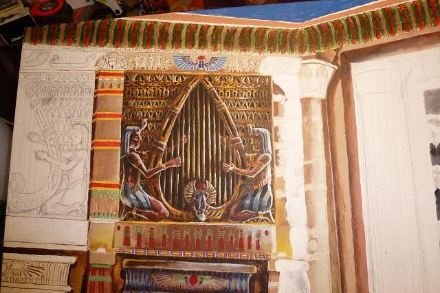
Thanks again for stopping by and commenting Wendy. :) I have to say I am learning so many things from painting this, not just techniques but also about myself. I really had major doubts I was going to be able to pull off this level of detail with all the crazy angles and everything, and really have never considered myself to actually be in the class of a fine artist painter of any sort. I felt like I was just dabbling, and still do feel I am not up to a professional level. However I begin to see that I could actually reach that level given more time and practice. Or maybe I just have too high of standards and self criticize too much... I dunno. :wink: The good news is that the theatre has already reached enough of the money goal through the very hard efforts and timeless work of their volunteers to begin steps towards starting the restoration. So even if they don't need my painting for the current phase, they still have plans for further phases to bring back the original appearance even more which they will also need to do fund raising for. And what did I say about learning through this painting? I think I have wearied the poor volunteers with all my questions about the history, and now see I went a little overboard in my zeal. So, I will go by the info I have now and do my best guess on where things went, and only bug them when I am really stumped. Plus I sort of drove myself a little nuts with figuring all this out to the point that I couldn't even paint for a while... so kinda counterproductive. Now, let us travel back to the tomb of the pharaohs for another glimpse into the Kapu tiki-less Tutankhamen tale... First, I used that outlining technique I learned about earlier in this thread...
Then I started filling in the gaps so my eyes would not go cross-eyed anymore...
Things started to get "fleshed out"...
I went back and defined/outlined the hieroglyphics a bit more, including adding two tiny cartouches on the ends.
Fixed the "torch" lighting and shadows, particularly where the hieroglyphs are.
Since this is in a darkened theater, I deepened the shadows behind the upper pillar divider, and also increased the light bounce from the theater screen to the front organ screen. I also made the decorative painted elements on that same pillar divider more distinct and in deeper shadow.
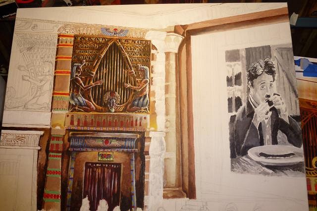
And our journey ends there for now. The iron bars on the far side bottom are a heat vent (I know, I had to ask too... seems a little bizarre in a way). Despite the frustration at the intricacy, I have been really enjoying working on this though I never anticipated it would take so long, and I am growing weary of it. I need to get this done soon so I can get some paying work done. I have a possible commission for a painting based on Adventureland at Walt Disney World right after this, so perhaps we will be getting back into the tiki groove very soon. :) |
|
GSM
Gene S Morgan
Posted
posted
on
Mon, Aug 26, 2013 7:49 PM
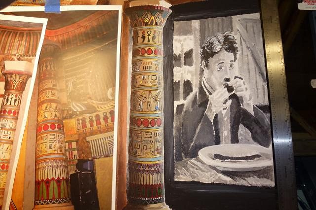
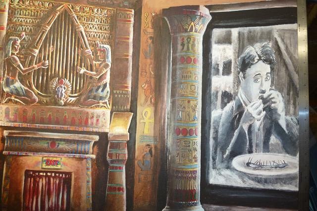
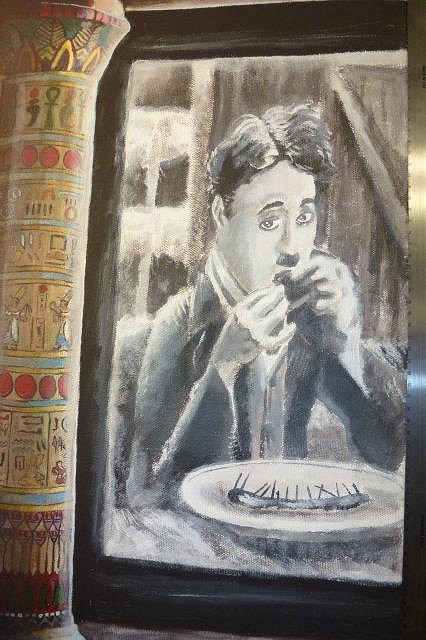
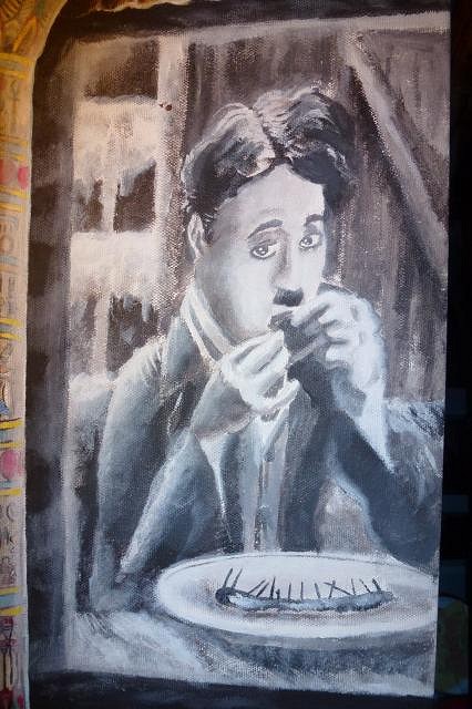
Boy this is such an amazing project. I love the detail .... The still from "The Gold Rush" is just so cool ... Gene |
|
M
MadDogMike
Posted
posted
on
Mon, Aug 26, 2013 10:10 PM
Holy Clotted Cream Nigel! I didn't realize you had two the harp playing organ panels to paint. Coming along very nicely, keep up the good work Tiger |
|
D
danlovestikis
Posted
posted
on
Tue, Aug 27, 2013 8:54 AM
tigertail777 thank you for making my morning special. I am enjoying your step by steps so very much and I'd been missing them. You do excellent art that takes not just talent but a keen eye for detail. You are right about practice, you'll be a better artist the rest of your life just from what you have accomplished here. This is over the top good. Wendy |
|
T
tigertail777
Posted
posted
on
Tue, Aug 27, 2013 12:03 PM
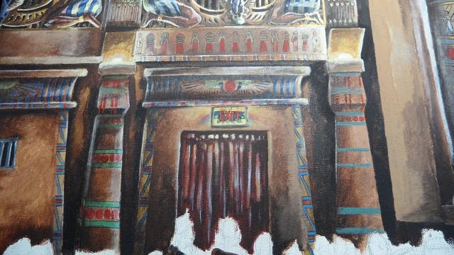
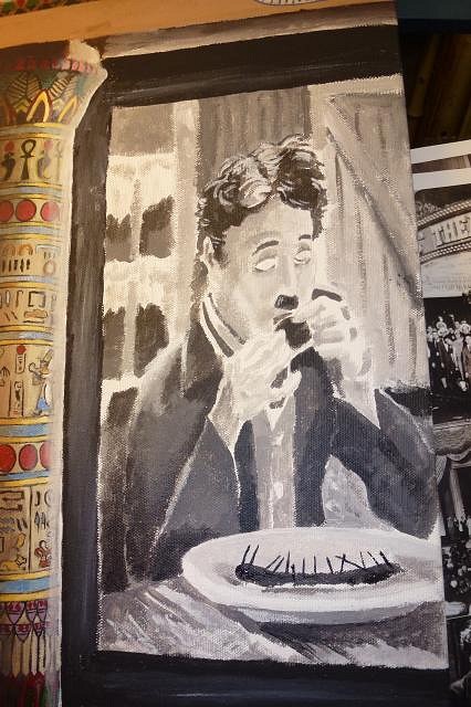
Gene: Thanks for coming by, and the wonderful comments. Glad you like the Gold Rush still, I see I forgot to add an essential part of the gag: the nails in the shoe which the little tramp spit out like bones. I will correct that and the eyes once I get back on that section. :) Mike: Well, it's actually one and a HALF... thank goodness. If I had to do a complete other organ loft panel I would have gone mad I tell you, MAD! I did that on purpose to not only focus the area, but also to cut down on the complication of the forced perspective, which was already insane. Also it leads the eye around a little better; every picture particularly ones that tell a story should have a discernible "eye path" it makes for a much more enjoyable viewing experience. "Clotted Cream Nigel"? Sounds like some British comedy I ought to know, and unless its a Python sketch I am not sure what it is... but it did sound darned funny. :wink: Wendy: You make me blush dear Wendy, :blush: I thank you for your generous comments and hope I can continue to bring a little bit of magic into your mornings. :) Now for the frustrating bit: I AM OUT OF PAINT. Okay, well... not ALL paint. But the most important colors I need are nearly gone, particularly burnt umber, lamp black, and pure white. I am going to have to wait for my next paycheck till I can get more. So very maddening, just when I am biting at the bit to paint. :evil: |
|
D
danlovestikis
Posted
posted
on
Tue, Aug 27, 2013 1:41 PM
tiger, while you are still blushing I want you to know that today I cleaned out my acrylic paints and I'm sending you all that I don't need. I didn't have "pure" white so you'll get Titanium White and the Black is called Ivory. I only had transparent burnt umber to send. There's a bunch more for your future projects. Now I can say I'm a benefactor of the arts! We'll get it shipped to you tomorrow. Enjoy, Wendy |
|
T
tigertail777
Posted
posted
on
Tue, Aug 27, 2013 4:04 PM
Oh my gosh Wendy... you are too kind. I don't know what to say other than I really appreciate you doing this for me. What an unexpected surprise. Thanks so much! :) |
|
D
danlovestikis
Posted
posted
on
Tue, Aug 27, 2013 4:37 PM
Hi Tiger, the tubes are all packed and ready for tomorrow. It will be fun for me if any of it makes it onto your magnificent painting. Hugs, Wendy |
|
C

cy
Posted
posted
on
Wed, Aug 28, 2013 7:40 AM
So much great work! |
|
T
tigertail777
Posted
posted
on
Wed, Aug 28, 2013 11:57 AM
Wendy you are just too awesome for words. Thank you! :) Thanks Cy! Your master carvings are wonderful to look at too! :) |
|
D
danlovestikis
Posted
posted
on
Thu, Aug 29, 2013 9:11 AM
I love compliments but you are doing something so wonderful for the theater its fun to join in with a bit of paint. Dan shipped the box yesterday and it should be to you within 5 working days. Just in case you needed some I sent you gold acrylic too. Wendy |
|
S

Sophista-tiki
Posted
posted
on
Thu, Aug 29, 2013 9:47 AM
I've got all the paints in a box too and will be sending them in a couple of days. |
|
M
MadDogMike
Posted
posted
on
Thu, Aug 29, 2013 10:36 AM
I love this place :D |
|
GSM
Gene S Morgan
Posted
posted
on
Thu, Aug 29, 2013 7:05 PM
Ditto .... what Mike said .... Some of the nicest folks here ..... |
|
T
tigertail777
Posted
posted
on
Thu, Aug 29, 2013 9:44 PM
Thanks so much Dawn! I really appreciate your help with the paints. Ditto what Mike and Gene said, the people on here are just darned nice folks. Here's to the tiki tribe! :drink: |
|
T
tigertail777
Posted
posted
on
Fri, Aug 30, 2013 5:07 PM
Thanks to the speedy arrival of Wendy's package I will be painting more for sure this weekend! I cannot believe all the paints you sent Wendy, these are the expensive ones too that I have never bought because I could not afford them (heavy body paints) I usually buy the medium weight or even thinner because they are lot cheaper. It will be fun experimenting with these heavy body ones, thank you so much! :D |
|
T
tigertail777
Posted
posted
on
Fri, Sep 6, 2013 5:44 AM
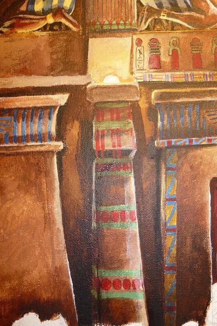
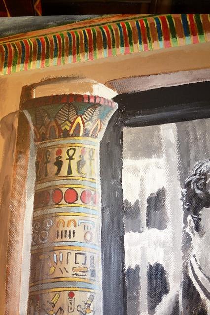
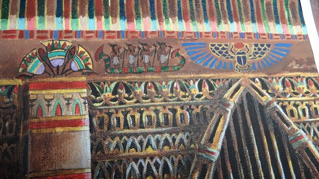
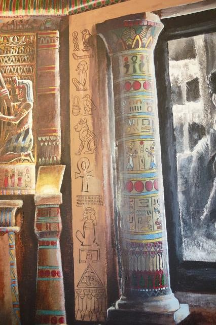
Well I felt a little overwhelmed with all the minute details I still had to get done and it took me a while to get into the groove, but once I did I boogied down the road. I really did not feel up to tackling the second harp strings, so I decided to do the other piece that I knew was going to be a pain: the pillar. But first, I noticed something that needed correcting. I erroneously thought that the stripes I did before were alternating red,green, and tan. I looked closer at one of the photos and noticed there was one more color: blue. So the order should be: red, green, tan, BLUE. A fairly easy fix turning one set of green stripes blue, just time consuming.
It does make the picture work better though. I see now that it is part of the intended color scheme of the original painter, because those colors are used throughout the theatre design. Next I started the general basic pillar with a start to shading and light to give it dimension.
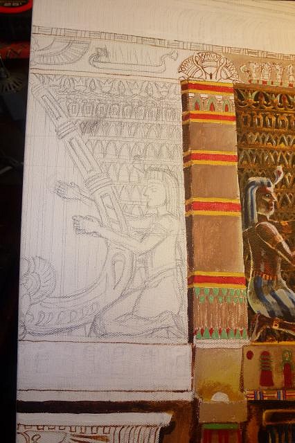
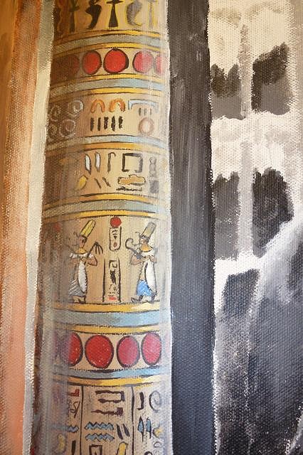
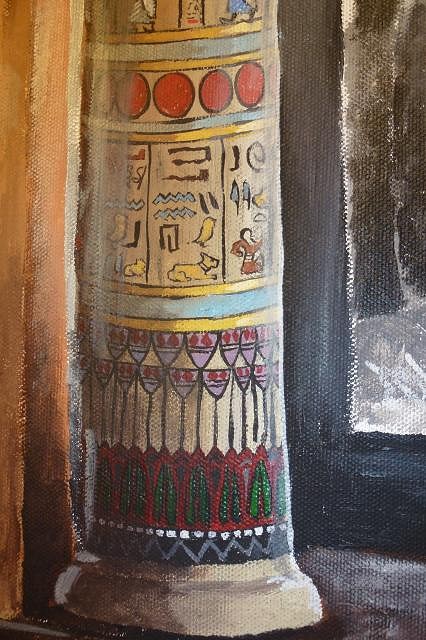
Then the really time consuming part; sketching in all those tiny hieroglyphic details on the pillar, and trying to make sure they stay in correct proportion. I had to erase and start over a few times.
You may have noticed I also blocked in the audience seats, and front stage to get a better idea of the lighting overall.
Then I started in on the more intricate black details and outlines.
After a little while I got into the zone and really went to town.
I saw that it needed more light reflection from off the screen, so added more brightness to that side and made the other darker. I also deepened the theater stage, and added reflection on the stage from the movie. I studied it for a while, then added a bit of yellow tinged light to the dark side shining off the pillar by the wall sconce. It still didn't seem right. Then I realized I didn't have light bounce or proper shadow on the inside of the arch. I fixed that and called it a night.
And that is where our camel caravan stops for now. Take a break and relax in the oasis until we meet again. And once again thank you Wendy for the paints! :) And... OH YES! I almost forgot, I just launched a Facebook fan page for my art! There will be some redundancy of what is posted here, but also all new projects I don't post on here such as a Scooby Doo villians card project I recently did. Head on over to https://www.facebook.com/pages/Tiki-Tiger-Studios/524934474245882 and like the page to follow along. :) [ Edited by: tigertail777 2013-09-06 06:10 ] |
|
D
danlovestikis
Posted
posted
on
Fri, Sep 6, 2013 8:58 AM
Tiger you could have been an architect. I've done a few paintings with buildings, none this difficult but even still they were so hard. You are pulling this off to perfection. Talent is your middle name. You are making a masterpiece. I can see why you wanted the pillar just right. Are any of the people involved in the project to save the theater watching this because they should. I am thrilled to have been able to keep you going. I couldn't have found a better person to ship these paints too. Pat on the back here, you have floored me, Wendy |
|
T
tigertail777
Posted
posted
on
Wed, Sep 25, 2013 3:31 PM
Thanks so much for the compliments Wendy, if I wasn't blushing before I sure am now! :wink: Funny you should say that; my brother is an architect. The joke in my family goes that he draws the straight lines and I do the curved ones. :) Well I am not entirely sure where I left off on my posting, so I will just have to go with my last session. I worked on the upper wall: adding more of the stripe/box design, and finally putting in those dreaded hieroglyphics that I have been putting off. Dreaded because of the tiny intricacy of the darn things, I thought I was going to have to get a magnifying glass a few times. I also added a bit more depth in the hi-lights of the pillar, and might add a bit more. I am probably going to have to lower that stage just a bit because I decided I am going to put the block under the pillar that I am sure was there originally from the floor impression I mentioned earlier. First... yet more stripes, of a different type. See the pattern at the top edge of the wall that is like little red boxes made of stripes?
As I said before, I am learning all kinds of new things on this painting. I really should have painted all of the wall background color before I penciled in and painted the hieroglyphics. Trying to match the paint color between the details was very time consuming. After a while on some of it I gave up and did just that, essentially starting over. I did that on the scarab beetle with wings because it was just getting too frustrating painting between everything.
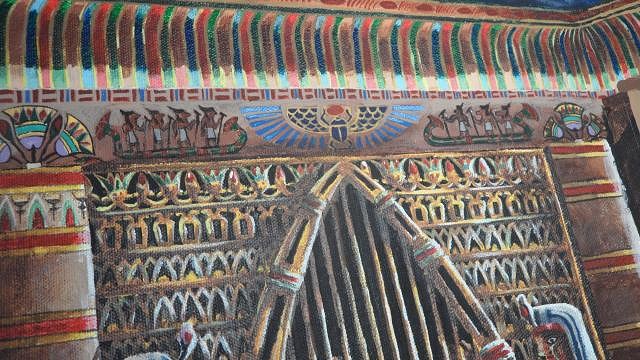
Next was all those boats with gods in them. I still am not entirely happy and may do some touch ups, but the overall image is there now. The papyrus flowers motif at the top of the dividers was the easy part.
Then came the other boat. I noticed there are only 3 gods making for a shorter boat. I am guessing this was done only on the far corner end walls, either because they ran out of room, or wanted to make the ending of the wall distinctive.
Finally, the last boat another 4 god one. And the half of the scarab beetle with wings motif.
And that ends where we are for now. Put your camels in their full upright position and thank you for flying scarab airlines.
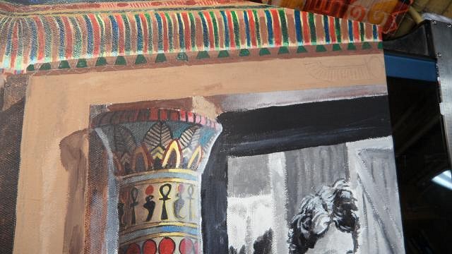
I did after much searching found an approximate correct time period (1930's) postcard of the same type of pillar which has very little supporting top brick under the arch, and a block pedestal base supporting (HA HA) my theory of how the pillars were originally under the arch before the move.
So I am going to lower the stage just a bit and add the block pedestal. It is the only thing that explains the square impression on the current stage precisely where the original pillars are. I may also come up with some kind of hieroglyphics to add to the arch as I am convinced now more than ever that it was painted over due to a detail I found hidden away on one of the photos. Might be a bit hard to see at this size, but if you look at the following photo, closely look at the top of the arch just under the pillars. You can see bits of hieroglyphics very sloppily painted over, with the paint not even reaching into the far corners of the arch. It's almost like they figured no one would see behind the arch above the pillar and gave up painting that far. Also those weird block things on top that I mentioned before, would not fit under the arch and if you look close at some of the pillar photos I posted before you can see sloppy "paste up" of some kind that I am sure they used to attach those funky blocks to the tops of the pillars, possibly in an effort to conceal their sloppy paint job on the arch. I kept thinking with all the detail already on the walls, and knowing that the very essence of art deco design is to cram details everywhere, that the arch HAD to be painted with more details. I am almost sad to say I was correct because lord knows what kind of beautiful artistic details were painted over so sloppily especially since the arch is the focal point of the room.
That's all folks till next time! |
|
M
MadDogMike
Posted
posted
on
Wed, Sep 25, 2013 3:39 PM
Part artist, part architect, part detective - great attention to detail Tiger! Keep up the good work. |
|
D
danlovestikis
Posted
posted
on
Wed, Sep 25, 2013 4:22 PM
MDM put it perfectly so ditto from me too, Wendy |
|
T
tigertail777
Posted
posted
on
Fri, Oct 4, 2013 2:28 AM
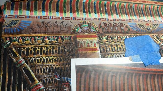
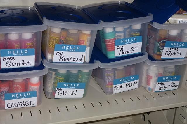
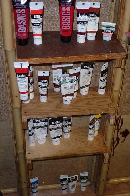
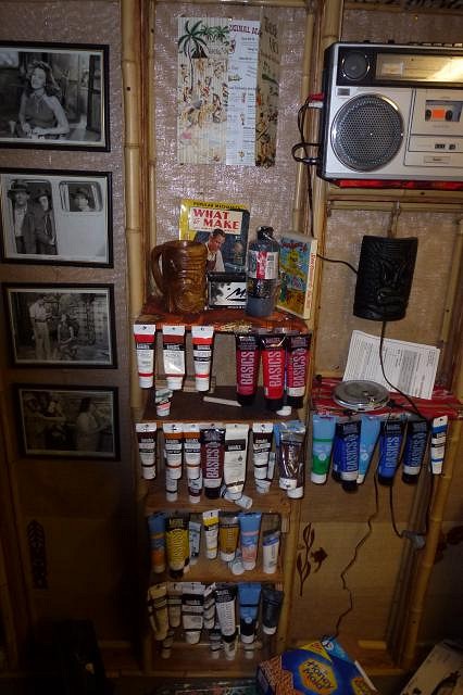
Hey Thanks MDM and Wendy! Yet another vocation that endlessly fascinates me. I think it would be fun to be a detective if it were all like in whodunit books... but I am wise enough to know the real thing is a lot more messy and complicated. I'll stick to Agatha Christie. :) A little bit of an update, but I am using a different camera right now which sucks all the color out of the picture unfortunately. I'll get back to the other camera soon. I did a little bit of paint organization, the older thin paints I had left I put in bins. Bet you can't guess my favorite game. :wink:
The ones Wendy was so kind to send I had shelves built for. I will be putting in more hanging nails on the sides to hang the ones I use the most like the red one is now.
Okay so now on with the show... The first thing was, I realized that the arch needed to come over just a little bit more to meet the corner of the building, and also need more "weight" to it. So I penciled a line closer in and carefully painted down it.
Then I added that bottom pedestal block to the pillar, and lowered the stage just a bit. The angle is ever so slightly off on the pedestal because if I lowered the stage more to accommodate the actual angle, the stage would be too low in comparison to the audience. I can live with it being slightly off, but the perfectionist in me can't help but notice it every time I look. I'm probably the only one it will ever bother.
After that it was more intricate tiny brush details: the painted designs on the moulding edge above the screen. First green.
Then red.
Then black.
Having finished that, I went in and adjusted some of the light reflection for when I do the final stage which will really help give punch to the "night time" effect. I also put some more of the decorative painted elements on the nearest exit pillar.
Shadows were then added to in the corners, and I put the winged sun hieroglyphic on the stage arch. That arch really bothers me; I have fully confirmed in my mind that it was painted over, and had more decorative elements originally but I just don't know what kind it had. I am going to have to guess to get it anywhere near what I think it may have looked like, but I really don't have much to go on. What really bothers me is the sides of the arch are vertical so would need some kind of vertical motifs and the only thing really vertical that has already been used is the cartouches on the ends of the little "arch" above the exit door. Unless they repeated some of the other border designs; I am thinking that probably the edge at least had the same design as that of what I just painted on the top of the stage arch. If I only had a higher resolution close up photo of those unpainted corners above the current pillar positions I could do a much better educated guess. It really bothers me that I will be having to "fudge" it since it is so obviously the focal point of the entire room. I'll try not to worry about it too much though and get on with the really difficult challenge coming up: the audience.
Welp... until next we meet in the swirling desert sands, ta ta for now. |
|
D
danlovestikis
Posted
posted
on
Sun, Oct 6, 2013 7:08 AM
tigertail777 I just love this painting. Your step by steps are excellent. Good luck on the fudging. I wish you had more contact with the restorers so you could have copies of all their photos. It's so easy now to photograph a photograph or to run it though a scanner. Have you contacted the local newspaper in that town? They may be willing to do an article on your painting, the project and to supply you with more photos. Our paper here is all about the community. You've done an outstanding job and I'm ready for more, Wendy |
|
T
tigertail777
Posted
posted
on
Tue, Oct 15, 2013 10:08 PM
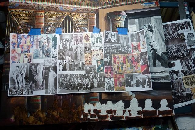
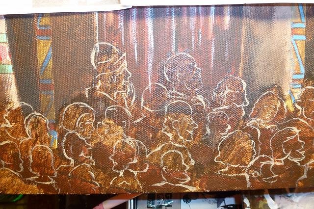
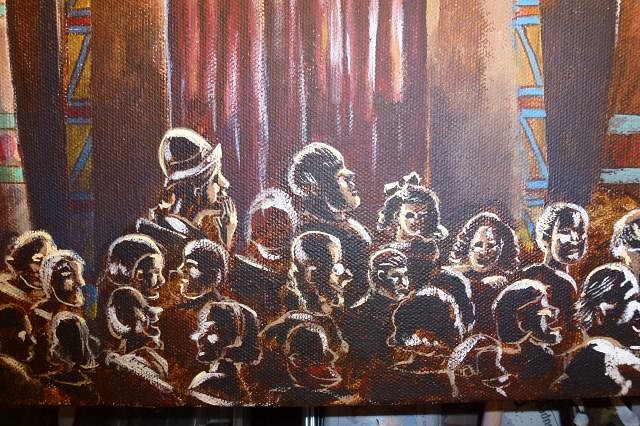
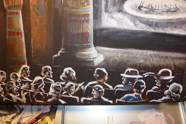
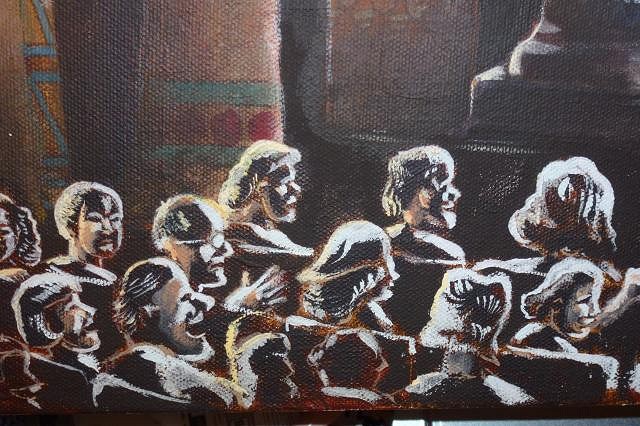
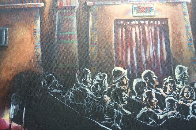
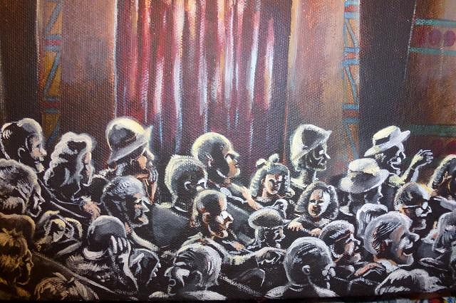
First off, thanks again for dropping by Wendy! I have tried to repeatedly get more information or better photos, and it is a complicated situation. The end result is I have what I have and there probably won't be anything better forthcoming. My solution is that I am going to paint hieroglyphics on the arch, but ones that if you can read Egyptian say silly things, and I will also be putting my signature in a cartouche on the arch. This helps fill the gap of what I know was there, without obligating me to have it be accurate because it says in so many words "I don't know" without being distracting to the rest of the composition. Let us once again cross the desert sands to that mystifying ancient place of magnificence. I am so very nearly finished with this very long journey. It's been over three months, longer than I have ever worked on any single art piece. I am very restless to finish this darned thing and start something new. The main thing I worked on was touch ups, adding some blue tinting to the areas where it would be darkest, and of course that oh so difficult audience. And awaaaaay we go! First off I filled in those gaping white audience "holes", and taped a bunch of 1920's period research above for inspiration. I really didn't have a very definite audience sketched out so just decided to wing it for the most part.
I took my handy liner brush and started making outlines of audience members. I didn't want them to all be just watching the movie though, I wanted to have little story vignettes like Norman Rockwell used to do. Very few of the photo reference pictures were outright copied, I made an exception for the lady by the exit with her hand to her mouth grinning in excitement. I thought that particular pose was perfect as it was. One of my favorite made up vignettes is also by the exit sign: the father absorbed in the movie while one of his twin girls is trying to talk to a boy behind her seat, and other with a disapproving look is trying to tattle on her. I've noticed pretty close to that exact situation play out numerous times in public spaces. It is quite amusing to watch when it is someone else it is happening to (first rule of comedy), but not at all funny if it is happening to you (I've had many occasions where nieces and nephews have tried to do this exact thing to me).
Another vignette I found amusing was the couple behind the two in the front seats trying to peer around the hats they are wearing to see the movie. The posture says it all, and I am sure we have all experience something like it. I often wear a 1940's style fedora which I remove as a courtesy in theaters for this very reason.
Towards the back of the audience I screwed up a little bit, but did not find out till later... so we will get there shortly.
I am really starting to get into film noir, which has been helpful in understanding how light and shadow plays upon the face. This is a dark auditorium with an audience in the dark, the only lighting being the bounce of light from the screen in front, the projection of light towards the screen OVER the audience, and the fake torches and upper lights on the wall. So the shapes of the audience members are composed entirely out of light and shadow. There is very little color that shows of the flesh or clothing.
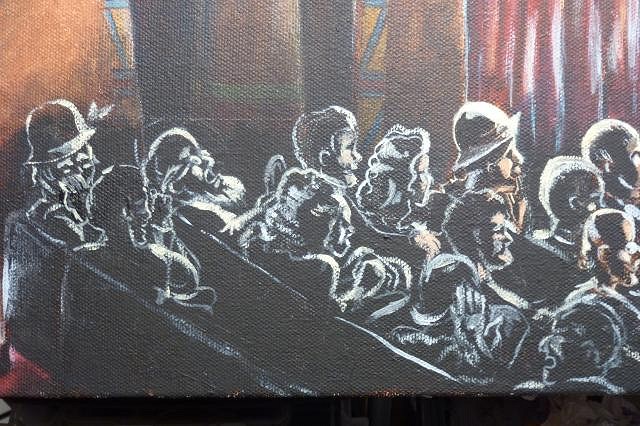
And there there is the back of the audience. I like the couple in back laughing, and the col. Sanders old guy, but I committed a few cardinal sins I need to correct. Some of the heads towards the back by the wall are too big, some are too small. To bring off the perspective of a "deep view" the heads should be uniformly smaller as they recede away from the eye. And I could not find the precise reference I needed so some of the head shapes are not right, and little boy next to the laughing couple looks too old, and is impossibly twisted around in the seat. Worst of all the seating grid starts to lose its coherence towards the back and some seats are where they should not be. This is a difficult seating grid because it is in a slight curve shape, not a straight line. The real seating in the theater has this curve, most theaters historically did this until anamorphic widescreen came into being in order to provide the best viewing situation per seat. What this means for me is essentially taking a straight row grid of seats and bending it slightly into a half moon shape, which makes the sight lines of the seats all over and head placement must be strategic in order to show all the vignettes and expressions correctly without one head completely blocking another.
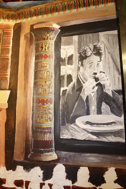
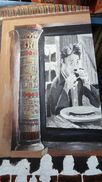
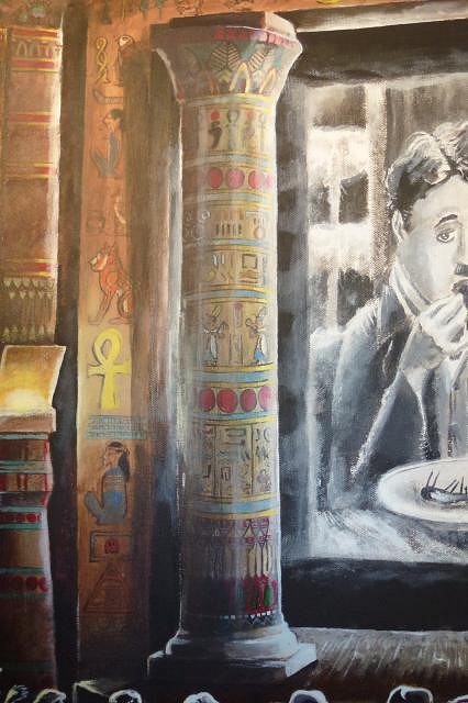
I saved the audience for last because I knew it was going to be ridiculously difficult to pull off. I still need to work on the audience corrections, but meanwhile I went back and made Charlie Chaplin a zombie. Which, around THIS place would mean I mixed him a drink.... but no... not exactly what I meant. :wink:
I still didn't like the eye direction and some of the shape so I redid them. I also thought that the Chaplin image was in too sharp of a focus for a projection, so softened it and added some grain. In photoshop speak: I added a gaussian blur and grain filter. :wink:
That's about where I stopped for now. Don't have much more to go; crowd correction, and adding foot lights to the stage (unlit). I may also add a small slice of the Wurlitzer organ at the front of the stage, on the edge of the painting. I have been working under my special arm lamp that has both fluorescent light, and incandescent in order to balance the color spectrum.... but dummy that I am I did not realize the overhead lights are also fluorescent tubes, which would be why things seemed so blue to me. I will need to add an overhead incandescent in the future to balance out the light color fully. After realizing this, I wanted to get a truer sense of the color under proper light so I turned off the overhead lights and only used the balanced light to take the last photos. These give a much truer sense of how it really looks.
End of the line for now, everybody off! |
|
H

hiltiki
Posted
posted
on
Wed, Oct 16, 2013 5:55 AM
You are doing an amazing job with this project. There is so much detail and the entire piece is so interesting. Great job. |
|
D
danlovestikis
Posted
posted
on
Sat, Oct 19, 2013 9:31 PM
You've accomplished so much it gives me chills! Wendy |
|
V

VampiressRN
Posted
posted
on
Sat, Oct 19, 2013 10:08 PM
LOOOOOOVE the Egyptian. My Master bedroom is decorated in Egyptian decor, mostly from Design Toscano. Your work is splendid!!!! |
|
T
tigertail777
Posted
posted
on
Sun, Oct 20, 2013 11:31 PM
Thanks everyone, really appreciate the comments! Sorry no posting this weekend I had another bout of gout from a food allergy and have been limping along with a cane. Difficult enough to get to the living room let alone to my studio. Hiltiki: Thank you, I love doing detailed pieces, but I admit this is probably the most intricate piece I have done yet. Thanks for stopping by! Wendy: as always you are incredibly gracious. I guess so this post is not bare bones I will show you what I finally ended up doing with the paints you gave me. I got all the nails in the shelving in so they just hang there and are so handy to just grab a few feet away from my desk. VampiressRN: Thank you for the compliments! You had me stumped there for a bit I had never heard of Design Toscano and had to look it up. Too rich for my blood, but man I really love the sarcophagus cabinet! Functional and cool as all get out! At my current job though that would be about 5 months of payments LOL. I've been in love with ancient Egypt as well as other ancient cultures for a long time. I attribute the love of Egyptian particularly to visiting this theatre when I was young; it was a whole other world, unlike anything else my young eyes had yet seen. In some ways even Disneyland didn't measure up to it. Thanks for dropping by the tomb. :wink: And now.... if you can stand the suspense.... paint organization!
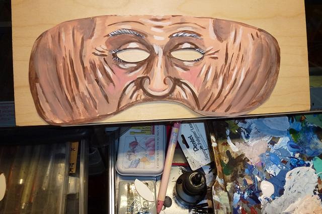
Okay fine, I'll throw in a quicky I old lady mask I painted last week for a start up theatre company.
And I can't remember if I mentioned it, I have a facebook fanpage for my art. Not anything earth-shatteringly new, but lots of sketches... right now a lot of Goonies practice sketches more than anything. If you are a true Goonie, I'm sure you'll like them... https://www.facebook.com/pages/Tiki-Tiger-Studios/524934474245882 Aloha 'till next time my camel riding compatriots! |
|
T
tigertail777
Posted
posted
on
Thu, Nov 7, 2013 7:33 PM
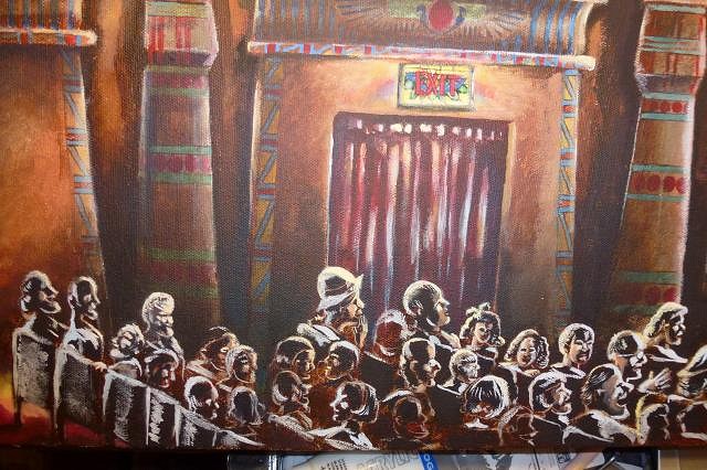
OK, so I am better and got a bit more done...man, we are getting ever so close to the finish line here folks! I did what I said I was gonna do about the side of the arch, and put some nonsensical (but meaningful to me) hieroglyphics, I just have to figure out what I am going to do with the top part of the arch now. I also did yet more changes to Charlie and the theater screen. And so... away we go... First I painted the outlines after penciling them in.
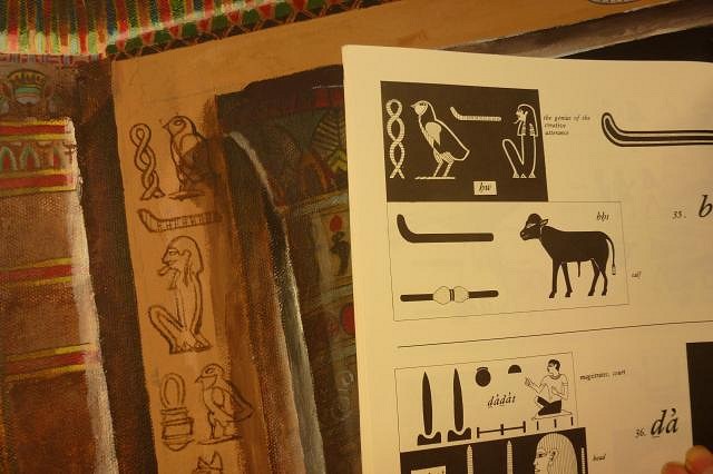
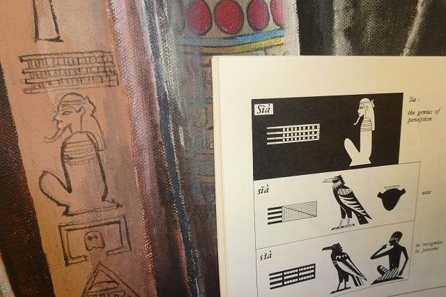
Research. More research as always. I have about 8 books on hieroglyphics checked out from the library right now. The Egyptian Hieroglyphic system has an order to it, but is ridiculously convoluted, there are not just symbols for sounds, but also groupings which change the sound meanings depending on their order and placement. Even with the famous Rosetta stone, it took quite a while to crack, and some things we are still not quite sure of. So rather than try and put sounding hieroglyphs together into words and hoping I got it right, I decided to use phrases already confirmed and published. These might be hard to read at this size, the first one is "the genius of creative utterance". What could be more apropos for a painting of a theater, in which both are creative endeavors that start with words and bringing into reality through them?
I couldn't find a tiger, so I used the next best thing, a cat.
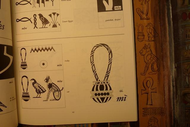
The next one goes in hand with the first: "the genius of perception", the ability to perceive both the normal and abnormal and how they interrelate, something that could be said of many movies and particularly the genius of Charlie Chaplin. You may also notice a little in-joke: a pacman ghost monster inside the little regeneration box from the game. It is a double joke, because there is a Egyptian hieroglyphic that looks exactly like the regeneration box, that means "home", or "dwelling". I normally put several in-jokes in my art but restrained myself on this one because I wanted it to be as historically accurate as possible. I figured the arch area was perfect because there is no way of knowing from the documentation I have what was actually there. There is a further personal joke there was well; with the combination of "the genius of perception" and "home" you get an approximation of "clue" and "house". My comic characters I have drawn since I was a kid and hope to launch as a web comic soon are called "Cluehouse Kids".
So the hieroglyphics were colored in, and my signature was added in.(The triangle/mushroom thing is my signature, it is my initials inside a triangle).
Then the painful part comes. You see, as is the hieroglyphics stand out too much. They have to be in dark shadows and as such barely perceptible. So shadows were added.
Now, I softened up Charlie a bit more. I wanted the screen to have that soft hazy glow that theater screens give off.
Originally I was going to have a full stream of light towards the screen, like you see from the projection booth due to particles in the air. But I felt it would ruin the dark ambiance I had built up, so instead I made some subtle streams around the screen, and added some distinctive light bounce around the pillar.
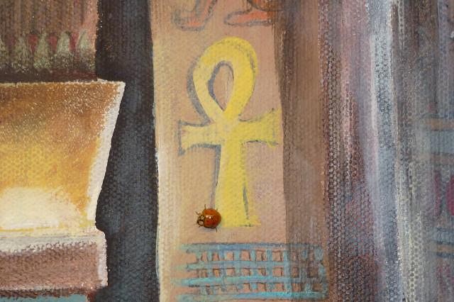
At this point, I noticed a little visitor to the studio that seemed to have a great fascination with my painting traveling all over it as I worked. Not a scarab, but close enough. :wink:
Finally, I strengthened the light on the crowd, and added some little hints of color. Now I think the light is too bold and I will need to go back and touch it up. I also need to fix more of the crowd still so the seating looks more natural.
So, all I have left is finish sorting out the crowd, and the overhead arch, and adding footlights to the stage. I am undecided if I should have any curtains showing above the screen or not as I am not entirely sure how the fire curtain and the stage curtains worked together. I have a hunch there were probably small curtaining above the screen, and closing stage curtains (as there are now) that were probably in front of the fire curtain which rolled up on rollers hidden within the backsides of the pillars. Not sure what color the curtains would be either, but they would probably match the exit curtains. Currently in the theater the exit curtains appear to be burgundy velvet (a very traditional theater color and cloth for curtains), while the stage curtains are yellow gold. It's possible these are the original curtains, but I highly doubt it because I worked in our local theater for a while and went through our bins of curtains from when they started (50's/60's) and those curtains just shredded under your bare hands (granted they probably were not brand new when they started... I'm guessing 1940's era). So for original curtains to survive from the 1920's.... I very highly doubt it. It is possible of course that they had curtains remade exactly the same as the originals over the years, but I know a thing or two about how theater budgets work: usually they go for whatever is the easiest and cheapest at the time because budgets are slim, if that means a color change from the original then so be it. Usually in the 20's drapes and curtains matched, it was rare to have differing colors within the same room/setting, so my theory is one of those curtain colors is the correct one historically, but not both. So what to do? add curtains? If so... which color? Well, that's it kids until next time you see me go crazy trying to pick out curtains. :wink:
|
|
C

Clarita
Posted
posted
on
Fri, Nov 8, 2013 11:07 AM
Cool style, a lot of work it seems, looking goood :) |
|
D
danlovestikis
Posted
posted
on
Fri, Nov 8, 2013 12:09 PM
I sure hope the renovation project ends up with the theater looking as good as your painting. Wendy |
|
T
tigertail777
Posted
posted
on
Tue, Nov 19, 2013 10:47 PM
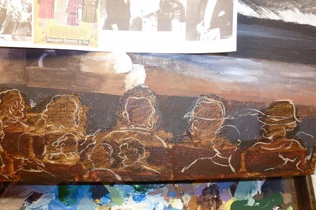
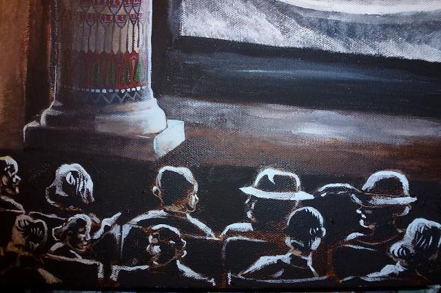
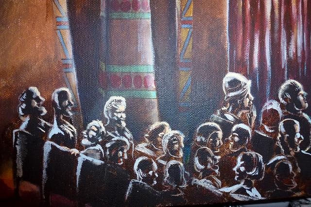
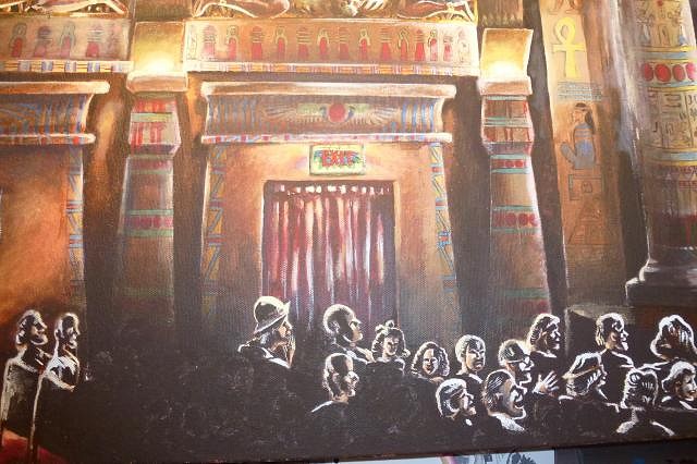
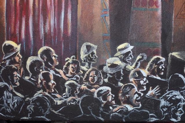
Well, kids you read the title right... this is our last trip across the shifting sands of Egypt. I pulled an all nighter this past weekend and finally finished! But first before we get underway... Thanks for stopping by Clarita and Wendy, and the encouraging words. Always appreciated. The biggest thing to finish off was the crowd. I had to black out nearly half the crowd a few times to get it right, because the seating was horribly out of line and not lined up like theater seats should be. The seats however are in a half circle sort of configuration so the sight lines are tricky particularly if I wanted most of the actions of them recognizable and not hidden by each other. Wiping out parts of the crowd...
I worked hard to make this not just a crowd watching a movie. I wanted to have little vignettes that each told a little story within the crowd, just like you would find in looking around a real theater during a movie. Of course back then so many people wore hats it was hard to enforce a "no hats" rule, let alone people wearing them in the theatre. A few more citizens in the crowd are added...
I currently lack internet connection in the studio (let alone a laptop or anything... going to save up for a kindle or ipad) so when I need reference I have to use my big convex mirror and a camera. In this case I needed the look of someone tipped back asleep in their seat and snoring. It's a little blurry but it worked for my purpose. :wink:
After that, I added more to the "snoring story" with a livid wife hunched over and clutching her purse next to the old snoring man. Then next to the wife is the daughter covering her face with her hand to avoid confrontation with her neighbor about the loudness of the snoring. Behind the snorer is a young couple much amused at the old man, with the young man using a feather plucked from the young ladies hat to tickle the poor snoring man. I can hear the daughter "Mother! He PROMISED he wouldn't fall asleep again! This is EMBARRASSING!"
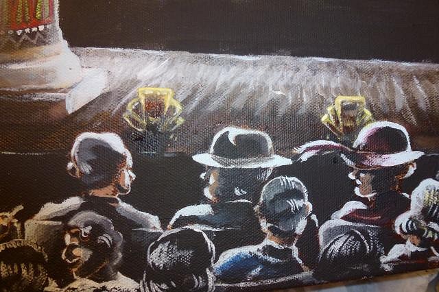
Remember the two twin girls by the exit door with their daddy? I added to the story of why the one twin is so annoyed with the other. You'll note the one turned around is talking to a young man I can hear her saying "She's doing it AGAIN DADDY! Do something!" Meanwhile an older man in glasses behind the talkative young man is tapping him on the shoulder about the noise he is making. Now... pay special attention to the man guffawing with laughter at the antics of Charlie Chaplin, we will come back to him in a moment.
There is an annoyed couple in the front row looking daggers at that guffawing man, they are the kind who think everything they do smells like roses and seem entitled to wear big lavish hats which are blocking the view of the poor couple behind them who are craning necks to see the film.
Adding a little flesh tone around the areas of the exit and faux torch lights, and more light projection from above because the invisible projector beam is above the crowd.
A splash of color to the front row people which is from the bounced light off the screen in front.
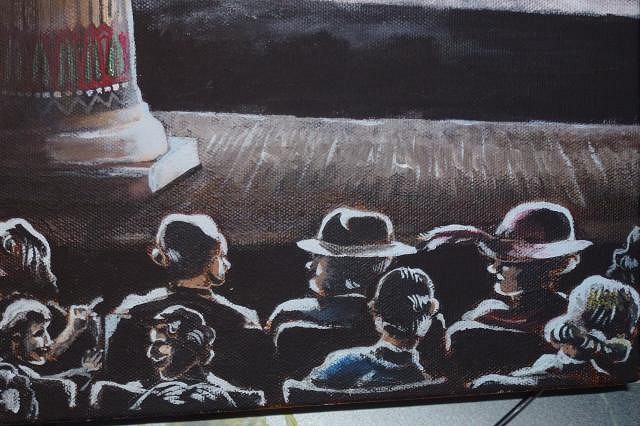
I didn't think the pillar felt "rounded" enough so I added some more light reflection and a little more light behind it to help form the shape.
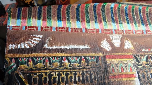
The stage needed some footlights so I added some art deco polished brass ones.
Oh those curtains! I decided it may have been possible considering the color scheme that they may have been gold color after all and added an upper ruffle of them. I left it to the viewer to decide if there might be some full length stage curtains hidden behind the pillar or not, which is possible at the angle I chose. At this point I finished the first wings motif on the arch, which I had finally figured out was done in relief: explaining why they had not been painted over with the other hieroglyphs I am certain were on the arch. It would have a) looked off to see a relief in a single color, b) it would have taken a lot to paint all those nooks and crannies, it could not be half assed too look okay and everything points to the fact that the arch was a hasty and sloppy paint over job so the easiest thing to do was to paint around the relief parts. The winged motif above here is not quite painted fully yet, I finally realized it too was relief so I had to paint lighting and shadows over it from the house lights directly below the striped area.
The screen needed a bit more "bright blur" so I fixed Chaplin more and called that done.
One the end of the seating aisles that are closest to the wall lights I added a fuzzy blur of light to the crowd to make them seem more optically distant, and have a bit more romantic moody lighting.
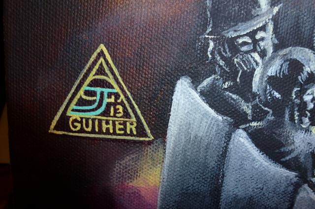
At long last it was time to add my signature to the piece. I've had problems explaining my signature in the past to people (it looks like a mushroom inside a triangle, but is composed of the initials to my first, middle, and last name: JDG) so I decided to make it a little more "user friendly" and added a very clear "GUIHER" underneath and then to tidy it up I added another rectangle around it... looks kind of art deco, which is cool that is one of my favorite art styles. I also defined the "J" in color so it reads as "J GUIHER".
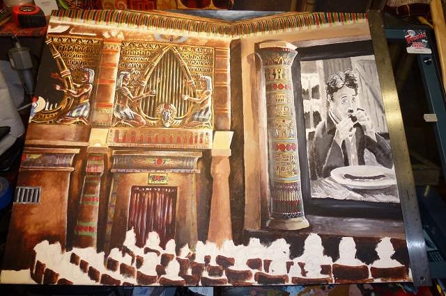
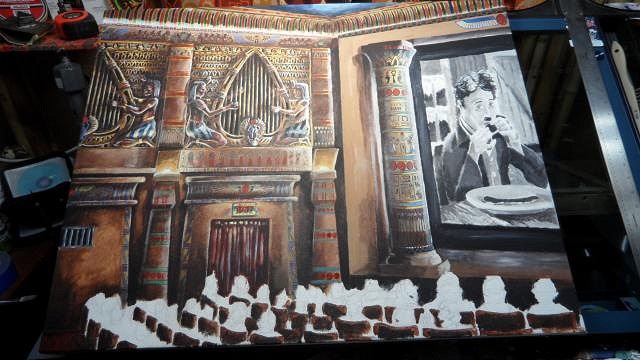
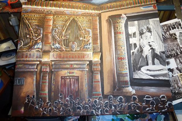
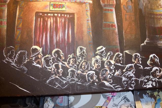
And now what you have all been waiting for... the final reveal... the last trip to the tomb...one more desert crossing...
Some parting shot details as we wave goodbyes to the camel caravan...
The only thing left is to seal it, and then figure out the logistics of scanning and getting it printed. Thanks to everyone who dropped into the tomb of the pharohs and said "hi" and commented on the work. Don't cry, there are more trips planned to other exotic locales ahead, stay tuned! |
|
TSA
Tiki Shark Art
Posted
posted
on
Wed, Nov 20, 2013 3:41 AM
So so soooooooo good! You really have captured the feel of a theater! all the detail, and lighting.... |
|
TSA
Tiki Shark Art
Posted
posted
on
Wed, Nov 20, 2013 3:43 AM
The other best complement I can give is "GEE... |
|
C
cy
Posted
posted
on
Wed, Nov 20, 2013 4:15 PM
Quite the project tigertail, outstanding work! |
|
D
danlovestikis
Posted
posted
on
Thu, Nov 21, 2013 10:36 AM
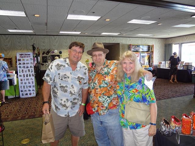
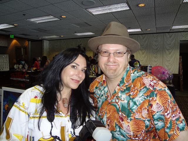
tigertail777 I loved reading all the audience stories and looking at the people. A true artist is one who knows when the painting is finished. You hit it on the nose. It's a masters work of art. I don't want this story to end. I hope you will share all the rest of the steps and stories that will follow this piece. Sometimes it takes a year to reach the end so I'll be patient but please continue this story. Also I hope you will start another project really soon. Hugs and well wishes, Wendy Dan and I with THE ARTIST Another photo with tigertail777 |
|
T
tigertail777
Posted
posted
on
Thu, Nov 21, 2013 12:05 PM
Brad: you're comparing me to Ray Bradbury? Wayne's World bowing and scraping "I'm not worthy!" But seriously, gosh that is one of the best compliments I think I have ever gotten about my art. Bradbury is among my top five favorite authors and I just cannot describe the utter beauty and mystery of the worlds he creates. As for wishing you had painted this... we are even on that score, there are a number of your paintings I just wish the same thing, I think my favorite is probably "Beyond the Reef", the mashing together of what seems to be Pirates of the Caribbean and tiki with underwater lighting is just superb! Cy: Thank you so much, your work is outstanding as well. I may not comment often but I always eagerly follow your Frog Island thread, and have been wearing your generous gift with the cold weather lately (the long sleeve Frog Island shirt). Wendy: You helped make this painting possible with your wonderful gift of the paints, a lot of your umber and black in particular are in there amongst other colors. I will of course "continue the story" once I know the score. Right now the committee is deciding the next step, no idea how long all that will take but I will keep you informed. As for the next project, I am contemplating it myself; one is a possible Walt Disney World Adventureland painting for a friend, we are trying to work out an equitable trade right now. Another is I really would like to get a comic strip launched on the web, but for the site I have in mind its going to cost around $800 so I will have to likely do some other fundraising projects in the meantime. I am really torn about posting some of those projects on here because a lot of my output either is not tiki altogether, or only fractionally features anything tiki. I love historical Polynesian pop stuff, but I just don't feel the urge to make all of my artistic output of that variety, and I feel like it is somehow breaking rules or cheating to put it on here. Some of it COULD be considered marginally poly-pop simply because I like throwing in those elements with others and melding them into a surreal amalgamation of the two, but I couldn't really honestly say they are poly-pop enough to go on here. I surprisingly didn't get really any flack but a few grumblings about the Egyptian stuff and I don't want to push that too far, I do understand it is a TIKI forum and not a free for all but I also feel a lot of people on here are almost family and I want to share...so as I said I am torn. Oh... and one more project... remember the tabletop mini golf? I have more clay to hopefully finish the first hole at least. The plan I am hoping to do with that is to make a nine hole course and possibly testing it out at the next Tiki Kon. So... I have plenty of projects to do I just have to decide what one. |
|
D
danlovestikis
Posted
posted
on
Thu, Jan 2, 2014 8:29 PM
It's time for an update on the Egyptian painting as well as the other projects you mentioned. Or have you taken time off and been relaxing and thinking about going to Kon Tiki in 2014? Wendy |
|
T
tigertail777
Posted
posted
on
Thu, Jan 9, 2014 5:33 AM
Sorry for leaving you hanging so long. I've been sick since before Christmas and am just now starting to get over it. Why so long? Every time I started to get better I had to go out into the yucky rain and cold to go to work, and it would start the cycle all over again. Good news is, I am working out a contract with the theatre right now which gives me some rights that I asked for such as the ability to publish the painting in a future book of paintings etc. They are earnest in wanting to get the ball rolling on the printing end, which is up to me to get the printer lined up, but due to the above I have not had the energy to get it done. I am just about well enough to start the ball rolling again, so that's good. I know its a meager update, but it's all I can manage right now. Once I get my tiki mojo back I will get back into the groove. Right now I am tired of feeling like the floor of a taxi cab (to quote Ghostbusters). |