Pages: 1 2 3 4 5 6 7 8 9 10 11 12 13 14 15 16 17 18 19 20 21 22 23 24 25 26 27 28 29 30 31 32 33 1,554 replies
|
B

BARNETT
Posted
posted
on
Tue, Aug 10, 2004 2:22 AM
Once again...nice work! |
|
F

foamy
Posted
posted
on
Tue, Aug 10, 2004 5:45 AM
Just as good in B&W as it is in color. Good stuff Sam. Is it time for T-Shirts yet? |
|
T

Tiki-Toa
Posted
posted
on
Tue, Aug 10, 2004 7:41 AM
Actually Sam you know what you should do is take these and do a hawaiian shirt, the SAM GAMBINO HEADHUNTER SHIRT! I want mine in 3X! |
|
SG

Sam Gambino
Posted
posted
on
Tue, Aug 10, 2004 8:01 AM
Thanks a lot for the comps, foamy, Barnett and Tiki-Toa. You guys really think that these would make cool shirts? But if they didn't go over well, I could lose my shirt on the deal. (Sorry, I know that was terribly bad, but I couldn't resist!) If the response pointed that way, I would look into having some shirts done. Forty years from now, maybe they'd sell for an unearthly amount on "Ebay2040.com." [ Edited by: Sam Gambino on 2004-08-10 08:03 ] |
|
T
Tiki-Toa
Posted
posted
on
Tue, Aug 10, 2004 8:45 AM
Sam I tried to do a lil digging, Toes on the Noes does custom I believe these are the guys that did the Disney Shag shirts http://www.ripleyshirts.com/index.html also does custom. This is a shirt that I think would be a good template for a design with your heads, but you do good enough on your own so...you may be able to come up with something better. |
|
JD

Johnny Dollar
Posted
posted
on
Tue, Aug 10, 2004 8:58 AM
hey sam g, am i mistaken thinking those heads have an influence from basil wolverton's drawings for the vintage MAD magazine?
[ Edited by: Johnny Dollar on 2004-08-10 09:01 ] |
|
B

Benzart
Posted
posted
on
Tue, Aug 10, 2004 10:12 AM
Woah Sam, these are getting WaywayWAAY WaYY WAYWay way Cooolll. I think your new tshirt should feature all your shrunken heads. We're gonna start calling you "Witch Doctor Sam" weather you like it or not. |
|
SG
Sam Gambino
Posted
posted
on
Tue, Aug 10, 2004 10:30 AM
Tiki-Toa, thanks for the shirt links. I will get into them and check out the costs. You are a wealth of info! Thanks Ben. Lately, maybe "Sloppy Witch Doctor Sam"! :) J$, I see what you mean about Basil Wolverton. Basil Wolverton's work seems to have some Ed Roth sprinkled in with it, or the other way around. I'm not sure who started first. [ Edited by: Sam Gambino on 2004-08-10 10:32 ] |
|
C

Chongolio
Posted
posted
on
Tue, Aug 10, 2004 10:48 AM
Yo Sloppy, Keep up the good work. If you have any t-shirt questions I will be more than happy to share any info that I have with you. |
|
SG
Sam Gambino
Posted
posted
on
Tue, Aug 10, 2004 11:30 AM
Thanks for the kind words. I wouldn't mind at all, Chongo. I used a Windsor and Newton short bristled brush (I'm not near it now, but I'll give you the size number later- I think it's a zero) and the same brand ink. It seems to cover better with more consistency than Higgins ink. The only pen I used was for my signature: A Koh-i-noor Rapidograph with a #2 tip. I have a rough time with those dip pens because I can only go in one direction with them, and I'm sloppy with them (appropriate for my recent nickname!) The bristol plate I use comes in a pad and is very smooth and white. I'd like to try Illustration board too, but never have. Thanks again! |
|
C

cabinguy
Posted
posted
on
Tue, Aug 10, 2004 5:21 PM
hey Sam, |
|
SG
Sam Gambino
Posted
posted
on
Tue, Aug 10, 2004 9:16 PM
Thanks a bunch, cabinguy. I had never checked in to pricing shirts to have printed but that gives me a good idea of the cost, since I've often considered it. I also appreciate the tips on the companies to buy from. I am crazy busy now, but you and others have given me a good place to start, and I will be looking into it as soon as I can devote enough time to it. Thanks again! |
|
SG
Sam Gambino
Posted
posted
on
Tue, Sep 21, 2004 3:28 PM
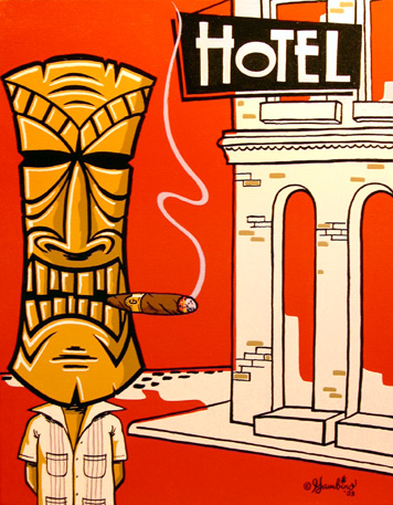
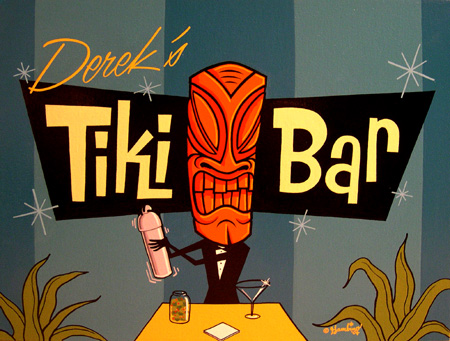
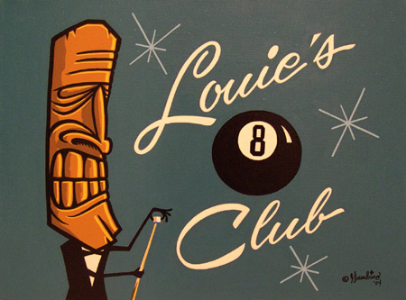
Here's some commissioned tiki art for Witch Doctor Recording Studio in Brooklyn, New York. Their site is http://www.witchdoctorrecording.com. and some other art...
[ Edited by: Sam Gambino on 2004-10-22 09:32 ] |
|
R

rodeotiki
Posted
posted
on
Tue, Sep 21, 2004 7:39 PM
WOW..I love it. did you do the art for the website as well? I was wondering what you thought about stripping a actual carving. I was thinking of laying some lines on my next project. Should I just use oneshot and then clear it. I am not sure how it will hold against wood. |
|
SG
Sam Gambino
Posted
posted
on
Tue, Sep 21, 2004 8:03 PM
Thanks, rodeotiki. If you put 1-Shot on bare wood, the wood will keep soaking up the paint and the color won't look consistent. It should be sealed, varnished or polyurethaned first, not just stained. I would not recommend clearing or putting anything over the top of 1-Shot. It really doesn't need it. Also, make sure it's degreased before striping, and turn loose on it. |
|
B
Benzart
Posted
posted
on
Tue, Sep 21, 2004 9:22 PM
Sam I Love your Wuitch Doctor. I Wanna Be a WitchDoctor. Glad to see you pourin out more good stuff |
|
F
foamy
Posted
posted
on
Wed, Sep 22, 2004 7:03 AM
As always, good stuff! |
|
SG
Sam Gambino
Posted
posted
on
Wed, Sep 22, 2004 7:31 AM
Thanks, Ben and foamy. I've been swamped with all kinds of projects, but the hurricane interrupted everything, so now I have to get back into the swing of things! By the way, FG, I couldn't resist putting the guitar in... (inside joke) :) |
|
C
Chongolio
Posted
posted
on
Wed, Sep 22, 2004 8:34 AM
Yeah Sam! I bet the jungle doctors of sound are stoked on that art. The tube amp tiki is out-o-sight. Sweet hollow body Guitar too! Did you creat the font also? |
|
SG
Sam Gambino
Posted
posted
on
Wed, Sep 22, 2004 9:14 AM
Thanks for the kind words, Chongo. I did create the "Witch Doctor" font. However, I recreated the little tube tiki from a logo they had, using different colors. Also, I'm a real sucker for those beautiful, hollow-bodied guitars. I've always wanted one, but never really owned the kind I'd really like. |
|
F

finkdaddy
Posted
posted
on
Wed, Sep 22, 2004 9:19 AM
Looks terrific! Your lettering always looks so precise. very, very cool. Glad to see your ok after the recent disasters. |
|
SG
Sam Gambino
Posted
posted
on
Wed, Sep 22, 2004 10:19 AM
Thanks a bunch, finkdaddy. I guess a touch of that OCD is showing through the lettering :) |
|
FZ

Feelin Zombified
Posted
posted
on
Wed, Sep 22, 2004 1:15 PM
dang, that's sweet! Excellent work as always. Makes me wanna finally build my basement studio (since we moved, it's still in pieces) I love the inspiration this place creates... it lights a fire underyourass when needed. -Z |
|
SG
Sam Gambino
Posted
posted
on
Wed, Sep 22, 2004 3:05 PM
Thanks for the kind words, FZ. It's nice to know that the art inspires in some way. |
|
R
rodeotiki
Posted
posted
on
Thu, Sep 23, 2004 8:36 PM
Well thanks to sams incredible work, I have lost a hour of my life i'll never get back. I went out to the garage, grab a mack10 brush and tried to stripe some tiki. Needless to say it failed by comparison.( think i will stick to flames and fairly simple lines for now) Just kidding sam. Could you maybe take some shots of a painting in progress. I would love to see where you start off at. |
|
SG
Sam Gambino
Posted
posted
on
Thu, Sep 23, 2004 10:11 PM
Thanks, rodeotiki. I just sent you a long, rambling PM. I hope you can decipher it! :) |
|
P

Polynesiac
Posted
posted
on
Fri, Sep 24, 2004 8:54 AM
Here's one more reason why your art rocks! not being a guitar guy, I thought your tube tiki was infact a space tiki inside of a stylized george jetson mobile. Cool deal. That font is beautiful. your art is very inspirational, thanks for sharing with us! |
|
SG
Sam Gambino
Posted
posted
on
Fri, Sep 24, 2004 12:39 PM
Thank you, Polynesiac. It's great to know that my art inspires. Again, I can't take credit for the little tube guy - I just recreated him with colors to fit my artwork. That is a cool concept you came up with, though...tiki meets George Jetson! |
|
HK

Haole Kat
Posted
posted
on
Fri, Sep 24, 2004 1:21 PM
Sam, Josh |
|
MD

Mr. Dale
Posted
posted
on
Fri, Sep 24, 2004 2:55 PM
Yo Mr. Sloppy Doctor Sam, (i think thats what it is right now) Your work is amazing. |
|
SG
Sam Gambino
Posted
posted
on
Fri, Sep 24, 2004 8:50 PM
Thanks so much, H-Kat and Mr. Dale. I really appreciate your kind words! This Witch Doctor piece is a vector illustration. I usually do these when the art is to be easily changed or manipulated for the web, printing or t-shirts. |
|
SG
Sam Gambino
Posted
posted
on
Sun, Sep 26, 2004 2:20 AM
Here's the Mondo Lounge 2004 postcard design. It is somewhat of a collaboration between me and our own Futura Girl who is organizing the whole event:
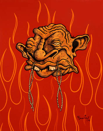
...and here's the latest painting, "Mishap While Flossing." The lesson here is to be really careful when flossing because this guy ended up on fire and accidentally stitched his mouth shut. :) Oct. 4 UPDATE: I'm renaming this painting "Bacon" thanks to Chongolio. It really does have that "Open Pit Bar-B-Q" look. Thanks, Chongo!
[ Edited by: Sam Gambino on 2004-10-04 23:43 ] |
|
T
Tiki-Toa
Posted
posted
on
Sun, Sep 26, 2004 8:20 AM
Sam love all the new stuff! WOW. The postcard is very cool and another head, man those get better and better. |
|
F
foamy
Posted
posted
on
Sun, Sep 26, 2004 9:52 AM
Cool head, and really nice curves on those flames. It agrees entirely (not that it matters) with my idea of a flame shape. Nice job on the postcard collaboration as well. |
|
AA

Aaron's Akua
Posted
posted
on
Sun, Sep 26, 2004 3:21 PM
Sam, Your work is excellent, hip, & most of all fun. I'm really enjoying this post. A-A |
|
SG
Sam Gambino
Posted
posted
on
Sun, Sep 26, 2004 8:48 PM
Thanks for the kind words, TT, foamy and Aaron's Akua. |
|
R
rodeotiki
Posted
posted
on
Mon, Sep 27, 2004 7:20 PM
Once again completly awesome.. |
|
SG
Sam Gambino
Posted
posted
on
Mon, Sep 27, 2004 10:10 PM
Thanks, rodeotiki. I'll try to do that during the next painting. |
|
R

Raffertiki
Posted
posted
on
Tue, Sep 28, 2004 7:09 AM
Maybe he should of used waxed floss. We can all learn from his mistake. And I agree, that's exactly how flames should be executed. Sweeet. |
|
SG
Sam Gambino
Posted
posted
on
Tue, Sep 28, 2004 7:46 AM
Thanks Raffertiki. I think that his whole problem was that he didn't carefully think out the whole process prior to attempting to floss. It just goes to show that carelessness can sometimes breed unnecessary, and even tragic consequences. By the way, I saw your finished fish tiki on GCFM, and it looks great. Carving is something I've always wanted to try. |
|
C
Chongolio
Posted
posted
on
Tue, Sep 28, 2004 6:28 PM
Keepin' busy and obviously luvin' it. Those are both sizzlin, Sam! Maybe too hot for poor lil crispy head though. I thought I smelled bacon when I opened this thread. Chongolio -- I believe that our Heavenly Father invented the monkey because he was disappointed in man." Come explore http://www.lost-isle.com [ Edited by: Chongolio on 2004-09-29 19:22 ] |
|
SG
Sam Gambino
Posted
posted
on
Tue, Sep 28, 2004 9:46 PM
Thanks, Chongo! Your post got me thinking - maybe I'll go raid the fridge - It's been a while since I've had a BLT... :) |
|
B
Benzart
Posted
posted
on
Wed, Sep 29, 2004 6:18 PM
"Crispy", Thats a new description for a painting. Love it, especially after seeing the picture. I've missed too much in just a few days. |
|
SG
Sam Gambino
Posted
posted
on
Mon, Oct 18, 2004 8:53 PM
Here's a new illustration for VooDoo Daddy Records in Brooklyn which is a branch of Witchdoctor Recording Studio. Hope you like...
|
|
R
Raffertiki
Posted
posted
on
Tue, Oct 19, 2004 5:16 AM
Voodoo Daddy's got a groove, and some Brooklyn attitude. Nice stuff. |
|
R
rodeotiki
Posted
posted
on
Tue, Oct 19, 2004 10:55 AM
Once again , I sit here and stare in wonder. Thanks for posting such amazing artwork. |
|
SF

Swamp Fire
Posted
posted
on
Tue, Oct 19, 2004 12:35 PM
Great painting! I love the teeth on the witchdoctor. Do you paint digitally? Or is that acrylics? |
|
SG
Sam Gambino
Posted
posted
on
Tue, Oct 19, 2004 12:36 PM
Thanks for the kind words, Raffertiki and rodeotiki. It's not exactly a tiki piece, but I thought I'd go ahead and post it since it's kind of tribal. |


Pages: 1 2 3 4 5 6 7 8 9 10 11 12 13 14 15 16 17 18 19 20 21 22 23 24 25 26 27 28 29 30 31 32 33 1554 replies