Pages: 1 2 3 4 5 6 7 8 9 10 11 12 13 14 15 16 17 18 19 20 21 22 23 24 25 26 27 28 29 30 31 32 33 34 35 36 37 38 39 40 41 42 43 44 45 46 47 48 49 50 51 52 53 54 55 56 57 58 59 60 61 62 63 64 65 66 67 68 69 70 71 72 73 74 75 76 77 78 79 80 81 82 83 84 85 86 87 88 89 90 91 4,327 replies
|
TH
Thorsten Hasenkamm
Posted
posted
on
Sat, Dec 9, 2006 11:31 AM
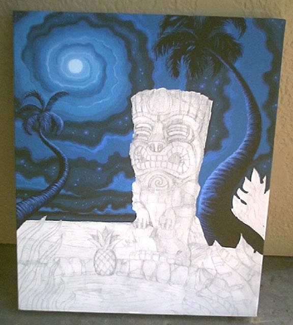
Nice pieces, I dig em...the only thing is that it's always the same kind of lightning source and composition (although this is a series)...other than that: nice! :) |
|
TSA
Tiki Shark Art
Posted
posted
on
Sun, Dec 10, 2006 3:23 PM
Hey Thanks TC, and Grog. Tiki Shark [ Edited by: Tiki Shark Art 2006-12-10 15:27 ] |
|
H
hewey
Posted
posted
on
Mon, Dec 11, 2006 2:19 PM
Looks awesome man Cant wait to see the sunken tiki either :) |
|
TSA
Tiki Shark Art
Posted
posted
on
Mon, Dec 11, 2006 11:06 PM
Thanks Hewy, and everyone for your feed back. It's like gold to an artist in the process to hear other tiki enthusiasts thoughts. |
|
F
frostiki
Posted
posted
on
Tue, Dec 12, 2006 8:12 AM
I hate you, I hate you, I hate you. As I seethe with jealous rage. This one is coming along great. I'm going to go cry over my inadequacy now. |
|
LLT
little lost tiki
Posted
posted
on
Tue, Dec 12, 2006 8:59 AM
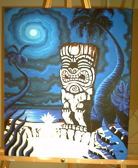
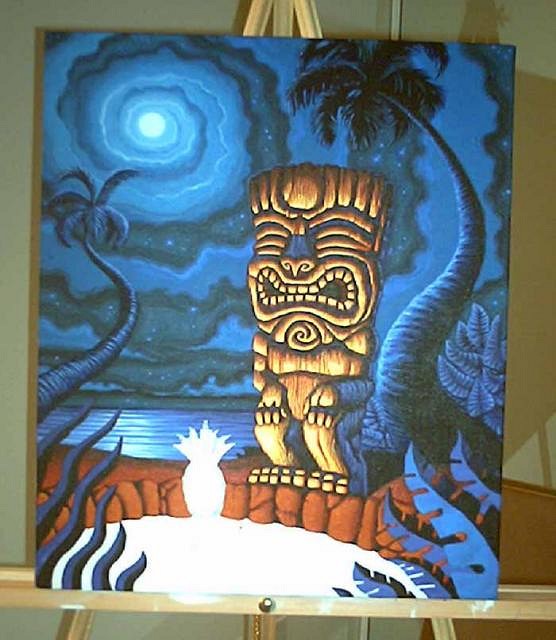
Looking SOOOOOOOO Killer Brad! Soooo what color are you doing the foreground pineapple in? |
|
TSA
Tiki Shark Art
Posted
posted
on
Tue, Dec 12, 2006 11:52 PM
Hey there Frostiki, I feel your pain. Really. I mean after I painted the clouds, I was seriously thinking of stopping this one, painting over the canvas, and starting another one, because it looked so completely wrong to me. I fret and pain over my work all the time. Ken! I'm totally missing the Tonga Hut! I will always keep the memory of dancing with Crazy Al, Squid, Mrs Squid and Grog while downing a bit too much Voodoo juice close to may heart. The color is... is... well If I could up load this image you could see it. My neighbor's wireless is even slower tonight than usual... It's still not doing it... |
|
LLT
little lost tiki
Posted
posted
on
Wed, Dec 13, 2006 9:15 AM
Nice! Lookin'great! That warm against cool colors really brings it forward! You're always so worried about the colors and you don't realize (or may slowly be realizing) that your instincts and art intellect are all you need! An artist's self doubt can be a most silent and stealthy enemy....Beware of it....shun it! Get that DSL up man!You're so lucky being so far away from these clowns! The Tonga Hut floor is looking to get quite dirty and bloody! As I jump into the MUGWARZ fray on Saturday, I will envy you on that quiet island,painting and feeding your soul! |
|
G
GROG
Posted
posted
on
Wed, Dec 13, 2006 9:24 AM
|
|
I
IsleConch
Posted
posted
on
Wed, Dec 13, 2006 5:28 PM
Double WOW..triple WOW !!!I really don't care how many painters of light there are or how they got that title, I just admire "Your" work right now..EXCELLENT Sir. |
|
H
hewey
Posted
posted
on
Wed, Dec 13, 2006 5:53 PM
Mate, its like gold being priveledged enough to watch these gorw and progress :) |
|
TSA
Tiki Shark Art
Posted
posted
on
Thu, Dec 14, 2006 12:24 AM
thanks so much! |
|
G
GROG
Posted
posted
on
Thu, Dec 14, 2006 12:50 AM
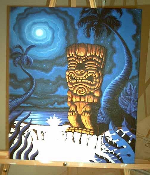
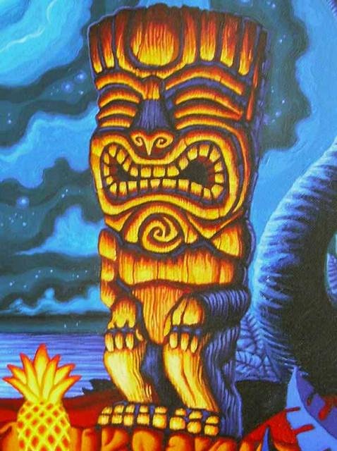
Just a suggestion. Your blue on the face, particularly on the nose and mouth, match the sky behind it too much and almost make it seem like we're seeing through the tiki to the sky, so you might want to adjust those shadows/reflected light a bit. They work better on the legs where the color behind the tiki is dark brown. I think part of it is that the blue is SO much colder and is so bright in the shadows that it competes too much with the warm hilights. The shadows should appear to recede more than the highlights. You'r almost losing the 3D quality with the shadows competing so much with the hilights. GROG almost like it better in the previous post when the shadows were a dark brown. The blue shadows almost make the backside of the tiki blend into the background. GROG know you're still working on it and it's progressing nicely, plus pictures never do the art justice, so GROG sure it looks better in person than what the pics portray. Just GROG's 2 cents, take it or leave it. [ Edited by: GROG 2006-12-14 00:54 ] |
|
S
squid
Posted
posted
on
Thu, Dec 14, 2006 1:04 AM
Holy Moly Brad! Lookin great as usual! Don't mind Grog. That's the reason I never post my crap...er...um....work in progress. Armchair petroglyphists....sheeeesh! Miss ya! |
|
T
teaKEY
Posted
posted
on
Thu, Dec 14, 2006 5:34 AM
I don't know, I think the blue is right. TikiShark paints with a magic paintbrush, so just let the brush do what it wants. Its hasn't let you down yet, has it? |
|
LLT
little lost tiki
Posted
posted
on
Thu, Dec 14, 2006 9:01 AM
That sure didn't sound like Mr.GROG! More like Dr.Ernie Keen....indubitably! What a fancy pants artsy showoff! He should do less yapping and more painting! I love the progress pics! Keep 'em coming! MUGWARZ! |
|
G
GROG
Posted
posted
on
Thu, Dec 14, 2006 9:46 AM
Yeah, these guys are right. Several years of art classes in college and over 20 some-odds years as a professional artist working for some of the largest studios in the world I guess doesn't qualify GROG to offer any critical advice. Just use your magic paintbrush and everything will come out right. It IS looking good, Bradmeister, GROG looking forward to seeing it finished. |
|
T
teaKEY
Posted
posted
on
Thu, Dec 14, 2006 1:59 PM
Hey Grog, do I detect sarcasm? I just think that it looked right to me when I saw it. And its already done that way. I haven't seen your work but for in TikiMagazine and I believe TikiSharks work seems something special. Its has a glow about it that I usually don't see it others paintings. But what do I know I have been drawing my whole life, art classes, art minor(but probably enough credits for a Major). I made my first tiki mug 20 years ago at the age of seven. Its a good one, I still have it. a little editing.. [ Edited by: teaKEY 2006-12-14 14:08 ] |
|
T
teaKEY
Posted
posted
on
Thu, Dec 14, 2006 2:06 PM
You know what, I looked at it again, and kinda looked past the tiki and I could see where the tiki looked to be missing in the nose area. The background swirl would be there if it was truly see through, but I can almost imagine the nose with little stars on them. Didn't see it when I looked but I can see it now, sorta like a Dali. But I heard black shouldn't be true black and good contrasting colors make these paintings. Grog friend? |
|
F
frostiki
Posted
posted
on
Thu, Dec 14, 2006 2:55 PM
Where is that damn sarcasm font? I thnk a lot of us need it |
|
SF

Slacks Ferret
Posted
posted
on
Thu, Dec 14, 2006 5:55 PM
I applaud Grog for giving something few on this board seem to know how: "Constructive" criticism. Just my 2 cents (1.8 cents Canadian) |
|
H
hewey
Posted
posted
on
Thu, Dec 14, 2006 6:45 PM
Grogs feedback (well, apart from the finger salute) was constructive, positive and well meaning. TC needs more of it. I think most artists would appreciate it. As far as the rest of Grogs posts (like the finger, and saying he hates TSA) are all sarcastic banter between mates. The first few times I came across Grogs humour in other threads I didnt know how to take it. Now I just realise its his sense of humour, and its positive. Plus I cut him some slack because of his depression from his baldness :) TSA and other artists, let people know if you want constructive feedback. And if people say they want it, give it to them. |
|
MR
Matt Reese
Posted
posted
on
Thu, Dec 14, 2006 7:47 PM
Hewey is right on the money! I agree with GROG's criticism. TikiShark's talent is obvious and if you're going to get any kind of constructive criticism about art GROG is the man to get it from. GROG knows art(but apparently not how to drive very good). TikiShark.....keep the series coming! I would love to see a postcard set or something of these. Amazing work. |
|
G
GROG
Posted
posted
on
Thu, Dec 14, 2006 8:26 PM
Yes, I joke with Brad because he's a friend, and I really respect and admire his work. But I also think it is important as a fellow artist to help other artists to improve their work, and "Oh that looks great" isn't always the best way to help them. Especially if you see something they may not. It's not easy for artists to be objective about their work, so it's good to have an objective eye. Try flipping a drawing over and light it from behind. You'll see your drawing has more mistakes than you thought. So many people post stuff and ask for criticism, and I mean "constructive" criticism, but nobody really seems to really give any on the board. I find good, constructive criticism an important part of growing as an artist. If everybody always just says, "Oh that looks great!", it may help with the artist's confidence, but it doesn't really help them improve their skill or to be able to look at their own stuff with an objective eye. In animation, my artwork is criticized every day. It's not easy always having people tell me what's wrong with my art, but I'm a much better artist for it. I think "criticism" has a negative connotation, and there definitely is negative criticism, so I think most non-artists not used to having their art "constructively" criticized view any sort of criticism as negative. And since most of the people on TC aren't professional artists and aren't used to having their art critiqued all the time, I think the majority are shy about giving and receiving constructive criticism. Brad(Tikishark) is a professional, and I know he would appreciate good constructive criticism.Criticism is also very tricky to give, because it can have negative effects even if it was meant in a positive way if worded wrong or taken in the wrong way which is another reason I believe people on TC steer away from it. I appreciate you standing up for me, and I know the right people will understand how I meant my critique. Thanks-------Ernie Sorry to derail your thread Brad. Now back to posting pics of your art so we can bash it some more, overly-talented bastard. |
|
TSA
Tiki Shark Art
Posted
posted
on
Thu, Dec 14, 2006 11:13 PM
Wow, I unload my container fer a day and I come back an there/s a big ol discussion about art criticism on TC! Cool! (Now for those of you wishing to submit such critisim, all I need is a resume and past work and edcational art experience. Just like Grog did. Please send all information to my e-mail address, wait 6 weeks, and then post your view point of the piece being talked about.) So Thanks Grog, And Thanks everyone else!! Now if I can only get more than two lousy bars of wireless reception I can up load the next version ... comon comon... Tiki Shark [ Edited by: Tiki Shark Art 2006-12-14 23:16 ] [ Edited by: Tiki Shark Art 2006-12-14 23:19 ] |
|
S
Swanky
Posted
posted
on
Fri, Dec 15, 2006 7:37 AM
ME think same as GROG too. Me think tiki may be in front of fire and that color be good fo highlights in shadow. Me no artist, just critic. While me being critic, I have to wonder what the composition will mean. I don't want to get too deep into it if you are really just experimenting and making it an education project, but the art critic in me says "What's the subject?","What's going on here?" As it seems to be going, it's nearly a still life. A study. IMHO, it needs some sort of depth of action. It can even be implied as in something off in the background or something that shows activity in the past, and that may well come as you finish, so don't shoot me. Now, I do like what you have done. Just so you don't think ill of me. I mean, no one kicks a dead dog. Offering critique is a complement. If I thought it was the sux, I'd just close my mouth and go away. I wanna see where it goes, but I want to see something to take my eye off the big honkin tiki in the shot. I want to see more "movement" in it. As it is now, I look at the big tiki and maybe notice what you have done with the sky and that's it... I know, I know, you are getting to it and all, so, fergit it if'n you are heading to that place. |
|
H
hiltiki
Posted
posted
on
Fri, Dec 15, 2006 8:24 AM
While I find myself agreeing with Grog on some of the points he made, I feel like we should wait for Tiki Shark to post more pictures of the finished piece. I think that he sets a great mood with the reflection of light on the forms.His paintings are well thought of and well balanced. There is a lot of motion and interest in them.I like how he makes the tikis the focal point of the pictue and how I am drawn to them everytime I look at his paintings. (graduate UCLA School of Art) |
|
S
Swanky
Posted
posted
on
Fri, Dec 15, 2006 10:42 AM
Just my little opinions. There is movement in the painting for sure. I wait to see what is going to be in the front. I guess I liked the tiki, pre-blue-highlights better for the reason GROG stated. I think what I was trying to say is I was looking for eye movement besides what was there, which will likely come as the piece is finished, and in some art fag way I was wanting more "mental movement" than a landscape scene. Again, that's without knowing what comes next and it may fill that mental and visual gap for me. All this just sounds wrong typing it. Stupid, or labored or obvious or whatever. It all is the sort of thing that were we in the same room talking abou thte painting it would be a minute of conversation that was just tossed out there and over and now it's a long thread and it just gets messy and convoluted. I always recall the professor in college saying "Where's the art?" Oy. |
|
H
hewey
Posted
posted
on
Fri, Dec 15, 2006 5:57 PM
I think the white section at the bottom of the painting is too plain :) |
|
S
squid
Posted
posted
on
Fri, Dec 15, 2006 6:54 PM
Hey Brad, I can't offer any color critique as I am massively color deficient, also known as color-blind. I hope it's still OK to say "I like it! Keep going!". Now that I think of it, maybe you should run ALL your color proofing by me. If I think it looks good, then you'll know something's very wrong! Paint on, brother!!! Now where did I put that cartoon finger?... [ Edited by: squid 2006-12-15 18:55 ] |
|
TSA
Tiki Shark Art
Posted
posted
on
Sat, Dec 16, 2006 1:20 AM
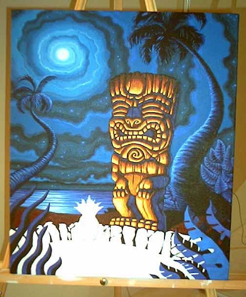
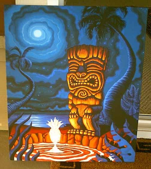
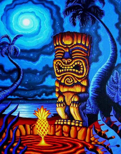
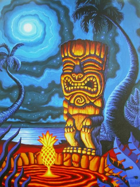
I'm honored by such deep thoughts, thanks everyone. I really do think about what every one suggests. I'm always looking for a way to improve. So, it's supposed to be a Lava pool shooting up a glowing hot lava spurt that just happens to be in the shape of a pineapple. A mystic sort of thing, no? P.S. |
|
TSA
Tiki Shark Art
Posted
posted
on
Tue, Dec 19, 2006 1:05 AM
Hey TC, |
|
F
frostiki
Posted
posted
on
Tue, Dec 19, 2006 7:04 AM
Very cool, I like the look. I thnk the pineapple needs some lava faling off of it though, to really get that feel you mentioned of the lava spouting off the pineapple shape. I like the glow and how brightly lit the Tiki is, |
|
T
teaKEY
Posted
posted
on
Tue, Dec 19, 2006 7:16 AM
you make it look too easy. if you think of it, Hawaii was all made from lava and the pineapples did come out from the ground. |
|
LLT
little lost tiki
Posted
posted
on
Tue, Dec 19, 2006 8:59 AM
You do make it look too easy! Four of my Menehunes walked out yesterday! They were grumbling something about how there's this better painter on the Big Island that they were going to work for! Great! Now I gotta paint the WHOLE picture! With their assistance you'll probably be able to paint a couple of these masterworks a week! |
|
CS
Capt'n Skully
Posted
posted
on
Tue, Dec 19, 2006 9:34 AM
It's coming out excellent Tiki Shark! Another beautiful piece. If I had any comment to make, it would be to possibly add some shoots of flames off the lava pool here and there.. maybe a super translucent, firey mist around the pool, too. (Thinking that would give it some more depth and add mystery to it..) Can't wait to see how you finish up!! |
|
H
hewey
Posted
posted
on
Tue, Dec 19, 2006 2:16 PM
Mate, I dont know how you manage to find the time to paint at all! I just moved myself, painting in the middle of moving was NOT going to happen.. |
|
TSA
Tiki Shark Art
Posted
posted
on
Tue, Dec 19, 2006 9:21 PM
|
|
G
GROG
Posted
posted
on
Tue, Dec 19, 2006 11:35 PM
That looks great! ( Damn you) |
|
P
Paipo
Posted
posted
on
Wed, Dec 20, 2006 1:46 AM
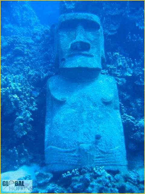
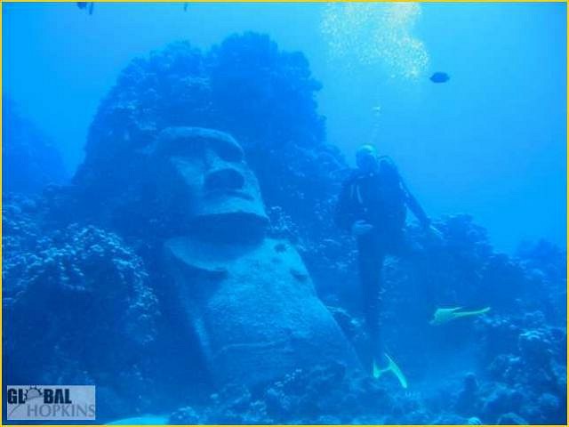
I'm stoked you give us so many pictures of your working process on these, and allow the peanut gallery to offer criticism. There aren't many guys working at your level that would do that. I'm really looking forward to the sunken tiki - have you seen the underwater moai before? |
|
MR
Matt Reese
Posted
posted
on
Wed, Dec 20, 2006 8:32 AM
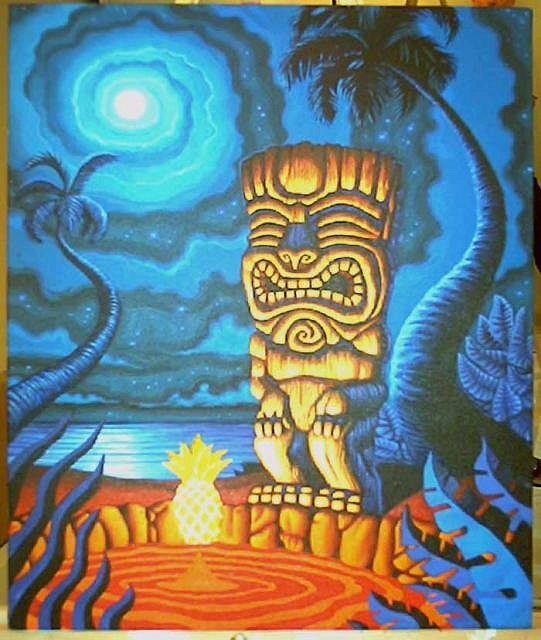
The painting looks great. I do think the lava looks like lava. The overall feel with the blue vs. red works nice as well. |
|
F
foamy
Posted
posted
on
Wed, Dec 20, 2006 8:43 AM
Fun stuff TS. You do nice work. I'm enjoying your thread. |
|
TSA
Tiki Shark Art
Posted
posted
on
Wed, Dec 20, 2006 11:17 PM
Thanks for the kind thoughts everyone. Paipo, WOW! How col is that sunken Moai!!!! Thanks for those shots, I've never seen it before! I spent most of today driving to the other side of the Big Island to deliver Mystic Tiki #5 "The Skull" to it's new owner. It's amazing how many different kinds of landscape the Big Island holds. Beautiful! So, I didn't get much painting time in. None actually. Maybe tonight, I'll put the last touches on #8. Aloha from the Big Island, |
|
S
Sneakytiki
Posted
posted
on
Thu, Dec 21, 2006 12:32 AM
TSA, the latest painting is stunning. Congrats on your move. Paipo, the sunken Moai is too cool, a real sunken tiki! Was it deposited there while being transported by raft around the island by the builders or is it legit? Coolest Moai pic ever! |
|
TSA
Tiki Shark Art
Posted
posted
on
Thu, Dec 21, 2006 10:13 AM
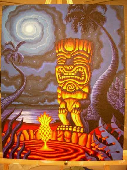
Here is the finished piece. |
|
TSA
Tiki Shark Art
Posted
posted
on
Thu, Dec 21, 2006 10:19 AM
|
|
SF
Swamp Fire
Posted
posted
on
Thu, Dec 21, 2006 10:24 AM
Looks great Brad. |
|
I
IsleConch
Posted
posted
on
Thu, Dec 21, 2006 3:18 PM
...FANTASTIC!!!! sorry, I don't have any art schooling so I can't find any faults. |
Pages: 1 2 3 4 5 6 7 8 9 10 11 12 13 14 15 16 17 18 19 20 21 22 23 24 25 26 27 28 29 30 31 32 33 34 35 36 37 38 39 40 41 42 43 44 45 46 47 48 49 50 51 52 53 54 55 56 57 58 59 60 61 62 63 64 65 66 67 68 69 70 71 72 73 74 75 76 77 78 79 80 81 82 83 84 85 86 87 88 89 90 91 4327 replies

